
The Whip and The Chair
There is a classic story of the lion tamer. A tamer holds a long, threatening whip in one hand and a small chair in front of the lion’s face in other. The whip usually grabs all the audience’s attention, but it is mostly for a show. It is actually the chair that plays the biggest role.
It's not that the lion is afraid of the chair. In fact, when a lion tamer pokes a chair in a wild cat’s face, the lion tries to focus on all four legs of the chair at the same time. It is confused. It does not understand how to behave. When facing so many options, the lion chooses to wait rather than attacking.
Frankly speaking, most websites, not just real estate ones, force users to feel like the lion - they confuse and do not give a chance to figure out what’s going on. And it should not be so.
More Questions Than Answers
There is a certain type of property websites providing their users anything except information about houses they sell. Others tell dull stories, recommend to watch breathtaking videos/photos, propose to read their latest press release/blog article/”informative” white papers, and to share them with Facebook/Instagram/Twitter friends. Oh, I almost forgot. Those who are interested in buying a house can also subscribe useless emails.
Why does that happen? The first thought comes to mind is that it is much easier to deal with the lion when it is confused. However, I tend to think it is not a conscious strategy but a misunderstanding - it is easier to deal with a cute kitty instead of the confused lion.
Design Is Not About Beauty
To be more precise, it is not just about beauty.
Let’s think about a real estate website as a piece of cloth. It is not enough to look good - it has to look good, fit good, be tailored good, be made from a good material, and, finally, match a buyer’s taste. When it comes to a luxury property website, requirements are not lower.
One who bought pants which were torn along the seam at the wrong time (actually, any time for this is wrong) will never buy them again and likely to consider the brand as generally low-quality one. One who visited an elite real estate website and did not satisfy their needs will likely not to visit it again, not speaking about a million-dollar purchase.
Let’s look at the most irritating and, unfortunately, common luxury real estate website design mistakes and figure out how not to give them to kill your business.
1. “Mystery Meat” Navigation
Usability evaluation is a relatively new field. So it is not surprising that there are so many UX/UI “experts” suffering Dunning-Kruger syndrome around. And if the world resembles a website, chances are that life would be pretty confusing. Do not let yourself to be tricked - choose a web agency carefully.
If you want a user to feel comfortable, make sure they have a clear understanding of where they are in that each step, each page. In another case, a user may face what calls a “mystery meat navigation” - a term that describes a case when a user experience turns into a nightmare.
Trump Tower website is a great example o how not to do a website (actually, in all senses, not just in terms of navigation.) It seems weird that one of the NYC's most visited attractions has such a horrible website. If this website is like a real-life navigation, it would be a catastrophe - imagine that in order to reach the 10th floor of Trump Tower, you would first need to lift up to the 7th, go to another elevator, lift up to the 9th, and go upstairs one more floor.
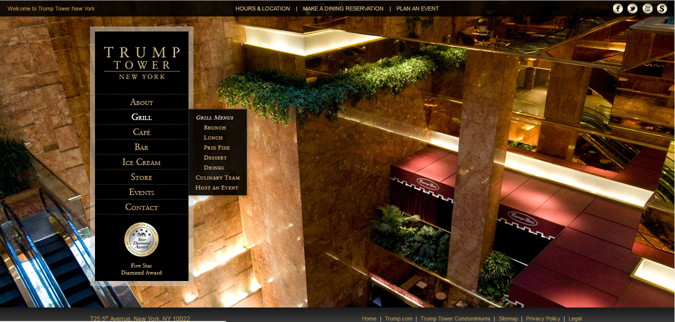

There are numerous things that make your website navigation sucks: from the use of a non-standard style of navigation to drop down menus to placing a hundred of pages. Navigability issues may kill a website faster than anything else. That is why our Vintage specialists have a habit of testing everything that is possible to test. We strive to achieve a complete intuitiveness of a website navigation. Intuitive navigation means that when a user needs to find something, they know how to do so. The easier your website to use, the lower a bounce rate will be.
Why Bother About Usability?
Due to enormous competition on the Internet, usability becomes a vital factor. If users challenge to use a website, they turn to competitors. It is that simple. Here are just a few reasons why users leave (actually, this list is far longer):
- They do not understand where they are
- They cannot easily and quickly get what they need
- They are constantly offered to watch boring presentations
- They are interrupted with nasty pop-ups
- They struggle to contact you
How to avoid:
- Hire a professional UX/UI designer
- Test your website on yourself. When browsing it, constantly ask yourself whether or not you understand where you are and what to do next. Show it to your mom and ensure that she had no problems with navigation
2. Why So Slow?
Like other elements of a real estate website, visual content communicates the brand of the company. Bona fide shots and videos are mandatory, but no one will wait until they are downloading. “Patience is a virtue” does not apply to e-commerce and, actually, Internet users are increasingly demanding. Poor website performance is bad in any case.

Web performance is a hugely important issue, so much so that the big companies which have own websites are obsessed with it. A slow website means fewer users, less happy users, and, thus, lower reputation and revenue.
According to a report by Aberdeen Group, an additional delay of even 1 second can impact conversions by 7%, page views by 11%, and customer satisfaction by 16%. Researchers found that a company's business performance suffers when its web pages take longer than 5 seconds to load.
Performance can be measured in a bunch of ways. The good news is that 80 to 90 percent of low download speed happens in the front end. This means that to achieve bearable speed, it is usually enough to optimize JavaScript, CSS, HTML, and images.
So to keep a customer on your website long enough for them to make a purchase, you have to cater to their impatience. Do let them a chance to see amazing photos of their future houses without feeling irritated.
How to avoid:
- Reduce image dimensions - optimizing your images and videos is absolutely necessary because most of the time they are the biggest files on a page
- Reduce the number of plugins you use on your website
- Do not use Flash
- Keep external style sheets to a minimum
- Keep redirects to a minimum
- Use Google PageSpeed Tools to identify ways to make your site faster and more mobile-friendly
3. Raw Photo Gallery
Good pictures are a crucial marketing tool for a home sale. Sounds obvious, right? Anyway, if you have been ever looking for a house or apartment to buy online, you know that many real estate galleries look awfully. If shots or videos placed on even the world-class website are dingy, people will associate a company itself as dingy. According to research from the National Association of Realtors, 98% of home buyers searching for a house online consider photos among the most useful features of real estate websites.
There are millions of elite homes are sold in the U.S., and even after buyers filter their searches by price, location, and a number of rooms, they may still be faced with a string of similar-looking properties. That is why you need to make yours stand out. If your property has a unique feature, emphasize it.
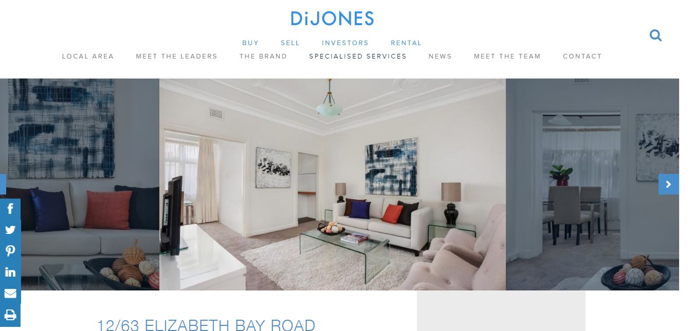
An example of how a good photo gallery may look like:
How to avoid:
- Hire a professional photographer
- Ensure that all photos are light and bright, high-resolution, clear
- Do not mislead your buyers and do not use extreme wide-angle lenses or other tools to make rooms look far bigger than they really are
- Pick the right amount. I know, they are all awesome but do not dare to staff all of those thousand into your listing. Have mercy on your clients
4. Poor Content
Do you have something to say to your buyers? Do it wisely. What does it mean? Content builds trust. It represents a company as an expert in the industry. It answers users’ concurrent questions. It differentiates a business from its competitors. Finally, it drives organic traffic through SEO and social media sharing. So when I say “wisely,” I mean neither underestimate an importance of a content nor overuse.
However, I’m talking not just about creating content but superior content. There is nothing easier than to put inaccurate, insignificant, out-of-date pieces of text no one will read. At the same time, there is nothing hard in compounding some basic information about your company and products it offers.
One may think “People love to see beautiful pictures of elite homesteads, not to read about them,” and will be right, partially. In fact, content is not just letters and figures. Anything you place on your website - panoramic shots, videos, technical documentation, presentations, contact information, and so on - is actually a content.
How to avoid:
- Use catchy headlines to attract visitors
- Respect a white space
- Love SEO optimization
- Forget about business-speak, dry details, and confusing acronyms
5. Missing Target (audience)
Unfortunately, there are a huge amount of websites which talk to everyone and, at the end, fail to interest anyone. Instead of being precise, they are lavish. The way your website looks and is perceived will naturally attract a certain type of visitors. If you are still reading this article, you are a part of my target audience. When writing it, I was thinking how to deliver my message to you in an appropriate language that could drag your attention and force to read to the end.
For example, there is a successful seller of upper-end homes, vineyards, and wine estates. Let’s call her Jessie. So Jassie appears to be niche marketing. As well as Joshua who offers luxury apartments in New York business center. Both Jessie and Joshua deal with a luxury segment, but their buyers are different (though I admit that global business owners may decide to buy a nice vacation home in a picturesque place). So they conceive their websites to attract a certain audience.
How to avoid:
- Identify and profile your target audience
- Cater it
6. Ignoring Mobile Users
We are constantly saying it but are ready to repeat: over 60% of people first visit websites via their smartphones, and your potential buyers are undoubtedly among them. By ignoring a mobile version of your website, you cut a great part of an audience off and present your company as secondary - no one respectable business does not allow itself to be disparaging towards its clients. So how can you?

How to avoid:
- Specify it with your designer before starting to build a website. Actually, responsive web design is a matter of course and any respectable web agency knows it, but still
- Ensure that your website works equally well on all devices
I am definitely curious what you think about each of those points and would love to hear your thoughts. So please, feel free to comment and share your experience. If, after reading this article, you found your property website unsatisfactory, reach out to us - together we will develop a website your business deserves.
View Comments