
Your e-commerce website is the first interface between you and your customer. It is your best assistant and a 'face' of your business rolled into one. That's why it is crucial for you to work hard to make it pleasing to the eye, easily handled, and working flawlessly.
My name is Maria and I’m a UX/UI designer at Vintage Web Production. By this crash test, I continue the series of posts about the most exciting websites in their industries. Previously, I wrote about best fashion, architecture, and gadget websites, so now it's time to look closer at the best examples of e-commerce.
Selected below are some of the most awarded e-Commerce websites on Awwwards.com, and even though they don't use AR yet, they are still top-notch, above and beyond "template" decisions in usability, design, typography, and custom. A Jakob Nielsen’s 10 heuristics for User Interface Design will be a ground to build on.
It's time to go shopping!
FreeWrite
The Astrohaus Freewrite is a smart typewriter equipped with Wi-Fi feature and e-ink display. This is those case when the future of writing looks exactly like the past.
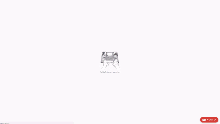
Main Page: When hitting the website, the first thing a user sees is a nice video of a product and can read about what it actually is. A slow, relaxing background music complements the idea of a slow, thoughtful writing.
A hint and visualization point on an option to scroll down which reveals a beautiful animation allowing to look at the product from different sides. The '+' buttons to learn more about the product are well visible and obvious.
Web developers gave a notable place for social proof with a great bunch of publications in the most popular online media, so we can see that this innocent thing has run a childless buzz.
The section called 'What people say' contains only two reviews, so it would seem that there are no more that these, at least, no sign or hint point on it.
A common trick of most landings is to write about a special offer “You can buy it for a reduced price today only.” However, it is unclear why the offer is limited and when a sale is going to end.
A top menu contains a call-to-action - ubiquitous 'Order now' button. But it works only if a user wants to buy a typewriter because if to click on it, it leads to a typewriter product page. But if a user is looking for a cable or a bag, they may be confused - 'Order now' here actually means 'Order a typewriter now,' not a product you are currently observing.
Shop: A large banner immediately offers to buy a typewriter.
A catalog contains only a few items (4, actually) but has a filter anyway. And here is some mismatch - if a typewriter is being sold for a special price at Main Page, here the price is shown as regular, so users may suggest that a sale is just a cheap trick to push them to a purchase.
Product Page: This is an example of a good product page for e-commerce. Pages include pretty detailed descriptions of product characteristics. The only flaw is that the price does not change when choosing two or more items to buy.
Cart: If a user selects a typewriter and proceeds to a checkout, they are offered to choose a type of a keyboard. There are pictures of each of a type for those who don’t know the difference. At the same time, the page does not allow to choose a keyboard language, although a user already knows from the previous pages that the device supports a few languages.
Checkout: Check out button redirects a buyer to a standard Spotify checkout page. If they decide here to order not just a typewriter but also a bag or cable, it will be challenging - related items are not recommended when checkout. The only chance to do it is to return to the website and get all the way all over again.
Overall impression: Great, atmospheric e-commerce website. It is completely designed for selling a typewriter, and the whole buyer’s path is designed to lead to a purchase of the product. But, at the same time, the sale of related items is poorly elaborated.
Score: 9 of 10.
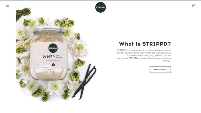
STRIPPD.
Premium whey and vegan protein powder and supplements. Manufacturers accent on that their blends are designed especially for women: light, lactose-free, and available in three flavors women like so much - vanilla, chocolate, and berry.
 Main Page: Visiting Main Page, the first thing a user sees is a banner familiarizing with branded products and encouraging to 'Shop now.' However, these banners change too fast so a user may have no time to read all descriptions that are actually important to read.
The sections below continue to familiarize a user with the products, each contains a strong call-to-action Show now.
Main Page ends with colorful pictures and a large hashtag. The latter is obviously clickable, although a user figures out where it leads to only after actually clicking on it (spoiler: to Instagram).
The navigation is hidden behind a burger menu. As for me, it is not the best choice - there are only 5 menu points, and they would be placed on the header so a user to see all them at once.
Store: A page looks like a nice blog page rather than a casual catalog of an online store. Such a playful presentation could be relevant if Store remained Store in its essence, without sacrificing some necessary elements.
It may not be clear at first sight how to go to a collection or a product - the page gives no hints or buttons pointing on where to click. If a user guesses to mouse over, they will see that a product name and price appear only when hovering on a product picture. Then, they, as I did, will probably try to click on collection titles and header images of collections and find out they are non-clickable. And even if they know beforehand what product they want to buy, they still need to poke at all images of a category and not to find Add to cart button.
Product Page: The first section of a page is truly awesome! A user immediately sees a product and all necessary information, including rating and reviews. The only things would be great to add are an option to switch between different tastes within a category and add to a cart a few of them.
The section below offers a user to subscribe to a periodic delivery and safe 10%. However, it is not clear whether it’s a one-off share or applies to all orders in a subscription. When going to a cart, it becomes clearer - a discounted price is calculated for each subscription purchase.
Cart: When a user adds something to Cart, the Cart page opens, that is annoying because, in order to choose another item, a user has to press Continue shopping button. Pop-ups here would be much better and less irritating solution, I suppose.
If choosing a number of items desired, a user needs to press an Update Cart button to see the new price.
Also, when an item is added to Cart, there are no hints reporting about it.
Checkout: A standard Spotify checkout form.
A form is divided into a few parts - it is a plus. A user does not know how many parts there are - it is a minus. Fields contain apprehensive hints on how to fill them - it is a plus. But if a user made a mistake while filling a field, they are not explained where they exactly were wrong - it is a minus.
Moreover, mistakes are not displayed all at once, so a careless user is doomed to irritation.
Score: 7 of 10.
Overall impression: Almost all pages are designed so to maximum convert every visit into a purchase, but not each page is designed to help a user to choose and buy desired items.
RVS Eyewear
RVS Eyewear is handcrafted accessories produced in limited quantity by Japanese artisans.
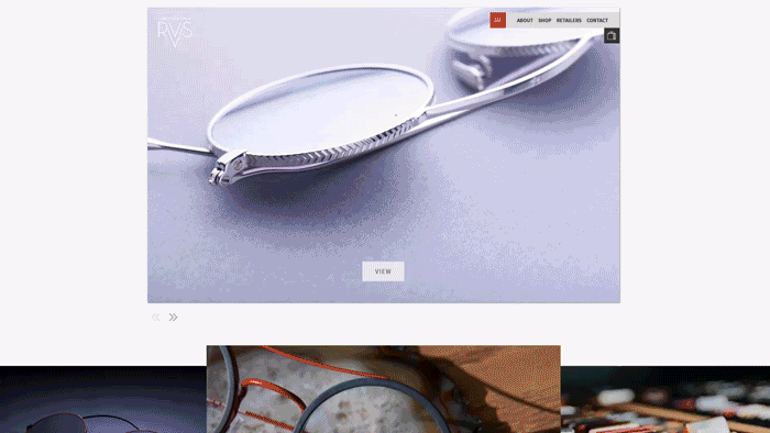
Main Page: Main Page offers a user large banners with the brand’s products welcoming to observe collections. Not all banners are clickable, like those with a store address on a place of a button. And it is a bit confusing because it designed similar to a button.
The last section of the page tells about the brand and its advantages. The blocks here are actually clickable, although they do not look like such. And even if a user guesses and click on, for instance, About block, they will be picked to Catalog instead of (logically?) About page.
Shop: The first thing that catches my eye is inqualitative item photos: they are poorly cropped and have some ugly stains on the background. Considering the fact that the brand seeks to demonstrate its exclusiveness and a high quality of its products, photos of such a poor quality only fear clients away.
Prices and names of glasses are displayed only after hovering on them, and inexperienced users may not guess that the items are clickable.
There are filters - it is good. On the other hand, a few filters cannot be chosen simultaneously (for example, 'sunglasses' 'for women'). No option to sort items and a total number of items sold.
Product Page: Once again, item photos are of a poor quality. It is one of the most repellent factors for a visitor of any online store, especially a luxury one.
No information about lenses and a glasses size. In general, Product Page lacks an item description and real-life photos. And, considering the fact that all pairs of glasses presented are of specific shapes, it is extremely important for a user to see them on real people.
No shipping information. A user from Uganda may not understand whether items are shipped to their country.
No descriptions of items advantages. Why should the user from Uganda (or any other country) buy this pair of glasses?
Cart: When an item is added to a cart, a font type of a number of items is too small and thin for a user to read it.
A number of items chosen can be changed only in a pop-up but not in a cart - here it is possible only to delete it. Here, e-commerce cart design lacks a Continue shopping button.
Score: 7 of 10.
Overall impression: It is pretty strange to see pictures of such a poor quality on a website of a luxury brand. This does not give me rest.
Monogram T-Shirts
A nice couple of designers, hunters for a perfect vintage t-shirt, decided to start making their own. As a result, Monogram was born - as heir ode to personality, vintage, and graphic design.
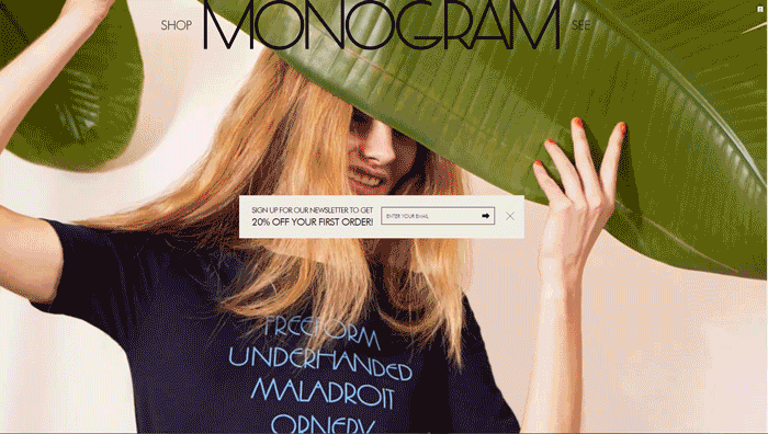
Main Page: The first thing a user sees when hitting the website is a subscription form offering to sign up to get a 20% off a first order. Okay, I don’t mind the form itself, but I don’t quite understand why to place a Close button where a Send button should be? Instead of signing up and getting a discount, a user will most likely to close the form.
Background photos (there are 4) are of a low quality. Anyway, even if they are of a high quality, they still do not explain to a user what they are offered to buy. In fact, Main Page is a one large banner calling for a shopping trip.
No signs indicating a scroll, as well as no sign pointing that banners are clickable. The menu is non-readable and looks like some title - like whatever but not a menu.
Shop: If a user somehow guesses where a navigation is, they are lucky enough. To filter items is possible only before viewing them: if you press ‘View all,’ you could not find a filter on the page. There are only two filters by a type of cloth and no sorting by popularity, color, or size. It seems to be considered as unimportant, as well as an information about a number of items in Shop.
A price of an item reveals only after hovering on the item picture.
No button to add to a cart.
Product Page: If a user hits Product Page and wants to move back, they will be confused - web developers did not foresee such turn of events.
Size font for an item description is too small. No reviews.
Cart: When adding the desired item to a cart, a full-screen cart page opens. Using a pop-up cart, when customers add an item to the shopping cart rather than taking them to the shopping cart page is a very elegant way to encouraging users to buy more and browse through the store. It also mirrors what buyers do in the real world: they pick items and put them in their shopping carts while moving around a supermarket.
Here you will not find an option to change a number or size of items added. Applying a discount becomes possible only when checkout.
Checkout: A standard Spotify checkout form.
Score: 7 of 10.
Overall impression: The website looks pretty good in terms of a graphic design. However, a number of important elements and steps may seem unobvious to a user.
Northernism
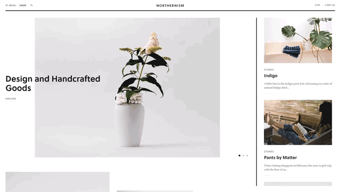
Main Page: The main banners explain to a visitor of the website what the company offers them. Although they are clickable, it is not obvious - there are no buttons, arrows or any other signs welcoming to discover more.
The next section consists of two banners - item pictures, that is clear by product names and prices.
The right side of the page is occupied by a section titled ‘Stories.’ Again, a user may not get that stories are clickable: no hints point at this; when being hovering, a color of inscriptions changes only slightly, and it could be not noticeable at all. So a user may just skip this block.
A navigation duplicates Shop button: one is placed on a header, another - in a hamburger menu. A better option would be to render store sections to the header, so a user could move to any desired category.
Shop: There are 7 different categories of products - it is a plus. But it’s impossible to choose a few at once - it is a minus.
Goods cards contain names and prices - it is a plus. Unfortunately, there is no information about a number of goods.
Product Page: A price is placed in an unusual place and its font size is pretty small - try to find it (It took me a few seconds).
Here, the right sections turn into a one offering related products. In some products cards, to learn about item materials, a user needs to read all description - this information is not taken out on separately. Some items have limitations in quantity, though product cards do not inform about it.
Clothing is available in unusual sizes - 1 and 2. Although they are explained as more familiar European 36-38 and 38-40 accordingly, a page lacks a size chart.
Cart: Cart is designed as a pop-up, so when adding an item to the cart or clicking on Cart in the header, the right section turns into Cart. There, you can press ‘View Cart’ button and hit the full-screen cart page.
The cart does not have limitations on a number of items to be bought. And only when a user proceeds to checkout, they are informed about an unavailability of the desired product.
There is a field for special instructions, but honestly, I did not get for which purpose this field is placed there.
Checkout: A standard Spotify checkout form.
Score: 8 of 10.
Overall impression: Good, minimalistic design which is, however, not fully elaborated.
I hope you enjoyed this breakdown and inspired enough to create your own website which would be worth to be the 1st on this list.
View Comments