It is beyond any doubt today that the website is the face of the company. Every business struggles to be represented flawlessly online because that is where the majority of people will get to know it.
Have you ever wondered how the world’s richest companies cope with their online representation and showcase? In this article, we have explored the websites of the top 50 companies in this year’s Fortune 500 rating and shortlisted 10 websites, which could have done so much better, considering the status of businesses they represent.
Our list consists of two gasoline traders (Sinopec, British Petroleum), two Healthcare & Pharmacy companies (CVS Health, United Health), an automobile producer (Toyota), an electricity provider (State Grid), a retailer (Kroger), a postal service (Japan Post Holdings), and a wireless operator (Verizon).
Honestly, we were a bit frustrating to see examples of bad design websites of such powerful companies. So here are the issues that we found on the websites of some of the most thriving businesses in the world.
1. Outdated website design (State Grid)
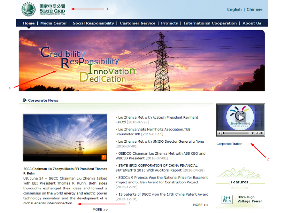
When you land on the State Grid’s official website, you get the feeling of traveling 10 years back in time. This is what corporate websites used to look like back in early 2000’s, and State Grid seems to not have had any design updates since then.
The company logo is poorly rendered, with pixels spreading out and the text hardly readable [1]. The integrated video player is too small [2], and the quality of the clip is very poor, especially when viewing it in full screen. The block with article previews seems to care little about whether the text lines are properly trimmed [3]. And the icing on the cake – take a look at the head slogan [4]. Aside from a poor choice of the font itself, why in the world would you use random captions in your text? What are those colors meant to symbolize? And does the background image have anything to do with Credibility, Responsibility, Innovation or Dedication?
We understand that a state-owned company would not be overly concerned about user-oriented website experience, but what it should definitely care about is that its website reflects the scale of the business. Unfortunately, this website is miles far from achieving that objective.
2. No comments... (Berkshire Hathaway)
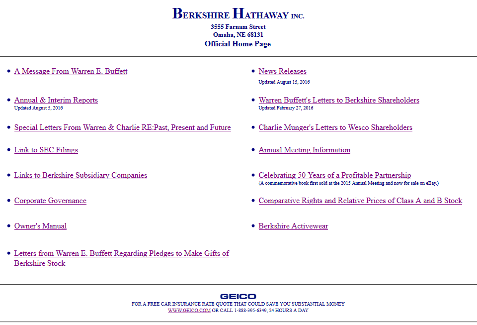
Believe it or not, but this is the actual official website of Berkshire Hathaway, a company with $200+ mln profits in the II-III quarters of 2016. We were looking for words to describe it but found none. It is definitely one of the worst corporate websites of such a huge company we have ever seen.
The subsidiaries of Berkshire Hathaway, such as GEICO and BHHS seem to have decent websites, though. It is a complete mystery why the corporate domain of the parent company looks like someone’s online diary from 1990’s.
We decided not to evaluate a design of this website. It is not a bad website design, it is its absence. No design, no problems...
3. Lack of good images (British Petroleum)
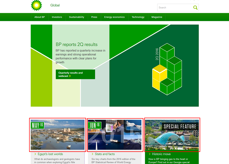
What do visitors like to see when they enter a website? That’s right, pictures. But what no one likes to see is bad quality, out-of-place, cheap-looking images that spoil the overall design impression. The BP official website is built around the “green” concept, and this is probably a good thing for an oil trader. But aside from backgrounds and elements in all shades of green, there is little else to be found here.
Take a look on how poorly the Articles section is illustrated. The first image, Egypt’s lost worlds, is looking like a video game render; the second one aims to portray an annual report, but actually resembles a poorly glued collage of several pictures with little in common. And finally, the emphasized Special Feature features a popular stock image of Tbilisi’s most famous landmark. Long story short, one would expect a company of such scale to invest into better images for their corporate website.
4. Why so slow? (Toyota)
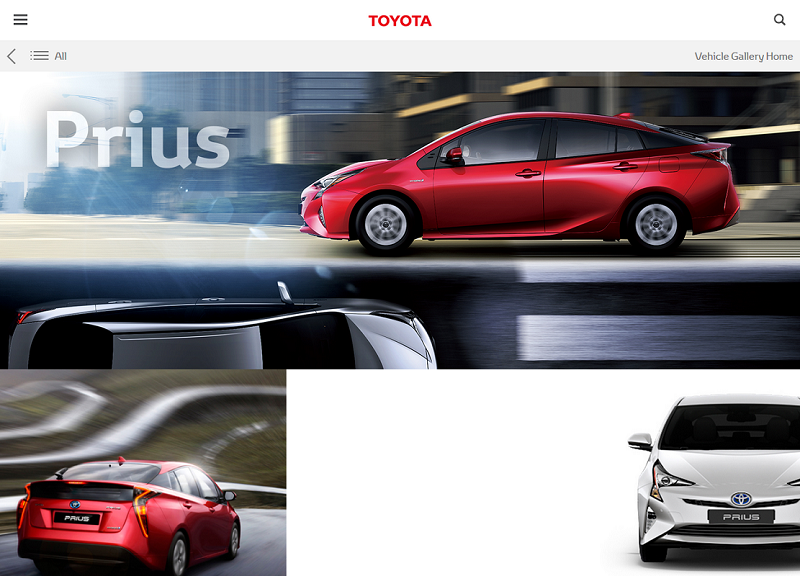
The official website of Toyota would have looked decent enough… if only it wasn’t so slow to load. For example, the Prius featured page is taking as long as 9,96 seconds! In this article, we blamed some of the sites for insufficient pictures, but this one is an example of having way too much of them. Would you expect a Toyota to start in whole 10 seconds? Probably not, then why does it have to take that long to load its web page?
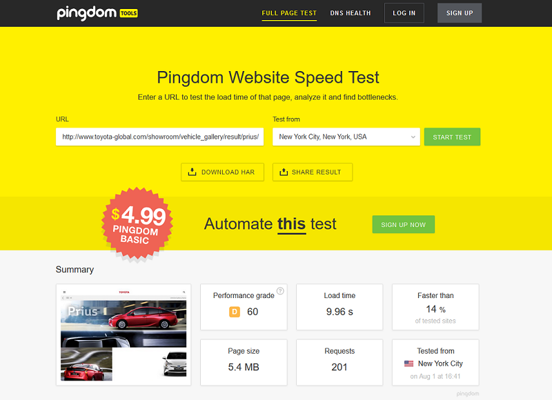
Another problem we encountered on Toyota.com was poor UX. Visitors navigate here to learn about cars and choose a model for themselves. Clear calls to action are expected, but instead, the main page resembles a blog with a mobile-like side menu, and the actual vehicle models are only accessible via the Gallery section. It is strange to have such an unintuitive navigation when your closest competitors (Ford, Volkswagen) operate on perfect user-oriented websites.
5. Social share forbidden (CVS Health)
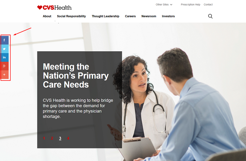
Social share buttons have become an integral part of a modern website. Every site strives to gain likes, tweets, reposts, and followers because every social activity means free promotion, which is likely to convert into more clients. Imagine browsing a website of one of the world’s top pharmaceutical companies, and finding out that the social share buttons simply do not work? Welcome to CVS Health! Try clicking on any of the icons on the screen’s left. We tried - each one just kept reloading the main page. Until someone addresses the issue, this company will have one of the least SMM-friendly websites in the world.
6. Living in a cartoon (Verizon)
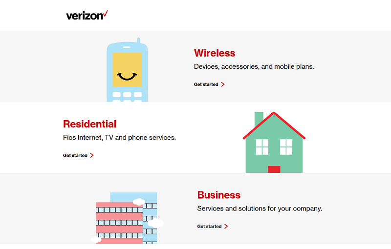
Is it a good idea to have only clipart as website illustrations? Verizon apparently thinks it is. While contributing to navigation simplicity and certainly helping to distinguish among the company’s target audiences, these easy-going pictures may invoke the impression of the site’s immaturity.
Let us look at Verizon’s main competitors, Vodafone and AT&T. We will see a clear people-centered design with pictures of happy customers. Such illustrations make potential buyers relate to the product or service. A website, which talks about plans and phones, and leaves people out of the picture, will probably not attract as many new clients as it could.
7. Blank space overload (Sinopec)
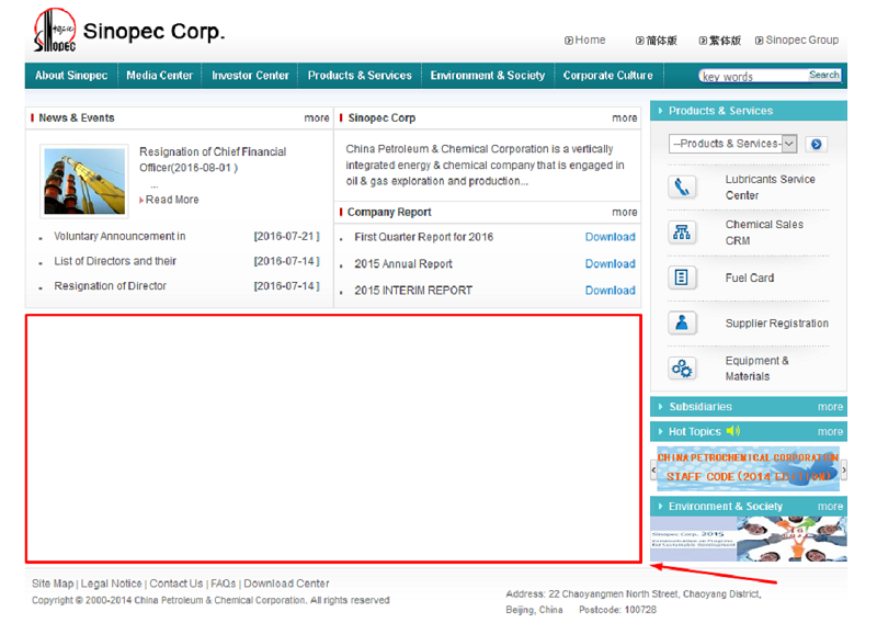
“Your Ad Here”, was the first thing that came to mind when we saw the Sinopec’s title page. So much free space could have been used for anything: a slide reel with illustrated article summaries, a video player with the company’s latest promo clip, or even a simple, nicely rendered picture to focus the visitor’s attention.
Instead, for reasons beyond our understanding, the central section of the screen is left completely blank. And such situation is not only with the main page - try navigating to various sections and you will witness the same thing. Apparently, the company has not a lot to say about itself if even one screen is too much.
8. For members only (Kroger)
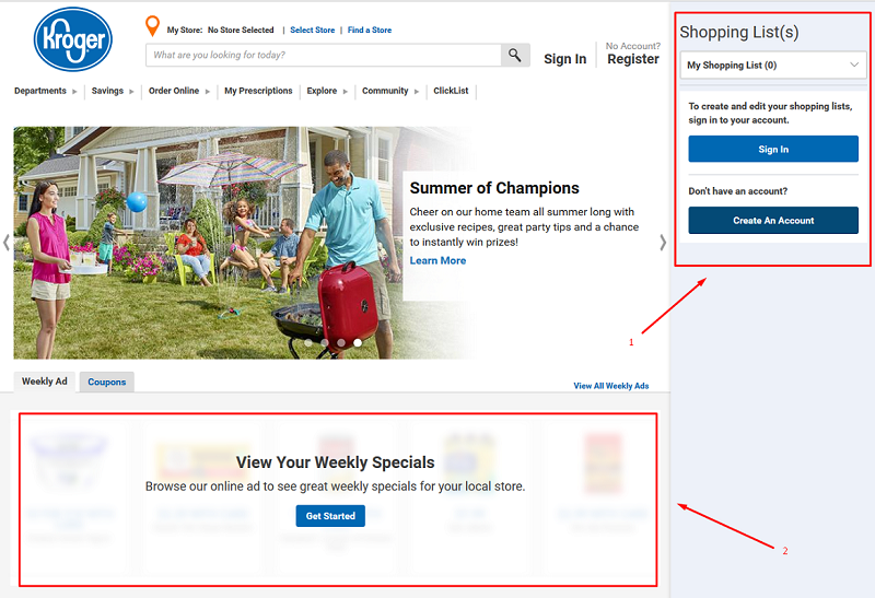
“Not a member? - Can’t view the website!” This approach would probably be good for a secret society, or a webpage with restricted content, but definitely not for a retail network. The main user category of Kroger website are their buyers, and it seems strange that they cannot see what’s in stock until they log on [2].
It would seem that Kroger is aiming to create some kind of a community out of their loyal customers - this intention is suggested by sponsoring social activities and publishing cooking recipes. But the structure of the website does not serve this purpose well, making the emphasis on stores and shopping. There is even an obtrusive shopping cart, which occupies a fifth part of the screen space [1], leaving a useless blank portion below.
All this suggests that the company cannot decide what exactly their website should do - deal with customers, act as an online shopping platform, or gather the community. At the moment, it is hardly coping with any of the three.
9. Poor choice of visuals (United Health)
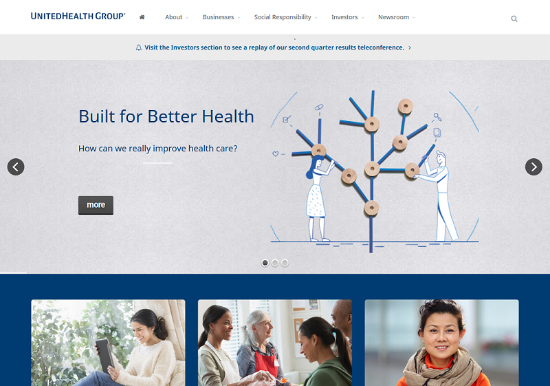
Stock images may look decent enough for the sites that cannot afford custom visual content. But for one of the top 50 companies in the Fortune-500 list, having such images seems a bit out-of-character.
What is more disturbing, the United Health main page has only three pictures, aside from the huge central clipart, which is a surprising decision by itself. If you try scrolling the screen down, you’ll only see text and nothing more. This approach may work well for the mobile version of a website, but should it have to interfere with the desktop experience? Probably not.
Look at United Health if you wish to see an example of how not to pick images for your website. This surely does not contribute to the company’s effort to uphold their level of reputation.
10. Smells like template spirit (Japan Post Holdings)
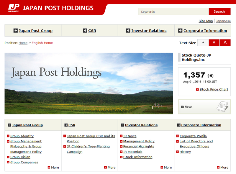
Templates, templates everywhere! Cheap website builders are available to everyone today, but it doesn’t mean that big, reputable companies should use them. And it is especially strange when one of the Top-50 does.
Any web designer has a keen eye on template-looking websites. If something can be compared to this site, for example, then it will never reflect the status of the company properly. Japan Post Holdings probably needs to rework their website in order not to scrutinize their business image, and they might want to have a look at the FedEx website for inspiration.
So, these have been the Top-10 design mistakes we have found on the websites of some of the most successful businesses in the world. We hope that our little research has convinced you that even if you are on top, there is always something to improve.
Have you encountered some other interesting things about the top companies’ websites? Will your website withstand such a website crash test? Do you know other poorly designed popular websites? Feel free to contribute in the comments section!
More of our Editor's pick website charts:

View Comments