Nowadays, almost every industry is moving from offline to online due to fast moving technological advances. A website has become an essential tool for keeping businesses up to date. There are over 644 million websites, and last year 3.2 billion people used the Internet. Competition to attract users to your site is fiercer than ever. The answer lies in solid website design and layout.
First, you judge ‘how nice’, then you judge ‘how wise’. This rule works not only with people but also with websites. Great website design is crucial as it helps to first grab a user’s attention and then keep them interested for long enough.
Content also plays a fundamental role in the design process because it’s responsible for sales. It should be simple in order not to distract or overstimulate a user but, at the same time, it must be informative enough to guide a user around a site. Eugene Kudryavchenko, CEO of Ukraine’s leading Web agency Vintage, says:
“When it comes to websites, the first priority is a design and image because a website must take the fancy of the user - otherwise, they leave the page. Content is a close second because it must be simple, but informative – otherwise, nobody will buy your products”.
Why design matters so much?
Design is extremely important because it helps your site stand out from those millions of websites presented in the Internet while also delivering your individual business goals.
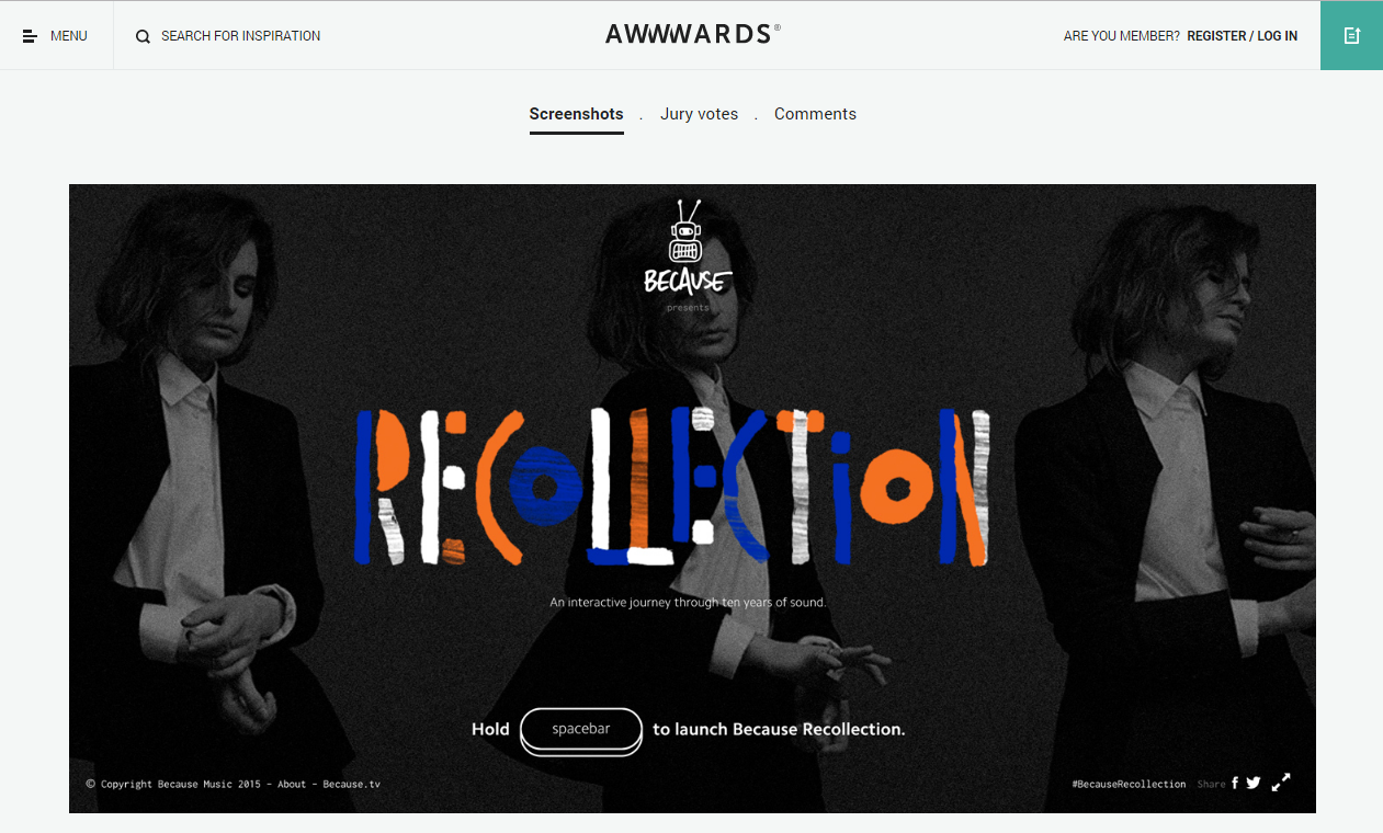
Olga Shevchenko, art director at Vintage believes that the design can be very simple, but if it copes with business tasks – it’s definitely a good one.

Website design can be simple but able to cope with business tasks
How to create great website layout design
In order to check whether your website design is great or leaves much to be desired, analyze it using the following pointers:
Business goals. Check whether the website meets your business goals.
User friendliness. The best way to check this is to imagine that you’re a four-year old child and whether you can navigate the site. The website must be really easy to use.
Trustworthiness. The website should look respectable and “real” to induce a customer to trust you (read: trust the website).
Content. Design is made to deliver content, not to make it beautiful.
Testing. Do not forget to test the website on real users. Remember that A/B testing is very important.
Aesthetics. Yes, it is possible to make the website aesthetically pleasing as well focused on your business goals. Design should intrigue users and convince them to stay on the page.
Modern. No ‘hellos from 2006’, please! Modern layout design must be up-to-date with the help of typography, creative animation, pleasant colors, and modern web-trends.
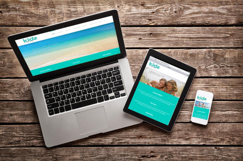
Functionality. According to the statistics, 60% of people all over the world are surfing the Internet on their mobile devices. That's why it is essential for your design to be mobile-friendly and responsive.

Modern website should be responsive including the mobile version of the site
Expectations vs. Reality
Theory is a great thing, but let’s see how it works in practice using the Chicardi site as an example.
Chicardi is a very special e-commerce website aimed at young women. The company sell beautiful and unique crafts, jewelry, and gifts.
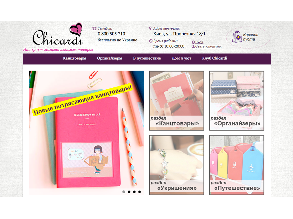
The old Chicardi site looked similar to thousands of other e-commerce sites, except the fact that the website offered unique products. The site itself didn’t look particularly appealing - it was made with the use of a standard WordPress theme.

The old version of Chicardi site wasn’t effective enough in terms of business
Users didn’t trust the website, that is why the overwhelming majority of the purchases were made over the phone. The lack of website trust resulted in high bounce rate, low session duration and average sales.
Tasks for Chicardi redesign
Before the site redesigning, Vintage listed a number of issues that had to be changed in order to meet the client’s business goals. The Key Performance Indicators (KPIs) for the new Chicardi website included:
- Sales increase
- Bounce rate decrease
- Dession duration increase
- Modification of purchase method
Working process on the new Chicardi website
At Vintage, the process of work is strictly defined and Chicardi was no exception. Redesigning the site, Vintage followed this step-by-step workflow:
- In-depth analysis of Chicardi business goals, target audience (TA), competitors, and trends;
- Building up a strategy based on Internet presence;
- Working on constituents such as structure, content, marketing, photo/video;
- Website development
- Advertising
Such a structured approach helps to produce a perfectly executed website and saves time on development. It’s worth mentioning that we never start design work or developing without a well-shaped prototype in Axure.
Chicardi redesign results
The difference between the old and new sites are evident.

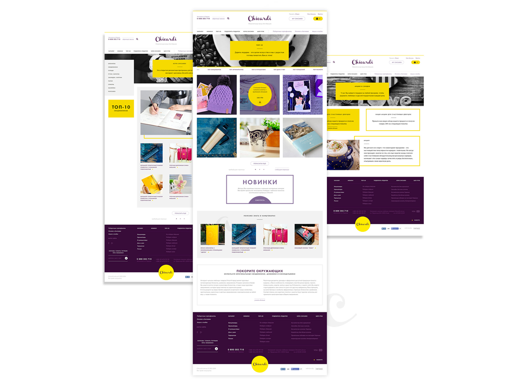
The new version of Chicardi website after the Vintage redesign copes with all business tasks
We produced a minimalistic and smooth layout, which helped to change user behavior, making the site easier to navigate and understand. These factors increased trustworthiness, making Chicardi both premium and attractive.
We added an emotional component: bright pleasant colors and patterns, different logo variants, animation, and a videos which holds the shopper’s attention for longer and gives users an insight into how ordered products are packaged and shipped to them.
It’s also worth mentioning that the new Chicardi site helped the business secure new contracts with new premium suppliers.
What about metrics?
Now, it’s time to see the results of the redesign from an analytic perspective:
An average purchase amount has quadrupled - it has increased from $27 to $106
The bounce rate has decreased from 25.32% to 10.98%. The average session duration increased from 2.28 minutes to 3.22 minutes.
The purchase method has changed drastically. Before the redesign, 87% of purchases were made over the phone, and only 13% - on the website. After the redesign, only 36% of purchases are made on the phone and 64% - on the website. It helped to decrease the burden on call-center representatives and saved the company's money.
The difference is almost unbelievable, but it proves that the right website layout design is critical.

View Comments