Banks have become like any other branded commodity and, in order to secure sales, they must aggressively market. Having a well-designed and user-friendly website is essential for banks not only presenting their brand but also providing customer care and services. Bank websites have become sales platforms, where banks present their products and push their brand.
In this publication, we review three of the top 10 US Banks. We review the US Bank, Bank of America and Wells Fargo websites, analyzing the sites from a user perspective.
Our research hopes to establish the following:
- Establish criteria for a well designed and user-friendly banking website.
- Analyze some of the biggest American bank websites, comparing and rating their positive and negative features.
- Give the banking industry professionals some tips and insights to improve their online presence.
- Help developers understand responsive web design in banking.
Additional insight was provided by Marc McNeill, renowned UX specialist and co-author of Agile Experience Design, and Eugene Kudryavchenko, CEO at Vintage, an award-winning web design company with extensive experience in building marketing-friendly websites.
‘SALES-FRIENDLY’ BANKING WEBSITES
A bank’s website is used for business transactions, paying bills, checking balances and transferring money. Users don’t usually spend more time than they absolutely need to on a banking site. The site’s primary function is to make people’s lives easier while inspiring trust. In order to achieve these objectives, a banking site should be aesthetically appealing, easy to navigate, and trustworthy.
1. Visually Appealing
An appeal doesn’t mean that you have to strive for everyone’s approval. An appeal is, by its very nature, subjective. Each bank has its own Target Audience – be it young, middle-aged or retired people, low-income, corporate or VIP clients.
“TA should be the key in banking web design”, suggests Eugene Kudryavchenko, CEO at Vintage, “go for bright colors, fancy product names, and an innovative logo if you want to attract youngsters. But keep your palette conservative, if you are selling retirement plans.”
One way to identify your TA’s preferences is a tool known as User Personas. A User Persona is a portrait of your typical client. It provides the typical habits, lifestyle choices, values, and needs that best describe your TA. Below is a good example of a well-designed Persona (image credit: Xtensio).
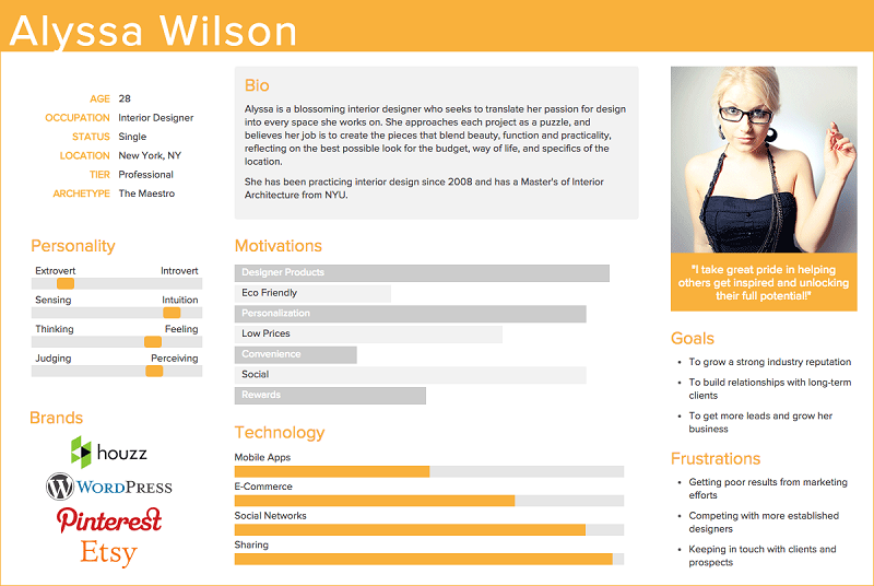
User Personas is a highly efficient tool that is not used as much as it should be by marketers and web design studios. Here’s a great example of a User Persona for the banking industry designed by Marc McNeill.
Design should be meaningful. Your bank’s website must stand out from those tens of thousands online by having something unique. The landing page will be viewed by both new and existing clients. Your pages should reflect your products’ positioning and your overall branding objectives.
Another common error that bank websites make is to overwhelm the user with too much information.
Your TA is not financial experts and most are not in the least bit interested in banking. They use it as a service and to complete tasks. In order to appeal to your TA, information on your products should be straightforward and simple. Get rid of complicated terminology. The client wants to get what he sees. Strip away all irrelevant information.
2. Comfortable handling
A good banking website should be easy to understand so the user doesn’t get frustrated or have to ask for help - which is both an inconvenience to the user and a strain on your resources. This is where the science of UX comes in. User Experience is basically what makes your client stay with you. The less you focus on UX, the more clients you eventually lose.
“Every bank has a similar range of services”, Kudryavchenko says, “let’s say, your bank has 5 top products. Name them in a distinct way to distinguish them from competitors, and then make them clearly visible and easily accessible on your website.”
For example, if you have 5 deposit plans, make it clear:
- why you have so many;
- what makes them different from each other;
- which one is the right choice for the client currently browsing your website.
The implementation of UX comparison tools for banking products is a great way for your users to quickly compare products and identify which are the most valuable for them. The designers should create comprehensive infographics, clearly portraying the similarities and differences between various types of products.
“When you do this, a good idea is to have an expert advice roll out for every option”, Kudryavchenko comments. “Info on my mortgage being split into uneven payments is not enough – I want to know why it’s good for me”, he adds.
UX is all about eliminating the purchase barriers. The following tools have been known to work well in this regard for the banking industry:
- easy-to-fill online applications;
- geo-tracking to suggest the closest branch office;
- online chat with a customer representative;
- call back service.
3. Sterling reputation
Reputation is a key to attracting new business, and even more so for banks. The client’s main concern is that their money is safe with a bank. The website should reinforce this image of security and trust.
In Eugene’s opinion, “a bank’s homepage should resemble trust, confidence, showcase the brand and brand positioning.” “Your certificates and awards are things that drive consumer trust. Make them visible, but not a distraction. A good idea is to place them in the footer of your homepage.”
A bank with a history has a story to tell, and that story can be used to inspire more trust in the user. The bank’s history, statistics, performance, and analytics should all be available with just one click.
A bank should show its user that it’s always aware of the current economic environment. It can do this by using a newsfeed, a blog, or a forum. However, all analytics should be open and user-friendly. Provide insight, but not in-depth analysis.
EVALUATING THE TOP 3
Now that we have established the criteria, let us look at three most prominent American bank websites. We will evaluate each website with regard to appeal, convenience and reputation, on a scale of 1 to 5, with the total score being the average among the three.
Appeal will be based on common user perception of design, illustrations, and color palette. Convenience will be measured by the speed of getting to the desired product, and receiving all the relevant information about it. To establish this we will attempt to apply for a credit card online with each bank. Reputation will be established by the visibility of trust-driving factors.
How much does a website really add to a bank’s success? Let us see.
1. U.S. Bank
The homepage greets you with what you’d call a typical banking website. The header image and overall color palette set a clear focus on family-oriented banking for a middle-class client.
Appeal
The menus are difficult to read. The font size is very small, and some sub-categories could be confusing. For example, the Credit Cards section contains names of particular products, together with more generalized options (1). There are no product-illustrating icons or pictograms in the menus and all the options are just listed.
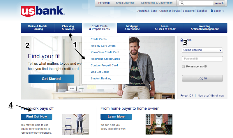
The page outline and design elements seem to be CMS-oriented, while it should be vice versa – design should come first, and technology second. On the homepage, only three key elements are displayed: promotion of a top product (2), login window (3) and two more product promotions, disguised as articles (4).
Information on product-specific rates is presented on the second scroll-down screen (5), but it is mixed with the calls-to-actions section (6), and fails to attract the user’s attention:
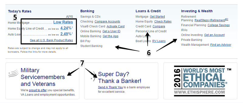
The information which should increase consumer trust in the company, is presented with very primitive illustrations (7). It’s common knowledge that consumers understand and connect with images quicker than they do with plain text. So, why not illustrate things you would want to draw the consumer’s attention to?
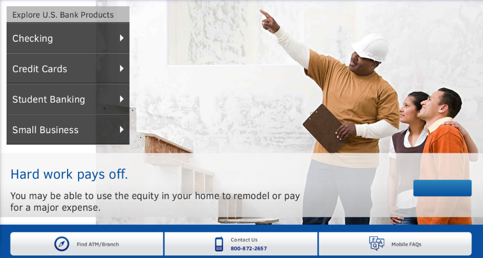
The mobile version of the site looks better. Toast menus are organized TA-wise (checking, credit etc.), with quick access to respective product offers. There are no illustrations aside from the central product promotion, but for a mobile website it is not as important.
Overall Appeal score: 3 of 5
With its minimalistic and image lacking design, this website takes a ‘strictly-business’ user approach. Good for the clients you already have, but bad for any new business.
Convenience
Products are difficult to identify but they are fairly easy to get to. There is a ‘wizard’-like tool to identify which credit card program you are eligible for. However, it requires entering personal data. A short survey with a few ‘yes-or-no’ options would be more appealing and efficient for this purpose.
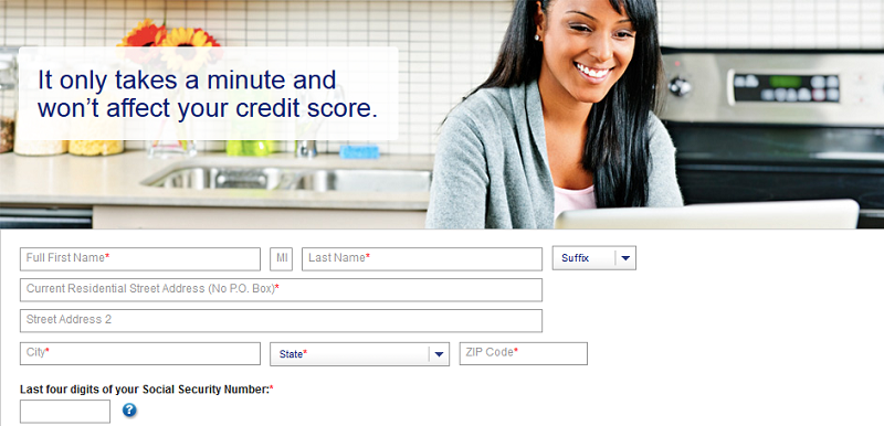
Now, let us run our credit card application test. And here is the first pleasant surprise from US Bank – the ever-vigilant product comparison tool. Before you decide which credit card you need, the site suggests that you compare the options with their basic parameters. Not bad!
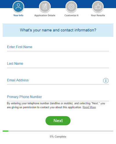
The application process itself is organized into ‘steps’ – a series of screens prompting the applicant to enter information relevant to the current block. This is rather convenient and removes the need for the user to constantly scroll down. Steps are neatly illustrated with relevant pictograms.
While the online application makes a positive impression, other services that commonly contribute to the UX, are limited or absent. There is a location finder but it’s hard to find.
There is no geo tracking. No callback service or online chat service. The Customer Service section is technically just a F.A.Q. with links to respective product categories, which kind of doubles for the main menu.
Overall Convenience score: 3 of 5
A handy online application system is shadowed by poor integration of basic UX features.
Reputation
Three trust-drivers are shown on the homepage’s second scroll down. Two of them are corporate responsibility perks, and the third is an award. All three are poorly presented (see US Bank’s second screen).
The About us section, for some reason, directs the user to Careers. Some information on bank reliability is available, but only at the reach of six (!) clicks from the homepage. Clicking on the Annual report takes us to the corporate holding website, which we weren’t keen on visiting. The site doesn’t have any updates or insights on current economics.
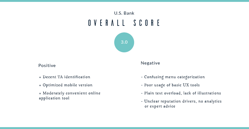
Overall Reputation score: 2 of 5
You would expect a bank of such scale to have more awards and accomplishments. Lack of analytics or expert advice might make the potential client doubt that this bank lives up to the hype.
2. Bank of America
At first glance, this website seems even more laconic than the previous one. There’s no header image, and very few supporting graphics on the homepage. However, user communication is a lot better than it looks.
Appeal
People tend to ‘read’ websites like books, starting from the top left corner. That’s why logos are usually placed there. But Bank of America’s logo could have been a lot better. The logo image is of poor quality, with visible pixels (1).
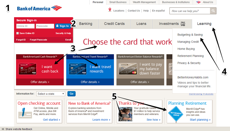
The main menu (2) is easy to understand, albeit lacking descriptive pictograms. Strong calls-to-action on the main header ad (3) prompt the user to select featured products. The Learn more section contains helpful insights on various types of financial activities (4).
On the second scroll, there is a blog-like information feed. This part is well illustrated, but looks a little out-of-place (e.g., like a widget), compared to the general layout.
The design seems outdated. There are very few images (5), and the transparent background contributes to the overall feeling of emptiness.
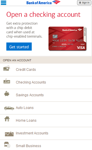
The mobile version is generally done on the same level. A central call-to-action is still loud and clear. The product menu is enhanced with relevant pictograms – however, they don’t exactly match the prominent color outline.
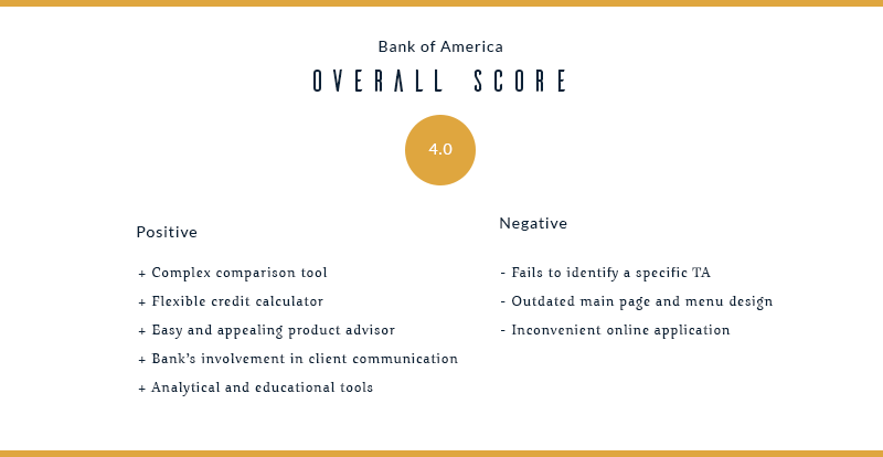
Overall Appeal score: 3 of 5
A well-categorized website with everything in the right place. However, lack of visuals and a transparent background make it look like it was designed 10 years ago, and has had no updates since.
Convenience
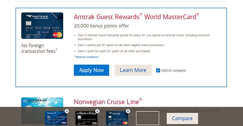
The information on products is brief and understandable, and the comparison tool is more complex than US Bank’s. You can add as many products as you want to the comparison list. Similarities and differences among the products are highlighted respectively.
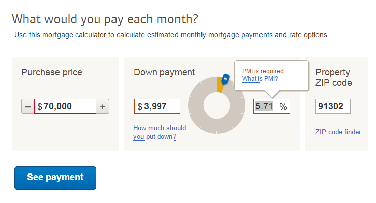
A flexible credit calculator is also available. It lets you do two things – pick the right credit line option based on the monthly pay amount, and then calculate your payment plan with the chosen product. This also works for loans and mortgages. A point scored here!
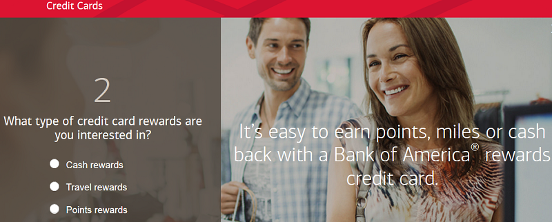
Now for the credit card application test. One click from the homepage and we arrive at the product advisor, which helps the user finding a suitable card. Remember the one at US Bank where we had to enter personal data? Well, this one is nothing like that – only two easy questions with 3-4 options each, and our credit card match is generated.
The actual application process is where things get complicated. The user is presented with 25 fields on 6 scroll-down screens. A typical applicant would probably close their browser at this point. We understand that all the fields are relevant and necessary, but BoA could have organized them way better.
Overall Convenience score: 4 of 5
User experience is good, products are clearly distinguished and explained. Minus one point for the complex online application form.
Reputation
There’s no history or awards displayed on the homepage. However, the About us section is very descriptive and resembles a ‘Hall of Fame’ of sorts. Background, corporate responsibility, sponsorship programs, and a detailed analysis of the bank’s performance are available from a wallpaper-style interface.
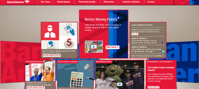
We have already mentioned the Learning section, where the bank attempts to educate their clients, and the blog-like information feed, located on the homepage’s second scroll. All these tools combined should drive consumer trust.
Overall Reputation score: 5 of 5
The website clearly shows the company’s value for its clients. Trust-drivers are implemented; analytics and personal finance education add up to the client’s experience.
3. Wells Fargo Bank
This website also takes a minimalistic approach and on the whole it works. All the elements are aligned, and the images fit nicely into their spaces and contexts.
Appeal
The site aims to target several TA's. Their primary TA includes middle-aged and family consumers with active credit involvement. Their secondary TA is small business owners and the self-employed. And a third TA is small to medium companies looking for corporate banking. Navigation among the TAs is implemented via the tab-style menu at the top of the homepage.
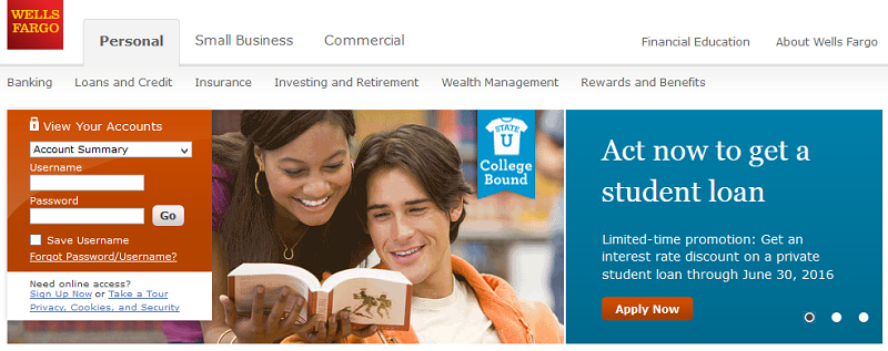
The design is rather straightforward. Hot topics and TA-specific insights run on a cycle, sextant-like menu, which is an interesting idea. Each category is illustrated and briefed, with a clickable button inviting the user to investigate further.
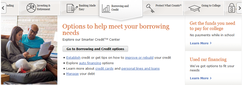
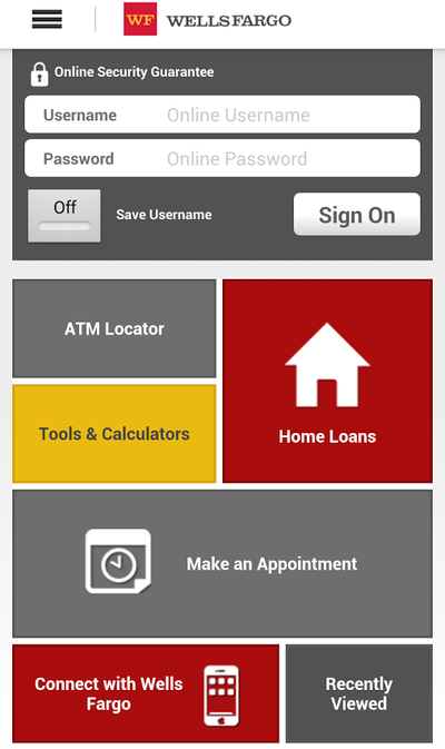
The mobile version of the site looks like an app, which is a good thing. However, the design is tile-based and resembles a Windows Phone from 5 years ago. A good idea would be to enhance it with a toast menu, which most users are accustomed to these days.
Overall Appeal score: 4 of 5
Although it would hardly win any awards for the best bank website design, this site gives its newcomers a warm welcome. Best-selling products are clearly presented, while the complete list is revealed with auxiliary menus.
Convenience
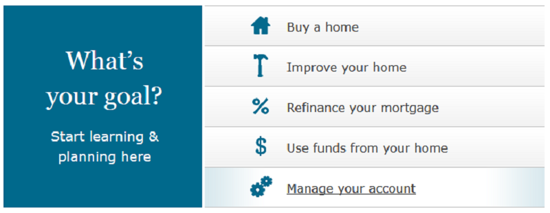
Each product category contains a call-to-action menu which attempts to establish user intent. For example, a ‘Home loans’ page prompts several options, such as: buy a new home, improve an existing home, refinance a mortgage or apply for a home equity credit.
Comparison tool is present, but it is rather simple. Online chat with a consultant is available, but only after you have started researching a particular product (e.g. did an interest calculation on a loan).

We were unable to find the callback feature, although hotline numbers for each respective service were available. There was also a ‘closest branch’ finder with extended options, but no geo tracking (the user must enter or choose their location manually).
Now for the credit card application test. Available offers are organized with a table, and key features are described for every option. However, some of the features are similar in several plans (e.g. $0 security deposit). Before the system lets you proceed, a warning is displayed that the bank may contact you even if you decide to abandon the application. This may be a turnoff for potential customers. The form itself consists of 15 fields, 3 rollout options, and a few tick boxes. As with the previous bank, it could be organized into ‘steps’, to avoid overwhelming the user.
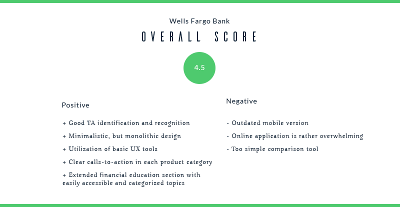
Overall Convenience score: 4 of 5
The online application form and the comparison tool could have been done better. Other than that, every UX tool has been implemented fairly well.
Reputation
Just like the other two banks in our review, this one does not have any accomplishments or awards visible on the homepage. However, the ‘About us’ and ‘Financial Education’ sections are very informative and the user can get to them with just one click.
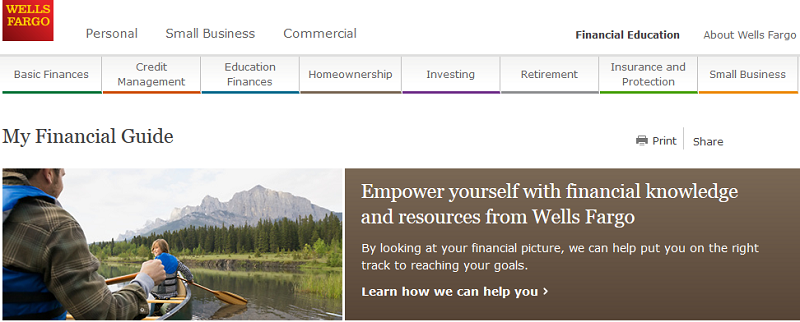
The Financial Education is split into categories, letting the user learn more about a specific topic. Some general expert advice is also available in the form of thematic articles, which can be accessed from the homepage’s menu.
Overall Reputation score: 5 of 5
This bank is keen on retaining their clients and provides news and educational materials in tune with today’s trends. History and milestones are communicated in the ‘About us’ section.
We have now seen how 3 top American banks handle their clients online. Vintage hopes that our expertise in bank website development helps marketing professionals in the banking industry.
How would you want your bank to be portrayed online? Please, share your thoughts in the comments section. Also, if you found our article helpful, do not hesitate to subscribe for more in-depth industry analyses, case studies, and bank web design inspiration.

View Comments