Branding and Web Design. Bringing Human Experience to Digital Landscape
Scroll DownAfter just a couple of decades of using the internet en masse and just under a decade of life with Facebook, the humanity is changing faster than ever. With humanity, brand strategy and web design have also seen a dramatic turning point in its genesis. Not only the mere physical means of delivering brand values have changed by majorly migrating from offline to online. More importantly and somewhat paradoxically, with technological advancement the brand strategy has shifted from commercial inundating intrusive flood of matter-of-factly info into a human-centered lullabying ubiquitous presence of caring brand-soul-mates.
How on Earth did human experience take upon itself such a major role in marketing, brand identity and even further penetrated into web-design? The answer is partly in millennial mentality. It's in Generation Y’s & Z’s ability to empathize.
The empathy has evolved to be a trend. The empathy now is an assumed spiral in everyone’s DNA.

Make Believe ®. Impossible is Nothing ®. Just do it ®. Don’t be evil ®. Let’s Make Things Better ®. Because you’re worth it ®. I am what I am ®. – Don’t they all just ooze the empathy, self-acceptance, humanity after all? Being capable of empathy is now a must. Being human is now a trend. The rich give away. The successful downshift to volunteer. Brands adapt. Brands learn new patterns of communications. Brands take it to the next level.
Is there any brand integral to your lifestyle? Let’s be honest, most of us have some in mind. Maybe it’s a pair of Nike sneakers that you’d wear on any occasion or an Android smartphone that you’d never trade for an iPhone. It seems even the most brand-agnostic folks have a favorite brand.
Making brands part of our identity has become a social norm, and we’re perfectly okay with this. We read news about brands, we follow brands on social media, and make jokes about brands.
But how do you foster that sort of behavior via branding? How to create a brand that would become a part of people’s lives?
Bringing human experience to branding certainly helps. I’m sure most branding specialist will agree with me — and they’ll also tell you web design plays an important role in this approach to branding.
Let’s explore what branding professionals have to say about this. In this post, we’ll look at several quotes from marketers, brand strategists, and designers. And we’re going to see how their thoughts apply to real life. Without further ado, read on.
Web design as a medium for human-centric branding
Singing odes to the awesomeness of your product or company is rarely a sign of outstanding branding. To become outstanding, your brand needs to shift its focus to people. Outstanding brands resonate with our joys and acknowledge the greatness of our little daily struggles.
Your customer is trying to be the best version of themselves that they can. You must empathize with them if you expect to uncover the triggers, behaviors, and beliefs that will underlie your brand strategy.
Jasmine Bina, CEO of the Concept Bureau.
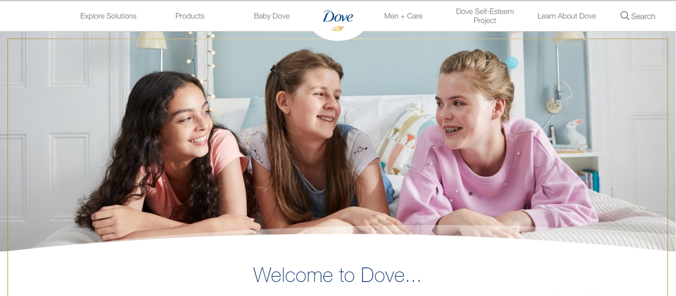
Empathizing with people is exactly how Dove won the hearts of millions. Dove’s Campaign for Real Beauty that started in 2004 revolves around, well, the real beauty of people. Unlike other personal care brands, Dove doesn’t use photos of models for its websites or visual advertising. Instead, it showcases the photos of real-life women and men.
 Source: Dove
Instead of imposing overmarketed beauty norms, Dove promotes healthier, more inclusive beauty standards.The brand uses its global network of websites to amplify this message, making sure it reaches anyone interested in the company’s products.
Branding that reflects your audience’s self-perception
Dove’s branding proactively impacts people’s self-perception, but you can practice the same approach in a reactive manner. Getting a brand to reflect the self-perception of a particular demographic is what many brand marketers strive to achieve.
The first question for brands to answer is what it says about a person that he or she uses this brand.
Deb Gabor, Founder and CEO of Sol Marketing
Hot Topic’s culture-heavy brand strategy is one well-known case of a brand that’s trying to speak the language of its customers. But there’s a more peculiar example coming from a European clothing brand.
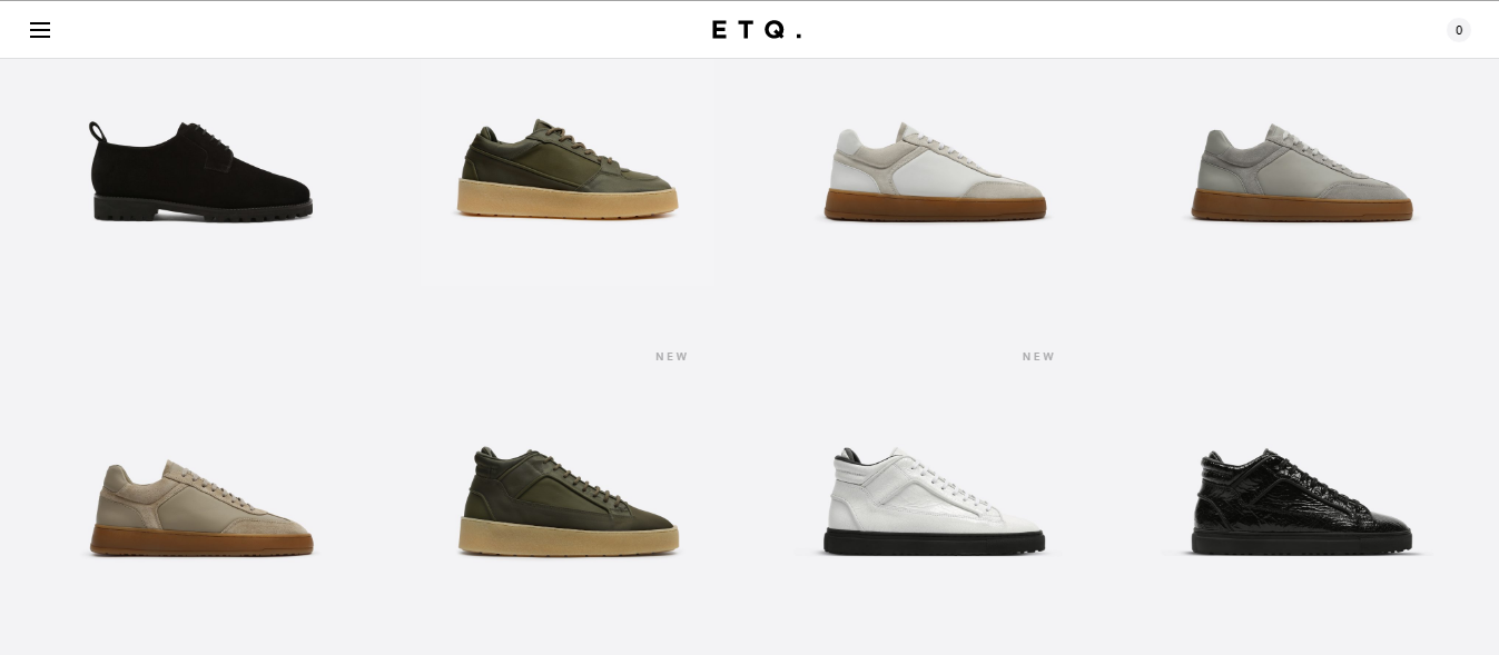
ETQ is an apparel brand that targets people who don’t like brands. Judging by the company’s online store, it does a great job at this.
 Source: ETQ
ETQ’s website looks so minimalist it’s barely there. No visible navigation, no hero images, no glossy photos of models. ETQ’s tones down every UI element of its website to ensure a complete focus on what matters most — the company’s products. This minimalism is what sets ETQ apart from the competition.
Great user experience design is integral to great branding
In many ways, the impact of a brand boils down to the experience of its audience. This includes customer experience with the company’s products or services, as well as user experience with the company’s digital properties.
Brand is experience in the digital age.
Kate Kaplan, UX expert at Nielsen Group
Whilst there have been some successful solutions from companies trying to keep up and agencies grappling to get to grips with the latest trends in the web and UX, one website stands out of the crowd. The brand is Virgin Atlantic, and the agency created the first ever responsive airline website is Work & Co.
Virgin Atlantic’s new website has been such a coup, with higher conversion rates, faster bookings times, and a pleasant user experience.
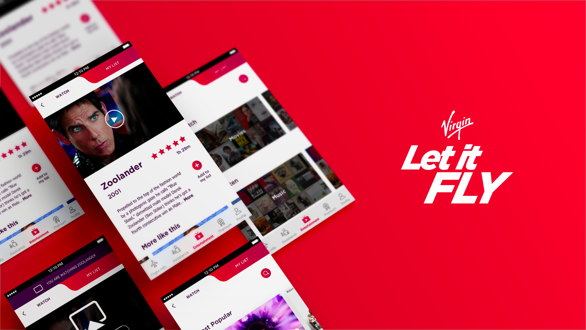
This contributed to the company’s branding in at least major three ways.
First, most airline websites are notorious for suboptimal UX. Having a web portal with a smooth user experience gave Virgin an opportunity to stand out. Second, the pleasant experience with the company’s website gets associated with the future customer experience during flights. Third, the benefits of streamlined conversion paths on the website are obvious to everyone.
It happens once so often when you get to feel completely brainless when life tasks you with a mission on the terra incognita. We all have been there – when you enter an unfamiliar building of sorts and ask a receptionist for a location of some office. That stare. Even if you graduated from Yale, chances are, you do feel like a complete dummy after that stare. That specific receptionist knows all the corridors and offices like the back of his hand. He has wandered and roamed and marched and strolled along them. He has probably nicked coffee from selected ones in the after-office hours. Arabica only, you know. He will indeed tell you where the office is with a broad smile on his face, but for that one initial second after that stare. You. Do. Feel. Stupid. You wish you were born with the knowledge of the geolocation of that office.
Similarly, in real life, when we need to do something for the first time, we google forums, Wikipedia, endless websites before we gain at least fundamental knowledge sufficient to make an informed decision. So this puzzled stage of the customer journey was indeed a mystery solved by Vintage agency in Vestfrost case. And we thought to give it to you as an illustration of this principle when great user experience design is integral to great branding. We totally eliminated the need to use any other resources to make an informed decision. To ask that snug receptionist for the way to the office. We provided them with a Freezing Encyclopedia. Right there a customer would know the whys and ifs and hows and whens of frosting.
Brands exist to win attention. So does web design
You’ve heard that our attention spans are shorter than those of goldfish. Okay, the goldfish thing might be an exaggeration, but this doesn’t diminish the importance of grabbing your audience’s attention from the first moment. On the internet, you have an average of 3–5 seconds to deliver your message. This puts a lot of pressure on web designers, doesn’t it?
Attention is a scarce resource. Branding is the experience marketers create to win that attention.
So how do you deliver your brand message in under 5 seconds? One way to do this is to demonstrate what your brand is about right away. That’s what the ETQ’s website does with its minimalist aesthetics and straightforward content. Another method is to entice interaction with your site via non-trivial UX.
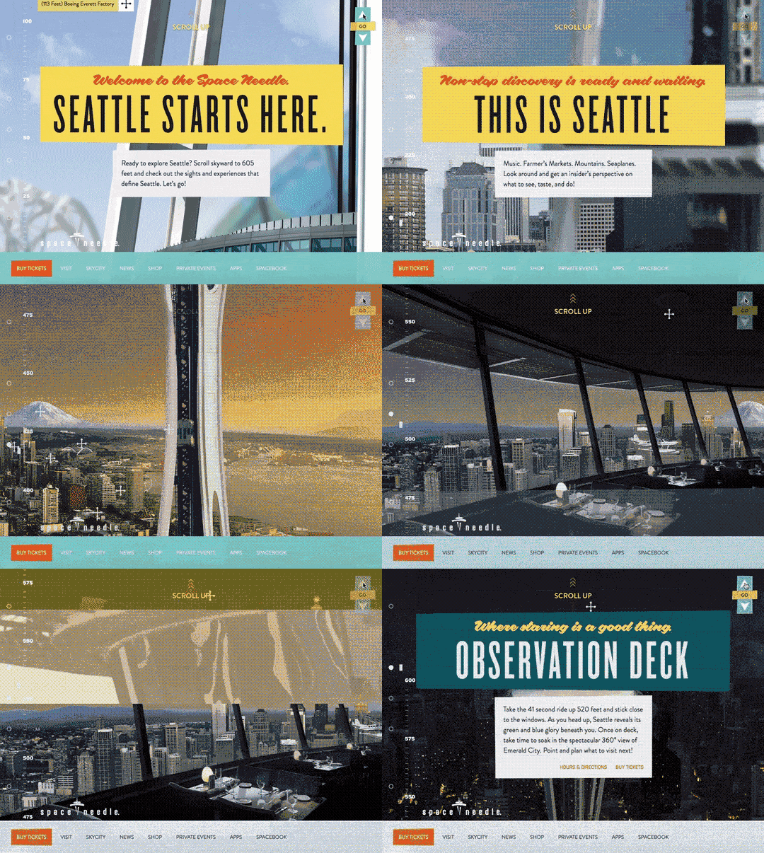
Playing around with unusual scrolling patterns is an old trick, but some brands still manage to pull it off. Seattle Space Needle is one example of an attention-grabbing website that uses this UX pattern in a smart way.
Source: Seattle Space Needle
Upon their visit to the website, users need to scroll up to explore one of Seattle’s tallest landmarks. The call to scroll skywards acts as an attention grabber, and the scrolling experience represent the journey to the top of the building.
Among other most used tools in the web designer's armory for irrevocably stealing that short-lived attention span of an adrift site visitor is, ladies and gentlemen, pure and simple - video. The catchier the better, the brighter the better, well, honestly, the crazier, the more chances to hold that gaze of a web-surfer for yet another second. We, at Vintage web agency, had plenty of those mind-blowing world level vids at our disposal, when we developed the Radioaktive film website. It was like selling ice-cream to a kid - a showreel of ColdPlay superstar on the fluffy clouds, sleek bright yellow Audi car whirling along the curve on the way home and the myriad of kissing stunners from the Absolut commercial - how could you possibly not let the works of this brilliant film production Team speak for themselves?
Yep, lucky us with such clients. But joking aside, the good old video does increase your time on page. While great and new video does so even more.
Using web design to tell your brand’s story
We’ve mentioned that brands are about people, but this doesn’t exclude your company image from the equation.
Apple’s branding, for instance, has a great deal of focus on both the company’s team and the amount of work invested into their products. This kind of branding channels the company’s identity in a very relatable way. After all, aren’t we all doing our best to create something noteworthy?
Branding is the art of aligning what you want people to think about your company with what people actually do think about your company. And vice-versa.
Jay Baer, Convince & Convert, one of the authors of The Now Revolution.
There’s one handy buzzword that summarizes such an idea of branding. This buzzword is storytelling. As a branding tactic, storytelling uses various media to communicate a comprehensive brand message to people.
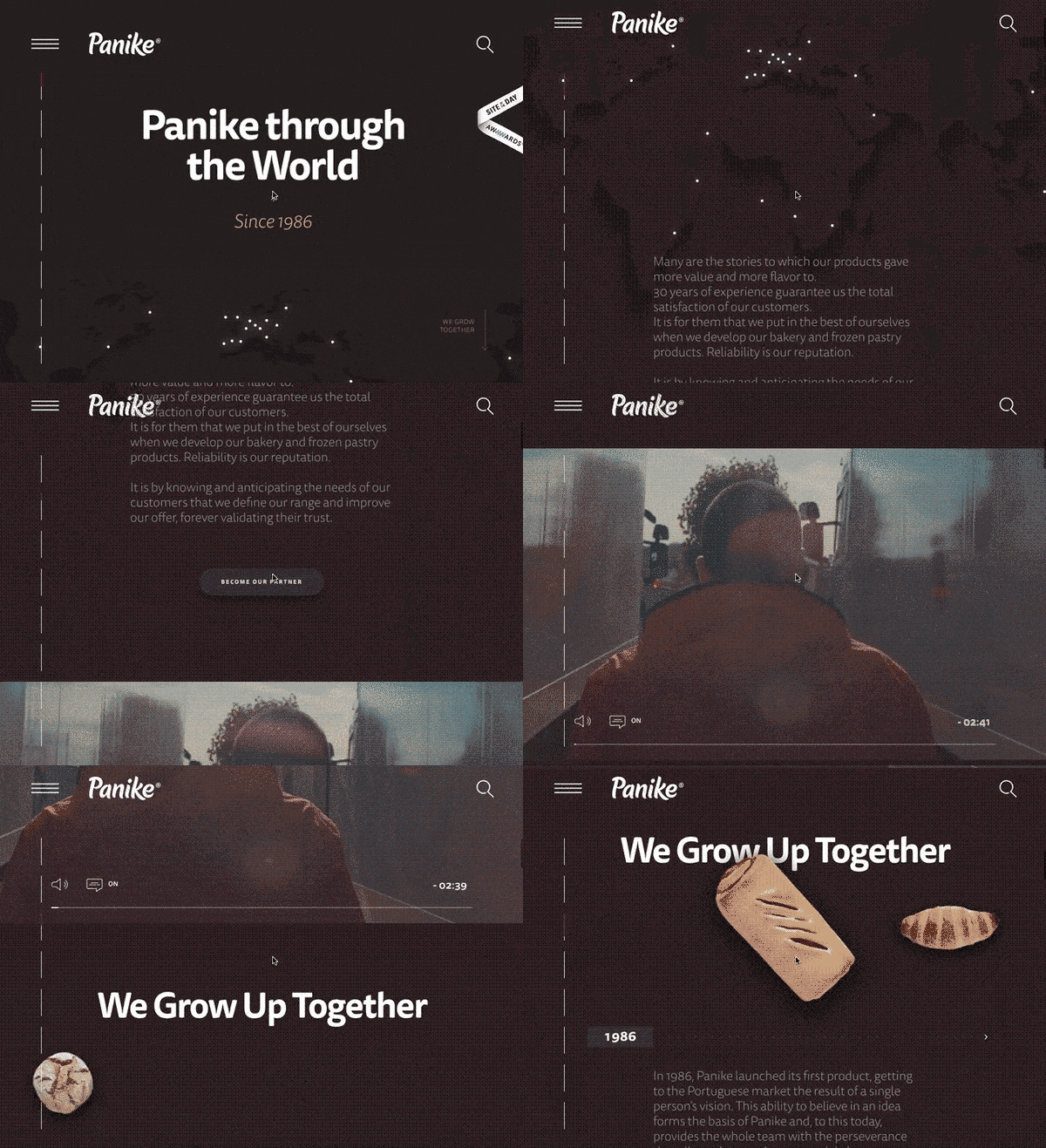
If you’re looking for a brand that utilizes the storytelling potential of its website to the fullest, here’s an awesome example. Panike’s About Us section offers a parallax-driven narrative that covers the company’s history and production process.
Source: Panike
Sure, parallax-driven stories aren’t new, but they can impress when done correctly. Panike draws your attention to the human side of its brand, and that’s what makes the story so great.
As you know, in the world of web, content drives commerce. And storytelling is one of the main components of a content marketing approach and is increasingly used to build customer loyalty. You can read more about storytelling in our previous article.
Positioning your brand through its difference
Focusing on advantages is competitive while celebrating differences is human. The strategy of positioning a brand as different rather than better works when entering a market that already has an established leader. As a brand, you don’t really get to tell your customers who’s better, because it’s their decision. Telling why you’re different, though, is perfectly viable.
Different is Better Than Better.
Sally Hogshead, author of How the World Sees You: Discover Your Highest Value Through the Science of Fascination.
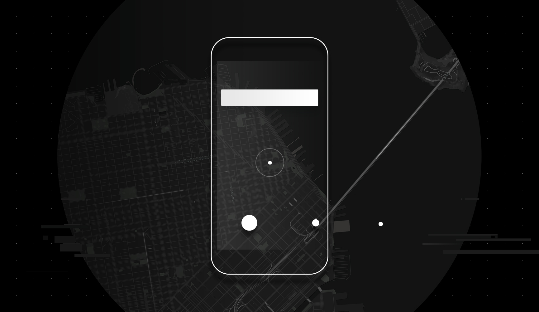
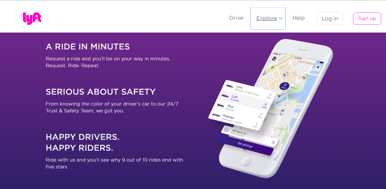
Here’s a case that you probably heard of. Instead of pitching its advantages over its key competitor Uber, Lyft focuses on the unique personality of its brand. Have a look at Uber’s and Lyft’s websites.
 Source: Uber Design
 Source: Lyft
Lyft’s playful logo and the color scheme of its website is contrasted to Uber’s somewhat austere aesthetic. Every element of Lyft’s web design is more playful, which means its branding delivers a stronger message on the emotional level.
Positioning your brand via its competitive edge
Okay, being different is good, but what if there is an objective way to prove you’re better than your competition? What if your product or service is innovative in a way that’s good enough for your brand strategy? Telling your customers about these competitive advantages can make for a successful branding.
A brand is a reason to choose.
Cheryl Burgess, Blue Focus Marketing.
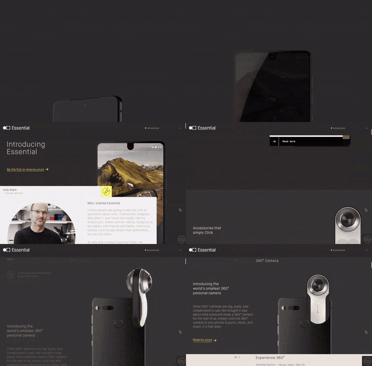
In other words, sometimes you’ve got to show off. Andy Rubin’s Essential smartphone, for example, has quite a few features that certainly deserve a place in the spotlight. No wonder that the product’s website focuses on the device’s unusual screen and accessories, reminding people of why they’d want to choose this smartphone.
Source: Essential
The first thing you see when coming to the product website is smartphone's display lighting up, revealing its unusual shape. What follows if an animated demonstration of how the Essential accessories work. These two design moves create a compelling on-screen experience with the product.
When planning out a branding strategy, introspection often becomes your starting point. It’s about discovering what facets of your own identity will resonate with the brand. Will it be something you feel or something you strive for? Maybe, something you take pride at? Prominent brands often embody abstract yet relatable experiences like care, affection or excitement.
No matter what experience you discover during your branding process, your further work with branding will boil down to expressing this discovery via various media. Web design might be one of the many media that you’ll use, but it certainly provides you with a wide range of expressive means.

View Comments