
One of the recent trends in web technology, Material design is clearly the next big thing in website design trends. With Google behind the wheel, it seems like material design is soon to become the philosopher’s stone of UI and UX trends. The number of websites, apps and games which utilize the material design principles, is growing by the day.
But is this style an absolute advantage? Will it fit into modern web design standards, and work for all purposes and audiences? In this article, we will try to define the major perks and flaws of material design, and see what it’s really good for.
Where does it come from?
Material design was born in a struggle to combine the best features of two web development trends: skeuomorphism and flat.
● Skeuomorphism
Web design started with portraying the real-world elements online. Buttons, icons and pictograms in early web design resembled their prefigurations from real life. It was a logical solution at the time, because such resemblances were familiar to most users. Early versions of iOS demonstrate this idea perfectly.
This design style came to be known as skeuomorphism. Skeuomorphism is rich with real-life analogies, which is good in terms of UX. But in terms of UI, many details appear unnecessary and distracting to the user. Skeuomorphism remained on top of trends in web design for quite a while, but with evolution of mobile platforms, skeuomorphic features tended to interfere with adaptability and loading time optimization. That is why an approach towards unification and simplicity was sought.
● Flat
In iOS 7, Apple suggested the Flat interface design. A revolutionary approach was chosen instead of evolutionary, which resulted in abandoning previous ideas, even if they had strong points. To many design experts, Flat was a step back in usability, because quite a few action signals have been lost.
For example, according to relevant studies, here are the main factors by which the user determines if the object is clickable:
- Traditional markers (blue underlined text, embossed buttons)
- Similarity to traditional markers (underlined text of custom color, text within a block)
- Contextual text (words or short phrases are perceived as menus)
As one of the current trands in web development, flat design trend often ignores these markers, which has a negative impact on usability. That is why flat appeals to advanced users with good Internet literacy, while being less intuitive for common users, since many skeuomorphic metaphors are left behind.
● Material
Material design is a compromise between skeuomorphism and flat. Material design retains the simplicity of flat (element unification, attention holders, loading speed), but enhances it through partial comeback to real-world metaphors.
To give you a better idea of how the three design styles differ among each other, compare how the Instagram icon looks in skeuomorphism, flat and material.
![]()
Principles of material design
So, what does your design need to be material? Having interpreted the Google’s guidelines, we can identify four cornerstones:
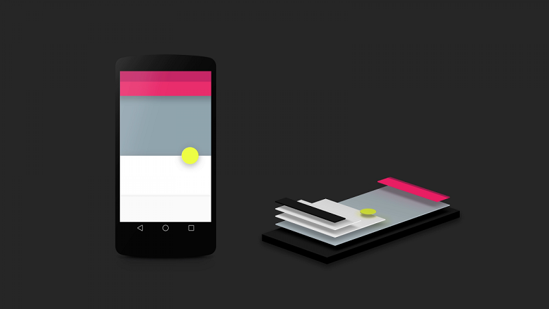
- Tactile surfaces. In material design, interface consists of haptic layers of the so-called “digital paper”. These layers are positioned one above another and cast shadows on one another, which makes the interface anatomy more intuitive for the user.
- Publishing outline. If layers are considered digital paper, then text and graphic elements become “digital ink”. A stencil approach, native to the printing and publishing industry (e.g. posters, magazines) is used.
- Meaningful animations. In real world, objects do not just appear and vanish. That is why material design constantly plays with layers and “digital ink” in order to provide hints for the user on how the interface works.
- Adaptive interface. With all variety of screens nowadays, material design combines the previous three principles to adapt to different screen resolutions.
Wait, but that’s a lot like flat!
It is, and it isn’t. It would be fair to call material a “3D version of flat”, but of course it is a little bit more complicated than just that. Here are the three major reasons why material is a step forward from flat:
- Material brings better user communication. Slightly convex elements are more responsive to user’s actions and give better interface hints.
- It retains the aesthetics of flat, but also takes the Z-axis into account, which gives opportunity for 3-dimensional portray. The illusion of the third dimension gives depth to the interface, and enables the user to intuitively follow the interface architecture, and define interactive elements within it (e.g. embossed object – “press” action, engraved object – “enter” action etc.)
- Both flat and material are minimalistic approaches, but material is more flexible, as it is capable of using real-life concepts.
Material design limitations
Here is the most interesting part. It should be clear at this point why everyone’s after material design nowadays. But is it really worth chasing it in every situation? We’ve learned what material design can do, but now let us look at the things it may have a hard time with.
1. 3D way of thinking
This is probably the biggest challenge of material design. Designers have to adopt "multi-layer thinking" as opposed to "single-layer thinking" they were used to. This requires good categorization and reflectional skills, as well as understanding informational architecture and user's mindset, so that the proper order of layers, animations logic and responsiveness patterns are followed. If layers interact improperly, all real-world analogies that material strives to reflect, will be ruined.
2. Lack of variability
Material design is introduced by Google, and is ruled by their guidelines. This may lead to millions of Google-like apps, which would struggle to underline their identity. If you must choose uniqueness over flexibility, think of how you will customize your material design artworks.
3. Not very intuitive
Users with little to none preliminary experience with Google products would have a hard time adjusting to any material design interface. Common users are likely to have problems with it still.
4. Floating action button (FAB)
The idea of this button is to simplify the access to the most obvious action in a given interface. Logic says such button is useful, but usability often dictates otherwise. The majority of design experts strongly oppose it, and even Google encourages to “use it wisely” in their guidelines. However, some apps are hard to imagine without the FAB (e.g. Photography or Navigation apps).
5. Energy-consuming animations
Material design cannot do without animations, and animations take up virtual memory and quickly deplete the batteries of mobile devices. Keeping in mind the latest developments in technology, it becomes filigree work to balance loading speed and the number of necessary animations.
Where would material design really shine?
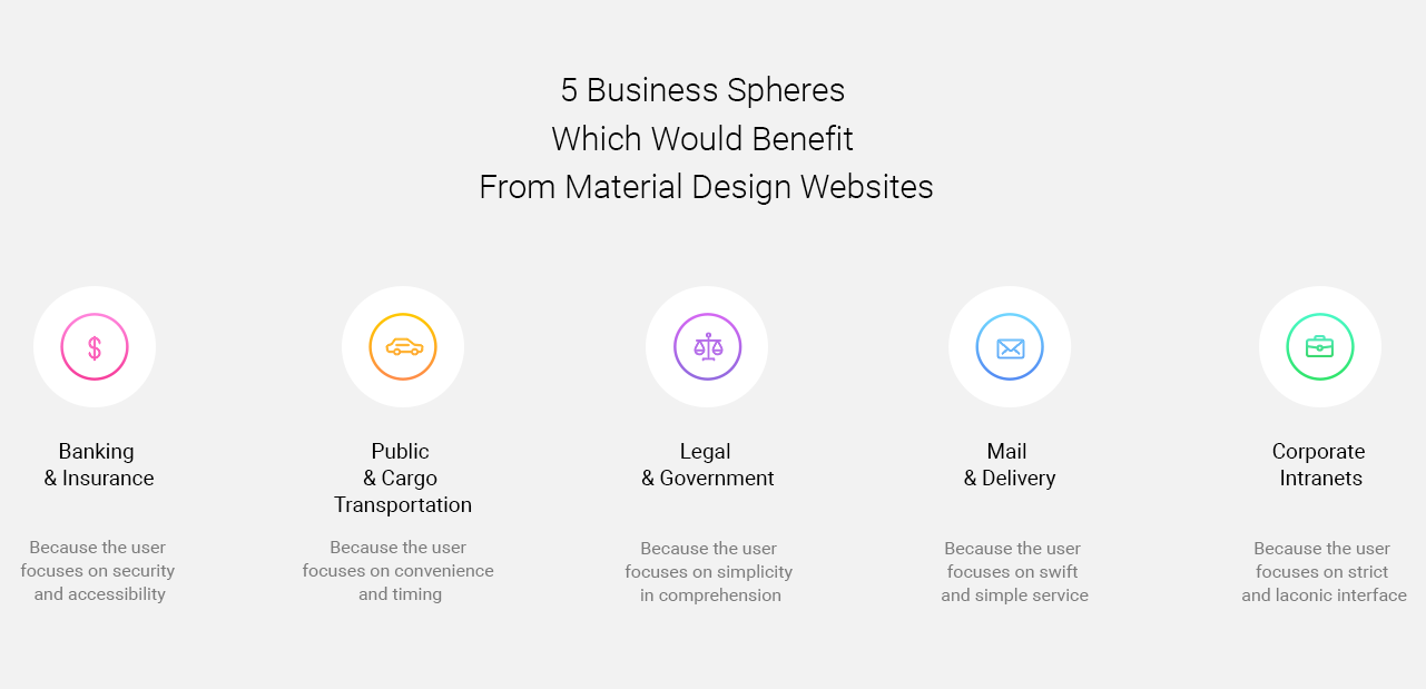
Given these problems, going for material design just because the trend dictates it may not be a wise decision. It is really hard to predict or calculate if it really is the future of web development. New web technologies in 2017 may completely drift away from the use of material design. But when you need to focus on service instead of creativity, material design trend is definitely a thing to consider. Below we have come up with 5 business spheres, where sites and apps would highly benefit from the material design approach.
Summing-up
It’s never worth chasing trends as much as think critically. We can never say for sure how the furute website will look. But you have to understand your target audience and the goal of each particular project. A designer is not a user, and things that seem great to designers will not necessarily be apprehended by users. But implementing material design wisely, you may discover a tool for really cool solutions.
View Comments