Your corporate website is the face of your diverse and many-edged business agglomeration. Governing your every venture, overlooking every field of business that your company is into, your corporate website must transmit your level of scale, solidness, and stability.
However, in order to create a good corporate website, one needs to clearly understand its purposes and classification.
In this publication, we are going to:
- figure out what a corporate website is and provide some good corporate website design examples;
- define the real purposes of a corporate website;
- answer the question when it is time for a company to consider launching a corporate website;
- highlight which sections, elements, and content can be considered good in terms of corporate website structure.
Based on our definitions and criteria, we are analyzing the best corporate websites of 7 prominent multinational companies in the final section of the article:
- Daimler,
- Retal,
- U.S. Bancorp,
- Sony,
- British Petroleum,
- Microsoft and
- Exxonmobil.
We also will provide you with a few corporate website design tips and inspire you to creating a company website of your own.
What Is Corporate Website?
Corporate websites make up a broad category of websites united by a single goal: to promote a company as a whole, rather than focus on a single product or sub-brand.
Many web studios – and their clients – often confuse corporate websites with promotional websites, although these two kinds have completely different purposes.
Have a look at OREO, for example. You’ve probably heard about it and most likely tasted it at least once in your life. This is how the OREO website looks like.
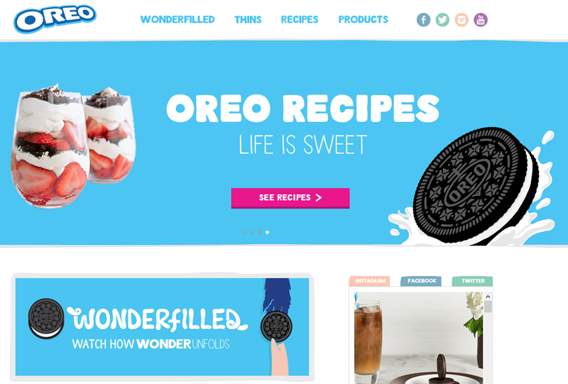
Is this a business website? Definitely. OREO is the multi-billion dollar brand, and being one of the best-designed business websites, it clearly serves a business purpose.
But is it a corporate website? No, it’s not. The corporate website for OREO (along with Milka, Halls, Toblerone, and a dozen of other brands) would be this one:
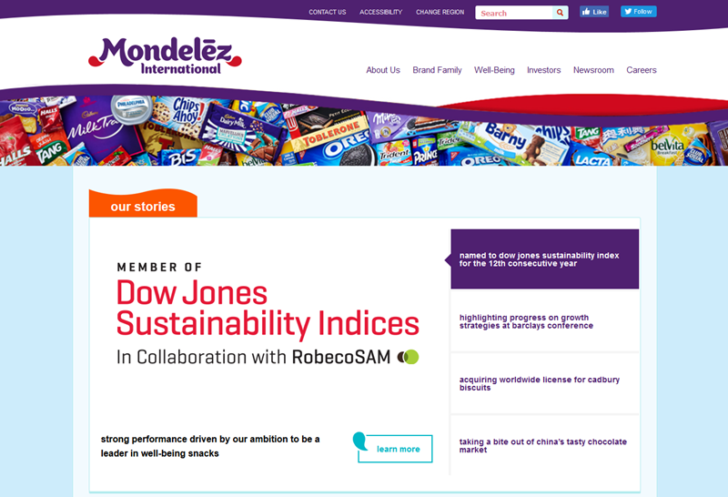
Mondelez International is the corporation behind an array of brands, and you can clearly see that their corporate website serves completely different purposes. Here, we can see a typical corporate website layout. Mondelez does not promote, advertise or market their products, but instead emphasize on business performance, corporate news, staff, and social responsibility. Nothing mouth-watery, but plenty of reputation, ethics, and trust.
As we can see, promotional websites are focused on a certain product, and their most important metric would be the increase in that product’s sales.
But once a company becomes associated with more than one brand, product, service or activity, it has to differentiate its fields of business and focus on attracting investors and reporting to shareholders. This is what a single promotional website will not cope with.
So, let us list the goals that a corporate website should fulfill:
- Representing the level of scale. It has to be clear from the first glance that the business is big and thriving.
- Instilling reputation. Your site must ensure its visitors in bona fides and impeccable business ethics of your company.
- Driving trust. Showing why the company is great to work for and work with.
- Informing about affiliated businesses or brands, but not shifting the focus to them. All brands should have their own, separate websites for detailed descriptions.
As we mentioned above, corporate websites concentrate on a company itself, and not its products or services. This is why you will rarely find adverts, customer feedback, and online stores there.
Corporate website content is not meant for clients and consumers. Who is it meant for, then?
- Shareholders, investors and partners. These people are not really interested in your products or brands. They want to be in the course of your (and, respectively, their) financial achievements. Publishing statements, indices, and operation reports on your corporate website will give them that opportunity.
- Press and mass media. You’ve got to track your publicity and the way your company is covered in the press. Mass media make news - that is what they do for a living. And they will release news about your business, one way or another. If you do not provide them with news materials yourself, they will start looking for such materials elsewhere. And you’ll rarely like what they’d come up with.
- Your staff. People need to feel they are part of the family. A team page on your corporate website will show that the company values and cherishes their hard work and contribution to the common cause.
- Your potential employees. A company of your scale definitely offers traineeships and career opportunities for young talents. There is no better place to manage such career opportunities than your corporate website. That way your new recruitments may benefit all your businesses at the same time.
- Public and government authorities. A thriving business always draws the attention of authorities in the country where it is based. That is why a corporate website has to contain everything that such authorities may wish to know about the business. The more clear and substantial info you provide, the less official audits and inspections your business is likely to deal with.
- Your competitors. Yes, that’s right. Your business rivals have to understand your company’s scale, boldness, and ambition just by looking at your corporate website. If you manage to make your website outshine theirs, this will give you yet another competitive leverage.
Criteria for a Good Corporate Website
Having identified our corporate website’s most probable visitors, let us think of how to make our site appease all of these target groups. To do this, we will have to look at the sections of our subject websites from such visitors’ perspective and identify the major corporate website features.

1.Brands & Businesses
Priority level: HIGH
Primary target audience: Everyone
This is probably the most general of the corporate website requirements. Representing your company as the owner and governor of multiple brands is what many corporate websites put at the forefront. We will measure the success of this criterion by whether the brands are portrayed or promoted. As we agreed, promotion must be kept to the minimum on the corporate websites.
2. Branches & Locations
Priority level: HIGH
Primary target audience: B2B clients, Authorities, Mass media
Multinational companies have offices, subsidiaries, and facilities all around the world. Today, simply listing your branch addresses is not enough. People need to know exactly how to get to your premises, and they need a way to contact your local office with a single click. Easiness to do so will act as an instrument in our evaluations.
3. Public & Investor Relations
Priority level: HIGH
Primary target audience: Investors, Shareholders
When you hit the IPO or have your company initially organized as a joint-stock venture, people who are investing their money in your prospects have to be able to track the outputs at any time. The corporate website must give these people a chance to do it easily and immediately. Accessibility and organization of the financial performance reports will be the yardstick of this criterion.
4. Staff & Employees
Priority level: MEDIUM
Primary target audience: Employees, Authorities, Mass Media
We often see big multinational companies as some faceless machines with gears and wheels turning on their own. A corporate website revealing real people behind the company’s history, strategies, and decisions certainly gives the company a more “human” look in the eyes of the public. Besides the obvious willingness of your staff to see themselves as a part of the family, showcasing your team on a corporate website can also make your company more open to new business leads.
5. Careers & Internships
Priority level: MEDIUM
Primary target audience: Employees, Students, Authorities
While the Team page is designed to showcase skill and professionalism of your existing staff, the Careers section has to attract new talents to your company - the ones likely to become part of your future team. Furthermore, your human resources strategy has to be fully implemented here, in order to encourage the people you need and filter out the ones you don’t. By these two criteria, we will evaluate our subject websites.
6. Trademarks & Intellectual Property
Priority level: LOW
Primary target audience: Licensees, Authorities, Competitors
One more interesting feature that your corporate website may consider having is the list of trademarks and intellectual property that belong to or are associated with your company. One of the latest corporate web design trends is to inform the interested parties as well as the general public about your company’s intellectual property rights. The corporate website can act as a rightful medium for that.
7. Mission & Social Responsibility
Priority level: MEDIUM
Primary target audience: General public, Authorities, Mass Media
A big company cares about impacts of its businesses on the public opinion. It also emphasizes that its business upholds the applicable laws and regulations. That way, the company is publicly associated with business ethics and social contributions, rather than just income and profits. Availability and coverage of sponsorships, programs, grants, and educational materials on our subject websites will affect our overall scores.
Corporate Website Examples
All right, now that we have come up with our criteria, let us analyze some bright examples of corporate websites and try to find out what makes them work well for their respective corporations.
Our list of corporate websites represents various fields of business. Of course, we do not claim to be aware of their real goals and prospects. But what unites these companies is their indisputably positive business performance, long history, and multinational scale. So, based on our experience, we will try to judge about the contributions of corporate websites to these companies’ success. Also, we hope that our little chart will add up to your corporate website design inspiration!
1.DAIMLER
Did you know that Mercedes Benz run their own bank? Or that they own and maintain a taxi service popular in 14 countries? Or, more importantly, that along with a dozen other brands, they are a part of the Daimler Corporation?
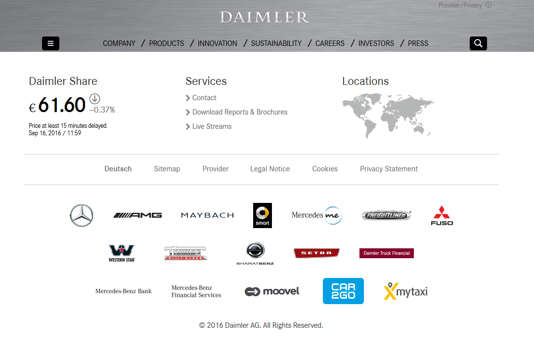
Managing an array of brands was probably the main goal of Daimler when they designed their corporate group website. The most memorable thing that lingers in your mind when you visited the website is a brand showcase. Of course, the brands are not simply listed. Each logo is a link to the dedicated official website of that particular brand.
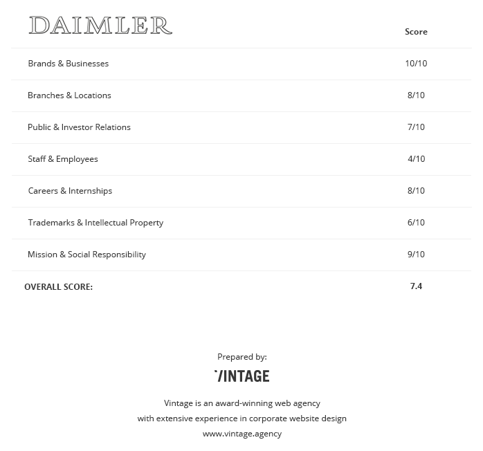
Other sections of the website seem to function fairly well, too - besides the section devoted to the staff currently employed. The Corporate Governance page gets the visitor acquainted with the inner top management circle, but we were unable to find a section for low and middle-level employee to relate to. Team achievements or branch performances are not published on this site.
2. RETAL
One of the best examples of managing international branches on a corporate website can be found at RETAL. Here, you have a world map with multiple pins on it. There are two kinds of pins: dark blue stands for production sites, and light blue ones - for offices. Clicking on the pin prompts the contact box of that branch, along with a photo of the premises, its address, phone, and email. The pin itself also acts as a geotag, which can be entered into your car’s navigator for detailed driving directions.
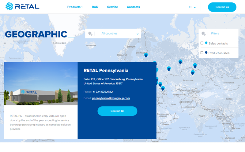
This approach ensures that every website visitor is able to contact the company’s representative in their area by various means and without any obstacles.
The site is also an example of the award-winning corporate web design. Smooth animations and interesting page scrolling and screen-changing effects add up to the image of the innovative and technologically advanced company, which RETAL intends to position itself as.
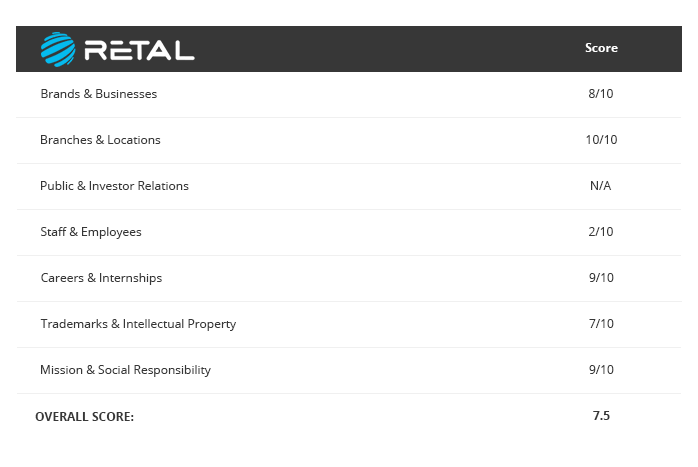
However, the problem of showcasing professionalism and achievements of its staff is also present here. We could not find a specific “team” page; some teamwork information was only available in the R&D section. RETAL is not a public company, so investor information is not published here, according to the corporate website policy. In such cases, we are not going to take the respective criterion into account in our evaluations.
3. U.S. Bancorp
U.S. Bancorp is the parent structure behind the well-known U.S. Bank. However, if the latter gets millions of visitors every day, the corporate website of U.S. Bancorp is far more modest in terms of internet traffic.
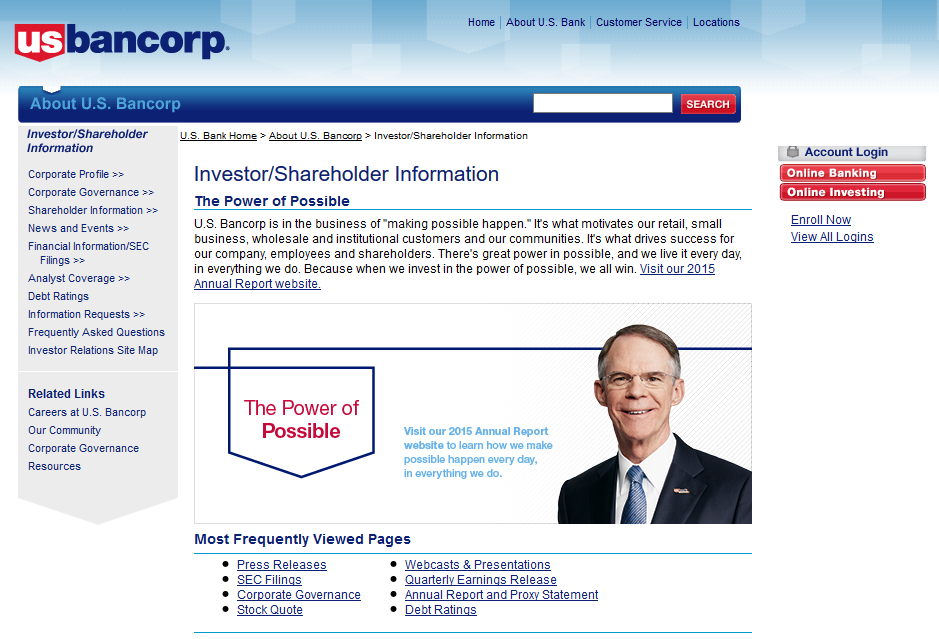
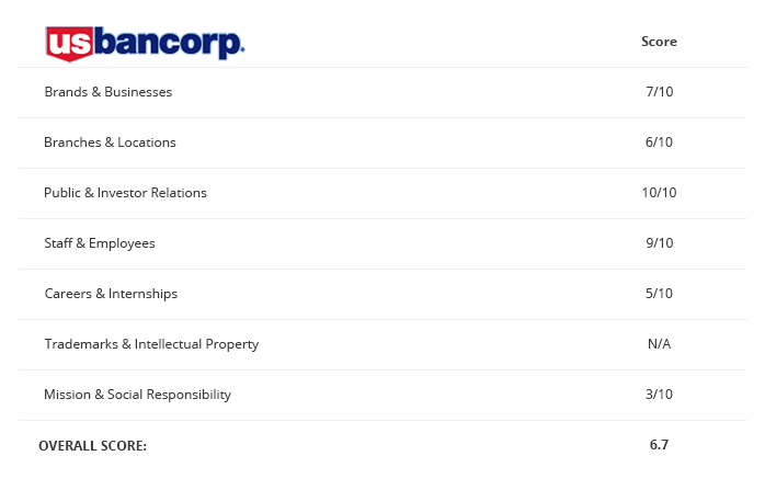
But that does not make it less important. The corporate website is the destination of U.S. Bank’s investors and shareholders, and the site has to drive their trust just as U.S. Bank itself drives the trust of its clients. The relevant Investor information is well-organized and easily accessible. Analytics, reports, stock quotes - all your investor or shareholder needs to know about the company’s performance and financial results is thoroughly gathered and presented here.
However, the site seems to be strictly corporate - and in some terms, even more strictly than should be. Focusing on business analytics and performance reports, it leaves people out of the picture. Not much information is given about career opportunities (in fact, the relevant link leads to the U.S. Bank vacancies, rather than corporate ones). And as for Mission & Social Responsibility - there appears to be no such section on this website at all.
4. SONY
Aside from its primary domain, sony.com the company also has a strictly corporate website, sony.net. This website is devoted to the company’s history and legacy, as well as mission and brand values. You can see all the hard work and effort behind the well-known products, devices, and art works.
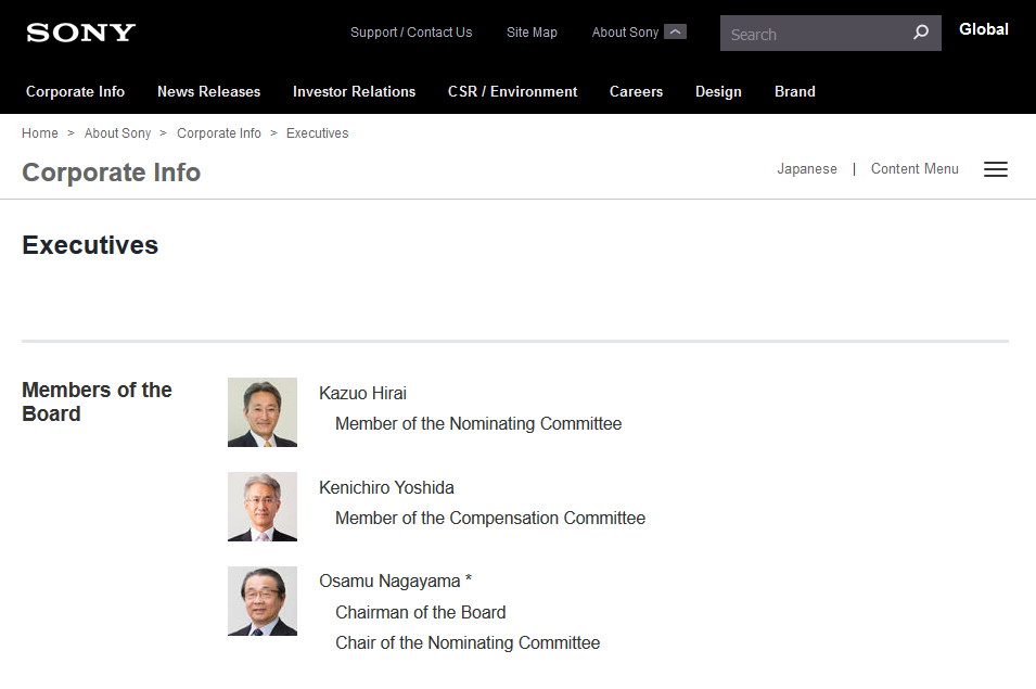
But what this corporate website especially excels at is putting the company’s stuff at the forefront of the business. In the Executives section, you can get acquainted with every top manager of the company’s Head Governance, along with the staff of all of its businesses and subdivisions.
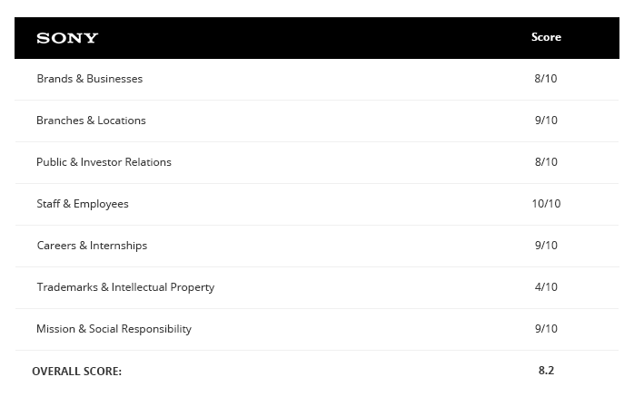
We were also happy to find out that the website fits each criterion of a good corporate website of our list. Brands, Locations, CSR / Environment, Investor Info - everything seems to be in the right places. The only minor flaw we found was the absence of the list of intellectual property. For a corporation owning a few dozen trademarks, it’s a little strange not to publish their property rights on the corporate website.
5. British Petroleum
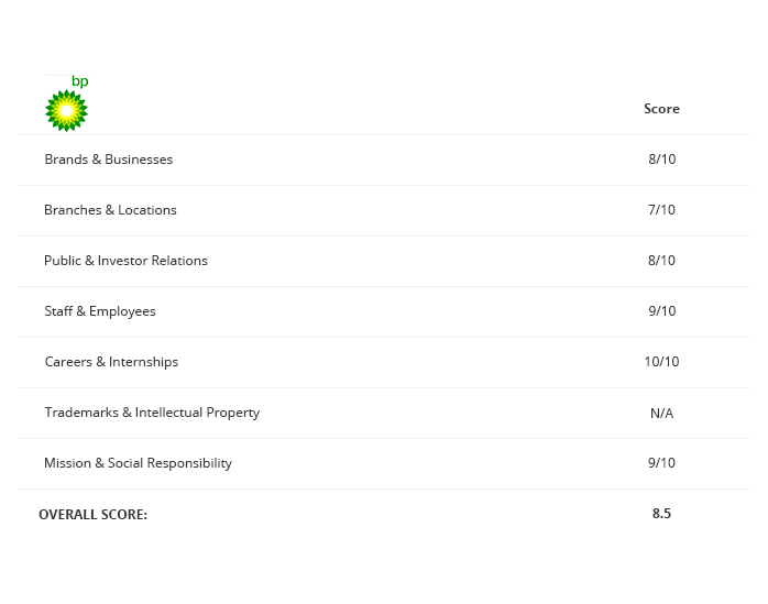
This is a good example of how a corporate website has to showcase the company’s human resource strategy. Its Careers section not only welcomes seasoned professionals to join the team but also provides vast career opportunities for students and graduates. BP has even implemented the Degree Matcher tool which searches through the company’s available positions by educational requirements.

With a tool that helps accumulate the database of potential employees, as well as manage existing staff, BP’s corporate website becomes a destination to hundreds of professionals. What could be a better way to attract the best people to your company?
Other sections of the site are also well-thought. Branches and locations finder is organized well, although it lacks some interactivity - all information is rather static. Aside from that, this website really seems to work well for its company's global showcase and strategy.
6. Microsoft
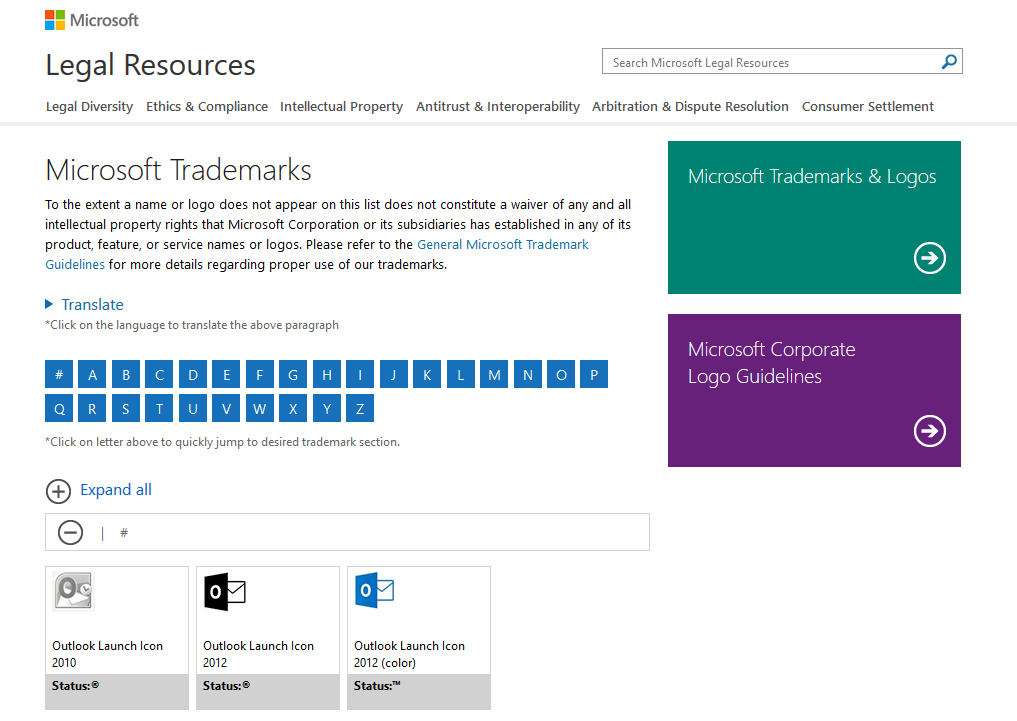
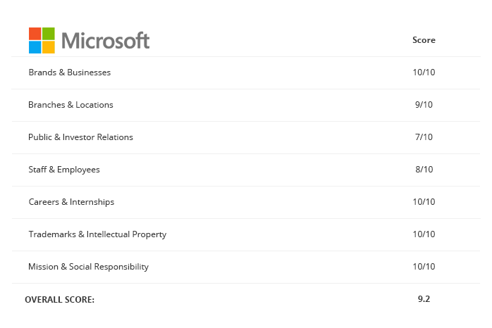
This website is massive. And it’s got every possible section you can imagine. However, what makes it really interesting for our case is how the information on trademarks and intellectual property is organized. This is the real mini-encyclopedia with search tools, alphabetical trade name catalog, and logo gallery.
You would presume that one of the most thriving digital businesses in the world has their corporate website designed perfectly. However, some sections turn out to perform a little less convincingly than others.
For example, the Investors section is only accessible through a tiny footnote link, and the page itself could be more informative, considering the scale of the company. Also, the detailed stock performance link leads to the MSN Money site rather than a dedicated internal page. These minor flaws are why we ask you to forgive us for not putting all 10’s on this website’s score sheet.
7. Exxonmobil
One of the areas that has always been critically acclaimed by the public opinion is oil trading. Everyone understands the importance of fuel and energy, yet the business associated with it tend to be shadowed by environmental risks and ecological sustainability.
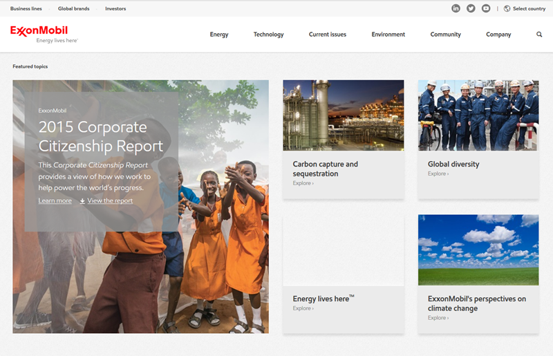
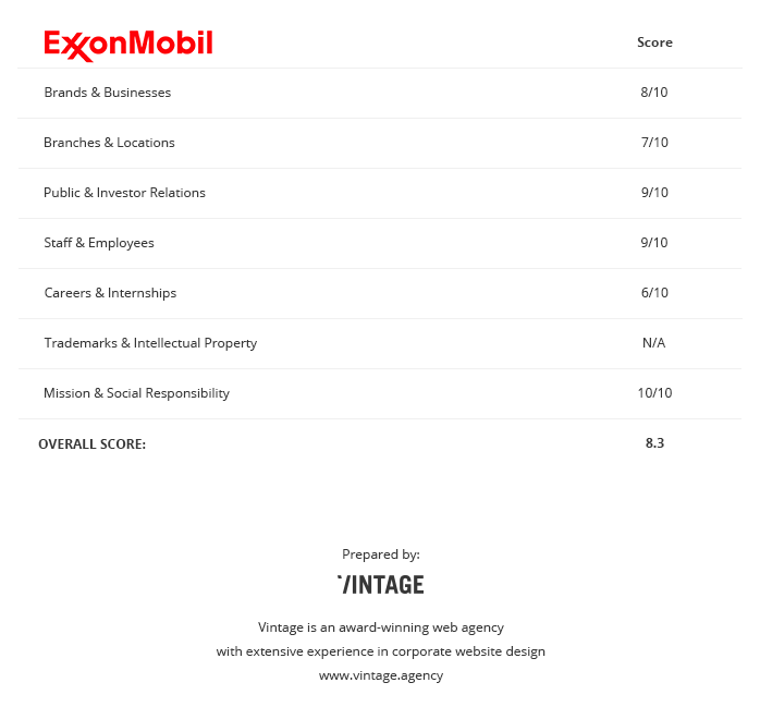
We were surprised of how well Exxonmobil manages to promote eco-friendliness and environmental protection while being one of the world’s most successful energy traders. In their Environment section, Exxonmobil regularly publishes reports on their charity programs, sponsorships, green energy research and strategies. If you are in the oil trading business, you can use the technique implemented by this creative corporate website to mend the socially sensitive aspects in a similar way, educating the public on social initiatives of your company.
SUMMARY
Many companies acknowledge the necessity of having a corporate website, yet tend to treat it simply as a sign of prestige: “It has to be there just to show off”. However, with proper corporate website marketing, it is possible to make your corporate website actually work for your company just as well as your promotional or industrial websites do.
By implementing a variety of features and organizational sections, along with corporate website responsive design, your corporate website can be turned into a real flagship of your digital business flotilla.
Here at Vintage, we have an extensive experience of building complex, visually appealing, and multi-targeted corporate websites. If you feel your company needs a corporate website development or redesign, we’d be eager to advise and assist. Feel free to pitch us with your website idea!

View Comments