
For interior designers and architects, it is crucial to have a website worthy of their talent and skill. A mediocre website creates the impression of service of a similar kind – and this is not what a designer’s business needs.
In our previous publications, we talked about benefits of having genuine, award-winning websites for interior designers, and the criteria of such sites. Today, let me list my personal top chart of interior design and architecture studios’ digital domains. Perfect examples of how your website should look – right ahead.
10. CASE 3D
A nice animated portray of sketches becoming actual interiors. Traditional menus approach is combined with scrolling navigation. The blog features extensive case studies for all completed works.
Why 10th place: aside from the interesting main page “drawing vs reality” solution, all other sections are quite boring and straightforward.
9.DOCK
An interesting concept of image unification – an Instagram-like “vintage” filter. This further underlines the studio’s architectural style in their showcase of works. The animation sequence of pages in also quite unusual.
Why 9th place: the site catches the eye with a title page “block” animation, but all further navigation is rather static.
8. JOVA Construction
What you will experience here is the navigation designed in the style of technical sketch. Page loading will feature lines forming perfect geometry shapes around text boxes. Every part of the drawing is clickable and leads to the relevant section.
Why 8th place: while the navigation and page loadings fascinate the eye, portfolio images are static and of questionable quality.
7. Concrete LCDA
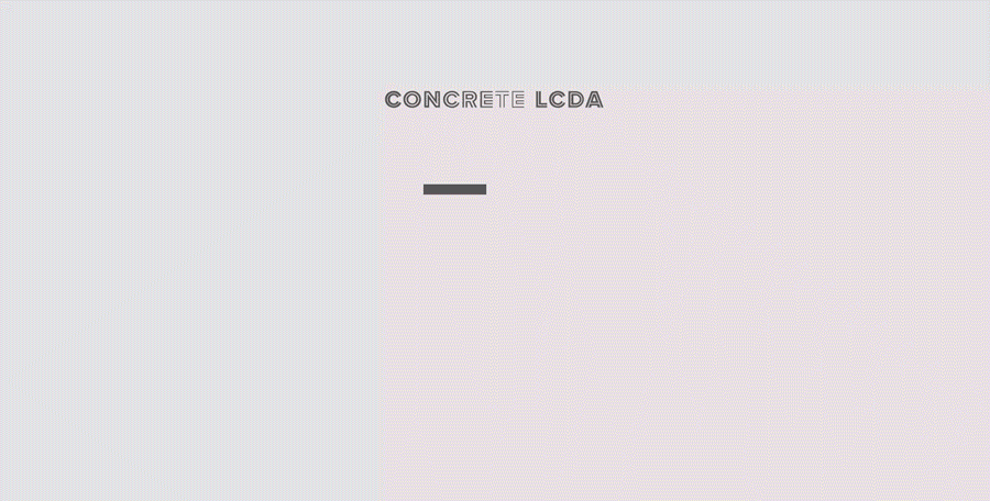
A catchy “double-view” paging concept, which attracts attention. Separate navigation hierarchy for arrow keys and mouse scroll. Smooth animation and a convenient portfolio slider, which allows studying the work closely, even in preview mode.
Why 7th place: navigation concept is very refreshing, but can be confusing at first. An overall color palette is a bit too grim.
6. HENGE

An elegant interior design showcase. Clickable buttons and menu elements are highlighted unobtrusively on mouseover, which looks like a very neat solution.
Why 6th place: scroll-down animation is rather straightforward, and the dark gamma of portfolio images sometimes make it hard to discern what is shown on them.
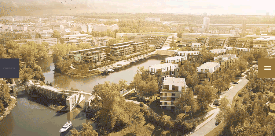
5. VN STAR Development

A blue background circle changes into various shapes upon scroll down, as different hero images appear and vanish. Portfolio pictures are taken down-tops and rendered with a transparent background, which makes them look more solid and monumental to the visitor.
Why 5th place: having shiny animations and an interesting innovative background, the site lacks a traditional menu, which would keep its categories organized.
4. JØSEPH a avoué
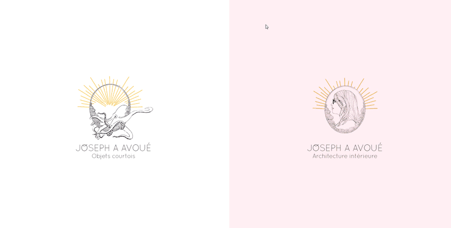
A very conceptual design, which changes screens from black to white in checkerboard order. Cases and portfolio works are given in chronological order, with a short article to describe the story behind them. The animation is smooth and eye-pleasing.
Why 4th place: no traditional, “structural” menu, and no English version.
3. Powerhouse Company
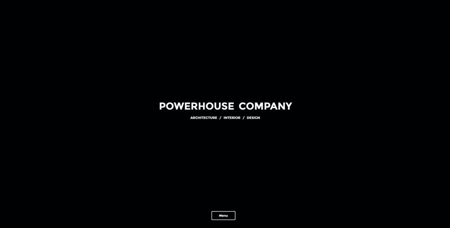
This is how you make your designs come alive with short video slides. A static picture is one thing, but when you see an interior or architectural piece from various angles, it definitely adds up to the presence effect.
Why 3rd place: a nearly perfect video showcase, which, however, lacks static and textual descriptions.
2. Andrey Sokruta
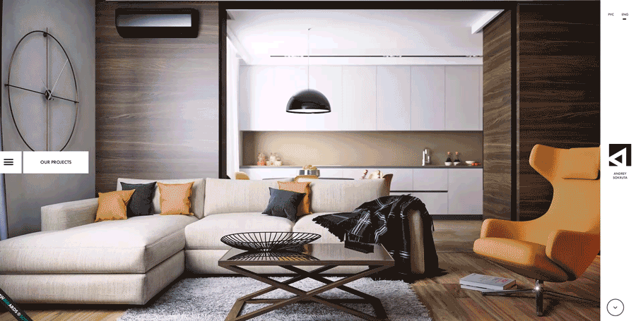
One of the brightest interior design websites ever made, this digital domain centers around the designer’s style and vision. Unusual and innovative page flipping effects. A step-by-step customer guide. Full-page background images of works. A comprehensive and neatly animated portfolio showcase.
Why 2nd place: because it is only shadowed by the first one.
1. Karim Rashid
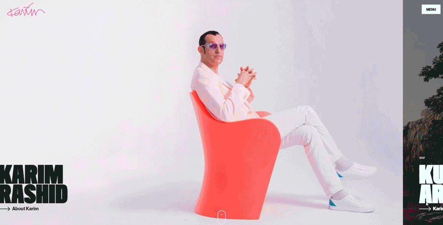
A perfect example of a website focusing on the man behind the works. Navigation is simple and convenient. Very comprehensive and distinct product categorization, and vivid portfolio showcase.
Why 1st place: A premium website for a celebrity designer. Creates the impression of luxury, and raises the service expectations to the similar level.
Your website should reflect on who you are. At Vintage, we enjoy working with world's top professionals and artists, strengthening their online reputation and lifting them far above their competitors. Our sites are made with wow-effect, invoke emotions, and create strong brand connections, what is crucially important in this field.
We were lucky enough to create one of the world's best interior design websites (though, decided not to include it in this article) that brought the owner a few 6-figure contracts. It is regularly visited by tens of thousands of art lovers and is widely used as a design reference in the industry. And we are not going to stop there.
Are you ambitious enough to create the best website in your field that reflects on who you are? Contact us and reach new tops.
View Comments