When you are in the world of luxury, you cannot afford a single flaw. And neither can your website. Take hotels, for instance. How can you assure your future VIP clients that staying at your hotel is really worth their money? How do you transmit the level of premium, and instill the feeling that your hotel has a top class service and experience?
One way to do it is to have a well-known luxury hotel brand. Marriott or Hilton do not need to be introduced, indeed. But what if your hotel is a small or family-run business that wishes to attract big spenders? What if you have invested a fortune in flawlessness of the building, service, and infrastructure and desperately desire for that investment to create a reputable image?
Here is where a top class luxury hotel website which can help. In this article, we gathered the top 10 award-winning, state of the art luxury hotel websites, which successfully transmit the level of style, class, and superiority.
Before we move on to analyze each particular website in our shortlist, let us briefly outline the peculiarities of luxury hotels and their clients.
- The first, and most obvious trait would be high expectations. “If you pay $100 per night at the hotel, and something is out of order, you can probably live with it”, says Eugene Kudryavchenko, founder and CEO of Vintage, “but if you pay $1000, even a single speck of dust will spoil your impression”. People who can afford to stay at luxury hotels are very demanding. They do not excuse flaws and never come back to a service they consider poorly provided.
- The second client peculiarity for the luxury hotel business is luxury sense. VIP clients are used to all things luxury, and they will easily discern premium from the mediocre. It will only take one look for them to tell if the thing is original, or merely a cheaper alternative. Similarly, such people will know if a website is worth $5,000 or $50,000.
- The third major issue to be aware of is limited pool of clients. People who can afford to stay at luxury hotels may amount to only hundreds or even tens. Within that few people, communication is very strong, and the majority of deals are based on recommendations. This puts personal approach at the forefront of every luxury business, and hotels - even more so.
Armed with these insights, we now move on to this year’s ten best hotel websites. If you aren’t on the Forbes 400, you probably haven’t heard of any of these places before. We invite you to dive into some of the most elite and expensive accommodations in the world and see how they represent themselves online.
1. Adriatic Luxury (Dubrovnik, Croatia)
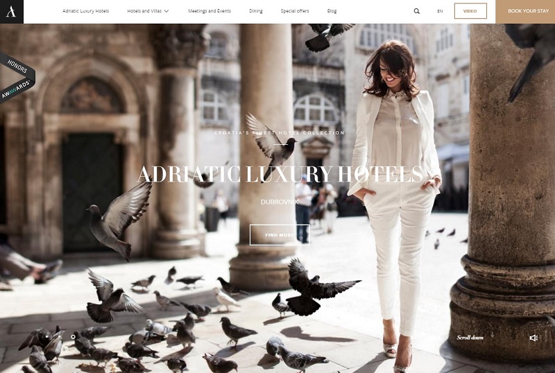
Dubrovnik has become famous in the recent years as the shooting set for King’s Landing, one of the most prominent locations in the iconic Game of Thrones series. This, and the magnificent lagoon view of the Eastern Adriatic shore, have created the demand for premium accommodation options.
Adriatic Luxury has got everything to showcase the beauty and entourage of this magnificent city and its breathtaking seaside surroundings. The greeting page contains a series of masterfully shot video sequences, which transmit the experience of staying at the place.
In terms of design, here are the instruments that contribute to the authenticity of the user’s experience:
- Promoting video clips. Short advertising clips are played in the background on the landing, and all the auxiliary pages. The videos are smooth and extremely lightweight: we tried testing the loading times on a tablet with a rather slow HSPA connection, and it took no more than 4 seconds for the videos to load, all the same.
- The blog. Blogging is an effective and popular tool to attract the audience to a product or service. However, with luxury websites, one would not expect a lot of followers. That is why here it is wise to favor quality of the content over its quantity. The Adriatic Luxury blog has just that kind of content - laconic, convincing, and stunningly illustrated.
- Elegantly designed, mobile-friendly booking form. Booking is the most obvious feature for any hotel website. But for a luxury hotel it is crucial to present a form that is simple, time-saving, but at the same time pertaining the luxury brand image.
All things considered, this website surely makes the city of Dubrovnik a desirable destination for the rich. And this is not something easy to achieve.
2. Badrutt's Palace (St. Moritz, Switzerland)
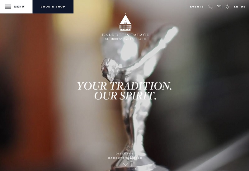
A winner of several web design awards this year, the Badrutt’s Palace website is one of the brightest examples of how a luxury service should be portrayed online. It stays true to tradition, outlines the premium features, and assures the visitor of the superiority of service from the first glance.
Here are the features that massively contribute to this website’s sense of luxury:
- Stunning first screen. When you land on the domain, you see a video loop of an extremely high quality. But the interesting thing about it is that it continues to play even while the animated menu shifts it to the side of the screen. This is a very neat and rich-looking solution, which we do not remember seeing anywhere else. Just look at how elegantly the premiality is showcased and brought before the potential client!
- Dedicated auxiliary pages. Every aspect of the stay at this hotel is covered on a separate page. For example, summer and winter activities, skiing or spa. The history page truly succeeds in reflecting the two-century-long legacy of the place with a vintage video background. Even the current weather has its own page, and there is not just a plain thermometer, but also a live webcam stream, showing the hotel’s picturesque surroundings in real-time!
- Events feed on the landing page. When you scroll down past the intriguing introductory screen, you see a feed of what is currently happening at the hotel. Being a popular destination for the people who admire and enjoy all things luxury, the hotel frequently holds meetings, exhibitions, and fashion shows. Seeing what’s coming up is a good attracting factor for the VIP clients, in addition to the overall luxury resemblance of the website.
Take your time and witness the magnificence of this luxury hotel website. To a web designer, it creates the impression that every detail has been thoroughly thought over in the process of its design. And to a VIP client, attention to details is the sure sign of a first class service.
3. 7132 Hotel (Vals, Switzerland)
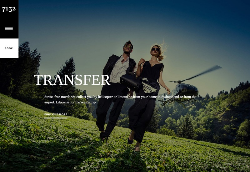
This boutique hotel, located in the heart of the Swiss Alps, is a great example of how you can make a website for hotels look worth a million, without using overly complex animations and vivid special effects. Everything here is laconic, if not to say minimalistic. But it is done with a touch of class so convincing that no VIP client would ever resist checking in.
Let us find out how such minimalistic approach works.
- Fantastic images. I mean, they are just mind-blowing. This website is probably the only one on our list that does not use videos, but it surely makes up for it with top-class, professionally shot and polished image gallery. One look at the first screen slide reel is enough to get the impression that the hotel is one of the most elite of its kind.
- Rich-looking menu animation. You can hardly surprise a user with a corner menu animation these days, but at 7132, it works with style and class. The effect is elegant and almost instant as if you are turning the page of a magazine.
- History timeline. Being a hotel built around the historic thermal water site, 7132 tells the story of a discovery of the source, and its accommodation to the needs of the willing. The user is able to see how the area and the infrastructure of the Alpine thermal baths have evolved over the last century.
There is beauty in simplicity, as the saying goes. However, turns out that the sense of luxury can be reached by the simplicity, too. All it takes is taste and a little aesthetic touch, in order to perfectly align the right elements in the right places.
4. VILLA Feltrinelli (Gargnano, Italy)
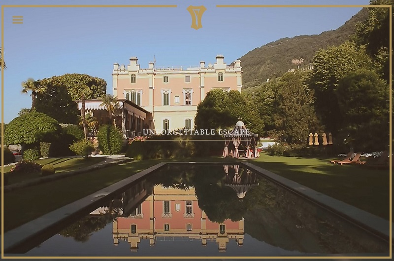
This luxury villa, situated in the world-famous viticultural region, utilizes the approach of living images to portray a website as a breathing thing. The structure of this website is rather simple: they have a landing page and a couple of auxiliaries. However, each scrolling screen is beautifully decorated with a high-resolution animated GIF, which makes for a living, and not just a static, illustration.
Animated GIFs are a marketing tool that has been proven and praised by many web designers. In luxury real estate website design, GIFs are primarily used as live images, designed to show ripple on the water, leaves on the wind, or spurts of flame in the fireplace. Showcasing a hotel’s interior or surroundings in living, not static pictures is a good way to invoke a presence effect in the user.
Villa Feltrinelli website squeezes a hundred percent out if this approach. Each of the scrolling screens on its landing page is decorated with a full-screen live image that perfectly portrays every aspect of the visitor’s stay.
5. Ananti Resort (Trikala, Greece)
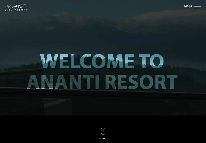
This website embodies the dark-and-light, “checkerboard” design approach. As opposite to the monolithic color gamma, this technique is capable of outlining features and emphases with clever use of contrast. When you scroll down the landing page, background images are covered by a “UV screen”-like filter, which resembles the view from behind the sunglasses.
Such technique adds a very interesting zest to the site’s browsing experience and certainly helps it stand out from the competitor crowd. Here are a few other things that also help to achieve the luxury resemblance:
- “Curtain”-like menu animation. Menu animations come in a wide variety of special effects these days. But the smooth “curtain” pattern when the menu fills the screen from both edges is not a frequent encounter. We loved how it is done at Ananti, with regard to the overall “checkerboard” design style.
- Sticky booking form. Sticky menus are a popular way to focus the user’s attention on the desired action. Oftentimes, however, they are brought to the user in an overly aggressive manner, making such elements a distraction, rather than help. On this website, the booking form sticks to the screen while the landing page is being scrolled down. Despite the fact that it’s done in a minimalistic, black-and-white manner, and does not obscure the user’s view, it also allows the user to make a booking from any place on the website. Convenient and engaging at the same time!
Just like pretty much every other website on our list, this one also uses background video clips. We will not further emphasize on this instrument and its importance for the luxury hotel showcase. It is obvious that if you are to attract wealthy people, you must show them what it would feel like staying at your luxury hotel.
6.Vesper Hotel (Noordwijk, The Netherlands)
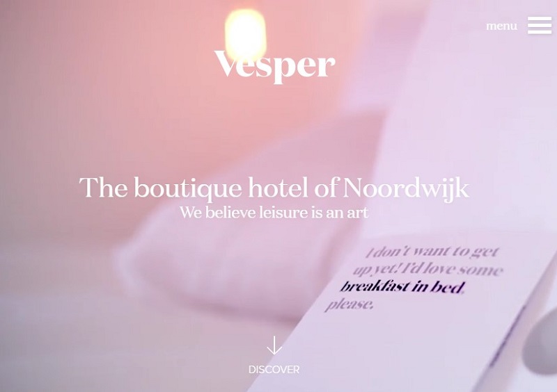
When you are on this hotel’s website, you get the feeling that it is located high up in the clouds. Vesper is an example of a luxury hotel website that transmits the out-of-this-world experience with the mood of lightness, calmness and serenity. White is the accent color, and the tones of light blue and purple unobtrusively underline the key focus points for the website’s visitor.
There were two things that we have found particularly interesting about this website:
- The Room explorer. Each type of accommodation has its own dedicated page, rather than being showcased on the common reel. Short descriptions of the rooms contain such crucial factors as square footage, view, bed type, and additional amenities (seating area, balcony, spa). Full pages contain professional, nicely rendered images that not only showcase the interior but transmit the emotional aspect of staying at the suite.
- The Breakfast menu. A lot of hotels have complimentary breakfasts, but what many fail to do is tell their potential guests what exactly they will be getting. Sometimes it may result in client disappointment, as they envision seafood cuisine, but get meat instead. With their website, Vesper successfully avoids such misapprehensions, providing the professionally illustrated list of available dishes and drinks.
This is the bright example for successfully transmitting the atmosphere of a hotel. It is light, relaxing, and conveys the "I want to be there!" feeling.
7. The Tuscan Hotel (San Francisco, USA)
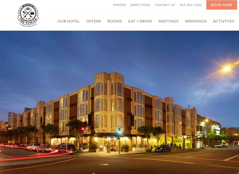
For a VIP guest, a hotel isn't just a place to lay their head - it has to be a home away from home, the space from which they begin their trip or vacation, and the place they are happy to return to when the day is over. The Tuscan Hotel in downtown San-Francisco seems to strongly advocate for this point, and use its website to completely assure their clients of it.
The website uses a warm, “urban evening”-style color palette, and is accompanied by a very interesting illustrated menu. If you hover over the top menu elements, the roll-down options are accompanied by the relevant images. This approach instantly brings the website out of the competitor bunch.
Although the design may seem a little bit too minimalistic, it’s got everything a guest may wish to know about the hotel premises. It even has the floor plans for the meeting hall, so that the events may be thoroughly planned and organized by the guests.
8. CAVOTAGOO (Mykonos, Greece)
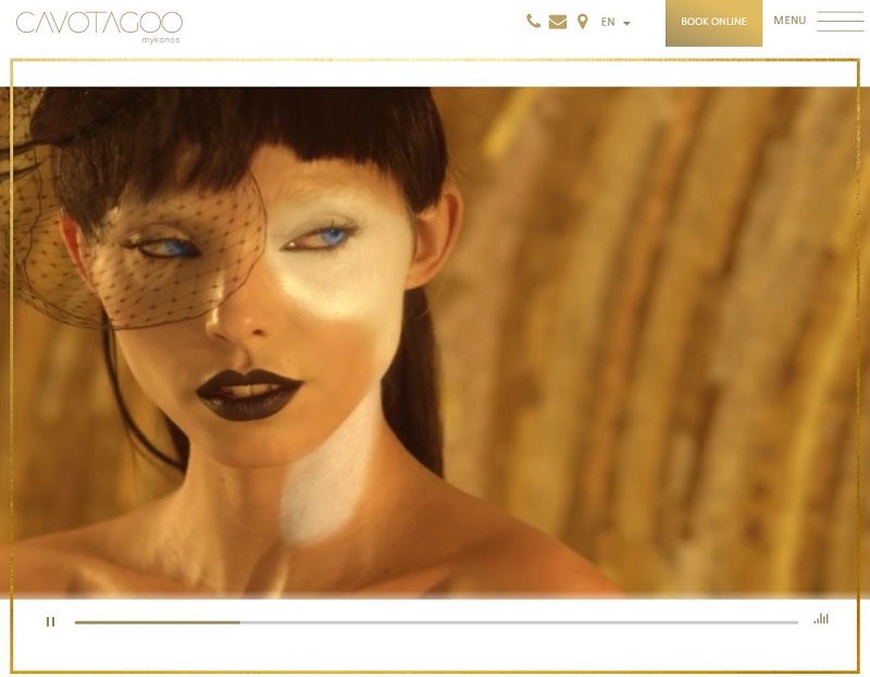
This hotel website should really be cited in dictionaries as the definition of luxury. Cavotagoo embodies the entourage of an Ancient Greek palace and transmits the feeling of grace with glitter and gold. We encourage you to scroll through the laconic landing page and dive into the golden paradise.
While you are scrolling, you will encounter these classy design solutions:
- First screen video. It is simply astonishing, personifying the guest as a Greek god. The video runs on a built-in player, too. This is a sign of a rich website, since it does not require connecting to an external video streaming service, and thus saves the loading time.
- Short mouseover clips. Images of “awakening into the bliss”, “indulging your palates”, and more will come alive as you hover your mouse over them.
- Picture gallery launching from the penultimate scrolling screen. The majority of hotel websites make their photo galleries only accessible from the main menu, which often make visitors leave before they get to see all the beauty. Cavotagoo makes sure every visitor appreciates their interiors and surroundings.
With such a breathtaking website, Cavotagoo has surely succeeded in being a world-favored luxury hotel, and a dream destination for seekers of unique experiences.
9. HONEGG Boutique Hotel (Ennetbürgen, Switzerland)
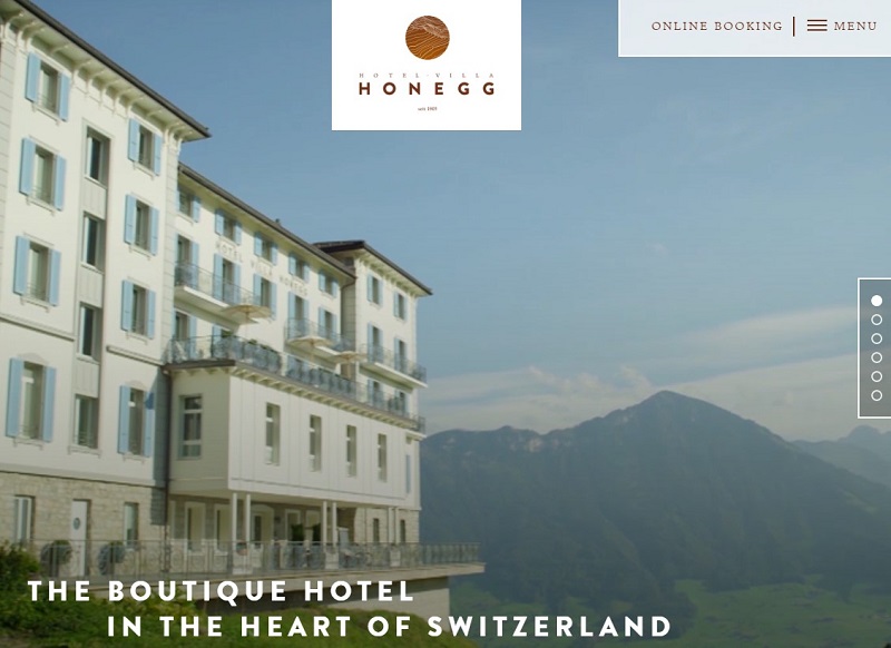
Here is another great example of a historic estate hotel, beautifully showcased online. Located in Switzerland, on the top of the mountain overlooking the renowned Lake Lucerne, Villa Honegg offers luxury suites, and the mind creating getaway from all the worldly fuss.
We loved how this website combines the use of images and videos, which work together in perfect synergy. The landing page starts with a background video, showing the aerial view around the hotel. With only 23 rooms, it's actually a large mansion, enabling the estate to offer a very personal service to its guests. And you really get that feeling from watching the marvelous homepage video clip.
As you scroll the page down, the screen is filled with a series of images that match the quality of the video. Each image represents the respective website section (recreation, dining, pools etc.). But what really grabbed our attention was the Rooms page. Here, each type of suite is elegantly portrayed and accompanied with a detailed plan. A showcase such as this must really invoke the level of service expectation in every potential guest.
10. Emiliano Hotel (Sao Paulo, Brazil)
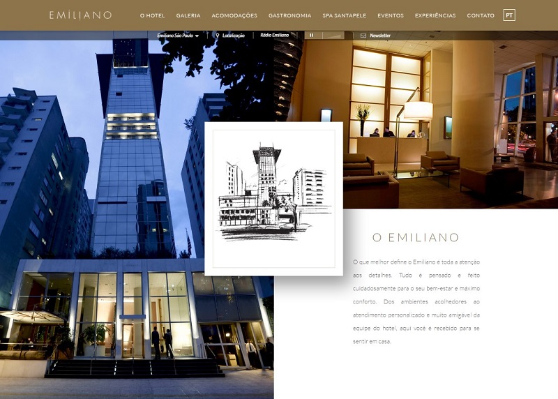
Located in the dense jungle of the business city district of Sao Paulo comes the final representative of our list of top luxury hotels. Along with many other features that we described in other contestant websites, Emiliano Hotel uses the one that can only be found in a few: the virtual tour.
In one of our previous articles, we talked about how wonderfully the virtual tours can work for condominium development websites. Such approach provides the user with the tremendous presence effect. Well, we don’t see why this practice cannot work for hotels as well - especially the ones that have the beauty to show.
Scroll down the Emiliano landing page, and enjoy the virtual tour around the premises!
Elements of luxury web design
If you ask random people which elements a luxury hotel website should include, the first thing they are most likely to say would be photos of rooms, restaurants, interior design, exterior, and so on. Indeed, a hotel website without photo gallery is a nonsense.
Then, there will likely to be a map, room reservation and booking, recommendations, prices, and location. The majority of people want to see an exact room they book instead of just reserving faceless twin, know what a view from their window will be, and that kind of nice details.
Luxury companies are in the first row of those who set trends in web design for hotels because they know how important it is to interest wealthy and pretty demanded clients. However, there are still websites lacking the bare minimum.
Costs of hotel website design
It is pretty hard to estimate by eye a hotel website design cost because of different levels of a project complexity and different levels of agency expertise. That is why estimates of different companies vary, sometimes by 50 times.
While in most Eastern European luxury web design agencies, including Vintage, the pricing starts from $50,000 for a world-class site, elite web design teams in the U.S. may change from $200,000.
We dedicated two articles to this topic where meticulously described all niceties and explained how to evaluate the website design cost by yourself:
- How Much Does a Website Cost: The Most Definitive Guide To Web Design Pricing
- How to Estimate Cost and Timeframe for Website Design Project
So, this has been our Editor's pick of Top-10 best luxury hotel websites that can currently be found on the web. We hope you liked this chart, and should you have an idea on how to create a website for your hotel, please feel free to reach out to us at Vintage - we are always eager to advise and assist. Also, consider subscribing to our blog for more interesting editor’s picks, case studies, and hotel web design inspiration!

View Comments