In a pursuit of lifting your business or brand name to the level of global recognition, there is no better instrument than a world-class website.
Design & Architecture is the sphere going completely digital, with borders and boundaries blurring away faster than ever. A designer residing in one place creates the artworks to be embodied thousands of miles away. And oftentimes, the only bridge between the designer and client is the website. Would you like that bridge to be made of ropes and hay, or would you prefer it to be a concrete, immense and breathtaking structure?
In order for your talent to be apprehended and recognized worldwide, you need a website that would be similarly perceived. The world-class websites are only made by world-renowned web producers.
On the example of this case study, we are also going to juggle through every typical stage of website production in our company, together with our CEO and co-founder Eugene Kudryavchenko, and Art Director, Olga Shevchenko. This approach will let us see how much this top-class project differs from what we usually do.
WHO IS MR. MAKHNO?
PORTRAIT OF A CLIENT
Sergey Makhno is a Ukrainian interior designer and architect, who, in the recent years, became one of the trendsetters in the national design industry. An artist, an inspiring handworker, an object designer, a host and popularizer of design exhibitions, Sergey developed his unrepeatable style and vision, which he inculcated in his devoted team. In the following short clip, we tried to summarize the quintessence of his artistic talents.
For 15 years, Makhno Architects gained a nationwide reputation of a design agency that does not copy, but creates the original pieces of art with limitless inspiration.
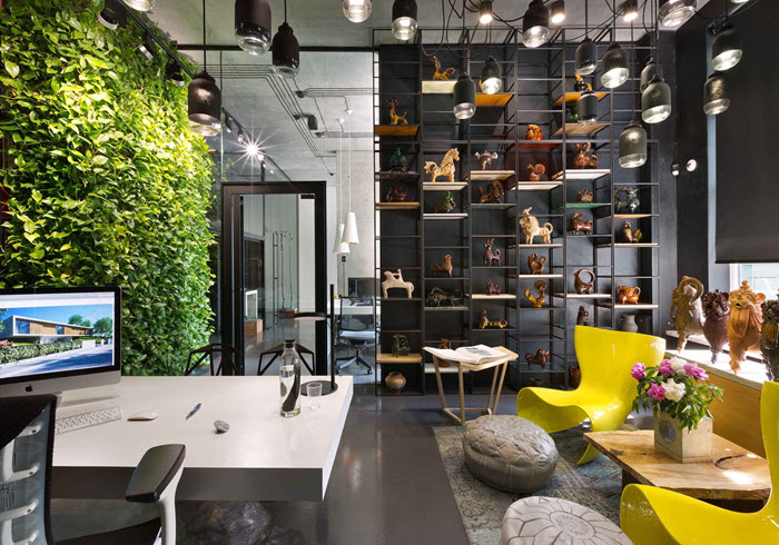
Sergey’s style is based on a combination of natural materials (wood, clay, glass, concrete) with an unostentatious ethnic-themed zest. This peculiar combination is perfectly embodied in Makhno Architects head office, which, of course, was built by their own design. So, there was no even a thought to use interior design website builder - a template website is not in Sergey's style.
A major influencer in his home country, Sergey sought to reach out to the international audience. And the idea was not simply to showcase what he can do, but portray his many-sided and artistic personality, the very soul behind his artworks. For accomplished designers, personality is more important than business image. Sergey aimed to share his philosophy and inspiration with the whole world and make his future clients appreciate his style not just as a particular design solution.
Olga Shevchenko, Co-founder & Art Director @ Vintage:
“A web designer has to perceive client before starting to formulate the future website’s objectives. Without a deep understanding of the client’s desires, cravings, doubts, and fears, you will never share their vision.
This is especially true when building websites for artistic people. They have their own sense of aesthetics, based on their unique style. And if you fail to catch the pattern of that style, you will be constantly ending up with rejected concepts.
At Vintage, we try to spend as much time with our clients as we can, in order to catch the tune of their personality. And this does not mean discussing the project only. In fact, the small talk usually helps to get to know a person better than a formal meeting.”
BUSINESS GOALS
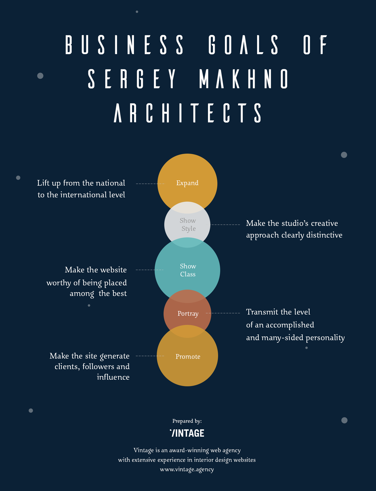
No matter how personified the website may be, its primary objective is always to achieve business goals. After consultation with Sergey and his team, we settled that the main objective of the new website would be to place a company among the top Interior Design & Architecture studios in the world.
We all knew this would be no trivial task. That is why we decided to break this objective down into a few smaller ones:
To lift Sergey’s business to the international level. As we said, national fame was not enough for our client, so we had to take into account the appeals and Internet habits of a wider, international audience to make the site attractive to everyone.
To illustrate and promote Sergey’s unique design style, which is a combination of various techniques. This meant two things. Firstly, we had to devote much brainstorming to the overall color palette of the site. And secondly, what’s more important, we had to transmit the style authenticity into the visitor’s head. For the latter purpose, we chose the short video clip approach.
To illustrate and promote Sergey’s nationally renowned blog to the international level. Just like any professional, Sergey is keen on sharing his inspiration and expertise. In Ukraine, his blog has gained a great reputation and lots of followers. So we needed to make it available – and apprehensible – to the global audience.
To personify the website to portray Sergey’s many-sided personality online. This was based on how we perceived our client. Visitors want to know who the man behind the works is.
To define the top competitor’s websites on the market and outshine them. This is where we moved on to the next stop of our journey – the market analysis.
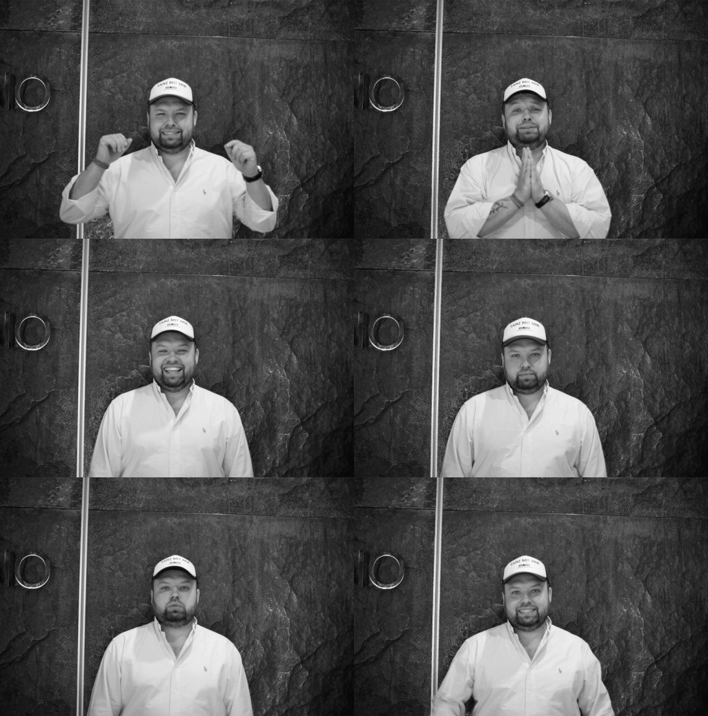
Eugene Kudryavchenko, CEO & co-founder @ Vintage:
“Identifying our client’s business goals is the obligatory preliminary stage of website production. We are not executionists and do not stick blindly to Technical Descriptions. For us, it is important that the website helps our client grow because if it doesn’t, it is not worth making.
Stuffing pretty pictures without understanding what they would achieve is not our approach. Until the business goals are clearly identified, we never move on to the actual concept thinking.”
KEY FINDINGS FROM MARKET ANALYSIS
To be treated as a top player, you must look like a top player.
That is why it was crucial for us to find out which interior design websites truly shine on a global scale, and then see how to create something as bright, and yet, completely different.
The first step was formulating a short list of the best websites in the Interior Design & Architecture category.
There are two major criteria we abide by when we are looking for the best examples of something on the web. Firstly, the site has to be unique. In other words, it can’t look like anything we’ve already seen. Secondly, it has to be recognized best, and that is to be awarded. By sticking to these two simple criteria, we were able to take into account both our own and the side experts’ aesthetic vision.
You can take a look at what we’ve come up with here.
Next, we had to mediate through local and global web design trends.
The website was meant to retain the existing local admirers and, at the same time, attract new, international audience. Mentalities, preferences, and internet behavior of both audiences had to be studied and properly balanced.
As much as trying to portray the essence of an artist, we could not afford to build an overly conceptual website for the interior design company, which would leave the common user absolutely clueless. Our research revealed that some famous designers like to have such websites. They think this underlines their level of elite further still. Other celebrity designers are fond of doing the opposite - leaving just a simple landing page with their contacts.
Sergey Makhno needed a website for a wide audience, so we could neither dive into ‘wild art,’ nor into extreme minimalism.
We completely excluded template websites from our competitor environment research. No matter how good the owners of such websites are, due to a handful of reasons, they could not be considered Sergey’s competitors.
Eugene Kudryavchenko:
“For this client, the objective was to create an interior design website differing from any existing one. But that does not mean that being completely different from your competitors is always a good idea.
If your strategy is expanding to a particular new market, it may worth it to mimic some elements of existing players, considering that market’s competitive environment.”
INSIGHTS ON PLANNING & PROTOTYPING STAGE
A prototype is the skeleton of every web design project. Web studios use prototypes so that the client and all production departments involved in the development process can catch the same tune.
However, for this special case, we did not create a prototype, or, at least, not in its traditional sense. This time, creativity mattered more than a formal structure. So, in order not to set boundaries for creativity, we opted to go without a distinct prototype.
Instead, we used a multi-branched project mind map. There, we gathered all Sergey’s personal peculiarities and preferences together along with his business goals, and our market study results.
This mind map helped us understand what we could use to make this website one-of-a-kind and what, due to various reasons, we could not. After much brainstorming and gathering ideas, we shortlisted the following traits that would make our side stand out.
- No portfolio on the front page. We were promoting not the works, but the person behind them. This decision instantly made our site’s main page unlike 95% of landings at the existing interior design websites. Any other player in this business wants their best works to be visible right from the start. But the world-class designer is well-known to such extent that visitors will want to see his portfolio regardless. For Sergey, it was more important for his website to stand out rather than to have his works thrown out at every visitor.
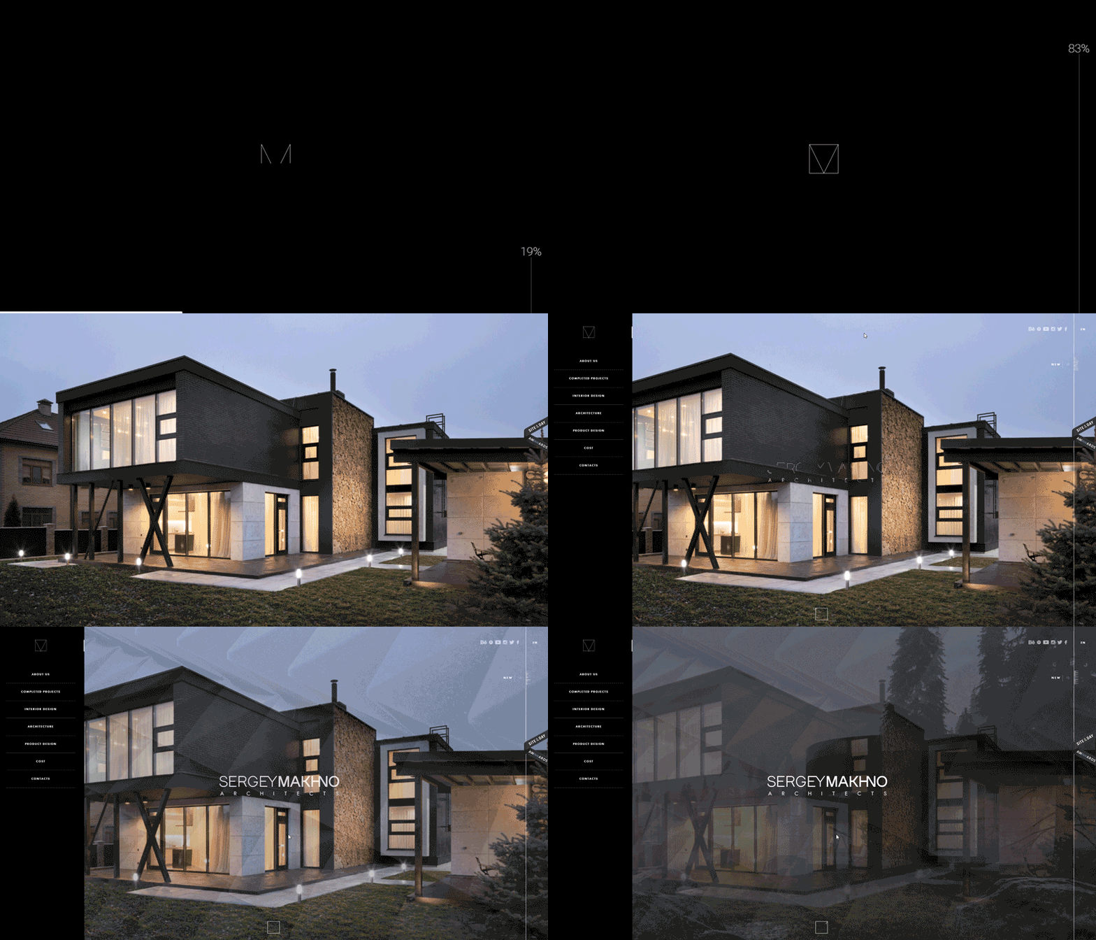
So the main page would act as a book cover, showing the site’s title and inviting the visitor to read on, chapter by chapter.
The portfolio would be split into 4 categories. Sergey Makhno works in several fields: interior design, object design and architecture. We created separate chapters to showcase the works of the three categories. The fourth section was devoted to the completed projects. There, you could see how the architect’s imagination is brought to life. This would convince the visitor that Sergey was not only capable of drawing concepts, but also completing the projects from A to Z.
Unique navigational patterns. Today, animated navigation has become one of the major peculiarities of a website. Everyone has learned to produce perfect renders, even templates have them. But smooth and interesting navigation is the sign of a rich website - and a competent, professional team behind it.
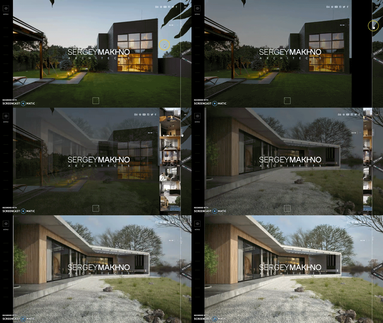
- Video clip integration. Static images, however well polished, do not impress the visitor any more. We decided that short video clips would govern each website section, and will make the website more interactive, enabling a more involving experience for the visitor. Another good thing about video clips is that they actually show the working process, and not just the result. You can see for yourself how clicking on each main menu option prompts the relevant video. As an example, here is one of these short clips.
Eugene:
“To prototype or not to prototype? Usually, the decision is a simple one. In 99% of all cases, we work out the detailed prototype to approve the future site’s appearance, structure, and functionality with the client. The prototype also serves as a visual guide for designers, so that they stay strictly within the frames of the client’s website objective. Only the special projects, which require an overly creative approach, are permitted to skip the obligatory prototyping stage”.
LONG WALK TO DESIGN APPROVAL
At this point, all our previously approved ideas had to be visualized, and for that purpose, the concept was to be drawn up and approved by the client.
A concept is the general visual theme, which would be implemented on the website. For this project, we drew a total of 18 (!) concepts before we were able to come up with the one that looked absolutely perfect.
It has to be noted, however, that having so many concepts was not a standard procedure. Such fundamental work required unlimited working hours and was evaluated as one-of-a-kind, luxury design project.
After all, we aimed for the top interior design website. When we were coming up with a brilliant idea that would work for any other project without question, we had to stop and make sure it has not been already done by someone else. A concept which featured the slightest resemblance of an already implemented solution, eventually ended up in the trash can.
Olga Shevchenko:
“For example, at some point we had an interesting idea with horizontal scrolling. This looked like a fresh solution, and it would definitely make our website stand out from the crowd.
However, after usability and adaptability research, this idea had to be abandoned, because it ruined the intuitive website structure comprehension, and did not look too pretty on mobile screens. So, every idea, however bright, always needs to be analyzed from various standpoints”.
Below you can see some of the concepts that we elaborated in our search of the ideal one. Compare them to the final look of the website!
It took us several weeks to find and approve the final concept. After that had been settled, the development of internal pages went on a quick pace. When you understand the site’s structural and navigational logic and have all necessary content at hand, assembling filler pages usually goes easy and smooth.
Olga:
“One or two concepts are usually enough for most clients, especially considering the project’s budget and timeline.
The idea of a corporate website, a web service website, or the one that sells or promotes a product is always clear from the start. After the concept has been approved, we only play with minor elements and stick to the general canvas”.
FRONT-END DEVELOPMENT
Front-end development is combining different elements and design pieces together in a monolithic structure that a website is.
In order for all animations to display correctly, all pages to fit the screen size, and every link act as intended, we have to write the appropriate scripts.
For this project, we created most scripts from scratch, in order to implement the approved design solutions. This increased the timeframe of this stage by three times compared to a regular project. But in the end, our website was able to run and load nicely and smoothly.
Another obstacle most modern website projects face is adaptability. Complex design solutions require certain rework in terms of adjustment to big and small screens.
Here, simple element scaling is not enough. In fact, for such complex websites as Makhno, mobile versions are nearly separate websites with their own elements and structure. Videos and animation sequences also had to be optimized, in order to be able to load quickly and smoothly even with a slow mobile internet connection.
On the other hand, we had to make sure the site behaves well on big, 27’’+ screens. This also required optimization and adaptation work. As a result, our website has a total of five built-in screen resolution versions.
ACHIEVEMENTS
So the website is finally done! Now, how to prove it would achieve the goals set initially?
Well, we have to launch it, and then wait and see how it changes the client’s personal and business image.
One month after launch
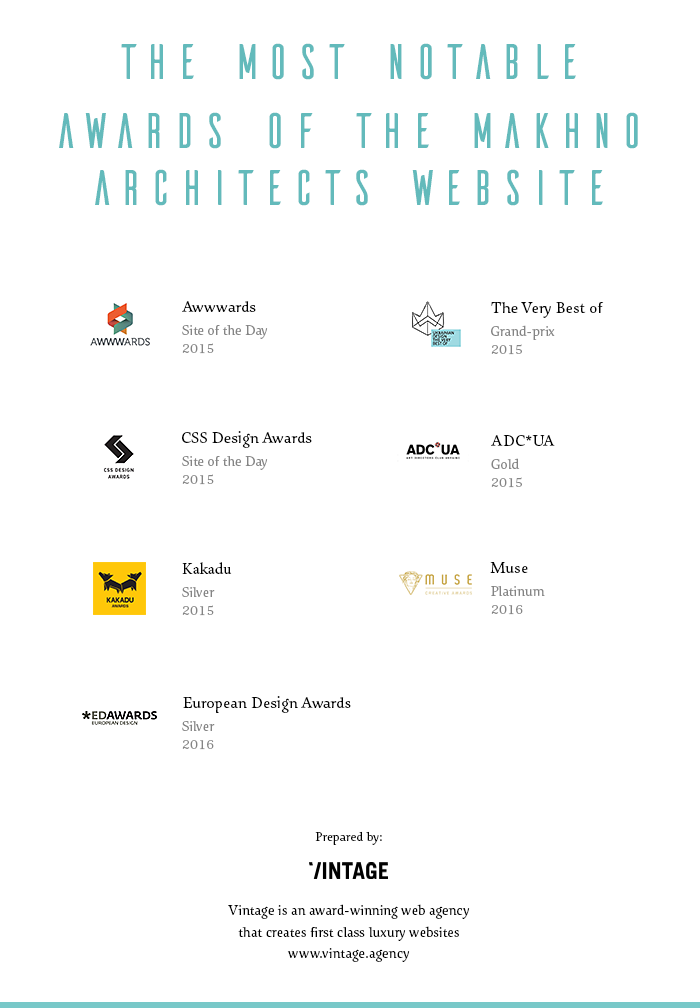
- The website receives the Site of the Day prize at Awwwards. This attracts hundreds of extra visitors, who are keen on design, from all corners of the world.
- Sergey receives the first order from a country he has not worked with before.
Three months after launch
- Makhno Architects sign a big contract with Amstar for their Skyline Residences project.
- One of the notable Sergey’s interior design works is published on ThePeople.com.
- The site wins two more prestigious awards: The Very Best Of, and CSS Design Awards. Thousands of international viewers, and hundreds of blog subscribers from different countries.
Six months after launch
- Sergey’s client geography spreads to 16 countries.
- His agency gets a handful of publications in the most reputable Interior Design & Architecture media.
- Sergey receives invitations to major international interior design & architecture events (IDA, A’Design, IDC and others).
- The site continues to receive more awards, with the most prominent being European Design Awards 2016 Silver.
One year online (and counting)
- Sergey is able to attract an international audience to his book ‘Life of Ideas’ and the exhibition of the same name.
- The blog has 20,000+ subscribers and social media followers and becomes an internationally recognized medium in its own right.
- Sergey’s agency gains clients in 20+ countries.
- A total of 12 web design awards for the site.
- Over 100,000 award-driven visitors by the end of 2015, according to visitor analytics.
Olga:
“It may not be so obvious, but your website’s awards have a tremendous impact on your business in terms of brand awareness and cross-industry recognition. Thousands and even millions of extra visitors, reposts, and social shares are an additional marketing effect, which is completely free of charge and comes as a bonus for investing in a flawless website.”
WHAT’S NEXT?
We are always happy to provide further website improvement and guidance for our clients. The average website lifespan in today’s digital world is 3 years, and the trend shows that it is likely to decrease further still. This is why it is important not to simply refresh a site once in awhile, but to have a strategy for pre-scheduled updates and expansions.
Here are some ideas that we have in mind for the Makhno Architects website.
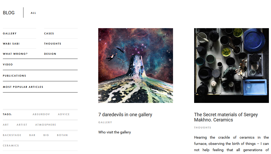
- Blog rework and expansion. If you visited the current version of Sergey’s blog, you could clearly see that it is already a thriving, many-edged web resource devoted to interior design & architecture. If it continues to grow at this rate, it will be way beyond the boundaries of its parent website. So we detached it from the principal domain and turned into a separate, full-scale digital product.
The online store is also the next thing to come. The idea is that it would not only be a showcase of products, but also a project assembler, where Sergey’s clients would be able to set basic parameters and get the idea of cost, timeframe, and the resulting form or shape. This would be a formidable challenge for us, but again - if you only do simple things, you will never grow.
A very interesting idea is virtual reality adaptation of the website - an expensive, but a really awesome feature to integrate. We already have videos, which contribute well to visitor interaction, but imagine what we can achieve with Oculus Rift or HoloLens technologies! A vivid experience of seeing Sergey’s works from inside would give him the cutting edge in further client attraction.
Eugene:
"When we think of improvements and enhancements to do, we have to take future trends into account.
Being a pioneer in the next big thing always puts you several steps ahead of your competitors. One thing is to do something because it’s cool, but another - to do it before it becomes cool."
A VERY SPECIAL CASE
The Sergey Makhno project has, by far, been the most challenging of over 350 websites we produced. In terms of cost, timeframe, and complexity, this project accounted for $45,000 and nearly 6 months in production. But as much time and effort as we put in, it paid off in the end for both us and our client.
Such compelling tasks are what helps a web agency raise its standards, and grow both professionally and strategically. That is why we always warmly welcome more projects of such scale. Thank you for allowing us to share this very special case with you.
Feel free to pitch us with your website idea, too!

View Comments