
When you’re thinking of how your small business website should look like, there are several things to take into account. Should it reflect your business goals in the right way? Definitely. Should it be up-to-date and possess all modern web features? Without a doubt. But what about design? Is there a way to tell which web design solution would be best for your company’s brand, scale and business niche?
Well, you can always look at bright examples. As a conclusion to our small business websites publication series, we have gathered the twelve most prominent, award-winning digital wonders, which perfectly illustrate how a great website in their small business niche should look like.
Ready? Here we go.
Robin Mastromarino
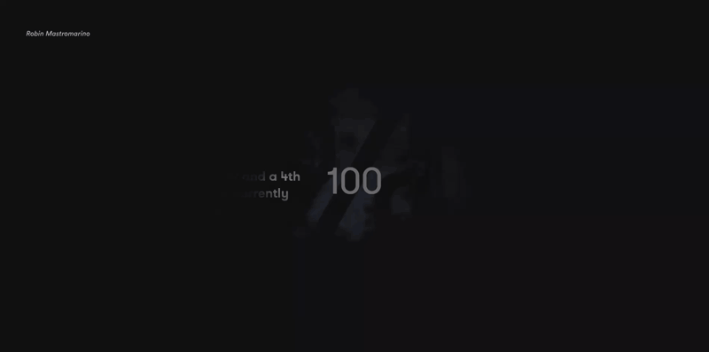
A freelance designer’s personal website, wonderfully portraying what he is capable of. For every designer, a portfolio is a way to showcase his professional level, but what many forget is that the very website, on which the portfolio is presented, must be the integral and essential part of it. Here, the author elegantly discloses his potential, and the accompanying special effects do not interfere, but gently add up to the visitor’s experience.
Gitman Bros.
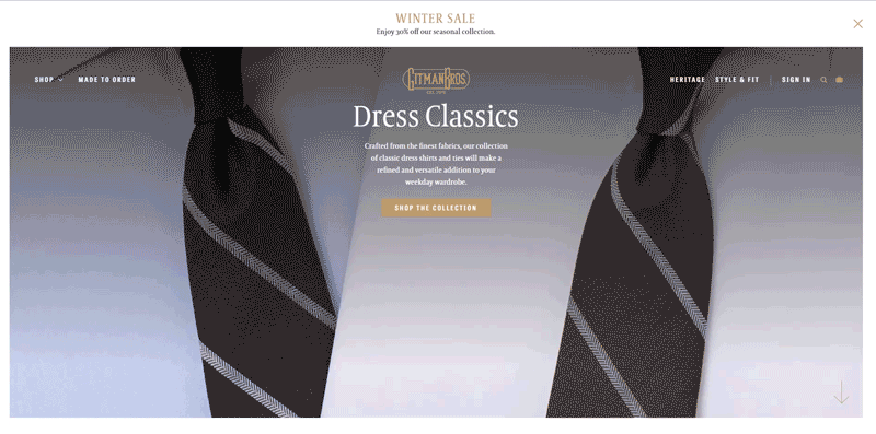
A made-to-order shirt & tie shop. A good example that the family business with long heritage and traditions does not necessarily have to sell with glitter and pageantry. The guys have created a modern and convenient online store, while not having their company’s spirit lost along the way.
Ben Lukas Boysen
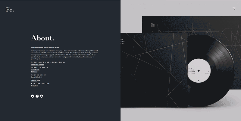
Web design is not about pretty pictures; it’s about solving a certain problem. Here is a perfect illustration of how the problem of portraying the musical portfolio without a single sound is solved. A very laconic, yet greatly inspiring discography and artistic story of a musician. No sounds needed, indeed.
Edita’s Casting
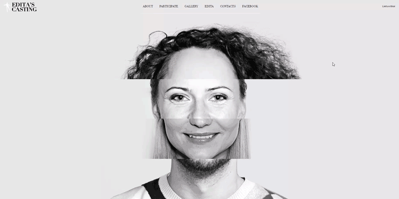
A family-owned casting agency, which thought of how their service would look like, and put that thought at the forefront of their website. Such emotional details are what really touches the visitor. Sometimes all you have to do is give people the right impression of your product, and unobtrusively put it under the spotlight. Check out this beautifully animated face match!
Sergey Makhno
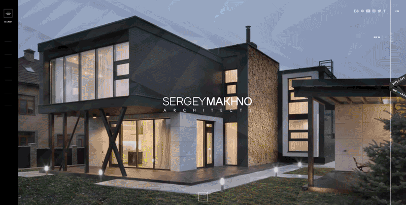
An interior designer’s essence gone digital. A bright example of how you can reach the level of top interior design websites, and at the same time, be none like any other. Neatly integrated video clips and smooth, eye-pleasing navigational patterns contribute to the overall luxury effect. Lean more in our special case study of this thrilling website.
Aaron Porter

An independent clip maker and film director, this guy makes every visitor of his website appreciate his creative talent. Entering different website sections triggers video playback on the background. An eye-pleasing, laconic presentation of a CV-like portfolio with brief, but informative case studies of every completed project.
Spring/Summer Studios
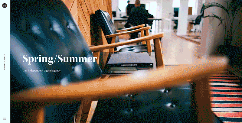
A small Danish digital app developer, who made their website look like a digital app itself. Neat animated scroll-down reel tells the visitor all they need to know about the studio. It’s especially interesting how the “slash” concept, which is the part of the brand name, is utilized on various pages (products, portfolio, awards).
Robby Leonardi
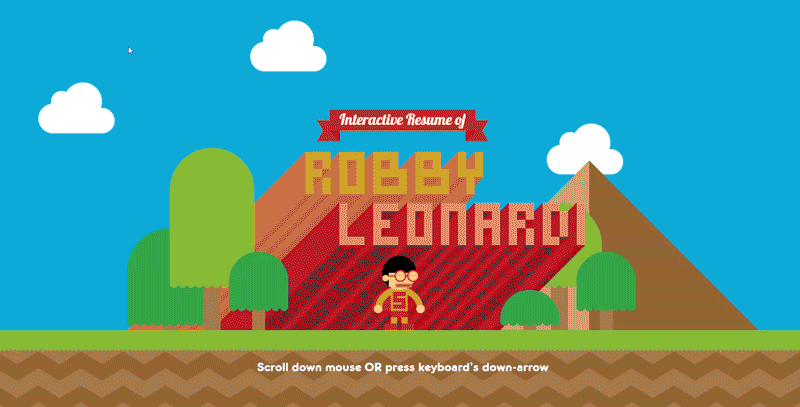
An interactive resume in the form of an 8-bit video game! This kind of CV and portfolio showcase won’t leave indifferent even the most thick-skinned HR indifferent. By simply scrolling your mouse wheel down, you learn about the author’s bio, work experience, hobbies, achievements, and awards. No doubt, every entrepreneur would wish for such a convincing set of credentials as this one.
UVE - Rooms & Wine Bar
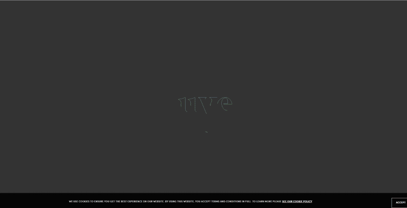
A family-owned inn and winery in the picturesque La Morra region, Italy. Every service – rooms, wine boutique and landscape tours – is elegantly portrayed and brought up to the visitor. Nicely rendered, living images truly reflect the beauty of the place, and make the visitor connect to the experience.
Tio Luncín
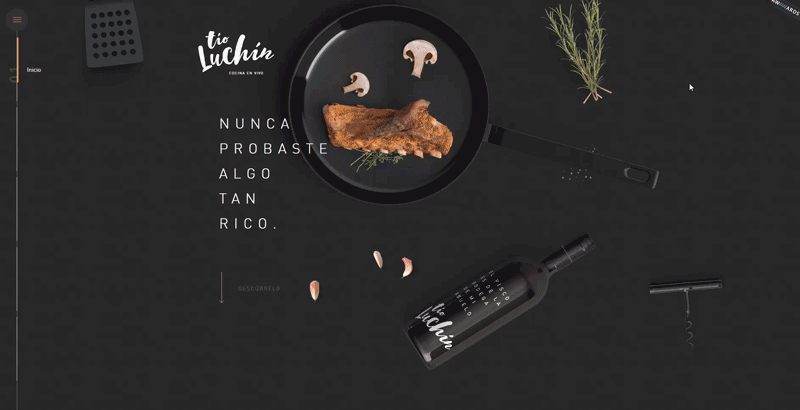
A stylish Perúan food restaurant, with an equally stylish website to match. The color palette, with a combination of background video clips, animations, and screen-changing effects perfectly visualize the restaurant’s brand and specialty. This is how you make your small business a bait for locals and tourists alike.
Before Beauty Bar
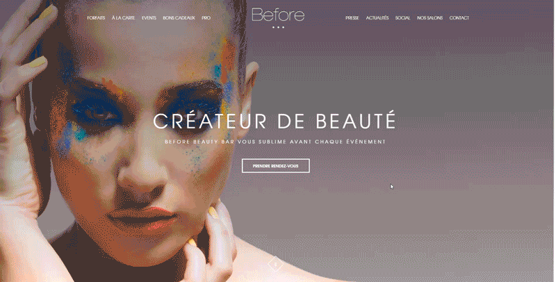
The beauty salon of vivid colors and a graciously designed digital domain. Each color represents a service, which helps create binding logical associations in the client’s mind. An interesting solution that instantly makes this salon stand out from thousands of its kind.
We really hope that you liked our little small business websites chart. Subscribe to our blog, and stay tuned for more top rankings of inspiring web designs in virtually all areas of business!
Learn more on the topic:
- How much does a small business website cost?
- Tricks to writing pinpoint web design Requests for Proposal (RFP)
- How to tell a great web studio from a simply good one
Our Vintage team is accustomed to create only the best websites which bring tremendous results for small businesses. If you feel ambitious enough to become one of the main, reach out to us.
View Comments