
Utility, simplicity, originality, intuitiveness, and continues improvement are the basic principles of solid web design. But some things shine more brightly when being compared, so I’ve decided to highlight some most important but not most obvious conceptual mistakes which may lead to a bundle outcome. Here are my 5 anti-principles of web design.
1. Beautiful, not usable
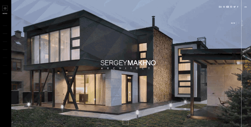
“Why - How - What” - that is the philosophy of all we do at Vintage and, I suppose, of all successful and holistic products in general. That is what allow us to develop impressive websites, such as Sergey Makhno Architecture:
Let me explain. At the bottom of this logical pyramid, there are all those physical forms of things that make up the “What” in the equation. “Wow, this website is absolutely beautiful, I love it!” Some clients come to us to get something smashing, something that forces their website users to exclaim this way. However, design is not just about beauty, because beauty itself has little relation to sense, quality, or aptitude - things that form a basement of a web design.
The “What” is a physical manifestation of the next, deeper “How” and “Why” levels. It is simple: it’s impossible to create something amazing, long-living, and, finally, holistic without the clear understanding of how to do it, for whom, and for which purpose. If to start the web development process from the wrong side, you will consequently end at the wrong end.
Frequently, user experience ends where a wow-effect starts. However, it would be a huge mistake to think that beauty and usability exclude each other - solving problems will lead to a good web design, but it will never lead to a great design. Great design does not simply ease people’s lives - it is an expression of a life itself. It breaks those chains and transcends a pure utility, turning into a genuine excitement from using a website.
2. Sophisticated, not ascetic
Things we interact with on a daily basis are predisposed to look a certain way because of the constraints imposed on their construction. Rooms are square because they are easier to construct - attaching flat surfaces to a curved wall takes more cuts, planning, attachments, and coordination. Bricks are square because they are easier to assemble this way. On the other side is art, in all its manifestations.
Design is a solution to a problem. Art is a question to a problem,
— John Maeda, Head of Computational Design & Inclusion @Automattic (an American web development corporation most notable for WordPress.com)
When it come to web design in its pure form, it does not (and I hope, will never do) belong neither to a mass production not to art. Web design is all about a use, emotion, personal expression, and exploration. It is first and foremost about function, and only then - inspiration. It aids a user in completing a task or navigating a system.
The best web design is that which comes from a deep understanding of a user. That is why minimalism today values so much. Lying somewhere at the intersection of a standard and art, it attaches a detail a significance, even crucial power. Every pixel, every letter, every picture becomes a king. Achieving this may only seem easy: simplicity is the ultimate sophistication. To make something simple, to truly understand the underlying challenges and come up with an elegant solution is probably the hardest task.
One of Jakob Nielsen’s heuristics says: “Every extra unit of information in a dialogue competes with the relevant units of information and diminishes their relative visibility.” In short, simplicity is about subtracting the obvious and accenting on the meaning. And vice versa, when the obsession with the impressive sophistication is pursued unconstrained, an abundance of elements may result in a stunning but messy user experience that does not pursue any purpose except to inflame.
When a website is too complex it just can be too much. It becomes garish, overwhelming and loses a sense of order and structure. On the other hand, an extremely simple one may look too plain, monotonous, humdrum. It serves its function but provides no emotional nourishment. It’s like eating stale dry bread with a slice of raw tofu – sure, it’s going to fill you up, but you’re not going to enjoy it.
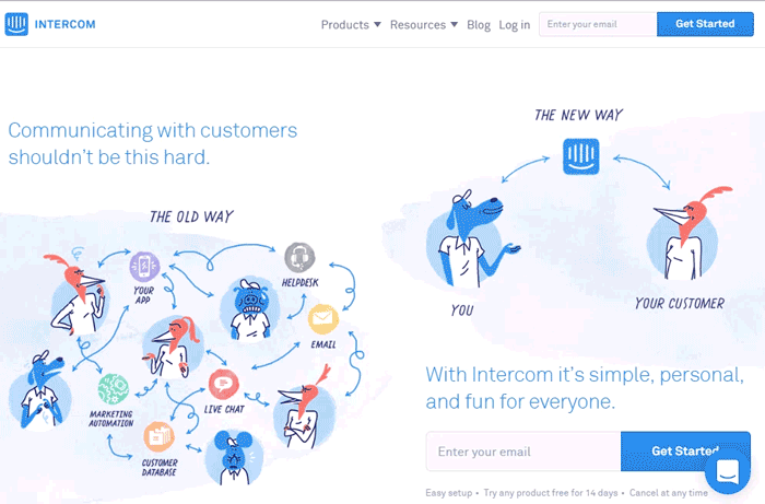
Intercom site is a good example of minimalism in web design: enough white space, funny and creative animations, friendly navigation, all necessary information. In short, see for yourself:
3. Conventional, not original
Creativity is to discover a question that has never been asked. If one brings up an idiosyncratic question, the answer he gives will necessarily be unique as well,
— Kenya Hara, a Japanese graphic designer and curator, founder of Hara Design Insitute.
It is a human nature to be afraid of changes. Indeed, all new fear us, but, at the same time, it excites us as well.
If to consider that the core of design is to find problem solutions, its advantage would be to make our lives better through beauty, fun, and inspiration. That is the difference between a good and exceptional web design.
Once you were stunned with something, it loses its power in course of time. Only babies laugh at a joke over and over again, but as growing up, they cease to admire by casual things and phenomena. The only way to catch their attention to them is to make people look at them from a different perspective.
So, when it comes to web design, the similar rules work. Originality brings some extra value to a website, and it often happens that this value transcends its primary purpose. If a creativity is an inalienable right of web designers, why do they use it so rarely? Especially given the fact that advanced technology simplifies the task providing more space for maneuvering.
I do not urge you to reinvent the wheel - it is enough just to improve it: to make it a bit firmer, more lightweight or, at the very least, rounder.
4. Knotty, not intuitive
Given all written above, you can see that it’s too easy to fall into the trap of creativity. In order to avoid such a mistake, always keep in mind your users when developing your website.
When something is designed to work beautifully, it tends to look that way too. Steve Jobs felt that design simplicity should be linked to making products easy to use.
However, minimalism is not equal to intuitiveness - sometimes a design can be sleek to use but unfriendly to navigate. Jobs considered the main principle of Apple design in making things intuitively obvious. And this was probably the biggest conceptual shift in the world of design of that time. Today, this principle is considered a matter of course.
Once, I’ve given my iPod to my grandma, who is 70 years old. I’ve just come back from a European trip and wanted to show her some photos. So I’ve given her the device and decided to look at how she would handle the task. Believe it or not, my old school granny has put on her glasses and next 15 or 20 minutes been flipping the gadget to view my shots. And this is both amazing and naturally at the same time.
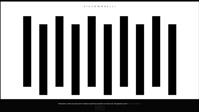
Seek to reach an intuitiveness when creating your website even if you design an online library for Oxford graduates. No one isn't likely to wonder through tons of extraordinary animations just to buy a pair of sneakers. Do not overshoot the mark like, for example,
Giacomorelli:
5. Product, not process
Perceiving a website as a fully completed result of the development process may be enticing, especially from a client’s perspective. “Hey, here is your pinch of a magic dust, just sprinkle your business with it and enjoy 10x profit boost.” Cool, huh? In fact, a solid website can really be some kind of a secret ingredient to your business but only if you know how to wisely use it. Otherwise, it will work as a one-off push at best.
I wonder that some people still consider websites as hamburgers: look appealing, smell tasty, cooked fast, cost little. Bought, ate, satisfied your hunger. But it does not work this way.
While a traditional product creation is a result of a linear process where we get a ready-to-use good in the output, a website developing is a process with a beginning but without end. Since a website can be constantly updated, developers take an opportunity to fix bugs and introduce new features. This makes websites something “never finished,” constantly changing, and, consequently, tending to perfection. This, in turn, means that perfection is not contemplated as such, and thus our conceptions of the ideal in the past have little place in the process of modern design.
If you have never heard about Kaizen, now is the time. This Japanese philosophy, first implemented after the Second World War, has since spread throughout the world and now is successfully used in web design. The idea of Kaizen is to be a continuous improvement over time.
Applied to web design, I can advise you to constantly listen to your website users, learn to use metrics (and, please, really use them), keep track of flaws, and provide constant feedback to your web agency to give designers a chance to improve their work.
My final thought: be wise, do research, and ask yourself how specific design decisions of your website reflect your business goals.
I am definitely curious what you think about each of those points and would love to hear your thoughts. So please, feel free to comment and share your experience.
View Comments