
Architectures excel at creating amazing structures, and for us as web designers, there is nothing more exciting than seeing this structures presented online in creative ways.
My name is Maria and I’m a UX/UI designer at Vintage. By this crash test, I continue the series of articles about the most outstanding websites in their industries. I have previously analyzed Top 3 Fashion Websites and 5 Best Gadget Websites, so now it's time to look closer at the best examples in an architecture industry. Selected below are some of the most awarded architecture websites that go above and beyond “template” decisions in usability, design, typography, and custom. A Jakob Nielsen’s 10 heuristics for User Interface Design will be a baseline to build on.
Enjoy!
Ortiz.Leon
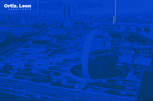
Main Page: When hitting Main Page, a user may be confused by a “Go To Home” button placed in the lower right corner of the screen - who knows where it can lead to as a user assumes they are already on the home page.
If to scroll down, you could see the first three slides that are actually banners welcoming to learn about Experience, Sustainability, and Vanguard. Hmm, any suggestions what they may mean? Let’s see.
Home Page: After scrolling down a bit, a user hits the home page. They can get it if take a closer look at the upper left corner of the website - the “Home” button is hardly visible. The page text is also poorly readable in a bright background.
Projects: In order to go to observing the project, you have to press either a “ Featured Project” button placed on Home Page or to scroll down a bit.
At the first glance, it is unclear where you actually are: the page seems to contain only the logo and a background photo filtered in the Instagram style. And only if staring at the page for some time, it becomes evident that there are some tiny inscriptions on it - names of the projects. It is unclear whether there are all the company’s projects or not - the website says nothing about it. Furthermore, a user may not get that the blocks are clickable - they lack some additional elements such as buttons or arrows which hint that you can move deeper to learn more about a certain project.
Project Page: A “Scroll Down” button is poorly visible (hint: you can see it in the upper right corner). Project Page contains a little information about a project. There is also unclear how much slides it includes. Moreover, a user should be able to read pretty fast in order to catch the description - web developers give a limited time to users for reading each slide.
After scrolling down, a user can see a clickable photo set. To get what it is, a user has to keep their eyes open - a small-font title “Related Projects” is, again, poorly visible and hardly readable.
Project Page lacks contact info.
About: The beautiful animation does not help - texts here are so small that it seems like the company owners do not actually want their users either to learn about the brand or to contact them.
Menu: Menu looks beautiful but chaotic. However, there is the only page a user can find a contact information but fails to actually contact the company.
Services: The font size is still too small to read. Pictures placed on each slide are meaningless and do not differ one from another.
News & Awards and Recognitions: News page offers a user to skim some latest news about the company and its achievements, such as awards, completed projects, or new offices opened. A font size of the text here is a bit bigger and, thus, easier to read.
As for A&R page, it contains names of awards gained by the company but lacks any additional information, such as dates, links, or photos. The scroll there is also a bit confusing.
Overall Impression:
Pluses:
- qualitative photos and pictures with a bold color grading,
- a lot of white space focusing on important things, strict and pleasant typography; a clever interplay of typography and content,
- creative scrolling decision.
Minuses:
- chaotic navigation here and there, unreadable font, too small font size,
- a lack of contact info, no chance to contact the company.
Despite all flaws, Ortiz Leon’s website is an elegant decision combining both smooth modern imagery of architecture constructions and an accent on sustainable strategies.
Score: 7 of 10
Level barvikha residence
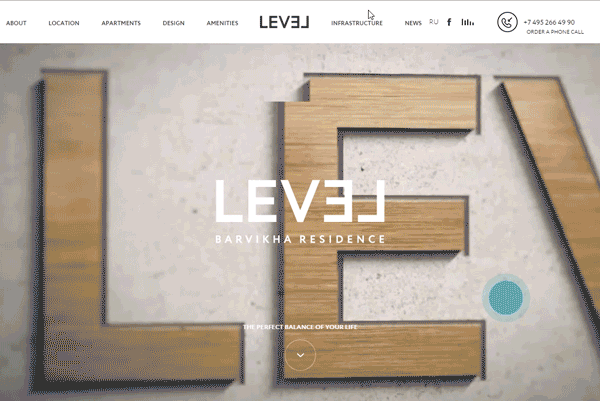
Main Page: First, Main Page video is not looped. Second, when hitting the English version of the website, a pop-up offering to contact with a company’s consultant is still in Russian.
The video does not give an understanding what the company actually does and what kind of product it is going to familiarize a user with.
A scrolling button is well visible. Also, there is a strong call-to-action - “Order a phone call.”
After scrolling down, a user hits the second page which is perplexing enough - if a user did not get what the website is about, this section may confuse even more. And content there explains nothing. What is “Nature”? What are “Technologies” about? Instead of answering these question, a user is offered to see a video with a happy dog running through a forest. It looks inspiring, but still. Oh, there is a “More” button which reveals itself to the most watchful only - the bright type color makes it invisible on the bright background. If to switch between the sections, the button looks like a downloading element - in fact, it indicates a downloading progress of the section video.
Each section has arrows (and the same “More” button for selected users only) offering to go deeper and learn more about a building.
Amenities: No matter which of the “More” buttons a user clicked, they hit the same page called “Amenities”. It is confusing and brings some inconsistency - it would be more logical if a section called “Nature” leads to “Gardening” or “Nature Materials.” However, if to browse the website a little bit longer, a user can see that arrows beneath the slides’ texts lead to corresponding amenities.
In some sections, amenity names are difficult to read.
The sections light up when hovering, but a user may not guess that they are clickable, not just beautiful banners - no hints, no buttons, arrows, or other elements alluding to an existence of inner sections. There is also unclear how many slides there are and when scrolling will finally end - this website seems to be a real web labyrinth.
The call-to-action is ubiquitous - the “Order a phone call” button is placed on each page of the website. If to hover on it and wait for a second, a small-font hint will inform a user that a call is free, estimate how much time they should wait for it, and give a hint of how to fill a call order form. Moreover, a user can choose a convenient time to receive a call - a great example of a client-oriented service. On the other hand, if the form is filled incorrect, nothing happens - the website does not inform a user about mistakes made, provides no information how to fix them, and the “Order a phone call” button does not respond on clicking.
About: Due to the bright color of background pictures, banner text is almost invisible. Anyway, it is not very informative and provides no information about where a user will move when clicking any banner.
Location: The page offers a full-screen map, so to place a using description on it was a wise decision. You can also see where the facility is built, although as just a point on the map because it shows no address. The question remains open.
Apartments: As for me, this is the most obvious and user-friendly section. The only puzzling element is a button in a form of a balloon - although it is not clear at the first glance, it redirects to a tab with a 360-degree photo.
A considerable plus: when interacting with the elements, a user can see which apartments/parking places are free and what is the total area of a selected flat/parking place.
Infrastructure: This section is designed and elaborate probably the best. Everything is clear, each step is evident and intuitive. Nothing to find fault.
Overall Impression: On one hand: beautiful design, a presence of all necessary information, strong call-to-actions on each page.
On the other: a quite chaotic navigation.
Nevertheless, attention to details is the hallmark of Level barvikha residence’s architecture website.
Score: 7 of 10
Villes & paysages
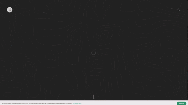 Main Page: The website has no English version.
The first section tells about the latest company news and awards but not about what Villes & paysages does, so it implies that either the brand is well-known or a user entered the website knows what they are looking for.
The hidden menu is not the best decision because a user cannot immediately move to a desired section.
When scrolling down to the next section called “Our agency,” a user first sees a beautiful picture which, however, does not explain what kind of products or services the company provides.
Interactive buttons below offer to explore the website further.
About: A background picture here is similar to that on Main Page, the only difference is that it is non-clickable here. This seems confusing.
Projects: This section is beautifully designed but does not show a name of a section a user hits. There is a division into projects and an option to observe all projects - it is a plus. A button leading to a particular project is poorly visible - it is a minus.
A great option of project filtering, but it is impossible to choose two or more filters at once.
Contacts: There is a separate section for contact information - it is a plus. It contains a personal mail of some Lyon, so website users cannot know whom their email will be sent to - it is a minus.
Overall Impression: Main Page design is fresh and interesting: the qualitative background video, unhackneyed navigation map, a stylish pattern on the background being visible when switching between sections.
Score: 9 of 10.
Here May Be Your Website
Vintage believes any successful business deserves a website of the same quality. We are always eager to help with that. Reach out to us and let your clients enjoy their online experience when browsing your new beautiful fashion website.
View Comments