
From a specialist’s perspective, it can be very interesting to look at the most outstanding websites from a particular industry to see how they correspond requirements of this industry. In the fashion industry, fashion companies tend to build their brands on trends, creativity, and freshness, so one could expect to meet the same when using their websites either.
At this article, Vintage designer Alex Ivanov and UX/UI specialist Oleg Karapuzov analyze 3 award-winning fashion websites in term of a quality of a design aesthetic, content, usability, and creativity. Sometimes it happens that, during an analysis, a stunning at the first glance website may fall into a usability pitfall or, vice versa, to climb out of the design simplicity list thanks to a thoroughly elaborated customity. Let’s look how the best design for fashion websites cope with these challenges.
Bouguessa
 Bouguessa is a great example of female fashion websites. However, does the brand site reflect its straight-lined garment design with elegant sophistication?
Main Page: The website download speed is pretty low. When hitting Main Page, the first a user see is a banner proposing to jump to the latest Fall Winter Collection 16-17. However, the button “Discover” is designed similarly to the collection. Not the whole banner but only the button and caption Fall Winter 16-17 is clickable.
There are no signs pointing on further scrolling and that there is more information below. A subtle visual cue, such as an arrow pointing off-screen or a copy “scroll down”, can inform users that most of the content is available below the fold.
The navigation bar is hiding when scrolling down and appearing when scrolling up. Another secret is that it is unclear why the navigation includes a burger menu if it duplicates an upper menu.
Too much white space. When hovering photos, there is no interaction. The first guess that they have to redirect to Product Card, but no - they lead to Collection Page which is a bit confusing.
The first question likely to appear on a user’s head will be “Where am I?”
If one guesses there is a scroll option, they will jump to the Our Identity page, with a brief description and a good background video. Below, you may see items to buy which, though, lack a price.
Scrolling down, you may see a journal article with a stroll call-to-action “Read” and Instagram.
Collection: When hitting the Collection page, the navigation disappears, as well as the Bag icon. That means that a user does not understand whether it is something in Bag and ponders how to move back.
Shop: There are only two filters: type of clothing and collection. For a clothing shop, it is not enough, as customers like to customize their listings. For example, to choose color/size or to sort by popularity/price.
When hovering an item, a photo darkens, and “+” appears. However, nothing happens, no interaction.
A “+” symbol often associates with adding to Bag. But an interaction here is different - moving to Product Card. It is confusing.
Product Card: Throughout Product Card, there is a problem of missing navigation and the Bag icon.
Although photos seem qualitative, they lack a zoom to examine the item and its material in details.
A considerable plus: breadcrumbs throughout the website do not give a user to get lost.
Minuses:
- when changing an item color, it is not changed on a photo
- no a “Favorite” option
- there is no hint when hovering the arrows
- no an item description on Product Card - instead, it opens in an additional window.
Bag: It is hard to understand how to remove a selected item. Usually, it can be made with “X” or “Remove Object” button, but here, a user has to think well to delete an item.
Purchase: Everything looks great, except for an unexpected extra delivery fee.
Overall impression: Despite some flaws, it is the great e-commerce website that gives a feeling of freedom: enough free space (somewhere, even too much), a full focus on clothing, a strict black and white color scheme.
Score: 7 out of 10.
BB Dakota
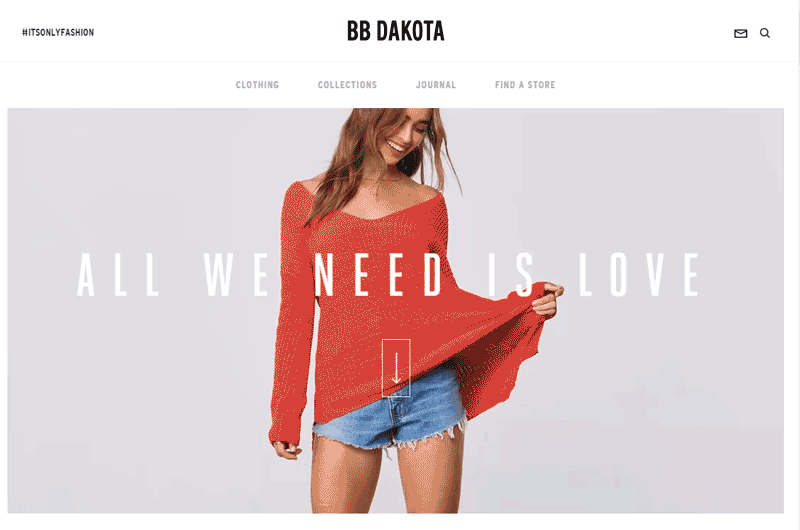
Main Page: When hitting Main Page, the first thing to notice is a video offering to scroll down. It is unclear what a video inscription means and where one will move when clicking it. Also, there is no call to push the video, so a user will likely to simply scroll down. But in fact, the video leads directly to Collections.
The confusing thing is an envelope in the upper right corner of the website, although when hovering, a hint appears.
When scrolling down, one expects to see a continuation of the picture theme, but instead, hits a blog. This section is beautifully designed but has one mysterious element - a “+” sign on the clothes. When hovering the “+”, there is no hint of what it is for and why to click on it. Also, the scroll sign disappears.
Only after scrolling off this section, a user turns to the theme set on Main Page. Here a user figures out that those video inscription meant the collection name and sees an “Explore the collection” button. Actually, it may confuse a user - this section would rather be right above the main video.
When continuing to scroll down, a user hits another collection with a few non-clickable banners. They set the overall mood - we see Instagram photos of stylish girls dressed in street-style clothes. Here is another “gap” - when hovering the photos, they are moving but lead to nowhere.
The website finishes with a strong call-to-action to subscribe. But again, it is not pretty clear where the arrow to the right of a field leads - to subscribe or to move further.
Dynamic grid: the sections responding to the blog and products are standardly designed but the location of photos/individual elements are chaotic. The typography is awesome, the color palette is strict.
Catalog: The website does not allow a user to view all items at once. Even choosing “Shop the full collection,” the website requests to move either to collections or to subsections. And when moving to a particular collection, the page lacks filters and item prices.
The main filter offers to choose either a clothing type or a material. But what if a user wants, for example, a leather skirt?
The listing has a substandard filter “Vegan Leather” - some users may be confused, so it would seem logical to explain.
When moving to a certain category, more filters appear, but there is still no option to sort by material and size.
Still no prices.
Product Card: The are a slew of great shots, it is good. A user cannot view them one after another, it is bad. No price. An element “fit: true to size” is confusing.
But the biggest inconvenience is an inability to buy something - the website is designed just a catalog. Even given the fact that all the items are branded, different product cards redirect a user to different online stores.
The website perfectly fits marketing - it sets the mood, tells the story about the clothing. But, at the same time, it is non-custom and does not allow to make a purchase.
Overall impression: It is a well-designed catalog, not an online clothing store. Also, as you may see in the screencast above, a download speed is just killing.
Score: 6 of 10 as the purchasing turns into a quest.
Adam underwear
 It is one of the top men's fashion websites that make you be obsessed with underwear.
Main Page: The first thing catching the eye is a photo of a man with a lipstick and colorful bottoms.
The text is small and people tend to avoid reading on the Internet.
A minus: in order to find a navigation bar, a user has to click a “Menu” button.
When hitting the second section, a user may think that the boxers banner is not an advertising but an acquaintance with one of the website’s clients. A “Check me out” call-to-action is not highlighted so a user may not understand that they are requested to move to Product Card.
Banners lack CTA like “Go shopping.” The blog posts are designed similar to the product cards.
Then, the website offers a user to familiarize with the brand advantages but does not motivate a user to hit Product Card.
Generally, the website is pretty interactive, with a bunch of colorful photos and funny gifs, but it gives an impression of an entertaining website about men in boxers rather than an online boxers store.
Catalog: The navigation is poorly developed: a user hardly understand where they are.
No prices.
Filters are placed uncustomary. The catalog lacks a sorting: by popularity, new or price. Also, there is no information about a number of items in the online store.
When using filters, a user does not see which filters were chosen.
Product Card: No information about a material a selected item made of.
A user needs to guess what the number “1” near the “Size” means. Also, it is not clear whether an item has additional photos.
The inscription “Free delivery in the Netherlands” is a bit confusing. What about other countries?
A button “Buy Me” activates only after choosing a size and does not react on clicking before - a user may think it does not work at all.
The size guide includes only size table and does not provide any information about proportions.
A product description is placed along with a photo of another item and a “Read more” button leading a user away from a purchase.
Bag: Everything looks good except “Free delivery in the Netherlands.” Remember?
Purchase: It is unclear why a delivery costs 25 euros while a user pays only for a selected item. A plus: the page has a field validation and offers a user to create an account.
Overall impression: The design decision is pretty bold. The website captivates with its beautiful design, but the same design distracts from the purchase and encourages to continue browsing the website instead of buying boxers.
Score: 7 of 10 for its very creative design.

Vintage believes any great business deserves a website of the same quality. So if your successful business still does not have a stunning website, think, maybe it is time to take the bull by the horns. We are always eager to help. Reach out to us and let your clients enjoy their online experience when browsing your new beautiful fashion website.
View Comments