
How often do you buy gadgets online? Do you face any challenges when browsing online stores? I bet that after observing this review of the best gadget websites, you will buy gadgets more frequently and with a more pleasure.
Hello, my name is Maria Kokovina and I am a UX/UI designer at the most awarded web agency in Ukraine, Vintage. In this article, I am going to scrutinize 5 world-class gadget websites from every angle and to figure out whether they are really the best in terms of user experience. A Jakob Nielsen’s 10 heuristics for User Interface Design will be a basement to rely on.
So let’s get started.
BoomBotix
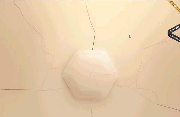
Main Page: A website is downloading pretty slowly.
The first screen with a beige pentagon on it (it is actually a gadget but it is not very clear from the first glance) what it has almost no text and other elements, so a user should think what they have to do. When they try to hover, it becomes a bit clearer - an arrow and inscription “Unleash” appear. After scrolling down, the beautiful animation changes and the next screen with a product appears. However, there are no call-to-action, hints, or indications of an existence of a content.
If a user has got to scroll down, they hit a second section which seems more obvious. Figures revealed in the left side point on a website navigation, that, when hovering, show which sections a user will reach if press. The text there is a bit small and may be hard to read.
This second section familiarizes a user with the gadget and its main characteristics. In order to examine the item closer, the website offers to scroll it down and gives a cue to drag the element.
The call-to-action may be poorly visible for a user as it is placed in the lower right corner while the main content is in the middle of the screen, and the navigation - left.
The next sections continue to familiarize us with the product advantages. If to use a menu section, the part of the content is automatically scrolled down. For example, a user skips all photos of the speaker or the part of a “water resistance” section.
If a user wants to buy the gadget, they will be redirected to a manufacturer’s website offering to choose one of the speakers available. Notably, a price there differs from a price pointed on the website, and this could confuse a user. When choosing the speaker of a particular color, one is also being redirecting to the manufacturer’s website offering to select a product again instead of the checkout.
Also, the website constantly shows photos of a golden speaker that is not available for sale, which can negatively impact a user’s buying decision.
Overall impression: The website perfectly fulfills its function of familiarizing users with the gadget and to make them want to buy the product. It is interactive and visual, but, at the same time, does not allow to buy the advertised product and offers the false price, lower than at the online store. This may create mistrust to the company.
Score: 7 of 10. Beautiful animations but a content mismatch.
Beoplay
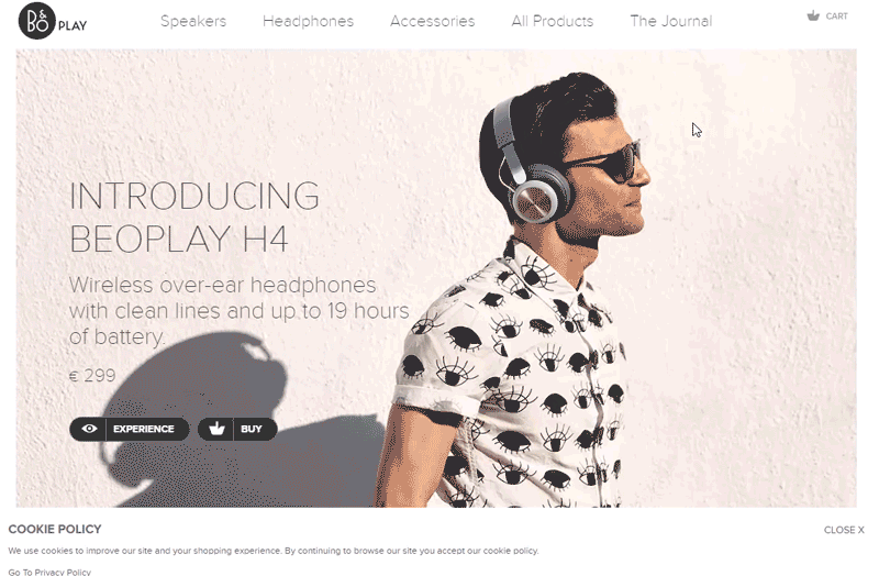 Main Page: This is a great example of how to design the first page of a gadget website - a user sees a product, its description, prices right away and is proposed to proceed to explore the product.
A precise website navigation allows to immediately go to the products of interest or popular items from different categories.
A good footer: using it, a user can jump to any section available. Everything looks clear. The key buttons like “Find Store” or “Newsletter” are also clearly visible.
Catalog: The catalog looks and feels pretty good. It includes filters and subfilters, a few could be used simultaneously. Product cards include an option to select a color of an item. On the other hand, there is no option to sort items by price or popularity.
Also, it is possible to instantly purchase a selected item.
Product Page: The first section looks good but lacks information about key product characteristics. Further, there is a lot of hardly understandable description about the process of a headphone creating, unique design, so a user has to scroll down a lot to see product characteristics.
Bag and Purchase: The page also looks good. Except that, as Nielsen Norman Group advises, it makes sense to divide Bag and Purchase Form to achieve higher conversion.
Journal: The website offers a user to go deeper into a product exploration - the amazing blog section looks like a real media. There, you can listen read some informative articles about fashion, music, art, photography or listen to podcasts. The only flaws I’ve noticed are a pretty small type size and a lack of an option to go back to the main page.
Overall impression:
Score: 9 of 10.
Petcube
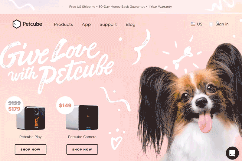 Main Page: Petcube is a great example of a gadget website - each website page is based on AIDA principles (Awareness - a consumer becomes aware of a category, product or brand; Interest - to interest a user by telling them about brand benefits & how the brand fits with lifestyle; Desire - to develop a favorable disposition towards the brand; Action - to lead a user to purchase).
The website familiarizes a user with a product from the first seconds. It gives a social proof by pointing newspapers wrote about Petcube and goes to a description of the product advantages and characteristics. A clever idea: to use both photos with cats and dogs in order to sweep away the discussion of which pets are better.
At the bottom of the page, a user can see an Instagram feed with real comments/photos of happy pets and their owners. An additional social proof - every few minutes, a pop-up window confirming the item purchase containing a buyer’s name.
Product Page: Product Page includes an item description, videos, characteristics, advantages description, additional items to buy with a product (“Meet the Petcube family”), and strong call-to-actions everywhere around a page. A section with customers reviews is an integral attribute of nearly any website page.
Petcube Blog: The website has a separate page for a blog with funny thematic articles. There are also an option to select one of the topics available and to subscribe.
Overall Impression: Each page of the website is designed in a landing style and looks great. Aesthetic and minimalist design. Qualitative friendly photos and videos, a sufficient white space. The text includes all necessary information - nothing more, nothing less.
Wherever a user is, they can see a direct call-to-action: Shop now, Buy now, Subscribe, Pre-order, and so on.
There is also a button to start a conversation with Petcube that as if says “Hey, friend, no worries - if anything goes wrong, immediately write us and we will help.”
Overall impression: After visiting this gadget website, I really wanted to buy this quaint thing. And who cares that I have no pets.
Score: 10 of 10. Good job, guys.
Aiia
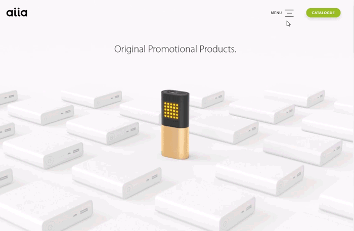 Main Page: An illustration and a title on it immediately explain where a user hit. A clear menu, a green “Catalog” button, a notable “Explore” arrow - there is everything to get a user rid of a need searching, tangling, or even scrolling down. Such a navigation fits perfectly both those who are new to the brand and those familiar with products it offers.
After pressing the arrow, a user hits the second page familiarizing them with the product. Here, a user can also see a familiar green button. It will appear throughout the website.
Wow-effect. A straight call-to-action. Social proof. “Get in touch” form.
Product Page: A “Products” page has an option to filter items by best sellers and category. However, there is no possibility to choose a few different filters at once.
Item photos at Product Page are high-qualitative, beautiful, and well matched. The single scroll button is everywhere, so a user already knows what to do next.
An item price placed on Product Page seems to be starting one, but, when hovering, a user can see a hit explaining this price includes. A product description, technical specifications, a set of different item colors and sides - there is everything to answer any questions a user may have when exploring the website.
If to scroll down a bit, you can see a “Get Quotation” section which may seem at the end of the page. But not - there is a social proof beneath.
Catalog: When pressing the “Catalog” button, a user is offered to fill the form to receive an original catalog via email. Also, after filling all the fields and pressing “Get Catalog,” the form is refreshed and a confirmation “Done!” appears. However, there is still not very clear whether a user should get the catalog via email immediately (I’ve checked my email in a minute - nothing). It is important for a system to get some feedback in order to give a user a chance to understand what is going on.
Filed hints give the cue if and where a user errs when filling a particular field. That's good.
Clients: A page offers to read comments of real people with good profile photos and occupation descriptions. Each comment includes a large beautiful product photo. Also, there in an option to switch between reviews using arrows on both sides of the section.
Scrolling down, a user can choose to go either to “About Aiia” or to review the brand’s awarded projects. Actually, each page leaves a user a choice where to go or what to do next - this is a so-called permanent user flow.
Overall impression: Fresh, with taste, user-oriented, elaborated - this is probably the best website for a tech startup. It looks rich despite the fact that it was made by Vintage for a moderate price.
Score: 10 of 10.
Carv
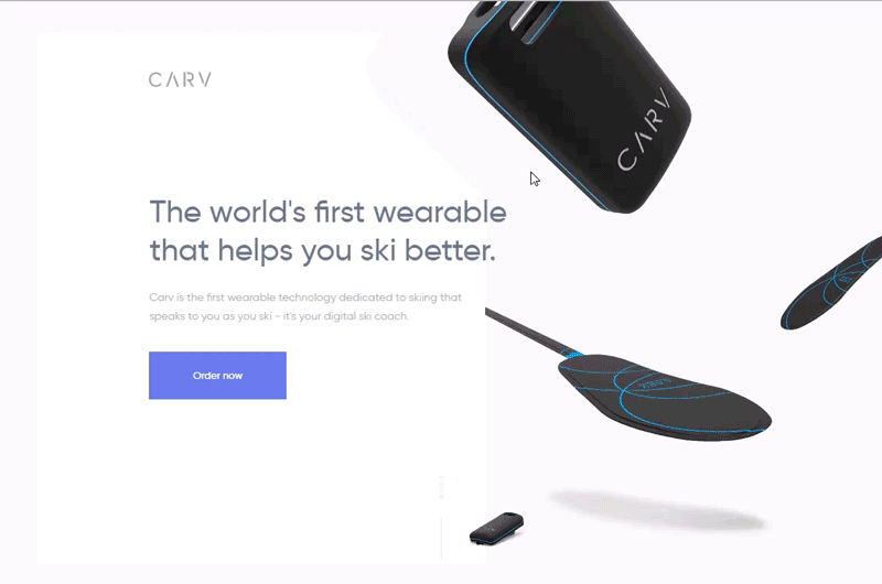 Main Page: A website is designed as a landing page.
Carv website instantly gives a clear understanding of what it sells. CTA is distinct, visible enough, and responsive when hovering - it’s a plus. A lack of navigation or a hint to scroll down so a user could not guess that there is something more on the website - it’s a minus.
However, even if they try to scroll further, a navigation does not appear so there is not always clear where they are and where to go next.
Inner Sections: The site is well-animated, the content is dynamic. At the same time, a section “Explore more features - The Press” does not respond on clicking and does not redirect to original publications.
A user will not find any information about guarantee and delivery - this website is simply lacks it. It may negatively impact a brand trust.
Moreover, you can see a repeated mention about an application. However, you will likely not to know how it calls, which platforms it is build for, how to download it, or how much it will cost you.
The button style, and Flat Web Design generally, “tends to sacrifice users’ needs for the sake of trendy aesthetics,” as Nielsen Norman Group writes. In other words, flat icons poorly motivate to pressing rather than 3D and rounded ones.
Bag: A button “Order Now” is placed on the website only twice: in the first and the latest sections. It means that if a desire to buy a product appears somewhere in the middle of the site browsing, one needs to scroll down to either the bottom or the beginning of the website. Wherein, a bag icon is present throughout a scrolling, but, when pressing, it opens a checkout pop-up window. Oftentimes, Bag does not associate with a “Buy” button but rather some website section where selected items are being stored. Here, Bag works as the “Buy” button, so it makes sense to design it also in a style of the “Buy” button.
Overall impression: En masse, the website is pretty good. Most elements are dynamic and cope well with familiarizing users with the products. On the other hand, the site lacks navigation, and the button “Buy” hides somewhere behind the bag icon.
Score: 7 of 10.
Here May Be Your Website

Vintage believes any successful business deserves a website of the same quality. So if you still do not have one, think, maybe it is time to take the bull by the horns. We are always eager to help. Reach out to us and let your clients enjoy their online experience when browsing your new beautiful fashion website.
View Comments