
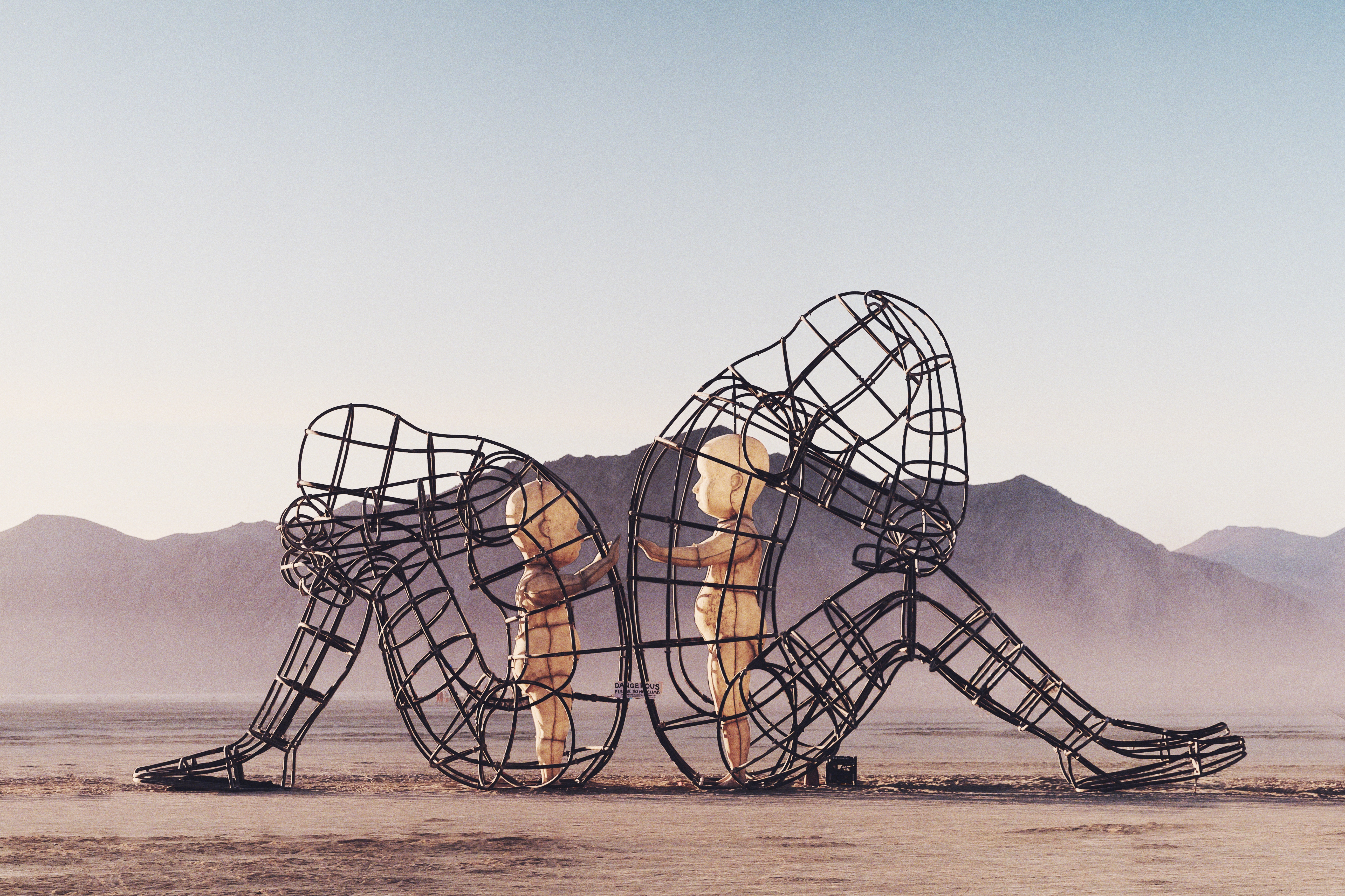
Festivals usually last from few days up to a week. Millions of people in the world annually plan their holidays around festivals. Sziget. Burning Man. Glastonbury Festival. Rock am Ring. Lollapalooza. They are all part of the globalization. They give people a break from reality and immerse them in the vibes of freedom and inspiration. They bring obscure destinations to prominence and they boost economies and stimulate tourism. For some festivals are a religion, for some festivals are an occasional adventure.
But it all starts with a website now. The festival website that renders the spirit of the event. A proper festival page makes one drop the world and get the tickets to the gathering. It is your preview, your spoiler, your trailer, your guide, your photo album, your booking engine for the event.
Why designing a festival webpage is a coveted mission for creative teams world over?
There are little possibilities in website development as creative as designing a festival website. Here’s why:
It only lives for a year, so it has to be on top of the trends in web design. In fact, it has to be ahead of the trends, as by the time it goes live, the web design trends will have changed.
This very website domain will have a completely different face by next year. Unless it is kikk.be. Then you just put a year after the slash and keep ‘em all. Festival web design is ephemeral and transcendent as art itself.
Any festival is a gathering of people of creative nature – so the whole occasion is charged with creativity, freedom, talent, inspiration, and innovation. You have to render it through every means available in web design – in prototyping, design, front end, back end, animation.
No uniform solution is the best solution. Yes, you have to have some basic info on the festival website, and the website has to sell tickets too. But the more unorthodox a design is created for a festival, the more precisely it renders the spirit of the event. The more tickets it sells.
All festivals have a distinct personality. The location, history, genre, line-up, memories of the last year. It all boils down to a unique mixture overflowing with emotion, vibe, sentiment, excitement, and drive. The design of a proper festival web page has to be crazy enough, offbeat and unexampled to invite an innocent passerby’s to drop the world and join the fest.
Festival websites 2017 Vintage Team love:
We have asked 3 of our experts to choose their favorite festival websites and say what they love about them. They all speak from the standpoint of what they are experts in: we have a UX Jedi, a Creative Director, and a Motion designer speaking on their favorites. Hear what they have to say on some beautiful hand-selected specimens of festival website design:
Head of UX Department @ Vintage Web Production, Oleg:
[impressed by the Parklife site]
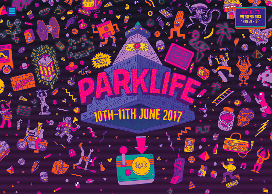 Image source: parklife.uk.com
When it comes to festival webpage design, the main purpose is, as always in any business — to get a user to buy. In this case to buy tickets to the gathering. But.
What makes designing a page for a festival different, is that you have to have a WOW. You’ve got to get ultra creative. You have to provoke and tease and excite. Sometimes even at the expense of breaking some orthodox universally-accepted laws of UX or purposely overlooking web design standards.
Because when it comes to festival website development — you are selling an emotion. A sentiment. Ecstasy. Joy. Elation. So rules can be ignored — as long as the user gets excited enough after checking out the line-up & venue to get the credit card out and click the “Tickets” button.
This is actually what I notice in some festival UX — the rules get broken or explicitly overlooked — and being sacrificed on the altar of emotion. And this is the exception, which proves the rule. This is a cunning gimmick, that adds to the level of emotional elation, which at some high enough point is converted into good old hard sell of the ticket.
The psychedelic design of the Parklife site is out of this world. I found its design quite a bright example of good UX for a festival website. When you open the page, you see a bright screen with plenty images of culturally significant personages and items.
Even though one could argue the first screen is about design in this case, rather than UX — I would dare to disagree. Even though design plays a major role, there is a lot of prototyping work on the first screen. A lot of persona study work. Heaps of psychological immersion into the target audience.
Yes, your eyes open up to the whole world of bright images — but they all are the culturally saturated characters. They are icons, that are dear to the hearts of so many generations. They have been a part of formative years for many. You get a Robocop, Jar Jar Binks, light sword from Star Wars, Terminator, game boy, alien, Hulk Hogan, Time machine. You get a whole mix of culturally compelling figures and items, that stir up the feeling of belonging to many. Belonging to a cultural layer, to a generation, to a crowd of like-minded individuals. This is UX. This is good UX. This is knowing your buyer persona.
When you scroll further from the first screen, UX seems to be too well-targeted and precise. You get a line-up of artists in chewable blocks as you scroll. You get a video, also styled in line with the overall design of the website. The video further immerses you into the ambiance and cultural layer of the fest.
As you scroll away, you end up at the upsell section — the VIP zone upgrade. It is flashing and flickering with neon lights and conveniently located at the bottom of the page — the user has no other option but to click. Great UX indeed. Off go your VIP tickets.
When I get a new project onboard, I always put the user’s shoes on and start a journey to a perfect sell. I study the product, I learn the target audience, I vivisect their pains and gains, I almost physically feel their mood. This is the reason I can't wait when Vintage gets a festival web design project onboard. To walk in the shoes of a festival goer.
Creative Director @ Vintage Web Production, Olga:
[impressed by the Kikk festival site]
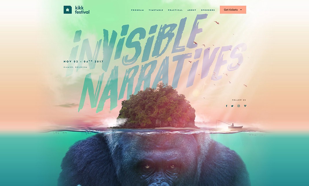 Image source: www.kikk.be/2017
Kikk festival has been setting trends in the festival web design for few consecutive years, producing Awwwards-winning sites year after year. I remember the first Kikk webpage I saw was the pink & gold 2015 design. It was rather ground-breaking for the time with the pastel pink color palette, the bold fonts, and the hover effect animation used.
The 2016 design was just as revolutionary again. With the bubble centerpiece reacting to the move of a cursor and the funky glitch effects used for the speaker images — the site again was a mesmerizer and an inspiration for many in the web design industry.
With 2017 Kikk yet again surpassed the expectations and managed to come up with an avant-garde design, that is cutting-edge novice and mind-broadening. The web designers chose “substance over form” approach. And at the end of the day, the approach was indeed a win-win solution for both — the form and the substance. As the designers seemed to have concentrated on the idea, that the substance, that lies underneath the form is at the core and should get as much exposure and attention as the form.
So they took that underwater world metaphor to render the message. You first glance at the island and the INVISIBLE NARRATIVES message. And with the first scroll of a mouse, you know exactly what they meant — as you deep dive into the underwater world, pretty much invisible from the first sight and so much unexpected, based on what you did see at first.
There is no such thing as too small detail in the Kikk 2017 website design. They all play together wonderfully and are there with the purpose to bring forward the idea of creativity, that the festival is there to nurture. The underwater gorilla, the fisherman, the birds in the sky, the fishes, the bubbles — they are all there to convey & persuade. They are there to convert the user into the festival attendee. As you scroll the Kikk site — you see the concept coming to life with every nuance and each element. I personally loved how the speaker images have this underwater movement animation effect. The images get slightly distorted as if they were placed under water and the waves magnify the image as they come in and go.
I find the execution of design truly smoothly integrated into the concept and idea beneath it.
Overall, when I think about festival website design, there are quite a few examples worth a favorable mention. Even when you navigate web design awards, festival web pages are quite often nominated and awarded. And this is not surprising at all — as a festival is a gathering of the best of the best. Be it a movie festival, music festival, digital festival or some marketing festival — you get creme de la creme of the industry attending those events and you get top industry leaders speaking and sharing their expertise and mastery. So naturally, there are no half-tones in website design for festival either. You’ve got to have the level of quality, message, design, and creativity to impress the best.
And this is the reason I, as a Creative Director of Vintage Web Production, would be interested to design a festival website. I would be thrilled to be tasked with the mission to vivisect the history and essence of the niche, to deep dive into nuances of the trade, to ascertain the pains & wants of the attendees — to create the picture-perfect design — yet such, that reinforces substance of the festival.
Motion Designer @ Vintage Web Production, Svetlana:
[impressed by VR Arles Festival site]
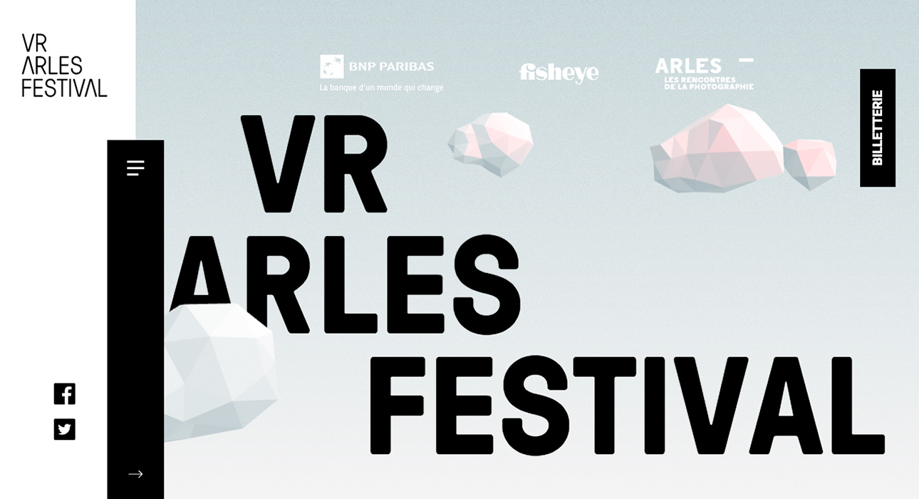 Image source: www.vrarlesfestival.com
Wow! I loved the site overall and definitely, huge kudos and my utter admiration go to motion designers who worked on VR Arles Festival. In fact, WOW is the word people say, when they see a website with fine elaborate motion design. The WOW effect is the ultimate goal of a motion designer. A great motion design is like a balancing acrobat — it has to balance between entertainment and function, it has to be the attention-grabber and yet weigh as little as possible for faster loading. It has to capture, direct, and reward a user for every move of a cursor.
In fact, 80% of the motion should support design and usability of a website and only about 20% is ideally serving WOW. This 20% of animation is there to make a user’s jaw drop.
With VR Arles Festival, my colleagues truly did a terrific job. The first thing is the polygonal sphere. It is there as the centerpiece of all pages. It is different on every page with distinct animation effects. Here it's exploding into pieces, here it's rotating around its axis, here the cluster of them is moving away from the center into different directions. It’s awesomely executed and all this animation is being controlled by a user: once they start scrolling, the centerpiece object starts interacting.
The stylistic of animation is consistent throughout the website and echoes the design overall. What is important, is that it complies with the 12 basic principles of animation. For example, we can see “slow in and slow-out” effect in action here. This makes the movement more natural, smooth, and less robotic-like.
The animation effect used in the name of the festival is rather laconic yet directs the user’s attention to the name of the fest so that to inform about the “what” of the page right away — first things first. Then in just a few more seconds, further info appears on the screen and a user can go on scrolling and click away to find out in detail about the “what.”
The vertical menu bar is also skilfully animated — it reacts to the user scrolling down: so the menu bar then shrinks into a burger menu.
The hover effects throughout the entire website are too fine, unobtrusive, rewarding for the user.
I really liked the simple yet effective idea on the bottom banner execution of the message fill in the form: when there appear letters in the box being typed out an invitation to repeat the action for the user. This is instead of conventionally putting a box in a different color, that is traditionally perceived as a field to fill in. This is brill.
What is unique about this particular example is that unlike in most of the pages, designers created animation effects for all the pages, not only for the home page. Really seamlessly incorporated animation due to the transitions effects between the pages.
The implementation of the timeline is also worth a mention. It acts like a chest of drawers when all info is on one page and a user needs not to sweat and scroll away. The user just needs to hover and click. When you hover over the time point on the timeline, a point gets encircled, giving the user idea of the shelf with more info on it. And when you click on it, the circle becomes even bigger, highlighting the days you are looking at.
I was checking out OFFF Barcelona recently. An event I would really love to go to myself. This is one of those festivals, that is of interest to my web design colleagues and of course, the expectations to the quality of the website are high. I could see an event like that having a website with a story layer to it. A story that mesmerizes the user to the extent, that even an uninitiated idle cyber surfer would want to get there — just from looking at the coolness of the website. Like this captivating example of a layer of story interwoven into the website by Tiffany — where a user is taken on a journey to a winter fairy tale.
This is what I find enticing about festival website design: the extent of creativity it allows for. With festival web pages you can let your imagination loose. Go wild. The more creative the design of your festival website is, the more tickets are likely to sell, whatever the price.
Vintage Team knows how critical a world-class design of a festival website is to the success of the event. Got an event coming up? Drop us a line to see how we can help you capture your audience, make them put their lives on hold so that to start living a dream on your festival.
View Comments