With $3.3 billion pledged to Kickstarter projects alone, crowdfunding is to a start-up as meth was to Walter White – the readily-available means to an end with some risks involved, but who cares at this stage? The platform is in the Alexa 500 top global ranking and boasts 13.6 million backers with success rate of massive 35.8%!
Small companies use crowdfunding, big players market on Kickstarter, individuals use Indiegogo for their art projects and nonprofits address them to meet annual budgets. There is adrenaline, there is gold rush, there is FOMO and social proof all in action on crowdfunding platforms like Kickstarter and Indiegogo.
While preparing for the campaign, aspiring millionaires face zillion questions: how?s and if?s and what?s and why?s. One of such questions is as ambiguous as chicken and egg dilemma: whether to first kick off the campaign and test your idea prior to making any major investments – or to create a website prior to launch, so that to cease momentum right away, if the idea is well-taken.
We, at Vintage, believe the website is a must for any tangible product, that is going to be mass produced after the campaign. At least for any project with a funding goal of $10.000+. To find out why just keep scrolling.
If you are not online, you don't exist
We could not locate the author of this wisdom - but isn't it characteristic of the online era? It is now used in a dozen of articles, go figure who was first. What is also characteristic of the Era is the blink-of-an-eye-short attention span of User AKA Client AKA Backer.

If your potential Client searched for you online - you’d better be on the first page of the search there to convert. Or else, there is a dozen of very attractive site previews fighting for his / her attention right there on Google, Facebook live push notifications jumping on top of the screen and somebody really fun going with an Instagram story.
Ooops, off goes your potential client.

Business without a website is like a person without a Facebook account. Even that dear friend of yours who has not yet registered on Facebook. Don't they just feel queer? They may be super nice and kind and caring. Despite all odds, they will even congrat you on your birthday. But they just feel one tad bit queer. And you can't really help feeling funny about it.
Even a small company may look like a multi-million corporation. Online
True? Indeed.
Your startup may be based in a garage or renting desk short term in a coworking space in the suburbs. But if you invested few grand into a website you may look like you are taking up a top floor of furnished offices with 360-degree views of Manhattan and its surrounding areas.

If you invest $25+K though, it may appear, that you are taking up the entire skyscraper, not only the top floor.

If you go in the $50+K range, you will give the impression as if you were the one who traded entire Manhattan from the natives.
With $100K+ website, you totally come across like the sole proprietor of the entire Silicon Valley.
Long story short - the bigger the budgets, the more chances you have of looking solid online. But, quite honestly, there are ways to come up with pretty decent pages at a rather low cost. That is if you are not aiming at premium segment or best-in-niche status.
Why have a website BEFORE you launch your Kickstarter campaign?
Well, there are 3 main reasons and a myriad of minor ones, 3 major ones being:
- credibility
- credibility
- credibility
Indeed, credibility is important for any business. But in crowdfunding - this is THE factor that either makes it or breaks it.
This is why you coin a funky non-existent easy-to-remember name out of 4-5 letters - so you get an available domain, that raises your credibility.
This is why you try and put as much about your team as possible on Kickstarter page, inclusive a common image with all-smiley faces.
This is why you clean up your personal Facebook page prior to launch.
This is why you hire a spacious studio set as office and put all your friends & family behind the desks, pretending to work hard on motherboards - to shoot a video for your Kickstarter.
You do it all to gain credibility in the eyes of your potential backer. So yes, getting your product a web site will indeed help too. In all probability it will bring higher ROI than all of the above combined.
Talking about minor reasons:
- information: as crowdfunding platforms are somewhat restrictive - you are only recommended to do 5-10 pledges - and may have dozens of fun products.
- build up an e-mail list to ensure guaranteed following on the first day. It is no secret, that first day of a campaign on Kickstarter is very important. An extensive email list is your platinum pass to a fast and furious start of the campaign. A website will help to grow it. The earlier you start the better.
- increased SEO and traffic for your page. AKA higher chance to be discovered and convert vs competitors in the post-crowdfunding era. If you have one or two or a dozen of media writing a few lines on your product and campaign - they'd better have an opportunity to link to your website, as well as Kickstarter page.
How much & What are the options?
Now, that we have chewed over all if’s and why’s, it is time to check out how much?
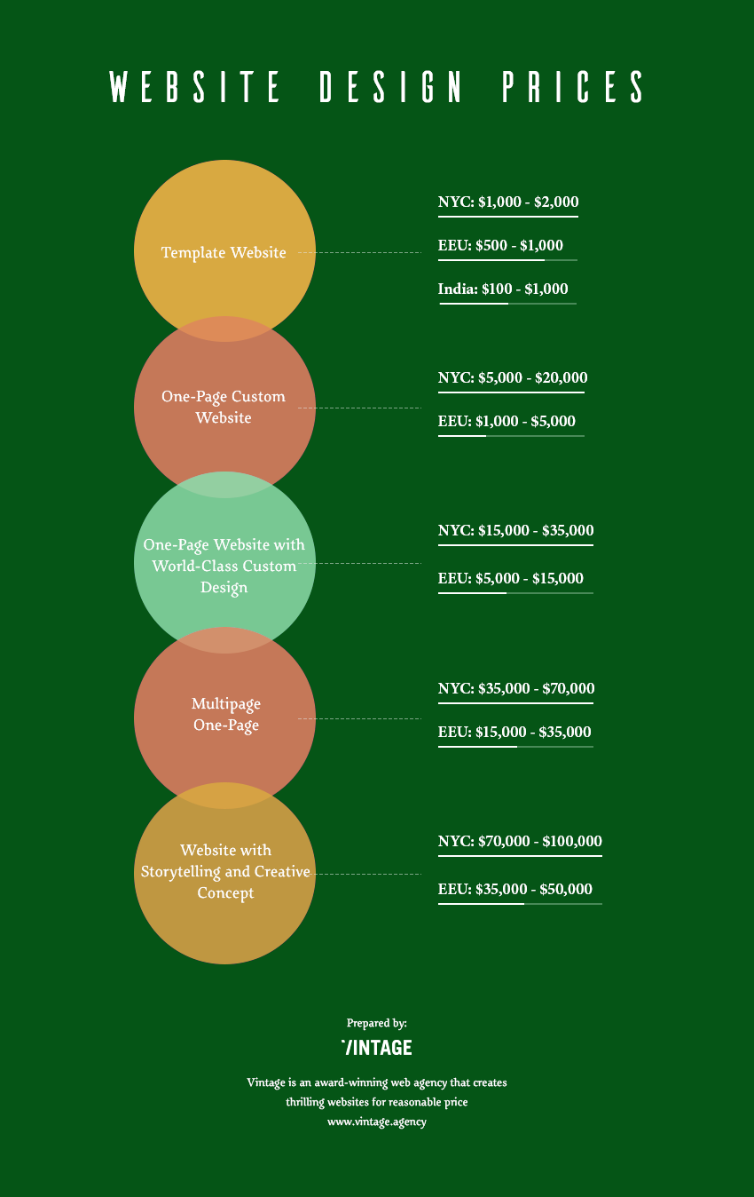
$$ To start with the basics, a Shopify website can cost as low as 29$ monthly plus transaction fees. You can sure set up a WordPress or Wix site too - as well with minimal assistance from third parties and at fairly start-up friendly rates. They will all have different functionalities and payment features but will do for the beginning.
$$$$ If your start-up budgets are not jar-lid tight, you may commission your online image to a talented freelance - this will ensure personalized feel to your website and may cost anything from $1.000 to $10.000, depending on your requirements and complexity of solutions used. The important thing to take into account is the rating of a specific freelancer and the time-frame of a desired launch of the page, as it will take time.
$$$$$ Goes without saying, the next level is endless as horizon assortment of web studios. They do differ. In quality. Price. Expertise. Level of professionalism. And other 101 criteria.
This level we would recommend for the companies, which can be classified as serial crowdfunders. It is common sense for a successfully funded project to want to capitalize on previous Kickstarter campaign experience and bring a yet another product or model to the extensive list of happy backers. This is where expectations get high. This is when you need more functionalities. This is when backers expect a higher level of sophistication than a templated website and appreciate to see a page design as unique as your product.
Long story short - when you grow from the fertile crowdfunding soil to a company big enough to be recognizable as a brand - it is time to consider creating a website with the virtual face and soul unparalleled, unexampled, one and only. Pertinent to your brand only. Reflecting the essence of your brand mission, vision, and philosophy.
Our recommendation to get the best value for money ratio is to look for award-winning companies outside US, Canada, and Europe. Chances are, that an Eastern European, South American, Indian or African Awwward winning agency will do a cutting-edge website at a waaaaay-below-NY-price range. Most of them have figured that out and employed a western-facing sales department, so the language barrier is a non-issue.

Website first it is.
The token of respect to your backers.
The matter of trust in the future of your business.
Indeed, we as a web agency, are biased a priori towards the “first website then crowdfunding campaign” solution of the dilemma. But we also hope we have armed you enough to comprehend, that by now the industry came up with solutions, which are as affordable and quick to implement, that this is no longer the matter of money and time.
This is now the matter of respect towards your backers. The matter of your own belief in the future and longevity of your business. The matter of being a long-term strategic partner who is there to stay and take care of the backers.
Once we took up on the task to come up with the solution of the dilemma as complex as that of chicken and egg, we sought some outside opinion too – to make sure you, guys get the most unbiased opinion.
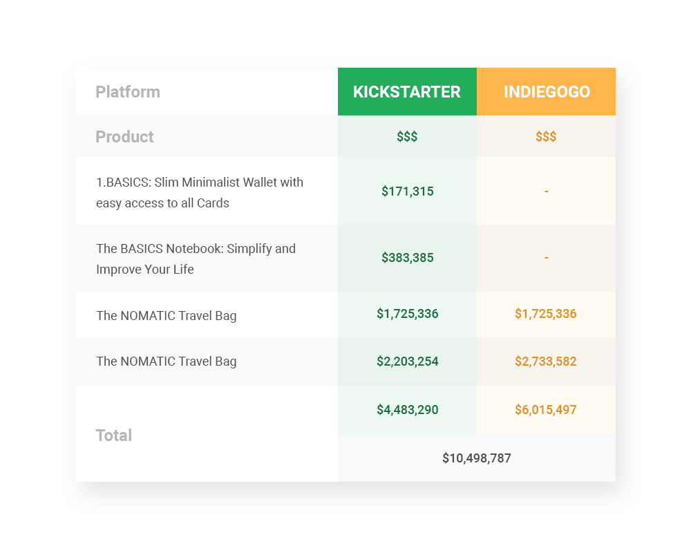
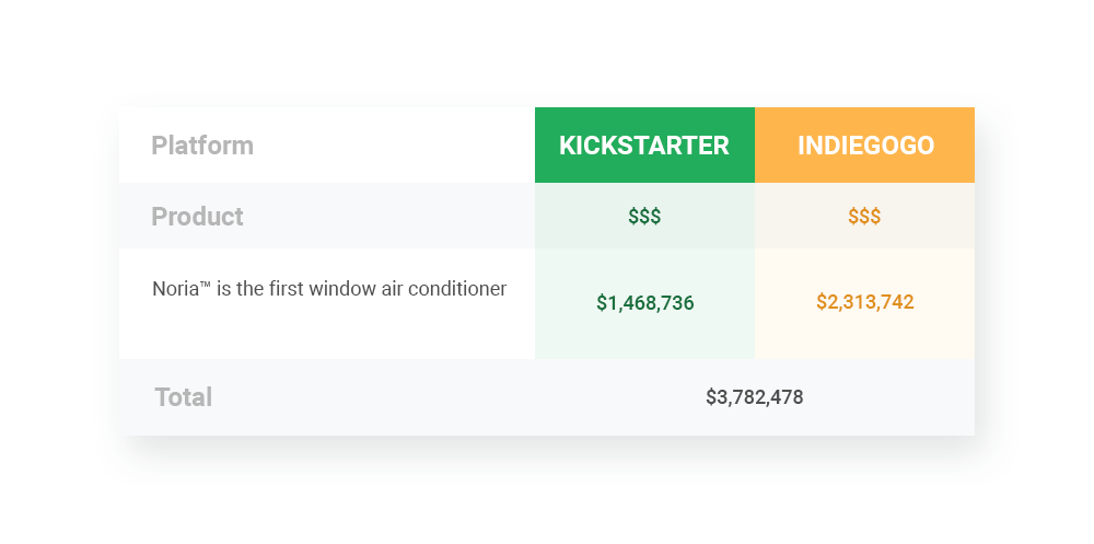
See below the kind replies of 2 companies, who managed exceed the coveted 1+ million benchmark and cared enough to give back to community and share their gains and pains.
Nomatic

V: Did you have a website by the time you launched your crowdfunding campaign on Kickstarter?
N: We did not have website when we launched our first campaign on Kickstarter
V: Why?
N: Our first product was the BASICS Wallet and we did not know what the demand for our product was going to be. We weren't originally planning on starting a business, but we thought it would just be a way to make some side money.
V: How long had your website existed prior to launch?
N: We launched our website towards the middle of our Kickstarter campaign once we realized the demand for our product.
V: Was your website costly?
N: We got a really good deal on the website.
V: Did you do your website yourself / freelance / web studio?
N: A family friend built the website.
V: What was the major purpose/mission?
N: Our first product we wanted to test the demand for our product. Know we focus on developing highly functional products that we interact with frequently. We launch our products on Kickstarter now to receive capital to fund our next production runs.
V: How did you see the traffic grow on the date of the launch/throughout/after the campaign?
N: Traffic started out high, then it dropped and then once we learned how to run Facebook ads the campaign picked up momentum.
V: Would you recommend to create a website before or after the launch on a crowdfunding platform and why?
N: We would recommend creating a website before launching your product to gather emails.
V: And once it launched – how did the content/mission/functionality change on your website?
N: Post Kickstarter we continue to sell our products on our site.
V: What are your top 3 tricks, that worked for you on the web-site for your campaign? Was it a conscious choice to have or not to have a website – or was it a cost issue?
N: 1) Drive traffic to your campaign
2) Landing page directs traffic to campaign
NORIA

V: Did you have a website by the time you launched your crowdfunding campaign on Kickstarter?
N: Yes. We decided it would be best to not spend the time to create an entire website dedicated to explaining all of the details of our new product right away. Instead, we quickly made a one-page teaser to help people understand that we had a new product coming and when/where it can be found on launch day. We also took email sign-ups on this page as well.
V: Why?
N: We wanted to get information about the campaign and the problem our product was solving ASAP to get feedback before we launched.
V: How long had your website existed prior to launch?
N: About 3 months.
V: Was your website costly?
N: We used Square Space so it was fairly affordable.
V: Did you do your website yourself/freelance/web studio?
N: We did everything ourselves. We are not web designers but Square Space makes it easy to design and launch your own website within minutes.
V: What was the major purpose/mission?
N: We needed to get a sense of how people felt about our product before we launched. We didn't know if the Kickstarter campaign would fail or succeed at the time so we were really using the site as a litmus test to validate our project.
V: How did you see the traffic grow on the date of the launch/throughout/after the campaign?
N: The first month the website/teaser page was up we had about 170 visitors. The following month was over 28,000 and the last month prior to launch was over 164,000.
V: Would you recommend to create a website before or after the launch on a crowdfunding platform and why?
N: We would highly recommend at least a one-pager just to find out if people are genuinely interested in what you are doing. It's the cheapest way to research market validation before spending thousands on PR and marketing.
V: And once it launched – how did the content/mission/functionality change on your website?
N: Once we launched the Kickstarter campaign we changed the one-pager into a fully detailed website which explained everything about the product. We still take email sign-ups to this day even after the campaign has finished.
V: What are your top 3 tricks, that worked for you on the website for your campaign? Was it a conscious choice to have or not to have a website – or was it a cost issue?
N: We knew we needed as cheap, fast, and effective way to get the word out about our product and pending Kickstarter campaign. We learned though that just having a website is not enough. We had our Kickstarter video live on Youtube months before it was live on Kickstarter. We teased images on Instagram and Facebook almost a year in advance. We emailed dozens of internet/magazine publications 6 months ahead of the campaign. All of this was linked back to our teaser site where we would continually collect emails.
The moment we launched on Kickstarter we sent out the "Be one of the first backers of Noria" email and it just took off. In the end, though none of this would have been as effective if the product we were creating wasn't something people genuinely desired. Noria, in a way, sold itself with the age-old problems it was solving. Its iconic and sexy design, top-notch engineering, and slim form factor were everything people wanted. Noria is the first premium home cooling product in the world and has proved that innovation was possible in a 50-year-old technology no one cared about until now.

View Comments