
There is a business purpose behind every website on the Internet. Even if it isn’t meant to return profits by the first intention, a website is still designed and maintained for a reason. Probably, the best examples to portray business objectives of digital domains are the B2B websites.
What is a B2B website? B2B is the sphere where your clients are businesses, not individuals. Therefore, classic marketing tools, principles, and methods are not fully applicable here. In order to attract a business to your product or service, you need to emanate reputation, instill trust, and outshine competition in terms of price, delivery, and reliability. And in the digital era, that means having it all transmitted through your website.
In this article, I’ve gathered ten most prominent B2B website design examples of 2016. We will see how these modern, innovative and great B2B websites market their businesses with a smart implementation of design, animations, descriptive images and infographics, and engaging calls to action that instantly connect them with their clients.
1. Reputation Squad
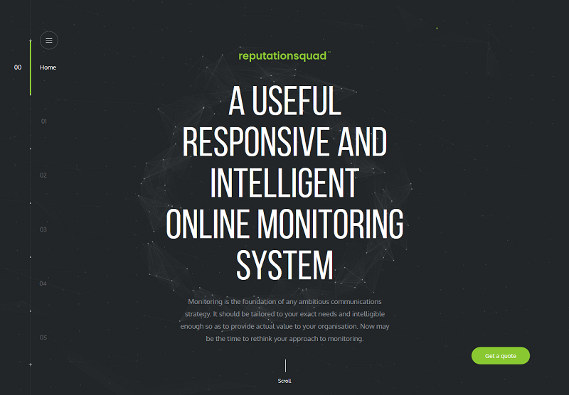
Business Summary: An online monitoring solution for big and medium-scale companies.
Design: A several-screen landing, furnished in green over grayscale, with live backgrounds and customly-drawn sketches. Animations are mouse-sensitive, and respond to the hovering (not clicking) actions. Although the background animations serve utterly decorative purpose, they manage to instill the sense of control in the visitor. And being in control is exactly what the client would expect from a monitoring system.
User Engagement: The landing page contains three distinct sections. The first, “black” section is a series of screens emphasizing business benefits of the product. The second, “grey” one, explains the customization options of the product for the needs of every particular client. And the final, “green” section talks about the company, team, and case studies. A clearly visible “Get a quote” call to action accompanies the user through all three scrolling sections. Live backgrounds and interesting screen-changing effects prompt users to keep on scrolling, thus unfolding the complete business message, and keeping users on the site till they learn all about the product.
2. Sonikpass
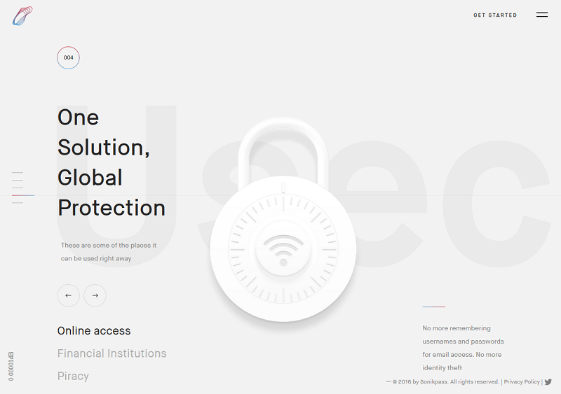
Business Summary: A “passwordless” identity and access management solution.
Design: Another good example of an animated scroll landing. This one uses white backgrounds, and has a slight influence of Material design, with objects casting shadows onto the background “layer”. The animations here are not mouse-responsive, but they are extremely lightweight, and do not interfere with page loading. I also liked the smart use of colors for brand identity and logo image. Instead of having a distinct color or a combination, a full gamma transition of red to blue is used. It looks especially nice on the site’s light-grey background.
User Engagement: Textual accompaniment is minimal, and only emphasizes the clear stressing points. Clickable pictograms act as calls to action. The primary CTA for the user is to proceed to the registration form, and the website visitors are guided to that form, no matter which page they may be currently browsing.
3. Danish Shipowners’ Association
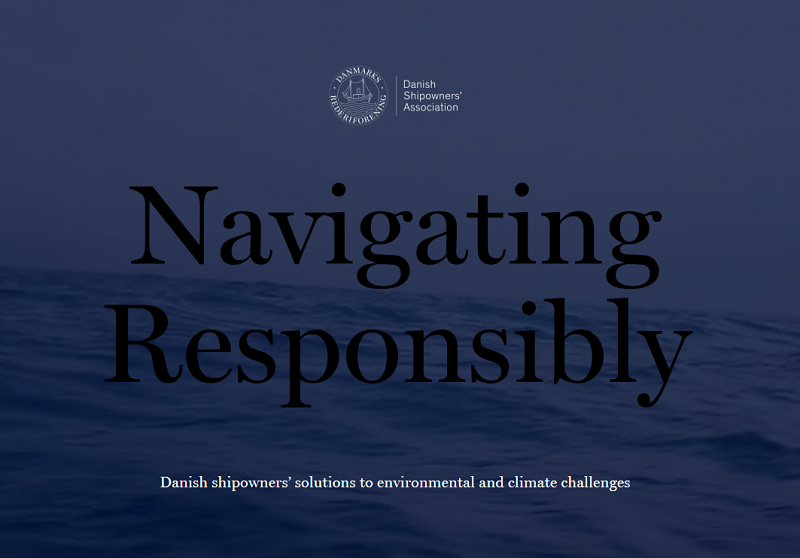
Business Summary: Eco-friendly certification service for maritime vessels.
Design: One more bright example of long scroll web design. This website carries you away, wallowing on the sea waves. Right from the first second, an intriguing loading wave symbol leaves the user guessing what’s to come. As you scroll down, the site tells a well-illustrated and animated story, revealing average fuel costs and carbon dioxide emissions of ships on popular marine trade routes throughout the world.
User Engagement: The site aims to disguise itself as a novel of sorts, splitting its content into 6 distinct chapters. Each chapter is accessible from an interesting side menu solution, which I would call a “wave menu”. At chapter transitions, this menu transforms into the familiar wave symbol. When you start browsing through the particular chapter, however, the menu returns to its usual position at the right edge of the screen. Without a doubt, good B2B websites must possess an equally intriguing outside-the-box design solution.
4. Kekselias
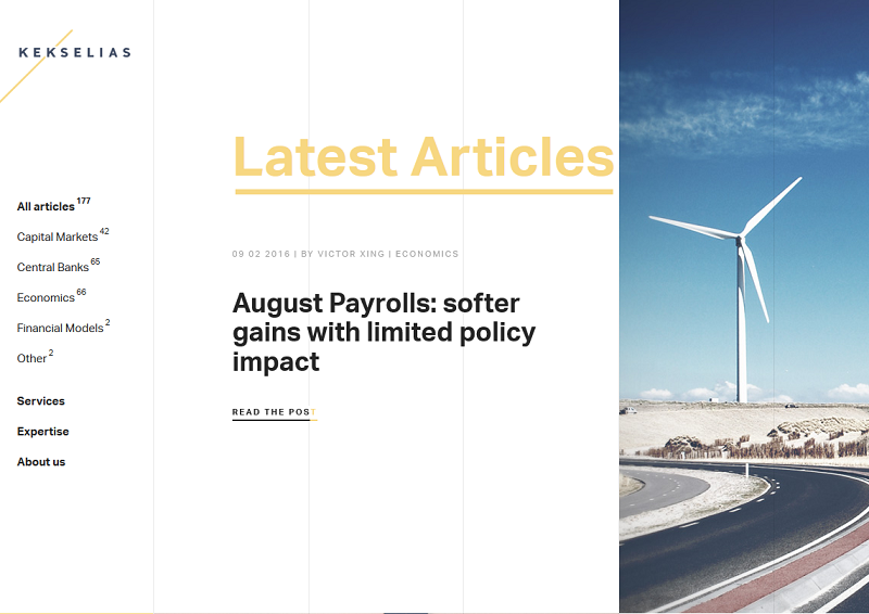
Business Summary: Web consulting, asset and investment analytics service.
Design: Here we have a rather simple and minimalistic landing page with images and elements highlighted on mouseover. The landing is enhanced by the left-side menu, which acts as an index for the company’s news and articles. The side menu is static, but just like the elements on the landing page, its categories and links are underlined, hinting the clickability of the headlines.
User Engagement: Kekselias manage to describe their business and services in three simple screens. However, the landing page itself is only the top of the iceberg. As any web based business, the company has to create additional value for its website in order to sell the intangible. And such value is contained in the Articles section. Here, the user can find helpful materials and general analytics on current trends in assets and investment. This blog-like approach makes the website act as a source of content and citation, rather than just offer its services bluntly.
5. MUV Interactive
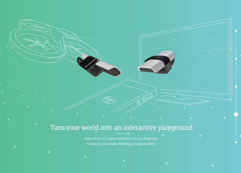
Business Summary: A wireless, thimble-like controller for various screen and projector interfaces.
Design: This website is aimed to sell a gadget - but not the one your typical mass buyer would be anxious about. The BIRD, as it is aptly named, is designed to facilitate collaboration in the group projects by controlling the flow of visuals with a fingertip, on various types of displays. And I must say that the first screen animation transmits that effect to every visitor of this website.
User Engagement: Upon entering the site, you encounter a “digital wave” animation, which changes its view angle depending on the cursor position on the screen. It left me moving my mouse around just to enjoy the effect for several minutes. While the user enjoys this thoughtfully made interactive animation, the site unobtrusively explains how the gadget works, and outlines its main features. So, by the time the user is done playing with the cursor position, they get excessive and detailed information about the product.
6. PETAS
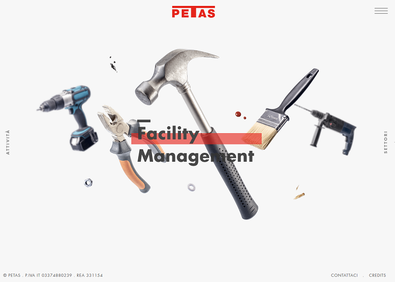
Business Summary: A privately-held construction company and facility management service.
Design: This website has not one, but three landing pages, and this approach does not seem too excessive at all. By default, the user is greeted by the main landing, which describes the company and its services as a whole. However, clicking on areas near the right and left edges of the screen takes you to the “Services” and “Industries” landings, respectively. Each landing consists of several scroll screens, with various tools and construction equipment floating in the background, and acting as one big live cover visual.
User Engagement: A very conceptual, and at the same time, engaging website approach, which I cannot remember seeing anywhere else. The user is prompted to juggle through all of the landings, and, as a result, is unable to leave until he learns absolutely everything the site has to offer.
7. Dropbox: Business User Guide
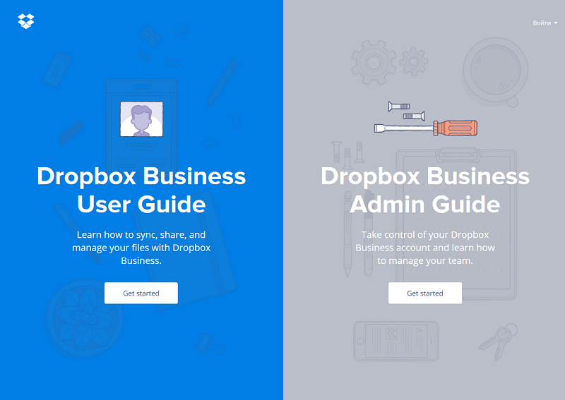
Business Summary: This one really needs no introduction, but just in case - Dropbox is a cloud storage service.
Design: I will not touch upon the massive and multi-purpose Dropbox website here. Since our list is focused on B2B, let us look at the subdivision designed as Business User Guide. In fact, it is a completely separate website. The Business User Guide is another bright example of the Material design approach. Using this guide is like reading an interactive journal. Screen-changing animations resemble page turning, while sections and chapters are easily accessible from the “table of contents” menu.
User Engagement: This guide is as user-friendly as can be. It creates the impression of reading through the printed manual, and the cross-chapter navigation is even better than with a paper book. I encourage you to try and browse through this site for a while, and get inspired by the spectacular FAQ solution for a business service.
8. ACME
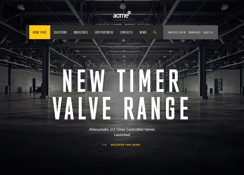
Business Summary: A tare and packaging provider for shippers and logistics operators.
Design: I like yellow on black - it is my personal little favorite as a designer. On this website, yellow animations turn into text headlines and then settle beautifully on a dark gray background. New sections do not simply appear on the page as you scrolling down, instead, they are neatly brought up from the bottom to take their respective places. I had to reload this website several times to fully enjoy the sequence.
User Engagement: This is a brilliant example of how to design a business website. The business is clearly aimed at three target audiences: shippers, retailers, and corporate logistics officers. These audiences are differentiated on the second screen - several blocks appear on the page, each representing the particular kind of service. Thus, each user is guided to the section of the site, which they are most interested in.
9. Future Water City
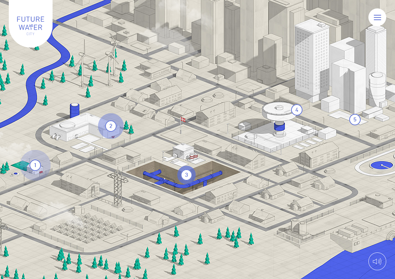
Business Summary: Water pipeline infrastructure solutions for households and facilities.
Design: If you ever played SimCity, you’d find this business website design very familiar. It is basically an interactive map of the city block, explaining how water circulation works, step-by-step. It is also accompanied by a rather catchy soundtrack.
User Engagement: Browsing experience here is anything but classical. In order to navigate to a particular website section, you have to choose the stage of the waterflow cycle first. Each stage is then explained by its own dedicated landing page, in a similar, game-like manner. Long story short, even if you wasn’t particularly curious about water pipelines when you entered the website, you’ll likely to find yourself nearly an expert after leaving it, all the same.
10. Aiia
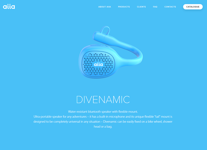
Business Summary: Branded promotional gadgets for corporations.
Design: One of the top business website examples, for sure. The main idea of this website is to demonstrate that promotional gadgets do not have to be ordinary and cheap-looking. The catalog of products is showcased right on the first screen, each one accompanied by a short description, prompted by mouseover.
User Engagement: When you click on the particular product, a full-screen, background promo clip is triggered. This lets the visitor see the gadget in action. Also, there is a strong emphasis on customizability of each item. They can all come in various colors, and with custom logo placement. Brightly colored backgrounds and nicely rendered images certainly add up to that impression.
So, this has been my personal pick of Top-10 best B2B sites currently on the web. This is how successful B2B companies market themselves through the best B2B websites. If you think your business deserves a website of such a quality, in this article, we tell you everything you need to know about b2b website development cost.
Hope you liked this chart, and should you have an idea on how to create a B2B website, please feel free to reach out to us at Vintage - we are always eager to advise and assist. Also, consider subscribing to our blog for more interesting editor’s picks and case studies!
View Comments