
It is likely that you started your day with microinteractions. By turning off the alarm on your smartphone, you engaged with a user interface in a single moment.
And you continue to engage in these moments throughout the day: when playing your favorite track on Apple Music, checking your email, answering your phone - various actions which do not force us to ponder over what outcome we are going to get. Each of these moments is so small that you probably do not even care much about. They are so tied into our everyday life so became invisible - if you are an average user and have a little deal with web design, you could hardly say how they work or look. But once you face with a clumsy feedback form, you will surprise how much such small details matter for an overall positive feel of a website.
Trust to a product comes from experience. Lack of trust comes from either lack of understanding or lack of control. So it looks like all roads lead to a customer-centric design when everything is spinning around a user. Being Motion Designer, I agree that paying attention to every detail of any product we create is as important as the design of these products.
What are microinteractions?
There are two things that are distinct the best website interfaces: thoroughly elaborated features and details. The first is that draws people to your product. The second is that keeps them for long. And microinteractions are the best tool to make your users satisfied with your website.
Website animation appeared a long time ago. First, there were tiny files .gif consisting of a set of pictures. The pictures change created a motion effect. It was dark times: tons of blinking icons, dancing cats, and lots of other stuff we would prefer to forget about. In those days, the animation was hardly considered as a tool for usability improvement and used mostly for decoration or simply fun. Everything changed ever since.
Today, web designers and developers use animation for improving website navigation and an overall convenience. Qualitative and relevant interface animation of web pages pleases the eye and help users to understand what is going on.
Web animation is currently one of the bases of web design. User interaction is tied on an animation. It helps report about an element state, direct additional attention, see an outcome of actions, and can even influence a user’s behavior.
Microinteractions deserve a separate discussion. They are probably the best proof that attention to details can bring a strong result. Simply put, the microinteraction is a tiny functional element performing one particular action. Most books on UX/UI design tell us the same: the final results of a design process must be not just beautiful, but also convenient and beneficial.
Microinteractions are usually invisible and are the constituent parts of the product functions. For instance, your music app is a function, while its volume switch is a microinteraction. We rarely buy an app for its switch, but such details still matter - they make the difference between a product you admire and one you just tolerate. We meet microinteractions when making any single task like turning things on or off, downloading a file and be sure it is received, changing settings or process, sliding down a page and seeing screens' change, sharing or liking a photo, sliding down on a mobile device to refresh content. Hell, even when you just sit waiting for a page to load, there is a microinteraction at play.
The quality of such, even the smallest, details defines the overall quality of the product. They make a big difference.
Nowadays, all microinteractions in digital are animated. Just try to pinpoint one that does not contain an animated element. I bet, it will be a great challenge.
Why microinteractions matter in web design
If microinteractions are only tiny design elements, why to care about them at all?
Sadly, but many web developers and designers still ask such a question, not getting that ignoring microinteractions may cost their clients a lot. Attention to details is what basically differs an an exceptional website from ordinary one. Here is why microinteractions rock:
- They improve a website navigation
- They make it easier for users to interact with your website
- They provide instant and relevant feedback about a completed action to a user
- They give tips to your users
- They communicate information about certain elements, like whether or not it’s interactive
- They make the user experience much more rewarding
- They encourage sharing, liking, and commenting on your content
- They direct users’ attention
- And, finally, they just make your site more emotional
Well-designed microinteractions are a clear sign of a care of a user. That’s why they value so much. A user gets what to do and whether or not their action was correct and approved by the system - an app or website provide an immediate visual feedback and teach a user to work with the system.
When microinteractions are done right, they can give positive feelings about your brand and influence users’ actions, often without people even realizing why. If you like or dislike one aspect of a product, you have a positive or negative predisposition toward the product in general. This so-called Hallo Effect can play both for and against you. In wise hands, this knowledge can help to improve a user’s feedback from your website - by paying proper attention to details, it is possible to leave your users satisfied.
We at Vintage often bring up the issue of website microinteractions as a method of boosting positive user experience. Let’s consider them at some particular interactive design examples and get some portion of a web design inspiration. Enjoy!
Loading Animation
Project: Radioaktive Film

Oftentimes, loading time is a byproduct of an ambitious outreaching web developers’ technical capabilities. However, there is a creative way to turn those few seconds of waiting into an entertaining and beneficial experience. And one of the oldest and most efficient uses of animation for the web is to distract a user from loading times and be a small promo for a website.
Although cool animations will not likely to solve the problem, they can certainly make a waiting time less annoying for a user. In the case of the website for our client, a film production company, Radioaktive Film, the loading animation not just creates a pleasant picture but also perfectly fits the overall concept of a web cinema, making user experience flawless and harmonious.
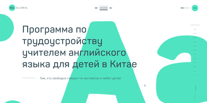
Project: ESL
Project: Vintage web Production

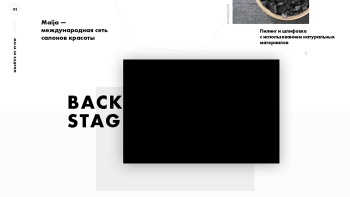
Hover Animation
Project: Maija
This type of animation is probably the most used one in web design. And it is clear why: it is not just beautiful but also add some dynamics to website pages.
When you roll your cursor over a link on the web page, it is often referred to "hovering" over the link. Hover effect is simply a change of some elements (color, size, shape, image) while you put a mouse arrow over them. It is usually achieved with CSS coding.
The primary purpose of hover animation is not aesthetics yet. It indicates that an element is interactive and something will happen if to engage with it.
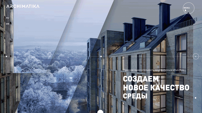
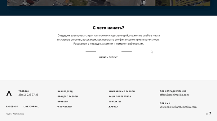
Project: Archimatika
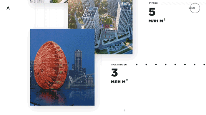
Animation to Attract Attention
Project: Archimatika
Want a user to do something on your website or app or turn their attention to some elements? Animated microinteractions are your new best friends. UX designers resort to a trick to grab users’ attention without annoying them anyhow. No matter whether you want to push a user to commit a purchase or share a post, eye-catching animation works the best.
Microinteractions provide clear visual cues for users towards the details and act on swiftly. Animation of a ringing bell with distinctive sound leaves no doubts about what it may point on - a user will likely to not miss a new message or important notification.
A good solution is also to animate call-to-action buttons, so your users would hardly skip them over.
Navigational Animation
Project: Vintage Web Production
Motion is often used to smoothly transport a user between navigational contexts and explain changes in the arrangement of elements on a screen. It allows to get rid of abundant content and interface elements so a user can grab everything you stuff a page with, not to miss important info, and understand what is for which purpose.
When redesigning our own website, we came up with the idea of using there a power of microinteractions. The task was to show ways of our work with a client. Through color, form, scale, you clearly get which part of a website development process is the most significant. Hereby we say to you that it is crucially important to initially choose the right strategy and way of work. Additional info appears when hovering, and it is a pure microinteraction.
Project: Radioaktive Film
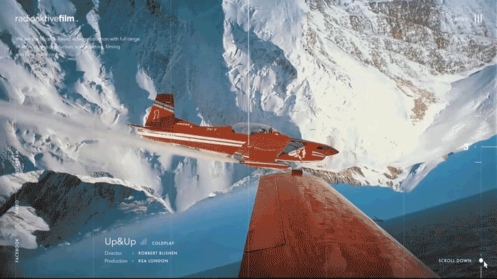
One of the today’s biggest trend in web design is a navigation menu hidden behind a button—so-called hamburger menu. While it seems to be one of the most controversial patterns, this solution definitely makes the function easily recognizable for users.
It has become popular because it not only saves screen space by grouping all secondary and abundant information together but also makes the design cleaner and creates negative space on a page that is found to be pleasing to the eye. Do not be greedy - feel free to allocate a whole page for a menu section. There is a lot of space on the internet.
As with the Radioaktive Film website, hamburger menu was an obvious, reasonable solution. Design decision - with its total concentration on a video content and elegant interface elements - demanded to avoid the use of abundant interface elements which could clutter up pages and distract user’s attention from the visual content.
Value Change Animation
Project: Octagonal
Interface elements, based on a symbols - numbers and letters - may change their value. You can see this on almost every website or app you visit but hardly notice. Anyway, the role of this microinteractions in usability should not be eliminated by no means.
In his “The UX in Motion Manifesto,” Issara Willenskomer, an editor at UX in Motion, writes so, “When value based interface objects load with no ‘value change,’ what this conveys to the user is that the numbers are static objects.”
In the real world, objects and humans need some time before they can reach full speed. Similarly, it takes some time to slow down to a complete stop. Physical bodies never move with a constant speed. So when virtual objects, like numbers, change their value linearly, there is less connection to the reality behind the values. Linear movement looks something unnatural for a human eye.
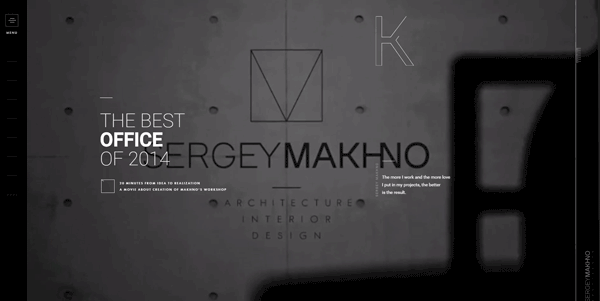
Project: Makhno Architecture
Gamification
Project: 100% Capri
100% Capri is a European luxury clothing brand with stores all over the world. It’s not a widely-known brand - such as Burberry, Chanel or Celine - but an absolute niche.
The task was to develop a parked page which should contain only store addresses and some contact information. For a mobile version of the website, we came up with the idea of creating a game which uses a smartphone’s gyroscope: after a preload image, a map with a ball on it appears. A user rotates their gadget so the ball gets to the hole marking the store location. When the task is done, you can either continue to play or see a main office contact info. The map makes it clear that the brand is international, and a game moment does not give a user a feel of routine visiting an ordinary site.
We also developed a similar interactive map for a desktop version. Once again, after a preloader, the map appears. When clicking, you can see a pop-up and it is nothing else as a microinteraction - an engagement with a particular element of the website interface. And only via interaction, some additional information displays.
Gamification is all about the story, which involves a user into an immersive journey. All great games are built on stories that show an understanding what tasks they need to complete and rewards they can expect. Using these game mechanics, you can turn an ordinary website experience into an exciting one.
Mouse Interactions
Project: Makhno Architecture
This type of animation is also of a pure beauty but does not make it less beneficial. It does not report about a page status or give tips to a user - the primary goal of such expedient is to support the overall perception of a high-end service and add some fun.
One of our clients, a Ukrainian interior designer and architect, Sergey Makhno, once opened the doors of our agency and stated that he needed a website which would lift his business to the international level and be an adequate “face” of him as a skillful professional. So it goes without saying - we should care of every even the smallest detail, every pixel. And the mouse interaction - a thin, hardly visible “spiderweb” - became the nice complement to the refined design of the website.
Project: ESL
Page Motion
Project: Multimed
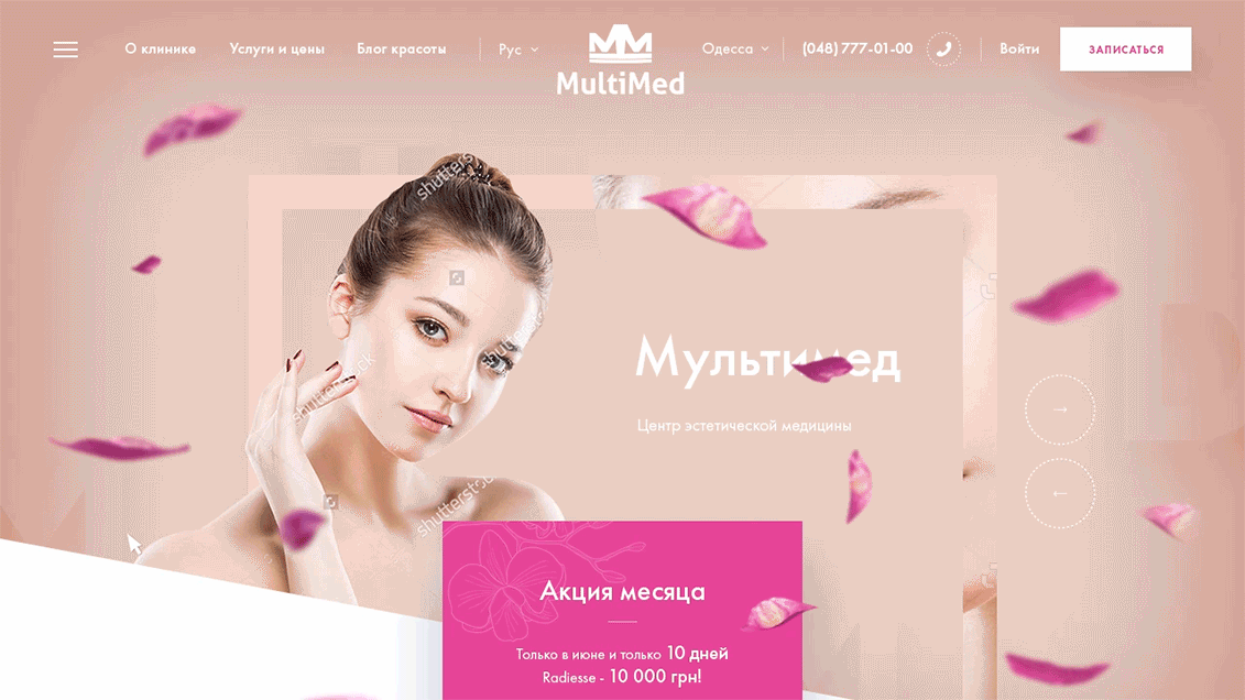
Multimed is a center of aesthetic medicine which offers a full range of medical and aesthetic services.
This is an example of a motion design for a clear emotion and beauty. Yes, sometimes designers can afford it.
Sliders and hovers are also microinteractions. We are so used to them, however, it does not mean we like them less.
As the company offers medical and cosmetic services and its clients are mostly women, it seemed to be a great idea to add some aesthetic elements to a website, such as lovely pink flower petals scattered over pages. By just adding a bit of elegant motion interaction - petals respond to a mouse moving - we managed to achieve a pleasing user experience while not distracting them from a primary goal - getting the information and ordering the services.
Remember, less is more with regard to microinteractions. Anything that if removed makes website design cleaner is almost certainly a right choice. That's why, when working on microinteractions, we focus only on a user, their convenience, and wow-effects.
In hands of our designers and developers, a product becomes not only expected but something that every user is entitled to. Beautiful, seamless, and smart is the objective. We know that sometimes a lot less is a lot more and that every detail rocks.
Although this list is over, our portfolio is full of many other fresh and creative examples of design concepts for different purposes and needs of any business. Reach out to us and see our team in all its professionalism.
View Comments