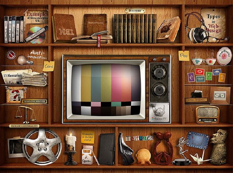
History is a spiral, and new trends are just reflections of their former selves. If we look at fashion or interior design, many of the forms and shapes are being reborn in new hypostases from the decades long past. With web and digital design, it is the similar case. Similar, but a little more complicated.

Image credit: Agendasetting
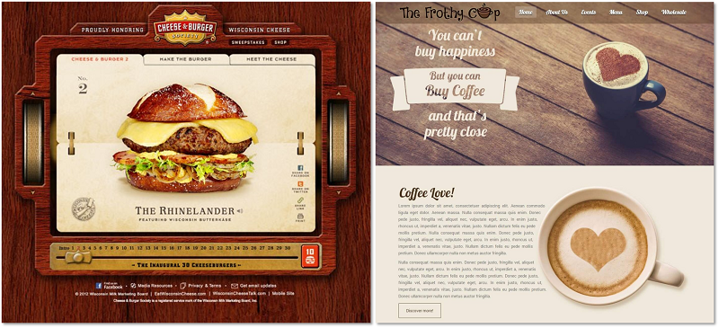
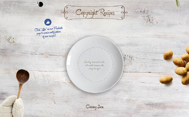
Pioneered by Apple, skeuomorphism was the first known approach to portraying real world elements online. In early web design, buttons, icons and pictograms resembled their prefigurations from real life. It was a logical solution at the time, because such resemblances were familiar to the general public, and they helped users get around the strange and scary digital space.
However, today there is a strong opinion that the modern web does not need this approach any more. In recent years, many influencers and web design trendsetters have dug the grave for skeuomorphism, and among the opinions why it should be buried, the three most popular ones are the following.
1. Aesthetically excessive
Web design craves for laconic, easily comprehensible forms, and skeuomorphic elements often seem too rough to the keen eye. It is a real challenge to design a skeuomorphic website without making it look like meat and fish in the same dish. This is one of the reasons why minimalistic approaches became so popular among designers in the first place. Conceptual vision lets you create things that look complete and aesthetically furnished, as opposed to the elements that have to mimic real-world objects, and thus, end up cluttering the screen.
2. Poor adaptability
Present-day web is all about fast pace. Users have so many sites at their disposal that their time spent on a single one is strictly limited. A website too slow to load, or too bad to adapt to the mobile screen, is doomed. At the same time, everyone likes animations and vivid visual experiences. So it’s fair to say that for a modern digital space, the perfect balance has to be maintained between beauty and speed.
Flat, and the recently emerged Material design approaches manage to cope with this balance pretty well. Skeuomorphism? Not quite. When you are allowed to have blank spaces and abstract animation patterns, your interface can easily fit into any screen. On the contrary, if you must resemble something real (e.g. folders in the drawer, books on the shelf, controllers on the panel), having it all just hang in the void would be rather confusing, would it not?

Which of the two is likely to deliver a better small screen experience?
3. An obsolete paradigm
Have you ever thought how a person who had no experience with a physical interface would actually perceive one? Fantastic as it may sound, we are already starting to get some evidence of such behavior. In an experiment conducted by Fine Brothers Entertainment, children of age 5–11 were asked to guess how to use a rotary phone. While most of the kids figured out the purpose of the device correctly, the concept of rotating the dial was rather hard to apprehend.
Indeed, when all you have known is the touch screen where any contact is reached with two or three swipes, the idea of rotating the disk to dial the number must be very confusing. We tend to forget that digital experiences are far from being similar to direct physical interactions. Think of how you click and drag the digital slider versus how you switch a physical one with a simple lift of thumb.
This seems to be the strongest argument against skeuomorphism in its traditional sense. The digital UX is already becoming the axiom to the next generation, just like buttons and toggle switches have been to the founding fathers of web design. So, do we really have to keep using that 30-year old trash bin icon for resembling a deleted data storage?
Not so fast!
The above stated arguments look quite convincing, don’t they? But just as we thought we defeated skeuomorphism, it turns out that in some corners of the web it is surprisingly alive and well. Moreover, skeuomorphism is likely to make a comeback as a mainstream trend in the next couple of years!
Let us look at some examples where you just can’t do without our old friend.
FMCG promo websites
When you want your audience to emotionally relate to your product, you have to portray it online as realistically as possible. And here is where skeuomorphism comes to aid. Buttons, switches, wraps and zippers let the user try and feel your product with the mouse click, just as though they were holding it in their hands. Flat and material design approaches, however appealing to the eye, are unlikely to deliver similar emotional experience.

Image credit: Milka
Web for the seniors
My grandma is 83, and she started using Facebook when it launched back in 2005. And believe it or not, she dealt pretty well with the early versions of the interface. Buttons, blocks and tab-like navigation resembled an intuitive, working desk experience. But over the years the Facebook UI has undergone through several updates, and that is where my grandmother began to have trouble using it.
The current UI version of Facebook is flat — just like most of the modern social media. It may seem aesthetically appealing and practical to us millennials, and the children from the rotary phone experiment, but not to the generation, which actually used those rotary phones.
And by that I do not only mean people long past retirement. Skeuomorphic features feel authentic and obvious on websites aimed at 50+ and even 40+. And if you think about it, all becomes clear. Seasoned people no longer feel the necessity to race for the trends. Their taste shifts to all things simple and timeless, if not to say vintage. That is why we will always have skeuomorphism shine on this pitch — even when we become old and grey ourselves.

Image credit: SIA Aperitivos
Skeuomorphism reborn
Now let us turn to one of the next big things in web design, which may — and probably will — inaugurate the return of skeuomorphism. I am talking about Augmented and Virtual Reality.
AR & VR-adaptive websites clearly seem the next step. They have an immense potential for interactive storytelling and truly involving experiences. Imagine visiting the online furniture store, and being able to see how the chosen set fits in your home right on the spot. Or making a hotel reservation and exploring your room from every possible corner. Or test driving a car before you decide whether or not to buy it.
But what would the UX be like on such websites? Will the patterns that are good for flat screens do as well in the stereoscopic perspective? Doubtfully. This is where we’ll probably need the real-life resemblances again.
One of the racers for the new virtual web is the JanusVR project, aimed at creating the browser which would enable the virtual reality website experience. Here is the review of its latest version so far.
Video credit: VR Reviewer
To push the door open. To pull the lever. To switch on the light, and to turn down the volume regulation wheel. Hundreds and thousands of skeuomorphic elements will come to our aid again to teach us how to act and behave in the virtual world. Another coil of the web design spiral will bring us reality within the unreal.
And once we have learned, once we have mastered the ways of the virtual, we may yet again come to the conclusion that real life resemblances are redundant and excessive — up until the next time we find ourselves in desperate need of them.

View Comments