
Health care is an honorable cause. Helping people cope with their conditions has always been one of the cornerstones of social responsibility. However, for owners and shareholders of medical institutions, health care is a business, first and foremost. And in order to identify profitability, performance and suggest a strategy, it has to be treated strictly as such.
Certainly, people like to work with people. But when it comes to making a purchase, they choose among brands. Patients who learn about your clinic from the Internet cannot judge it by the actual professionalism of your doctors or effectiveness of their prescriptions. Instead, they look at your clinic’s brand, its digital image, and online showcase.
How do you work with your clinic's online image? Are you sure that your institution has a good reputation and your patients leave positive reviews? What is the first emotion your patients experience when they come to your clinic's website? And finally, what must a good clinic website design possess and transmit, in order for your patients to quickly and easily find your hospital online?
In this publication, we aimed to identify the crucial components of an effective clinic website, taking into account the Internet habits of the present-day medical care seekers. We have also analyzed the websites of the Top-10 U.S. clinics, as per the 2016-17 Best Hospitals Honor Roll. From the outcomes of our research you will learn how their websites work for their medical businesses, and how, based on that knowledge, you can make your hospital or treatment institution website work to a 100% of its potential.
The Role Of Internet In The Medical Business
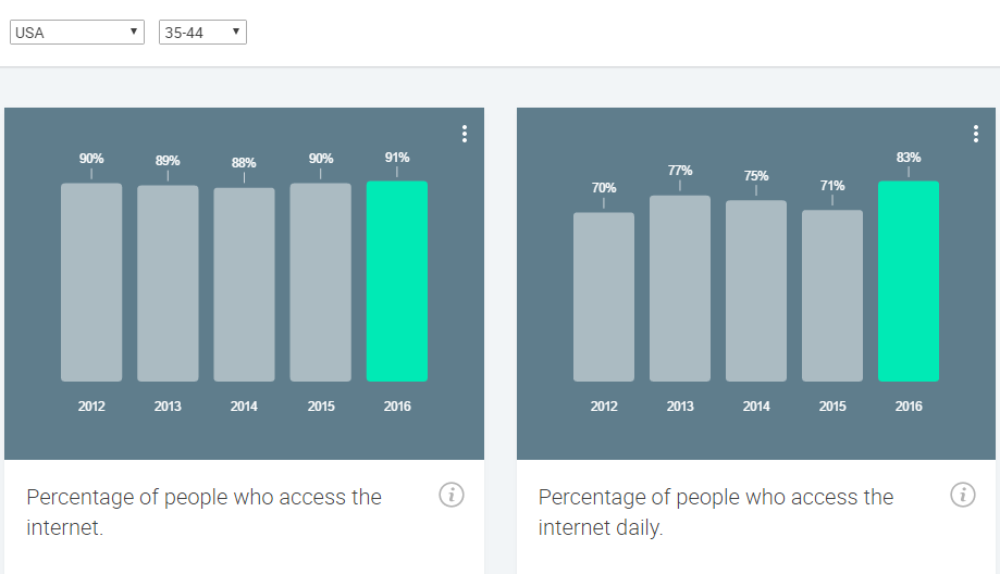
Let us begin with a few quick figures. In 2016 in the U.S. 81% of people have Internet access, and that is 2% more than last year, and 6% more than 5 years ago. 70% of Americans access the Internet daily, and in those between 35 and 44 years old, the figure is 83%.
75% of U.S. Internet users access the Internet from desktop and laptop computers. This figure has not changed drastically over the last 5 years. However, smartphones and tablets have become means of online browsing for 72% of the U.S. daily Internet users. And this percentage has been showing remarkable growth: from 53% in 2012 to 85% in 2016.
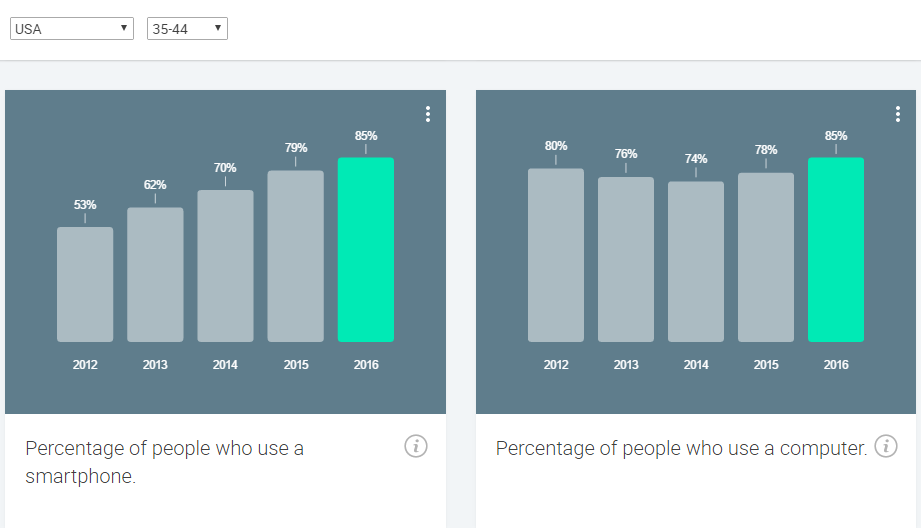
Studies prove that the age group of educated males and females from 35 to 44 is the most likely to seek medical services via the Internet. People in late 30’s and early 40’s begin to get concerned about their health and seek medical attention for conditions which they may have earlier managed to cope with. This particular age group is also considered to be the most productive and financially stable. And within it, 83% access the Internet daily, and 76% use their smartphones and tablets for Internet access at least as often as computers (source of data: Google Trends).
We needed this statistics to back up the obvious, yet somewhat underrated statements:
- Just like any other business today, medical care must use the Internet for promotional, educational and public relations purpose.
- The digital domain of a hospital needs to be mobile-friendly, in order not to deny the lion’s share of patients who wish to learn about it from small screens.
- Ignoring the understanding of Internet browsing habits of people who might become your potential patients will make those people turn to other clinics, and make good publicity - as well as profits - for their business, and not yours.
Elements Of An Effective Clinic Website
In digital space, the process of business interaction between a website and its potential client can be split into the following 3 stages:
- See. The user needs to find your site, navigate to it and see what it has to offer.
- Like. The user has to be carried away by your site’s design, usability and wow-effect.
- Purchase. Your site has to contain the kind of textual and visual content which would keep the user interested in following up and becoming a client.
![]()
In all three stages of this process, the quality of the website plays a major role. The more furnished every aspect of your website is, the more likely your visitor is to turn into a client.
Let us share the list of 5 components of an effective business website, which we try to implement in all of our web projects, regardless of the website’s business purpose:
- Goal of the website. Decide what the primary goal of your website is: to get your client acquainted with your business, to let the client enquire about your service, or to convince the client to make a purchase.
- Circumstances. Consider under what circumstances the client is most likely to navigate to your site. Your home page visuals and content will highly depend on it.
- Client’s expectations. Define what exactly your client looks for on your website, and provide them with that.
- Comfortable experience. Take aesthetic preferences of your clients into account. If they have a hard time adapting to your interface, or a problem navigating to various sections of your website, they will subconsciously expect similar kind of discomfort from your hospital.
- Adaptation. As shown in the figures at the beginning of this article, adaptive or, at least responsive design is a must for your website.
These are the basic principles which we try to uphold in all of our websites. Now let us extrapolate them to the medical care business.
Firstly, we need to embrace the fact that medical care is tightly connected to fear and negative emotions. There is no running from that. When people feel good, they do not need medical care. So, the primary difference between medical care and other types of services is that your potential clients are afraid of you.
Secondly, in the majority of cases, your potential clients are in despair. They may have tried coping with their condition, or experienced a treatment that failed, and now they’ve come to the point where they cannot bear their condition any longer.
Your clinic website must help them overcome the initial negative emotions. And when it does, it must suggest a solution to the patient’s problem, and ensure them that their problem will be taken care of at your clinic. No small task, that’s for sure.
And last but not least - the utilitarian criteria. How fast is your hospital’s website to load? How quickly the information that interests your patient can be found? What is the way that information is presented? Will the patient be able to schedule an appointment without significant obstacles?
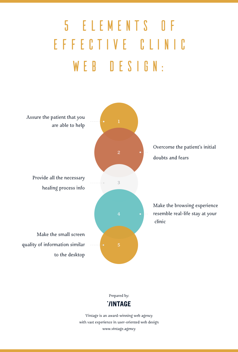
Assuming the above points, our list of effective website components for the medical care business will look like this:
- Goal of the website: to assure the client that your clinic is able to help.
- Circumstances: Health condition, illness or disease, which often comes in par with desperation and depression.
- Client’s expectations: to find out if your clinic can help (and keep in mind that some other ones may have already tried, but failed), learn about the cost of treatment, schedule the initial appointment.
- Comfortable experience: the patient should be able to find his or her section of interest (information on their respective condition along with a positive overview of previous successful cases), learn about the facility, specialists, and costs. Live chat would be the best option here, but if it can’t be implemented, then there must be an extensive FAQ-like section.
- Adaptation: the patient must be able to get the same quality of information from points 3 and 4 while browsing the site from a mobile device.
Now, that we have identified our criteria, let us look at the Top 10 U.S. clinic’s websites from the patient’s perspective.
Honor Roll Best Clinics: How Good Their Websites Actually Are (And How You Can Use That)
The U.S. News’ Best Hospitals ranking is considered the most credible clinic ranking in America. Based on survey responses from more than 30,000 patients, the full list of best U.S. hospitals 2016-17 consists of 153 entries. Death rates, patient safety, and hospital reputation are generally the most important among the factors weighed.
There is no doubt that the top 10 hospitals from this nationally acclaimed ranking are successful in terms of business performance. Despite the fact that 7 out of 10 are considered non-profit organizations, they have been known to gain substantial business profits (source: Modern Healthcare).
So, how many patients do their websites lead to them? Having a site with millions of monthly visits should be a great source of clients. In our analysis, we used the popular SimilarWeb tool to gain data on the overall Internet traffic, visitor activity, and the bounce rate of the subject websites. We also applied our genuine list of criteria to each of them. In the end, based on the example of the best U.S. hospitals, we tried to identify a set of business opportunities for your clinic website, which will lift it above the great lot of your competitors.
So, our patient websites lay ready before us. Let us light the lamps, sterilize the instruments and begin operating.
1. Mayo Clinic
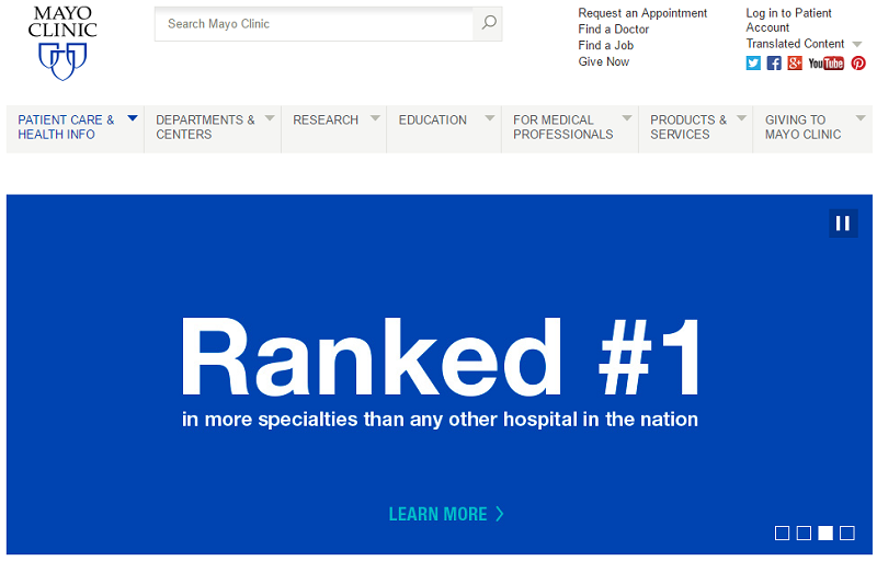
The home page of Mayo Clinic website greets us with a message that it is ranked #1 in the U.S. Two other images from the central slider contain titles to patients’ recovery stories. This is a good way to present your clinic to new patients. Knowing that others received professional treatment, and were able to recover from it helps mend the initial fears and doubts of the website’s visitors.
Right on the top of the screen there is a list of quick options, of which two are exactly what the new patient needs: Find a doctor, and Request an appointment. The first is a handy search tool to find the particular specialist employed by the clinic. One can refine their search parameters by name, department, and location. Each doctor has their own page with possibility to the appointment with that doctor right from it.
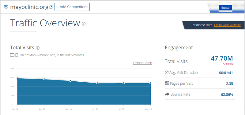
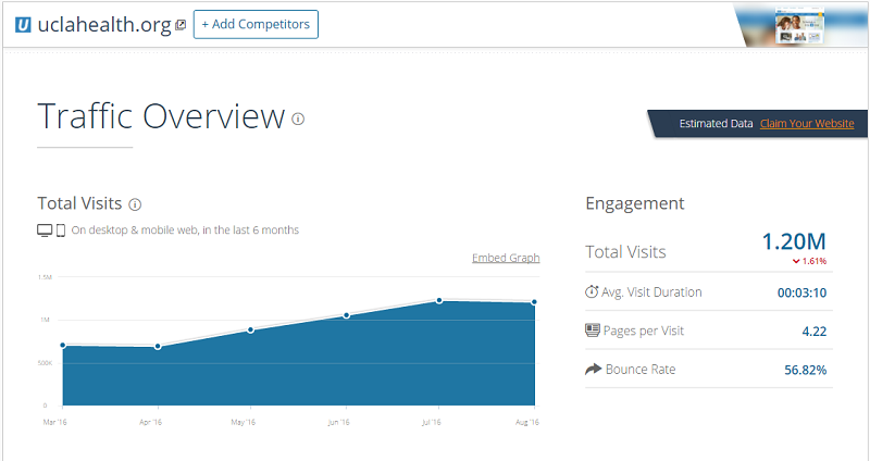
Let us look at the Internet performance of this site. Mayo Clinic is definitely popular online (ranked #361 most popular website in the U.S.), has over 47 mln. visits per month, and an average of 2.35 pages per visit. This tells us that people generally succeed in finding what they were looking for on the website.
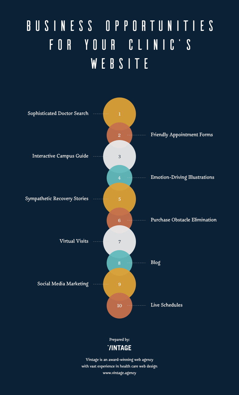
Business opportunity: By-Symptom Doctor Search.
Mayo Clinic appears to have a nearly perfect website in terms of patient experience. Almost everything the visitor can expect from a clinic website is implemented and can be easily accessed. However, the doctor finder tool is missing one awesome feature: search by disease or condition. No doubt that all doctors are educated and experienced professionals. But what can a person tell by their names only? If the search could match symptoms to the list of doctors who specialize on associated conditions - that would be a terrific website experience for your potential patients.
2. Cleveland Clinic
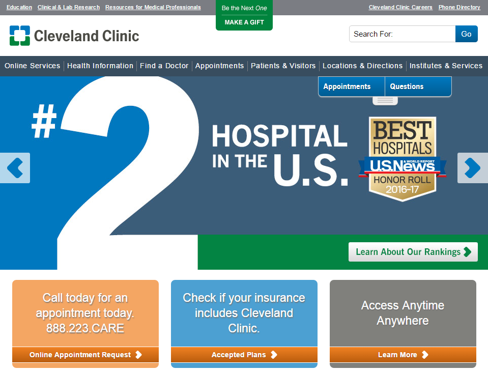
This hospital apparently takes pride in being #2 in the U.S. The homepage interface looks strangely similar to the Mayo Clinic’s website, but that is only at first sight. In terms of patient’s online experience, this website seems to organized far worse than the previous one.
The first screen has over 20 outgoing links, while the human mind can grasp only 4 (+/- 2) objects at a time (source: Livescience). Design could be improved by removing less important elements and making more explicit groupings (blocks), so that several elements could be perceived as a single category. Right now the website has two dubbing menus and a lot of unrelated buttons, which makes the visitor to read them all through, in order to understand their next step.
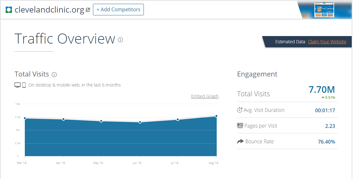
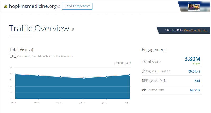
Some quick visitor metrics for the site. The first thing that catches the eye is that it has not too many viewers for a second best - only 7.7 mln. per month (compared to Mayo’s 47.7 mln.). Next, it has a bounce rate of 76%, which means that the percentage of clients who did not make any appointments or online inquiries after visiting the site is way too high. If everything seems to be organized properly, why would that happen?
The site has a cluttered interface with many distractions, which makes focusing attention hard for the visitors. It seems like the designer wanted to put all important information on the main page at once, but failed to prioritize.
Business opportunity: Friendly Appointment Forms.
Another example of distracting user experience on the Cleveland clinic’s website is their appointment booking form. It has a terrifying lot of fields. When the patient decides they need to see a doctor, they are certainly not in the mood of spending 40 minutes filling out a questionnaire. Our advice is to organize the booking forms on your website into several “steps” with visible progress tracking. That way, even if you have a lot of fields, and all of them are obligatory, your patients will not be overwhelmed by the infinitely scrolling appointment form.
3. Massachusetts General Hospital
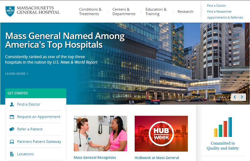
This is the last clinic on our list that emphasizes its national ranking on their homepage. The website’s first screen is rather laconic, but that can be considered a good thing. By contrast with the previous website, here the structure is easy to understand to a newcomer. The number of links is way fewer, and one does not have to read through all of them, as they are divided into two blocks with a clear meaning:
- The default "header menu", where you can find all the necessary information;
- The “call-to-action” menu, emphasizing the most referred information. Again, you don't have to read through it. Seeing that the block is called "Get started" is enough to decide whether it is what you need.
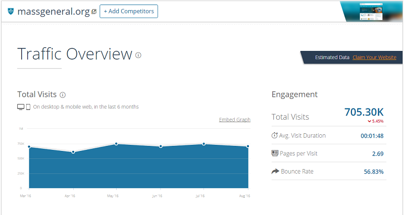
In terms of traffic flow, the site seems to be consistent. Fairly good bounce rate, and almost 3 minutes of average visit duration tell us that Massachusetts General Hospital manages to deal with its patients online quite well. However, there is one particular thing that we would suggest improving.
Business opportunity: Interactive Campus Guide.
This clinic’s campus is huge. It consists of over 30 buildings, and the total area is 350.000 sq. ft. Without a doubt, patients would need directions to and around such a massive facility. The website offers to download a map in pdf format and has a link to the Google map service. However, an interactive map with searchable directions to the particular departments and premises would be a better experience for potential patients. Instead of just having a static picture, your hospital website can be able to guide your patient right to the doorstep of their doctor’s office.
4. Johns Hopkins Hospital
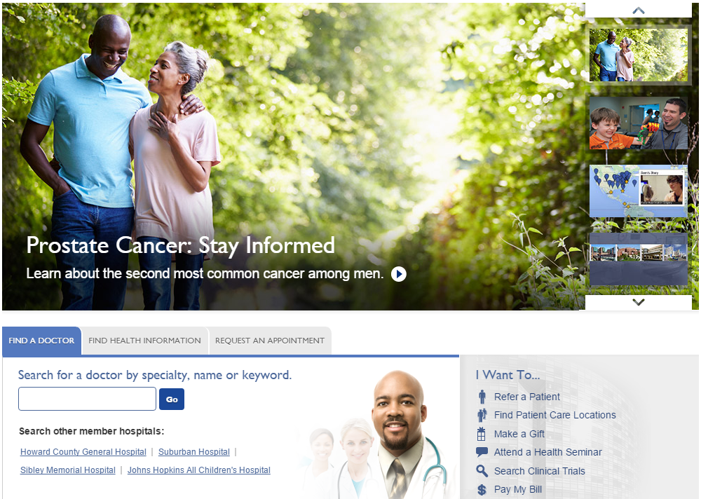
Just like every other site in our list, Johns Hopkins Hospital greets us with a photo slider. And just like every other website on our list, it could have had much better images. The messages are right: “stay informed”, “learn about us”, “we can help”. But when people browse the Internet, they perceive images a lot faster than text. The 2014 MIT research funded by the National Institute of Health revealed that it takes human brain only 13 milliseconds to identify the image being seen (source: MIT).
This is why, no matter how well the texts are written, every website needs fitting visuals. A hospital website needs the ones that would assure the patients of the comfortable experience during their visit and actually encourage them to come and stay. And to achieve this, simple stock photos will certainly not suffice.
Business opportunity: Emotion-driving Illustrations.
Good visuals make viewers relate to what they see. A picture of misty forest makes the viewer wish they were walking through it. A picture of the iced soda on a hot day makes them want to have a drink, even if they weren’t particularly thirsty. Integrating the invoking visuals into websites is an approach called Emotional Design. It aims to make your website’s visuals not just perfectly rendered and neatly-looking, but invoking the emotions you need your visitors to experience when they enter your website. You might want to prepare your clinic’s photo session from this perspective while having a website for your hospital designed.
5. UCLA Medical Center
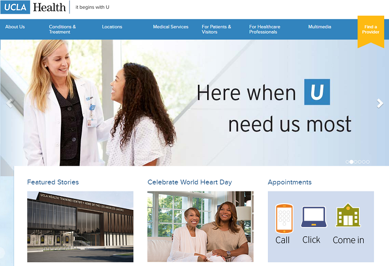
This is one of the good examples of how to market a clinic’s brand. The branding U-symbol is cleverly integrated into messages and calls to action: “It begins with U”, “Here when U need us most”, “Schedule a little U time”. This is exactly what we meant when we talked about building a patient-centered clinic website.
To add up to the positive user experience, an encouraging appointment registration system is implemented. It is aptly named “Call, Click, Come in”. Existing patients are prompted to call their doctor’s office (even after hours, which is emphasized). New patients may schedule a non-urgent appointment online, or request a same-day urgent appointment via live chat.
But as a true icing on the cake, comes the feature that we would really encourage all hospitals to implement on their websites, in one way or another.
Business opportunity: Virtual Visits.
No doubt most patients would prefer the doctor come to them rather than having to go to the hospital. And for non-urgent treatment or conditions that do not require complex diagnostics, this can - and should - be arranged with modern communication technologies. UCLA operates the online care program called Zipnosis. It is basically an online questionnaire, which the patient fills out. The completed interview is then sent to the physician, who responds with likely diagnosis and offers treatment.
This method of patient-doctor interaction is certainly no good for serious conditions and urgent medical care. But how often people just feel unwell and need a simple advice on how to get better? A practice such as Zipnosis will provide a terrific marketing effect, and act as a real trust booster for your clinic. The patients treated through it will surely consider coming back to your hospital in person for more in-depth diagnostics.
6. New York-Presbyterian University Hospital
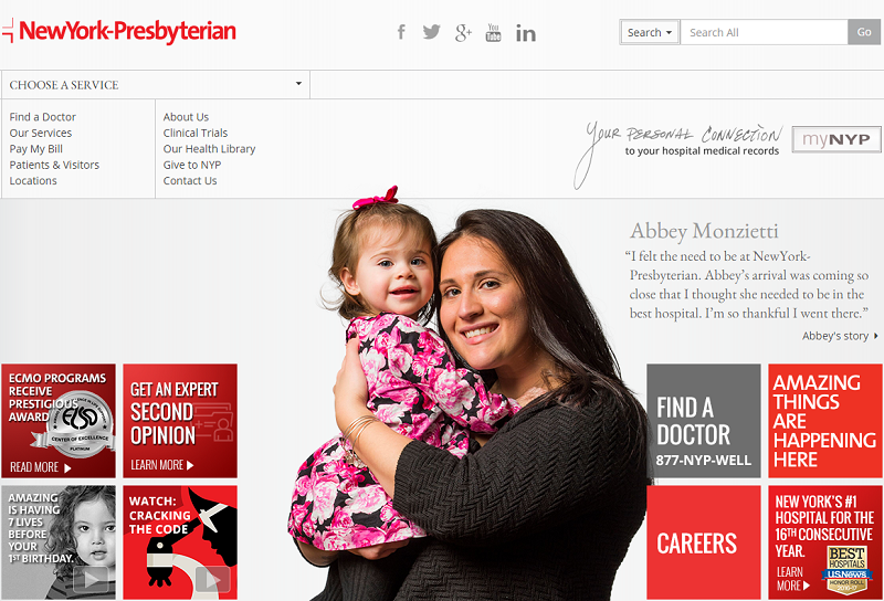
Finally, a website that does not have a homepage photo slider. Instead, the attention-grabbing content is organized here in a different manner. Firstly, the site has a central image of a happy patient, with a side link to their recovery story. It is interesting that patients (and stories) are different every time you load the page. This way the user gets more proof of the clinic’s social credibility with every visit.
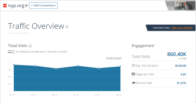
Secondly, the attention catchers are presented in the form of tiles. The most obvious user actions have been identified and outlined, in order to save visitors’ time and guide them to what’s important. And these tiles work even better for the mobile version of the website, aligning in two neat columns. The visitor engagement statistics prove that this method of content organization works well for the users: the site boasts over 6 pages per average visit, and only slightly over 30% bounce rate.
Business opportunity: Sympathetic Recovery Stories.
What we liked most about this website was how it tells stories of recovered patients. There is a special section called “Amazing Things Are Happening Here”, which acts as a catalog of patient stories. A short summary of each patient’s experience with the clinic is unfolded on the mouse over. Each case is presented in the form of a video interview, from both the patient’s and the doctor’s perspectives.
Yes, this obviously is a promotion. Yes, these videos may look like adverts. But how better to instill trust in your future patients than letting your former ones share their positive experience? Consider filming a few interviews with the patients whose cases you consider best in your clinic’s practice. These videos will tremendously facilitate both online and the word of mouth promotion.
7. UCSF Medical Center
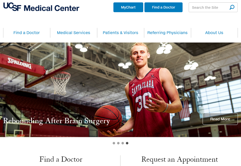
This website was clearly built with a “Mobile-First” strategy. And this is as much a curse for it as it is a blessing. We certainly encourage mobile adaptiveness, in fact, we strongly advocate it. But it doesn’t mean you have to completely ignore your traditional desktop viewers. And for such viewers, the UCSF website will have too much blank space.
On the other hand, everything here is as simple as can be. There are two search fields - one for doctors, and one for appointments, each with roll down specialty options.
Surprisingly, however, the Schedule call to action button does not actually schedule anything. It does not even begin the registration process for the patient. Instead, it takes you to the visiting information page with driving directions and parking regulations.
You have to navigate to the page of the particular doctor (via the Doctor Search), in order to get to the actual appointment application option. And mind you, that doctor may not be accepting new patients, of which you’ll only be notified after you’ve completed the form.
Let us see how all this reflects in the user engagement statistics. Just as we thought: 75% of visitors leave after only one minute spent on the site and have less than two pages viewed. This is exactly the scenario we went through.
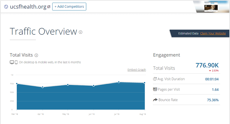
Business opportunity: Purchase Obstacles Elimination.
A good business website has to guide the client to the purchase. Of course, it cannot be fully applied to clinics’ websites. But the main idea here is this: your user should not get confused on their way to the final goal. The patient turns to your clinic’s website for help. They want to book an appointment to be able to visit your physical premises and consult your doctors. If the button reads “Schedule”, it must do exactly that. We were honestly surprised to find such a rookie UX mistake on the website of one of the nation’s most prominent hospitals. You’ve got to make sure it never appears on your clinic’s website.
8. Northwestern Memorial Hospital
This website embodies the trendy “Material design” style, common for the majority of Google services and applications today. It is the only website on our list with an animated scroll-down landing page. Such web design approach has only become popular in the last couple of years, so it is fair to assume that the site is freshly launched.
All gimmicks appear to be in the right places. Appointment forms are minimalistic and quick to load, and doctor search is refined by the “language spoken” filter, among other obvious ones. We have to admit that this website creates a decent visitor impression, and the browsing experience is smooth and eye-pleasing. It does not overload the visitor with a lot of links, and has only the most important information visible. Everything else is hidden not to obscure the view.
Our impression was confirmed by the SimilarWeb statistics - the site has one of the lowest bounce rates possible - only 39%. Furthermore, it shows continuous growth of traffic over time. Good design and pleasurable user experience certainly make a good contribution to such result, but we think we’ve figured out one more, not so obvious instrument that adds up to it.
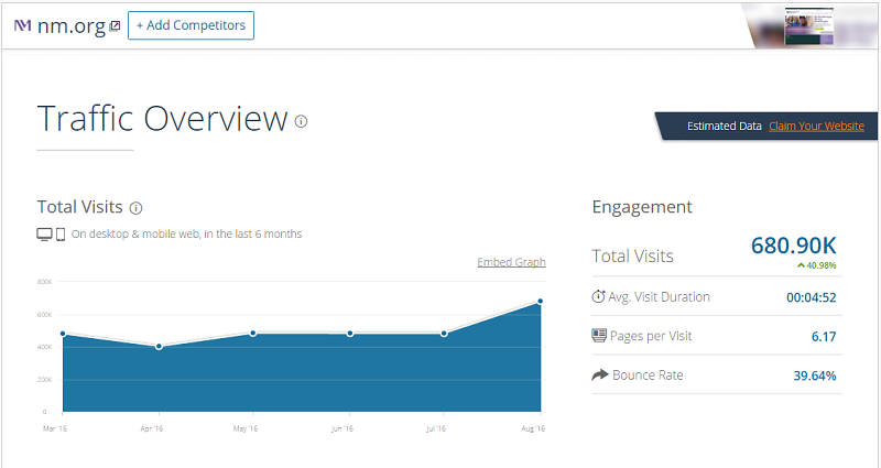
Business opportunity: Blog.
Blogging is a popular promotion tool for any service-driven business, and medical care does not have to be the exception. When you publish articles and post updates on your blog, it creates the impression of that your website is a living thing. Northwestern Memorial’s blog has been maintained since 2011 and has an impressive library of over 500 articles in 40 categories.
It is true that every website tries to publish news once in awhile. But blogging is different. It actually creates a pool of interested followers for your website, who facilitate traffic and promote the website simply by sharing the articles within their social circles. There is a whole science behind successful blogging, but it is not too difficult to embrace. And websites that do not neglect this practice will find their web performance drastically improved over time.
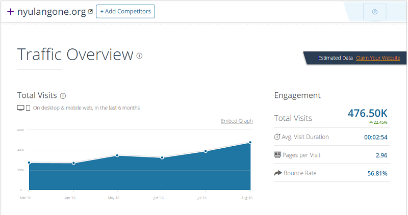
9. NYU Langone Medical Center
The design here looks modern and decent enough to be displayed on all screen sizes. The cover image may have been more fitting, but honestly speaking, we have seen worse matches on the websites from this list, so we won’t make a big deal out of it.
Appointment applications are integrated through the Doctor search, just like at USCF, but the implementation is far more user-friendly here. Firstly, the doctors are selected based on the required medical specialty. Next, the appointment booking option pops up with a calendar showing available dates and times for that particular doctor.
Other website functions are rather a standard, and invoke neither awe nor repulse. But one of the features is easily noticeable and suggests that this clinic has a distinctive strategy on it.
Business opportunity: Social Media Marketing.
Social media is where people tend to spend more and more time nowadays. An average American user spends nearly 50 minutes per day on Facebook alone liking, sharing and checking out what’s new on their feeds (source: Facebook Q1 2016 Report). This is why no business should neglect to maintaine active profiles in the thriving social media.
NYU Langone does it with strive and purpose. If you scroll down from the first screen, you will see a neatly organized feed with featured publications on the clinic’s various social media profiles. The company even has active profiles on Instagram and YouTube - not where you’d typically seek medical advice, but nonetheless.
10. Stanford University Hospital
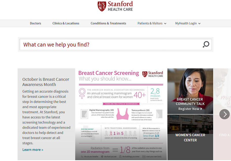
The first thing you notice on this website as a visitor is the “tiled” central slider. We have seen quite a lot of examples of image sliders on our subject websites, and we saw one that used tiles. But at Stanford Hospital’s page the two approaches are combined. Each slide is a self-sufficient content section with a visual (image or infographics), accompanying text, and two quick links to the related actions. We consider such an enhanced central slider a good practice for visitor engagement.
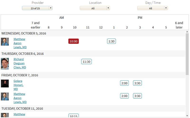
Now let us run our standard appointment schedule test. Here is another pleasant surprise from Stanford Health Care: in only two clicks, we get to the interactive scheduling desk, where all the available doctors are listed with all available appointment times. You can refine the display by name, location, and specialty. Out of the ten websites we went through in our research, this one appears to have the most user-friendly appointment application.
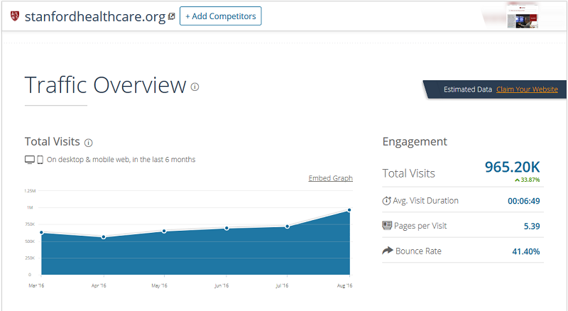
Traffic and user engagement data, according to SimilarWeb, are also one of the best on our list. Nearly 7 minutes average visit and the low bounce rate suggests that most users successfully manage their appointments and further interaction with their doctors through the clinic’s website. And in the end, what is a better measurement for the hospital website performance than this?
Business opportunity: Live Schedules.
When the patient comes to the reception desk at your clinic, one of their most common inquiries would be the availability and appointment hours of your doctors. It is an obvious intention to make that information accessible online. And it is strange that only a few clinics care to do so. Integrating the doctor schedules database into your clinic’s website is a thing you’ll have to tune once, and then have it work for you and your patients ever after. This simple tool will likely reduce the number of phone inquiries to your reception desk, and let your patients choose the suitable time and date of visit in a comfortable and relaxed state of mind.
Opportunities And Takeaways
We have journeyed through the digital spaces of 10 best American hospitals. This is how their websites look like, and this is what they use (or lack) to welcome and manage their patients online. Based on this experience, let us sum up the 10 business opportunities for your clinic’s website, which would bring it out from the pool of your competitors, and make your patient’s pre- and post-visiting experience amicable, cozy, and worthy of sharing.
Read more industry analyses on our blog:
View Comments