New condominium developments are emerging by the day in greater city areas all around the globe. You would think it’s a seller’s market since the urbanization rate is growing, and cities tend to get populated even more densely. But in truth, a lot of new condominiums fail to find their buyer, and stay barely inhabited for years.
In this article, we will try to identify the major features of the best condo sites on the web. We will also lend some tips on how to build a condo development website with respect to design, usability, promotion, and conversion, in order to make it a self-sufficient property seller for a development business.

Why The Website Is Important
It’s the XXI century, and everyone is online.
Today, no business can run from that. If you are selling anything other than basic necessities, people will look it up on the Internet, and expect to learn all about it there. So, it is fair to say that the majority of the potential property buyers of your newly constructed condo will get the first impression about it from its dedicated website.
Just like many other digital showcases today, real estate websites are largely impacted by the Halo effect in web design. As stated by Nielsen Norman Group, the Halo effect is a subconscious psychological pattern that occurs when the user transmits the quality of the website onto the one of the actual product or service it represents.
The quality of a condominium website design defines how your potential property buyers will treat the residential unit itself. If your website is poorly designed, uses bad visuals, and offers unintuitive browsing experience, the user will question your firm’s capability of building a decent living unit.
Goals Of A Condo Website
When you imagine a typical condominium website, you would think that its main goal is to showcase the living space to the potential buyer or tenant. A logical assumption. However, just like with many promotional websites in other business spheres, simply showcasing is not enough.
A property website must sell the property.
A condo website must sell apartments. It must be as convincing as your best salesperson. If it isn’t, then the salesperson may never get the actual lead.
In the chain of events leading to the buyer’s property purchase decision, your website is initially just one of many. To make it the only one, it has to end up at your buyer’s “favorites” list. It needs to invoke expectations, create the emotional binding. It needs to win over the heart of the potential buyer to such extent that they would look for flaws in the competitors’ websites, but never in yours.
Let us think of how a typical property buyer acts, prior to making the purchase decision.
First of all, they do a research to narrow down their options. The easiest way to do so is getting onto the local real estate finder (e.g. New London Development, Condos.ca), and browse through options available in your area of interest. At this stage, the buyer is not looking at any specific, dedicated condo website. What worries them now is location, amenities, proximities and user ratings. But this is the stage where your potential buyer must be directed to your dedicated website. Failure to provide a good cover image and a witty description along with the price range for the catalog will increase the chances of your offer being screened out.
Secondly, the buyer studies the options selected. At this stage they expect a dedicated property website to give them a full and solid impression of the offered property. If your website contains insufficient information or lacks arguments to back up the purchasing decision, then your condo will not be seen as good enough to investigate any further.
And finally, they pick a few offers for a personal visit. Usually, it’s not more than five or six options - visiting more would be physically exhausting. This is when the buyer will actually contact your sales department and wish to schedule a meeting. However, do not get complacent - you haven’t conquered the buyer yet. This is where your condo website has to pass the final test: the test of honesty. If something was overly exaggerated or presented only from the good side, then the buyer’s expectations may be set too high, compared to the real thing. Once they see that the reality isn’t as bright, they are instantly off the hook and are likely to spread bad publicity on top of that.
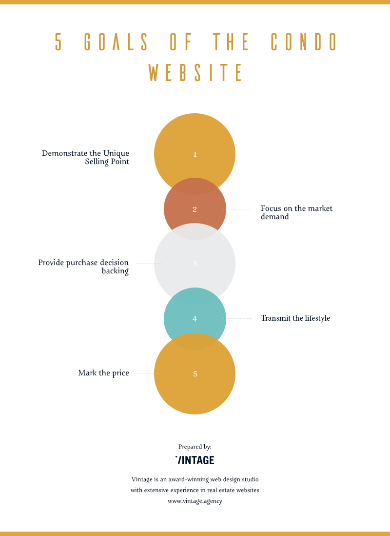
So, based on the above buyer behavior analysis, we have identified the following goals that a good condominium property website must accomplish:
Demonstrate the core of the project. In other words, show the USP (Unique Selling Point) of your condominium. If this is a piece of innovative architecture, then the website must transmit that feeling with various futuristic gimmicks. If it is designed as family residencies, then underline it with colorful, family-oriented design. Always keep your target group in mind, and try to look at your website from that group’s viewpoint.
Focus on the current demand. Opting to sell to everyone is equal to selling to no one in particular. A “one size fits all” website will only bring clients by the matter of accident. If your condominium contains multi-bedroom suites, it does not mean they will all be bought by families of ten. But it is fair to assume that such families would be the most interested target group. Make your website appeal to that group with proper design, social perks, and textual content.
Provide the sufficient info for a rational decision. Even if you have the best salespeople in the world, they will not be contacted until your property offer makes it to the buyer’s shortlist. And to get there, your website must back up your condo with every possible purchasing argument. Further in the article, we will define what such arguments may be.
Transmit the lifestyle. Living at your condo will be associated with a distinctive lifestyle. Its essence must be portrayed on the website, in order to invoke the right emotion in the potential buyer. The tricks of Emotional design approach would be of great help here.
Mark the price. We have to admit: this is the most sensitive and controversial point. A lot of condo developments do not have price ranges indicated on their websites. Still, we consider that showing prices will always play in the seller’s favor. Price is the most important purchasing factor for 80% of buyers. If it is omitted, the list of purchase-backing points will never be complete for the potential property owner.
A Good Condo Website Criteria Breakdown
Based on these goals, let us now dive into the depth of the criteria for a pinpoint and sales-driving condominium development website.
1.Design
A fitting website design is the transmission of style and purpose of the product or service it represents. The primary criterion of our research in terms of design was the illustration of style and concept of the condominium by its website. But the overall design outlay is not everything.
Every condo website development needs perfect pictures.
If your unit is ready for commissioning, then you will need good photos to showcase it from every possible angle. If the building is under construction, the website needs good renders. Below is what we consider a good example of a high-quality picture on a condominium website (source: Adelphi).

The final criterion in terms of design is the implementation of animations. Animations are the sign of a rich and solid website nowadays. They are what keeps the user’s attention focused, and creates the feeling that the website is a living thing. Check out this condo website, for instance. It may have used an overly excessive amount of animations, but looks terrific nonetheless.
2.Functionality
Needless to say that a good condominium website must contain the modern functions, which the user expects from web browsing. Most of such functions are common for any promotional and sales-oriented websites that are willing to thrive on the present-day web.
- Fast loading. Users hate it when something takes too much time to load. If your website is not optimized for loading time, be sure that users will not blame their Internet connection speed - they will blame your website. In our research we used the popular Google’s Pagespeed Insights tool to determine the average loading time of our subject websites.
- Mobile adaptability. With mobile traffic starting to exceed desktop, this point should be a real no-brainer. Your website should have an adaptive, or at least a responsive layout, or you are likely to miss nearly a half of your potential clients. Here is a good example of a mobile-responsive condo website design (source: The Hugo).

- Convenient navigation. The more simple - the better. Although your website must tell the user all about your condo and surroundings, we will see in the examples further on that a good website fulfils this purpose with a landing page and 2-3 auxiliaries.
- Social media linking. Present-day Internet users are all into social media, linking, sharing and discussing stuff. That is why social media buttons are a must. Even if you do not have a social media marketing strategy, let users share the website, and spread the word about the condo.
- Contact and feedback forms. Of course, the “Contact us!” call to action is obvious, but very few people will actually pick up their phone and call your sales office. Web forms are the obligatory means of establishing the primary connection, and these forms should be light, quick and easy to fill out.
A website’s design sets the first user impression, and informativeness enables the user to find out all about the property you are selling. But without proper functionality, the user will have a hard time getting to that information. This set of criteria is aimed to ensure that the website provides convenient means for the buyer to keep researching.
3.Informativeness
As we stated earlier, information is everything to the buyer. A good website must present a complete set of information, substantial for making the rational purchase decision. However, you never know which criteria will be crucial for every buyer. Some features of your condominium will be seen as advantages, and some - as drawbacks.
Make drawbacks look like advantages.
Simply admitting and explaining the drawbacks is bad practice. The website must convince the user that the drawbacks can be seen as advantages. For example, let us imagine a condominium constructed in an suburban area next to the railway. There are two ways to describe it:
- Option 1: The building is located in the green area, near the railway.
- Option 2: The building is located in the green and ecologically friendly area with a picturesque countryside view and beautiful picnicking sites. Its close proximity to the railway allows quick train trips to the city. To prevent you from the railway noise, the enhanced sound-proof windows are installed in each apartment.
Below is the first screen of a condo promotional website, which manages to describe the USP, lifestyle, surroundings and living space in one simple phrase (source: The Columbus Building).
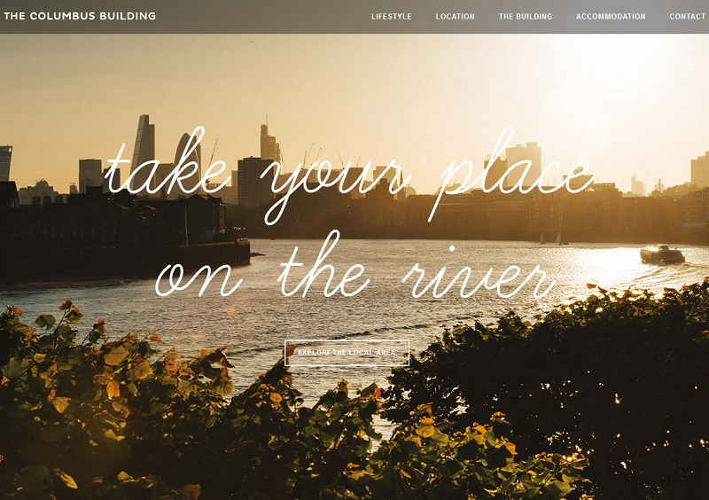
It is important to avoid over-exaggeration here, however. With a witty marketing description, your website will set certain expectations for the potential buyer. When such buyer is interested, and chooses to visit your condominium, they’ll be disappointed if the real thing fails to live up to the expectations.
Next comes the infrastructure. The condominium does not (or will not, after its completion) just hang in the void. People who will be considering buying property in it will want to know about the neighbourhood and surroundings. Thus, it is crucial for the website to provide the following info:
- Location and directions (both driving and public transport);
- Closest necessities / emergencies (general stores, pharmacies, hospitals etc.);
- Closest places of interest (parks, landmarks, restaurants).
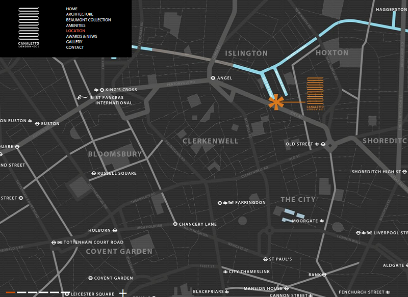
A good way to show all of the above is the custom interactive map with clickable pins. A lot of websites from our list just use an embedded Google map of the surrounding area. Although Google maps are accurate and popular, they often look out-of-place on the website, and interfere with the overall design outlay. We strongly believe that a customly drawn map will add up to the website’s value. See a good example of a custom neighbourhood map below (source: Canaletto London).
Floor and apartment plans are one more feature that is obvious for any apartment website design. We will not even stop at explaining why the feature is important- this should really be a no-brainer. There are several proven ways to present your building's plans:
- Sketch top-down view. The most popular one, since it’s the easiest to produce. We consider it to only work well for the condos under construction. See a simple sketch plan example below (source: 8050 Vero). If the unit is commissioned, then it is better to go with the enhanced view option.
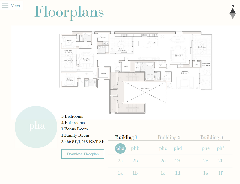
- Enhanced top-down view. The plan is presented in the form of a render. Can work for both ongoing developments and commissioned ones, if the budget does not allow more complex solutions. However, renders must be of a very good quality - which also applies to all other renders used on the website.
- 3D view. Requires 3D modeling or a 3D animation. Allows the user to see the layout of the selected apartment from various angles.
- 3D walkthrough. A series of panoramic images shot by a 360-camera. This option is the most complicated but provides the best presence effect.
No matter which option you choose, it is a good idea to enhance your outline with decor and interior, so that the user does not see bare walls only, but a variant of how the place can be fit for living.
Lastly, we have to emphasize that an informative infographic works much better than plain text, no matter how well-written. If you can summarize all your perks in a short, but witty infographics, it is never a bad idea to go for it.
4.Price
We put this criterion into a separate section, because we wish to strongly underline its importance. Indicating prices for every property piece, or at least the price range in which apartments will be sold in the unit is a business booster for you, and a time-saver for your potential buyers.
60% of any business website visitors expect to find price on that website.
We emphasized earlier in this article that today, people prefer personal research to live interaction with salesmen. People deal with attempts of being sold to on a daily basis, and try to avoid aggressive offers whenever they can.
That is why giving your potential buyer the idea of price on the realty website will always act in your favor. If your price offer is within the acceptable boundaries for the user, then it will be one more argument for considering your option. If it isn’t acceptable at all, then the user is not your potential buyer, and will save time for your sales department by not contacting them. Here is an example of smart combination of floor plans and prices showcase on a condo website (source: Echo Park).
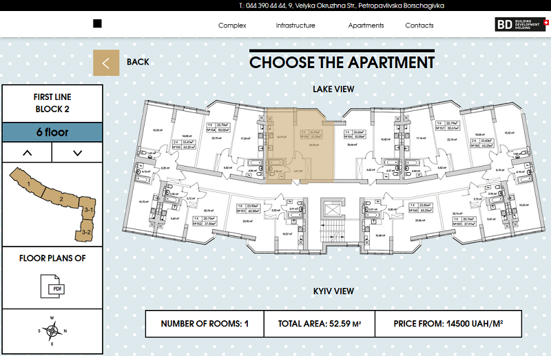
The “Halo effect” principle we spoke about earlier in this article, suggests that the user is likely to subconsciously judge the value of the apartment by the look of the website. If the property website is convenient, well designed, possesses all necessary into and features, the price will add up to the positive user expectation. If you are selling a budget condo, then the fair price will match the good website. If you are selling a luxury suite, then its high price will be matched by the impeccable website.
The only case, when the price plays against the user expectation, is when the website is mediocre or poorly designed. But this should obviously not be the case with your condo website.
5.Credibility
When people consider buying a house, they legitimately assume to be the sole ruler and governor of their property. With condominiums, it isn’t quite like that. The apartment is a personal living space, but the building itself, and all commodities that come with it are being shared among the neighbors. For this reason, the credentials of the building itself have to be showcased and presented on the condo website.
This is especially the case when the building has not been commissioned at the time the website is launched. You have to assure your buyers that the construction will be completed successfully and on time, and that there will be no trouble with commodities for years to come.
Below is the list of credibility criteria, which we consider important for a good condominium website:
- Developer brand. Promote yourself as the developer of the project, and link out to your corporate developer website. This lets the buyer see that there is a respected entity behind the project.
- Architect brand. Link out to the condo development company, or even better - record an interview with the Head architect.
- Previous projects. If this isn’t your first living unit in the development, you must have a history of successfully completed and commissioned condos. Do not hesitate to link out to them, or at least provide their short textual descriptions.
- Construction perks. This mostly applies to units under construction, bit won’t hurt a commissioned condo website, either. Describe the construction methods and materials used, to assure the future buyers that the building is modern and up-to-date, and will stand for centuries.
- Endorsements. It is a good idea to collect favorable opinions or quotes regarding the condo from public figures or well-known former buyers. If you do not have endorsements for the condo itself, but have one for your developer brand, consider placing a logo or a banner of that brand on your condo website. See an example of how the project credentials are being shown unobtrusively on the bottom of the first screen (source: Rathbone Square).
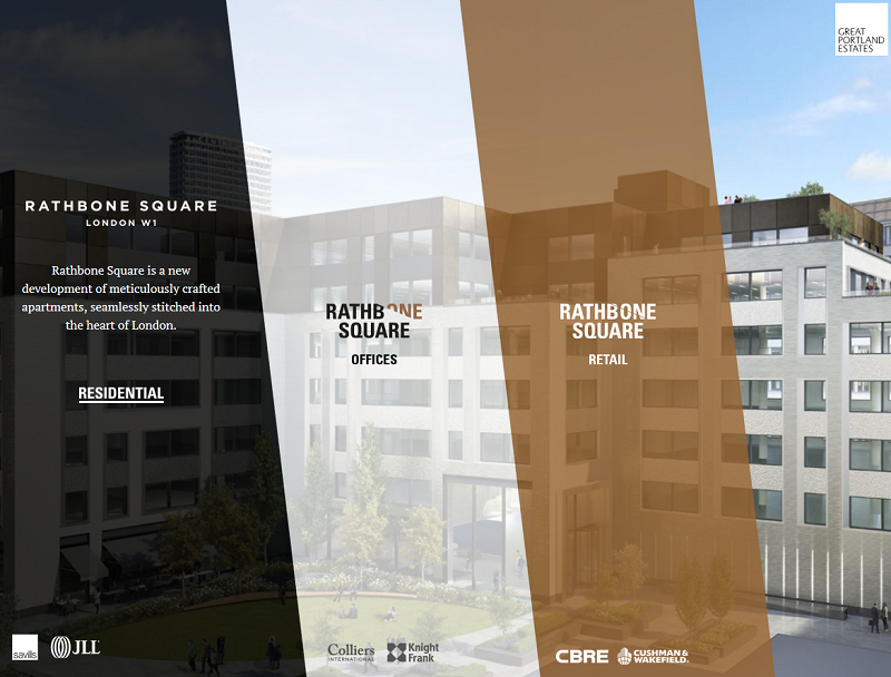
Every credential on the condo website boosts the level of trustworthiness of that website. Showing connections to other projects, and people behind the design, planning, and construction, reassures the potential buyer that the living space was made by professionals who were confident in their expertise.
6.Advertising
The final two sections of our criteria deal with how a condo website fares on the vast digital space. Producing a terrific website is not enough, unfortunately.
You have to make sure your website is served to the interested party.
There are two distinctive channels where you can advertise a website on the Internet:
- Direct advertising. This is when your website is brought to people who are actively looking for it.
- Indirect advertising. Opposite to the first channel, this one focuses on promoting the site where it isn’t specifically sought.
The most obvious resources to advertise your condo website on would be the online property finders. Here is the list of top 10 real estate websites of 2016, which we published a while ago. However, the competition on such platforms is very tight, and thus the advertising cost may be relatively high.
Therefore, in order to differentiate your marketing efforts, and outplay your competitors on alternate fields, we would advise exploring less obvious advertising resources for your condo project, such as:
- Local user review platforms. They typically have sections devoted to real estate.
- Tourism forums. This lets you promote your condo as a new city landmark;
- Young families forums. Make an offer of a cozy apartment to move in.
- Social interest clubs. When people get together, they usually discuss a lot of random things. Advertising on social interest clubs will let your new condo become a subject for discussion, and thus - spreading the word of mouth.
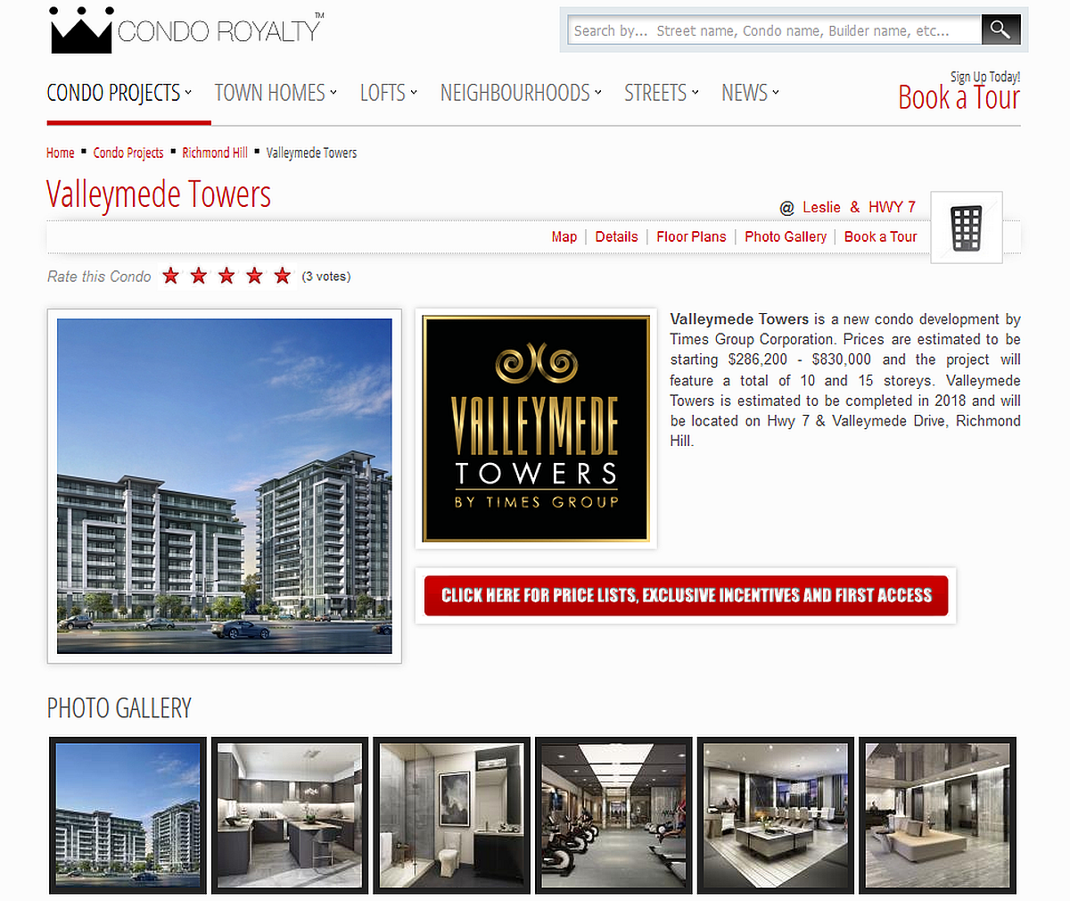
- Yellow pages and catalogs. Make sure the address of your new condo is highlighted on your city’s directory. Below is an example of advertising the condominium on a specialized web marketplace (source: Condo Royalty).
7.Search Engine Optimization
Commonly referred to as SEO, this combination of techniques and activities is targeted at delivering your site’s content to the people who are actually interested in it, rather than just having it hang in the void and waiting to be sought out by strangers.
Internet search engines, namely, Google, use sophisticated website estimation algorithms, which decide whether the given website is fit to show in the user's’ search results. Websites that are not SEO-friendly are likely to lose the competition to the ones that have been properly optimized.
That is why your condo website must contain the following:
- Main page meta title and description. This is the short summary of a website in the user’s search results. If this section is empty, the engine will state that “no description is available”, or simply display the first 160 characters of the website's body text. Either way is certainly not a good way to present a website to the user.
- Auxiliary pages meta titles and descriptions. Just like the main page, it’s a good idea to write titles and descriptions for all of your pages.
- Sales-oriented keywords in the meta titles, descriptions, and alt tags. Keywords are words and phrases that people are likely to enter into their search bars when looking for results similar to your website. Including them into descriptions that are being processed by search engines increases your website’s chances to be displayed in the direct search results.
- Alt tags for images. An alt tag is the textual description of an image, by which the engine searches the Internet. Putting a good keyword there will ensure that image search will work for your website just as well as the regular textual search. Also, the alt tag will substitute for the image, should it fail to load.
Besides keywording, you should also get quality links from trusted sources pointing back to your site. This seems to remains one of the most important search ranking factors.
Here is a list of results returned by the “new condos Toronto” search inquiry. See how Mattamy Homes manages to retain a high position on the list, above their competitors?
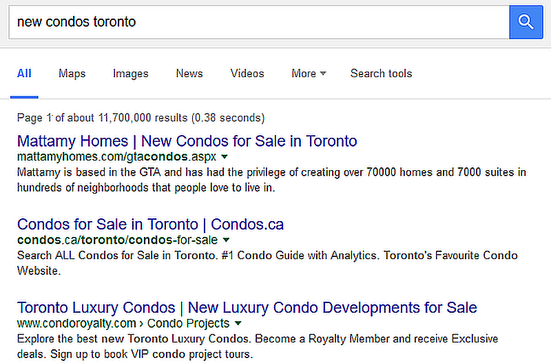
Please keep in mind that our goal was not to show the peculiarities of SEO for real estate developments. The points listed above are the basics of SEO that you should be aware of. But if you need to achieve superior SEO results, do not hesitate to hire an expert.
Cost Of Condominium Website Development
Estimating the timeframe and cost of any web development project is a complex and multi-staged process that requires effort and commitment from both clients and the web developers.
However, having identified the major criteria of a good condominium website, and being an accomplished real estate website builder with more than ten years in business, we can make a good guess for a price range of such a project.
If you need a simple landing page with 4-5 auxiliaries, like, for example, this one (East United Condos), then the estimated cost of developing condo website would be around $30.000. If it is a complex site with detailed descriptions and dedicated pages for amenities, floor plans, offices and landlord endorsements, then the price can go as high as $100.000 (example - Federation Tower).
Please note that the price estimations take into account the production of renders and hi-resolution photo and video content. If you are already in possession of the high-quality content required by such a project or plan to produce it separately elsewhere, then nearly 30% can be deducted from the cost of the website.
In any event, if you need a condo website produced, re-designed or refined for the massive marketing campaign, we would be eager and willing to assist you here at Vintage. Please feel free to contact, and if you found this article helpful - do not hesitate to subscribe for more!

View Comments