
There are these times in our lives when we have to choose the next place to live. I’ve had one of such periods recently, and just like everyone else, I began racking Google for good real estate websites in my area.
However, as a web designer, I just could not bear with the experience of browsing through ordinary, poorly made property website design. That is why, after nearly a week of searching and weighing up pros and cons, I decided to share my personal chart of top realty websites that I came across in my quest.
I don’t like to claim the unerring, but to me, these are probably the best sites you can find in this business, as of October 2016. I have accompanied each of my 10 favorites with my initial, first entry impression. Hope you enjoy, and who knows - maybe use this little chart for inspiration, should you ever have to create the best real estate website design.
Before starting to review the best examples, let’s highlight the primary elements of good web design for real estate website.
Elements of real estate web design
Clear and smooth navigation. This is a matter of course for any solid website, from a landing page to a large database-driven website with a customize back-end and content management system.
Simpler a navigation is, easily people will find what they need and more enjoyable their experience will be. If your website users cannot find the information they are interested in without being irritated, why do you think they would want to buy a house from your company?
Meaningful content. Strong content always wins. But what make it so special?
Content builds trust - through content, you tell your potential clients who you are and why you differ from others while clients’ reviews and ratings establish themselves in thought that you can be trusted. It establishes your company as an expert in the industry - by providing real estate-focused information, you say people that you know what you deal with. It gives users something to share. And finally, it drives organic traffic through SEO and social media.
Home search. Imagine that you come to a clothing store and cannot find any piece of cloth there. That is how visitors of a real estate website lacking a humane home search feel!
IDX is an umbrella term used to cover standards, policies, and software pertaining to the display of listing information on property websites. Most importantly for brokers and agents, IDX enables members of a multiple listing service (MLS) to integrate real estate listing from the MLS database into their own websites.
Responsive design. Today’s consumers do their research online. Over 60% of users visit real estate websites via their smartphones first.
It is crucial to establish a mobile-responsive website. This means that users could find all necessary information quickly and easily no matter what device they use - laptop, desktop, tablet or smartphone - without being redirected to another website. Let people a chance to see your beautiful apartments.
Needless to say that each of websites listed below meets all these criteria and far more.
One last caution before we proceed. I live in New York, so some of these services deal strictly in that area. Doesn’t make them look worse, though. All right, the popcorn’s ready. Let us begin!
“The Iconic Perfection” - Compass
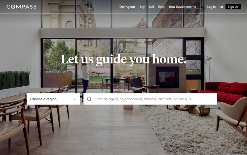
This is a great and solid example of a modern real estate website. Nice cover visuals, really fast loading and a comfortable mobile browsing experience (even without installing the app) let you look through the available options while you are simply killing time with your phone. The properties are listed in both the traditional “tile” view and the “map” view that lets you hover over the map and expand the relevant pins. The catalog of dedicated Agents comes with photos and short descriptions, leading to the personal page and contacts of each one.
I liked this website for its minimalism and navigation simplicity, and at the same time, a well-transmitted impression of professionalism and high standards.
“The Agent Next Door” - Redfin
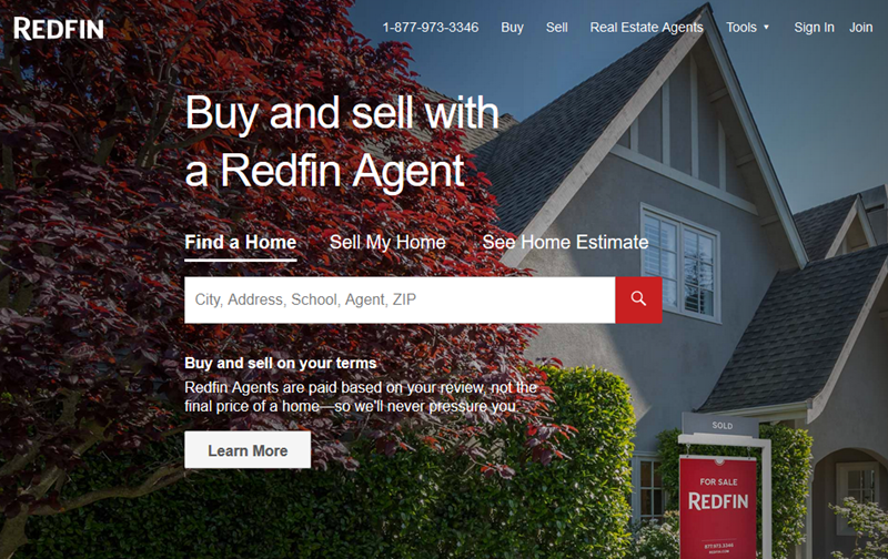
This website aims to deliver a “right-around-the-corner” experience. The landing page instills the feeling that your personal agent is already at your doorstep and eager to assist. Visuals and color palette embody the “domestic” feeling of a warm blanket and plaid pajamas. The central slide reel features a series of success stories of happy homeowners. And the company also refunds a part of their commission from every successful deal!
One feature that I particularly liked about Redfin was the “3D walkthroughs”. The agent does not simply take pictures of the property, they film a 360 Camera video, and take every potential buyer on a virtual tour. This service is included in the listing fee. And I must admit, it makes a great difference when you can view the place from all angles before you decide if it’s worthy of a personal visit.
“The Urban Pace” – City Realty
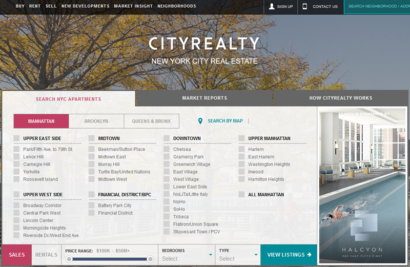
Here is all you need to rent or buy an apartment in the city - quick and easy. This website design for real estate does not overburden you with extra gimmicks and features. But what it does have in full supply is filters. You can literally narrow your options down to the bed size or the bathroom faucet shape. This is the most sophisticated apartment search platform I’ve encountered so far. Pity it works only for NYC and the Greater Area.
Aside from the obvious real estate and rental services, City Realty also offers curated market insights. It is possible to track appartment price fluctuations for the last 60 days, either by region, number of bedrooms, or interior conditions. If you are a picky buyer, this is a nifty tool for you to strike a smart deal.
“The Traditionalist” – Riskin Partners
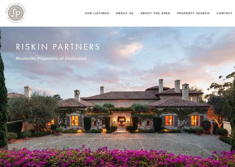
A property agency website in its most conservative sense. It is strictly down to business - renowned pieces of property are waiting for people to claim their ownership. The company mostly deals in luxury and historic estates, but since I’ve stumbled upon this website during my search, I thought it was worth mentioning here anyway.
The site emanates reputation, and does it with style and class. Scrolling down the landing page, you come across various trust-drivers and badges of recognition: “in business since 1979”, “featured by WSJ, FT and The New York Times”, “a Webby Awards honoree” etc. When you are in the world of luxury, you need proper credentials, and showing them off on your website is a good way to prove your worth to your clients.
One special thing that caught my attention on this website was the “Search by Lifestyle” feature. It lets you choose not just the kind of property, but the surroundings suitable to your lifestyle of choice (e.g. beach, ranch, seclusion, mountains view etc.). Truly, for the luxury estate buyers the surrounding may be more of a factor than the property itself. Choosing by this criterion is a good way to focus on the big picture rather than just the interior.
“The App For That” - NOOKLYN
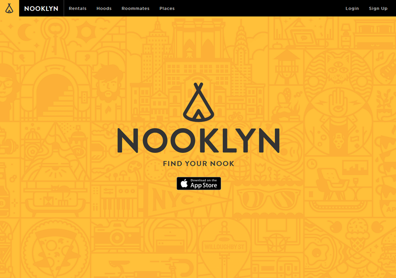
If you’re from New York, chances are you’ve probably heard about this one. Nooklyn is a rental website for the next generation tenants. It does not only let you browse the rental offers, but also highlights places to hang out in your area of interest! You can use this site as your personal guide around the new neighborhood, and rest assured - places of interest aren’t just advertised to you, but suggested based on user reviews and rankings.
Another cool feature of Nooklyn is the roommates matcher. Having registered with your Facebook account, you get into a tenant social network of sorts, where people team up to share a loft, or look for available room offers.
Needless to say, the site is built with breezy web design trends in mind - I believe it’s even got two or three awards. It prompts you to install the app, but there’s no real need for that - the site can be comfortably accessed and browsed from any possible device.
“The Creative Mind” – East United Condos
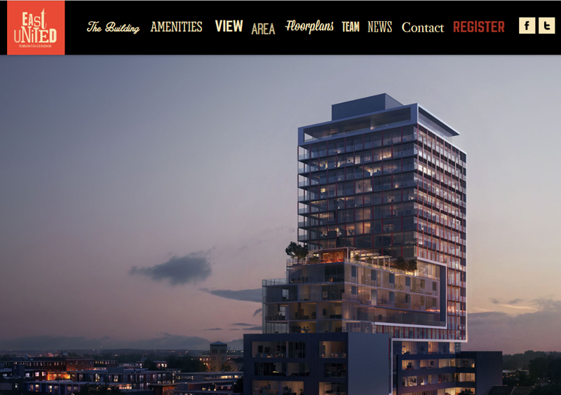
This seemingly simple landing page website turned out to be a designer’s eye-candy. Scroll down and see how suites and surroundings unfold before your eyes with spectacular animations and witty screen-changing effects. The company decided to focus on creativity, and it surely paid off.
The site focuses on amenities and floor plans of newly constructed condominiums. Like other good examples of property websites, this it pays utmost attention to the area where the condos are located. Shopping, parking, restaurants, health & wellness, public transportation - it’s all covered for your property of choice. If there is the right way to sell suites in the newly constructed buildings - it certainly is the East United Condos way.
“The Socially Obsessed” - Trulia
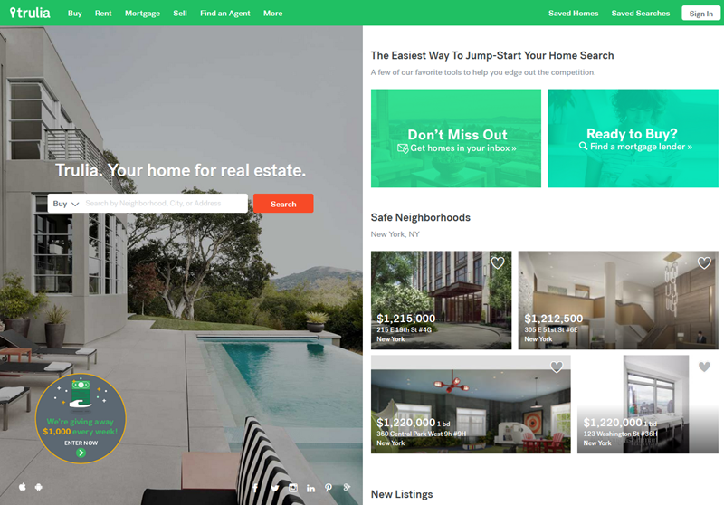
Like it. Share it. Let it flood everyone’s feeds. Social media are the new temples today, and people tend to spend more and more time there. According to the Facebook Q1 2016 operation report, the average U.S. user spends nearly an hour per day liking, sharing and checking out what’s new on their feeds.
Every other business is eager to use that as an opportunity. Delivering offers to potential clients while they are simply browsing for fun is what no other traditional marketing method will ever achieve.
One of the best examples of how to use this approach wisely in real estate business is Trulia. Each piece of property that hits the market craves to be socially assessed. User likes and reposts act as rankings for each particular house, apartment or estate. Trending and top-ranking properties have priority display, and thus - better chances for a deal.
So, in order to succeed in this “auction” of sorts, the sellers have to excel at visuals and descriptions of their property, but isn’t that a good thing after all? As for me, I would certainly turn my attention to a well-prepared offer, rather than a simply listed one.
“The User’s Bosom Buddy” - HILLEL
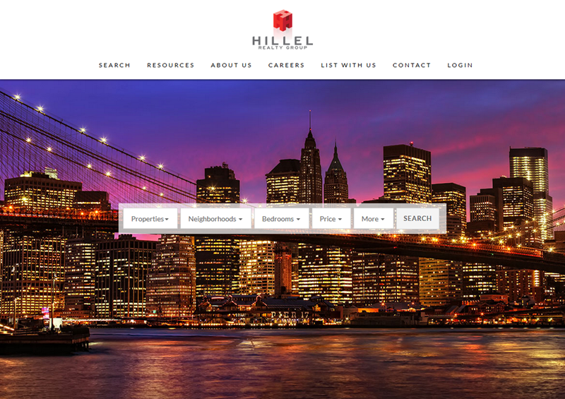
For me, this site was a top scorer in terms of user experience. Everything here is straightforward and simple as can be. Set up your parameters and get your shortlist of offers. Pretty much everything you want screened out can be done so by using only five simple filters:
- Type of property: for sale or for rent;
- District: single or multiple choice;
- Number of bedrooms: from one, and up to 5+;
- Price: set a range between the minimum and maximum value;
- Additional details: square footage, bathrooms, kitchen type etc.
Within a few clicks, you get your personalized shortlist of up-to-date offers. Nothing too fancy or mind-blowing, just a simple tool to find your next place to live. Thumbs up to this website’s UX designer! Once again, too bad it only works for New York City.
“The Hood Overlooker” - RadPad
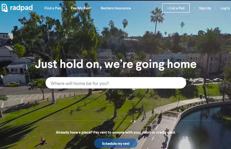
Amazing videos of neighborhoods shot by flying drones. When I first navigated to this website, I must have spent nearly half an hour just looking at the background clips. Yes, the footage is that good! Currently, 9 U.S. cities have been filmed, and the site promises there are more to come. In the future not so distant, such a breathtaking feature may really change the way we’ll be looking for property.
Upon typing the name of the city or area of your interest, the website takes you to the interactive map with available offers. Here you can apply filters and save your picks for later view. Everything is straightforward, but the service is really spiced up by the magnificent aerial views of various living blocks and districts.
“The Classy Galore” – Elite Luxury Homes
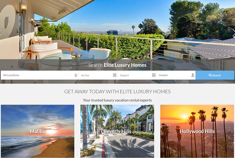
The finest residencies for the VIP buyers. I put this site on the list because of the stunning visuals of the world’s most elite apartments. One day I may be willing to rent one for a week or two - and websites like Elite Luxury Homes will be there to give me that opportunity.
Aside from the perfect images, every piece of property listed here comes with a lengthy, detailed and well-written description. Seriously, it’s like reading a novel about it. Makes you want to move in and embrace the experience. I’m sure that after spending a few nights in one of these residencies, your home will never look the same again to you.
So, this has been the tour around what I considered the best real estate websites of 2016 - the most thrilling, engaging, and beautifully designed ones. Hope you loved it and burnt with the desire to create your own. Now, I’m going to tell you how to create a great real estate website and how much it could cost you.
How to create a great real estate website
No matter what kind of website you need to design - for elite mansions, middle-class houses or affordable apartments - it has to inspire clients’ confidence and immerse them into how a property will look like. So forget about cheap renders and so-and-so content - they will not just help you but fear your clients away. Only well-designed 3D renders and only professional photo gallery.
Secondly, define your client. Your client has a portrait and your goal is to draw it. Do not be fooled into thinking that you provide real estate services to everyone. At the very least, you probably business with buyers and sellers within a specific financial bracket.
Create email subscription. The consumer buying-decision process is long-term, so it makes sense to remind users of yourself from time to time. Otherwise, your client may just forget about you.
Pay attention to a mobile version of your website. This means that users could find all necessary information quickly and easily no matter what device they use - laptop, desktop, tablet, smartphone - without being redirected to another website. Let people chance to see your beautiful apartments.
If you want to know how luxury real estate website design differs from cheap, read our article.
Costs of real estate website
For 10 years of its existence, our Vintage team has launched over 400 web design projects. Many of them were recognized as world’s best sites and made our clients unbelievably successful. It became possible due to the fact that our clients knew what they wanted and dived into the process.
There is no simple answer to a question on how much developing a real estate website costs. However, there are three main approaches you can use to make your own estimates on time and cost:
- task-based approach (breaking the project into small tasks, determining a timeframe and rate, and adding some contingency amount)
- benchmark approach (reference based approach)
- tools-based approach (using web development calculator, very rough estimations).
Keep in mind that every designer or design agency has their own project phases depending on client’s needs and requirements. If you want to get more accurate estimates on a long-term basis, find a few web agencies whose works you like and contact them.
Here is a couple of articles that will help you to understand stages of web development and not to make a floater:
- How Much Does Website Cost: The Most Definitive Guide to Web Design Pricing
- How to Estimate Cost and Timeframe for Website Design Project
More of our editor's picks:
View Comments