
We all love to discover new places to eat out. But what can we learn about a cafe or a restaurant from its website? Location? Obviously. Menu and cuisine? Definitely. But shouldn’t there be more to it? How do we get absolutely positive that if we choose this restaurant, we’re going to have a terrific time there? A top restaurant website would help convincing a great deal.
For me as web designer, a restaurant website is a reflection of quality of its food and service. A poorly designed or mediocre website will not give that restaurant’s potential clients the feeling that the place is good to visit. How many times did we find ourselves browsing around the local places to eat, and screening the options out because of poor restaurant web design? How often have we seen a website for restaurant loading slowly, displaying improperly or having unappetizing visuals?
In this article, I’ve gathered a dozen of examples of well-designed and yummy-looking websites of the small local restaurants around the world. These best food websites design examples surely did make me want to spend an evening at the places they represent.
Have fun browsing, and feel free to use this little top chart for your web design inspiration. I have to warn you, though - better grab some snack before reading - the pictures may be extremely mouth-watering!
1. Royal Plate (New York, USA)
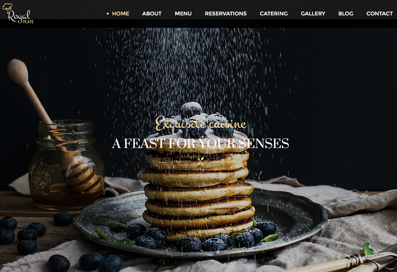
Opening our list is one of the most beautiful restaurant websites ever made. Royal Plate specializes on freshly made bakery, and the website has a full supply of it. Biscuits, pancakes, fruit & berry pies are showcased from all angles possible, and with all dressings imaginable.
An interesting concept used by this restaurant is the Instagram dish reel called Royal Plate Moments. Every client is encouraged to contribute to the collection by adding the respective hashtag to their posts. A really clever way to promote the cuisine and attract new admirers to it.
2. Marché Notre-Dame (Québec, Canada)
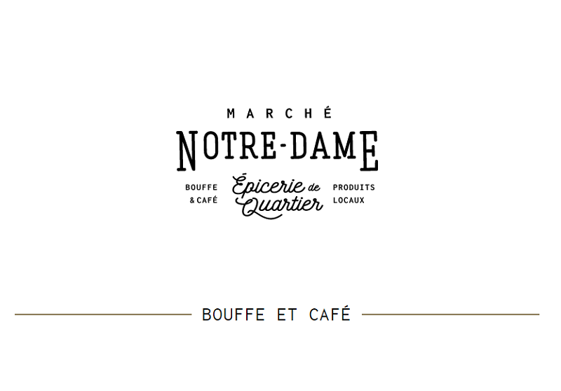
Minimalism in all its beauty, this website is designed to resemble a vintage signboard. Menu entries are interestingly unfolded in the scroll-like manner, with pictures of every dish rotating on mouseover.
This is an example of a good web design for restaurant, which intrigues with its simplicity and a light trace of innuendo, which encourages to learn more about the place and its cuisine by diving deeper into the menu sections.
3. Tio Luncín (Lima, Peru)
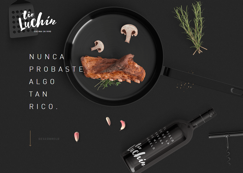
Various raw products, ingredients and cooking equipment fly around this website, creating the impression of the dish being cooked right as you scroll down. Smart integration of video clips further add up to the presence effect.
The website is a winner of one of the good restaurant website design awards, and you can see why. An opaque dark background perfectly harmonizes with neatly rendered images of food and dishes that this restaurant takes pride in cooking. This is a good example how to showcase a brand image, while staying focused on what matters to your clients.
4. Quay (Sydney, Australia)
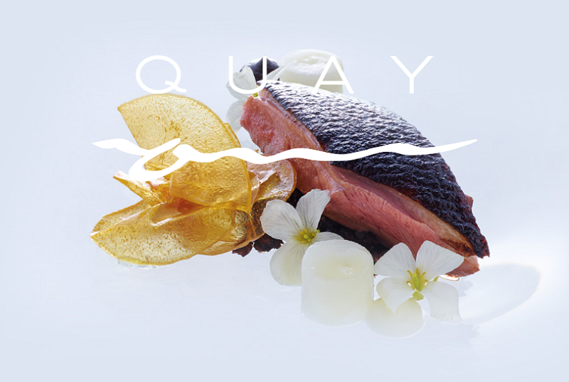
This restaurant has a perfect location - the eastern shore of the Sydney Harbor, just opposite to the famed Opera House. And it’s understandable that to match such a location, it needed to have one of the top restaurant websites in the world.
What the site aims to instill is the impression of luxury and unforgettable experience. In addition to the obvious menu and reservation options, It has special dedicated pages about the chef, the team, event organization and planning.
The feeling of exquisiteness is further emphasized by beautiful main hall and terrace visuals with stunning views. I would certainly love to eat a freshly cooked Australian seafood dish at Quay one day!
5. Baltazar (Istanbul, Turkey)
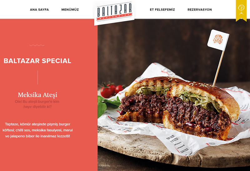
Welcome to the kingdom of beef, shawarma and kebab (to my vegetarian readers: please scroll down a bit, I’ve got some options for you, too)! Turkish cuisine is famous for two things - meats and desserts. And believe me, both can be so spicy you get “dragon’s breath” after having them.
Baltazar showcases its dishes in a way similar to Tio Luncín, but uses white background instead. I found it interesting how the regular mouse cursor turns into a stylish arrow when the interface hints for horizontal scroll. All specials and featured dishes are presented on the homepage, so you don’t really need to bother digging into the menu. Once you’ve seen the landing - you surely won’t turn down the chance to visit.
6. Green Rebel (Ottawa, Canada)
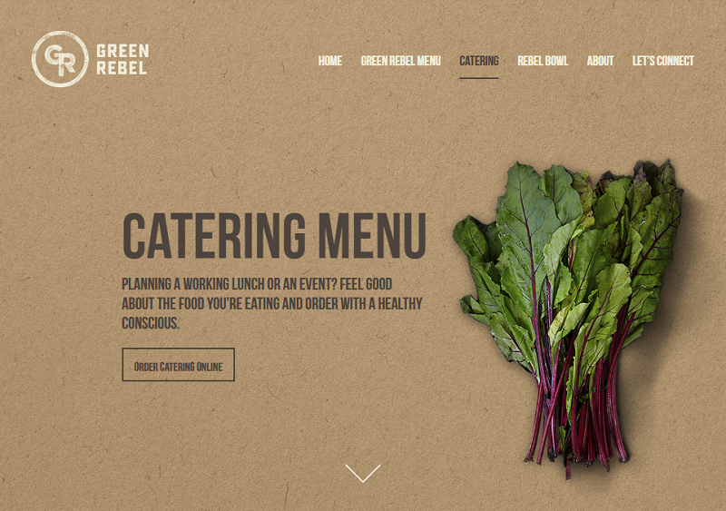
Genuinely organic, and strictly vegetarian, this website’s design perfectly embodies the identity of both. It greets you with a video clip of interior, servings and full-fed clients. Animated leaves of salad, bundles of carrots, and slices of onion dress the unfolding menu sections, just as well as they would dress your plate.
I also loved a very neat background, resembling the texture of the organic cork. The website transmits the impression of food being cooked in a “green” and ecologically friendly environment, which makes the visitor want to taste it right on the spot.
7. REEF (Kiev, Ukraine)
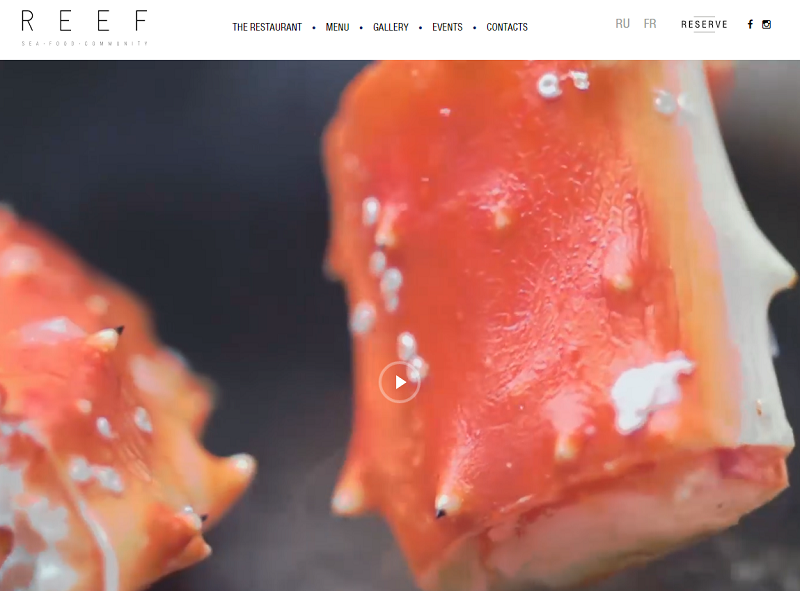
The first screen of this website is basically one big video clip. And it looks like a fresh and interesting web design solution! It can leave you observing the seafood cooking process for quite a while.
When you scroll down, a slide reel is presented, where you can opt to see either the restaurant’s interior or images of dishes. Menu and contacts conclude the landing page. This website has nothing excessive, but with its simplicity and clever video integration, it invites you to visit and discover what’s in store.
8. CRUDO (Nijmegen, The Netherlands)
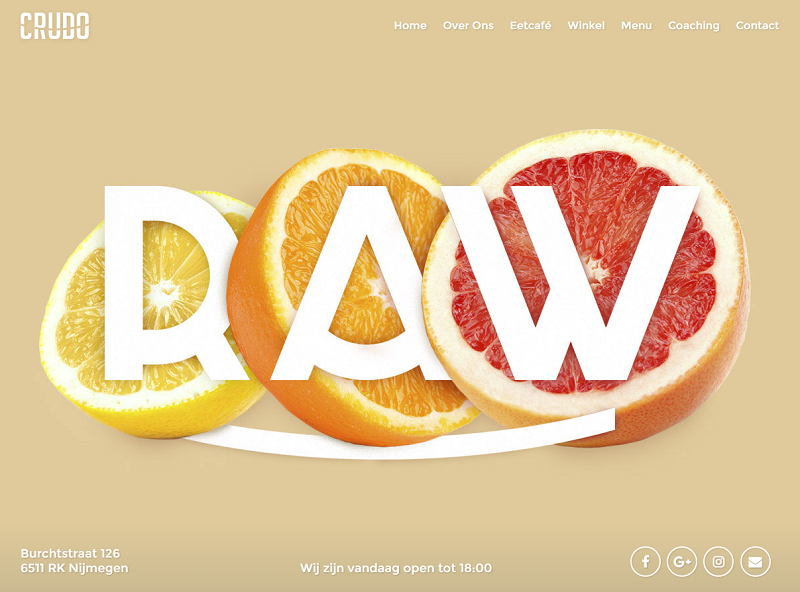
Vegan food in all its diversity! That’s a good way to apply colors when designing a restaurant website. Crudo uses monolithic warm backgrounds to underline the veggie delicacies on its first screen: it’s navy blue for lettuce, scarlett for tomatoes, and tan for oranges.
Sections of this website are presented in the form of screen-changing backgrounds, containing more renders of popular vegetable and fruit dishes. Very lightweight and minimalistic, this website instills lightness, freshness and healthy diet. With such a website, I have no doubt that CRUDO is a popular vegan food destination for both dinners and takeaways.
9. MOXHE (Bronte, Australia)
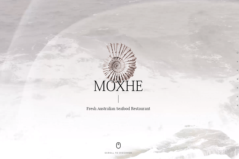
The starting screen is an infinitely looped live image of the ocean waves washing the shore. No wonder this restaurant’s main specialty is fish and seafood. A semi-transparent image of a shell, which appears to act as the restaurant’s logo, accompanies every loading sequence of the auxiliary pages.
On this website, I especially liked the reservation form. One of the few good examples of how it can be properly organized, without overburdening the user with excessive number of fields. The booking process consists of 5 easy steps (screens), each one prompting you to type only one or two words. This is what users like to see when they fill out an online application.
10. Hualalai Grille (Kailua-Kona, Hawaii)
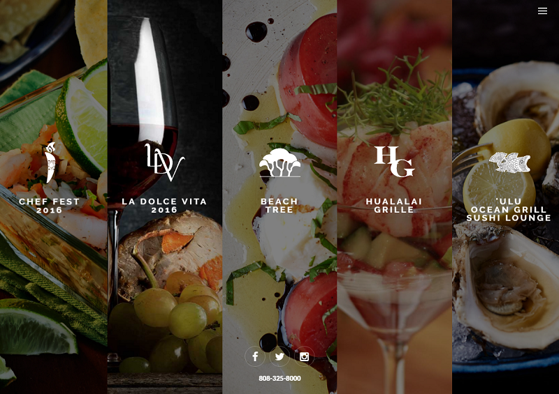
Aloha! One would presume that Hawaiian cuisine does not need to be presented or advertised, because once you’re there, you’d be tempted to taste it all the same. It may be true, but wouldn’t one of the top restaurant websites in the world be a powerful addition to this fantastic experience?
This beautiful website surely manages to act as one. On the initial screen, menu categories are presented for the visitor’s choice in five vertical “folders”. Basically, you have five different websites on this domain, each one focused on its own menu specialty (vegan, meat, salads, seafood and desserts).
One more feature worthy of note here is the elegant dish showcase. While browsing through the menu options, clicking on the particular one prompts the unobtrusive dish image pop-up. This simple solution lets your visitors see what they’ll get before they actually order it.
11. Il Buco (Sorrento, Italy)
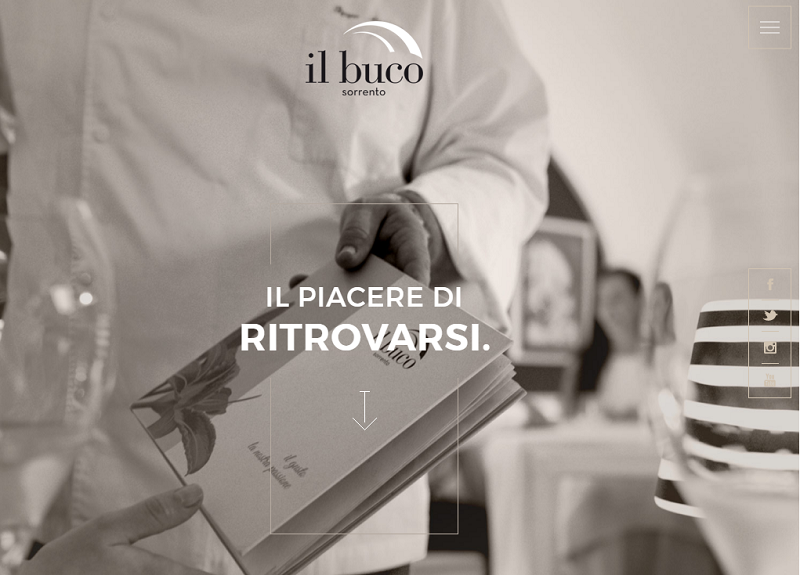
Surely, one of the best Italian restaurant websites, this one uses an elegant combination of vertical and horizontal scrolling on the landing page. When you simply scroll with your mouse wheel (or the top-down swipe), the page showcases a series of smoothly animated sections - About Us, Team, Menu etc. However, if you are interested in exploring the particular section further, you can do so with an edge swipe, which sort of “turns the page” with a horizontal scroll, and takes you to the relevant auxiliary page.
The overall color gamma of the website creates the impression of luxury and timelessness. Animations embrace various screen elements with a touch of class. Apparently, such stunning looks and smooth navigating experience was what won this site the Awwwards Honorable Mention, one of the world’s most prominent best restaurant website awards.
12. The Rosa (London, UK)
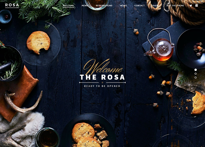
To conclude our winning dozen, here is an example of restaurant website with an authentic showcase of Northern cuisine. Cozy wooden interior with tones of pine, fur and leather charm and enthrall the website visitors into the atmosphere of warm fireplace during a stormy winter blizzard.
This website is built with smart use restaurant website design templates. What I loved about it in terms of design was a witty first screen animation. It lets every visitor spice up their dish with a simple mouseover. Dish visuals look very authentic, too, in their well-thought and beautiful entourage.
Well, it’s high time to have something to eat now - if you haven’t done so already. I hope you enjoyed our little restaurant web design examples chart. Good luck in your web design prospects, and should you wish to build a website for your restaurant- the Vintage team of dedicated web design professionals is always eager to help!
More of our editor's picks of best websites:
- TOP-10 Best Interior Design & Architecture Websites
- 12 Great Small Business Website Examples
- Top 10 Best Real Estate, Property & Rental Websites
How much should a restaurant website cost?
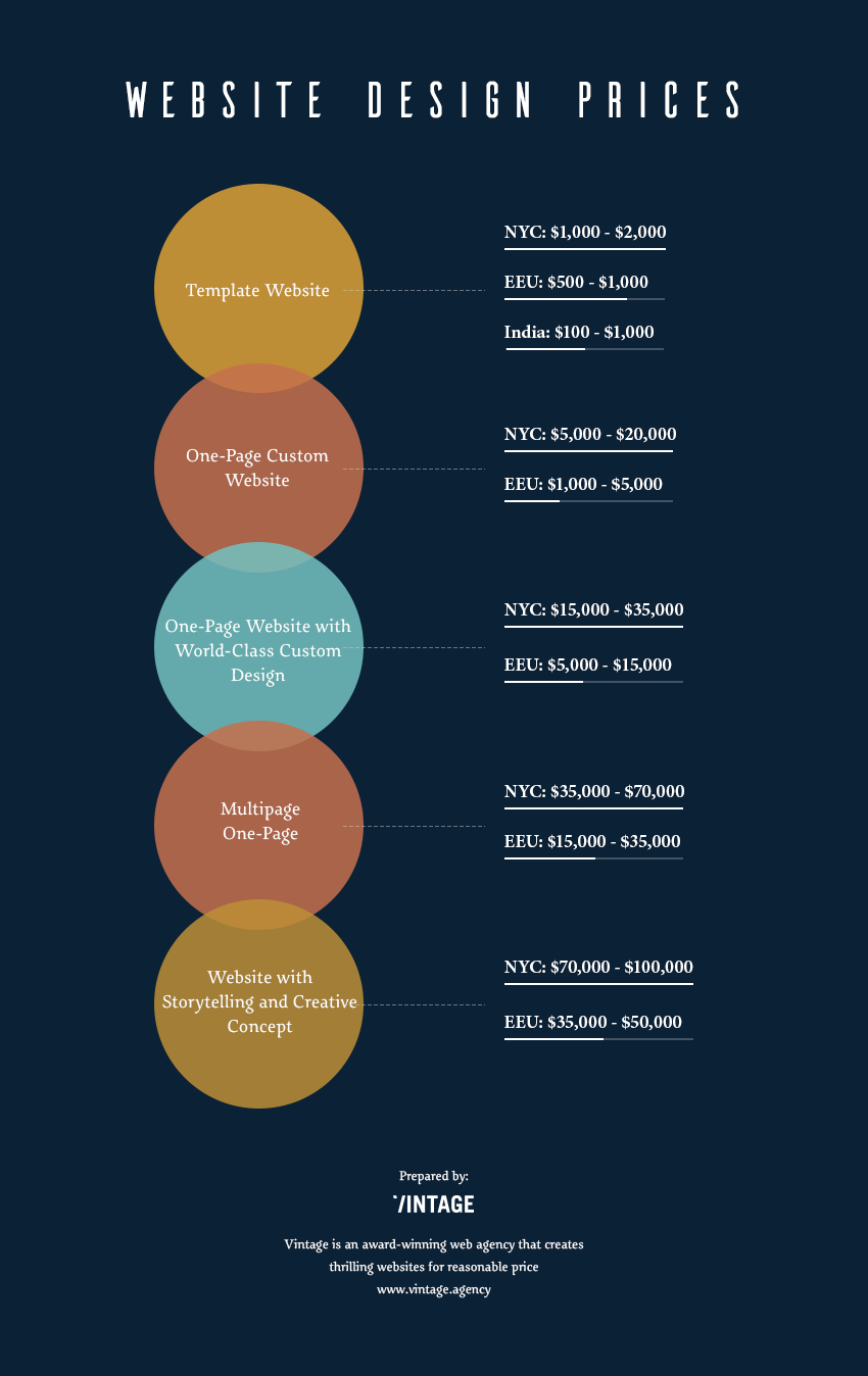
Now, let's figure out what kind of web design services restaurant owners can have for different budgets. We’ve talked both to agencies from the U.S. (particularly, California and NYC) and Eastern Europe.
In the infographic below, you can see key categories in terms of time and websites which can be developed for that amount of time. To make out the pricing, just multiply the working days by 8 and the hourly rate. Average restaurant website web development costs are $40 for best Eastern Europe agencies and $200 for best U.S. boutique agencies. Large companies can charge $250+ per hour. India is considered nowhere except “Template Website” due to a lack of professionalism.
To note: the pricing does not include video/photo production.
You can find more about costs of restaurant website in our previous article.
How to create great restaurant website?
Are you inspired by those astounding websites from our picking? Want to create your own one not worse?
The only distinctive feature of all great websites is that all of them excite both visitors and restaurant owners. To achieve its goal, the best restaurant website should transmit an atmosphere of the establishment, its unique vibe and, at the same time, be flawless and fascinating.
Read our comprehensive guide to designing one of the top restaurant websites in the world - it will help you to embrace the whole process step-by-step.
The Vintage team wishes you good luck in creating your future stunning restaurant website. If you are looking for dedicated web design professionals, feel free to contact us. Together we will create a website for restaurant covering everything your clients interested in (and even more).
View Comments