Promotional websites are a perfect tool to generate hype for a product or service that is soon to hit the market. With movies, it cannot ring truer – every major title gets a stunning conceptual website that is good enough to inspire web designers and filmmakers all across the globe.
But there is one problem. Once the movie has premiered, rolled out through theaters and hit the stores on Blu-ray, all hype is gone, and the copyright owners often choose to discontinue hosting the breathtaking, but costly promo sites.
In this article, we gathered the best examples of feature film websites, which persevered to stay online. Although some of these digital wonders were made more than 10 years ago, they all resemble innovation, style and web design trends of their time.
Enjoy and get inspired by the sturdiest movie websites so far, but keep in mind that some may require plugins that are rather out-of-date, such as Flash or JavaScript, to be enabled in your browser.
20. MEN IN BLACK 3
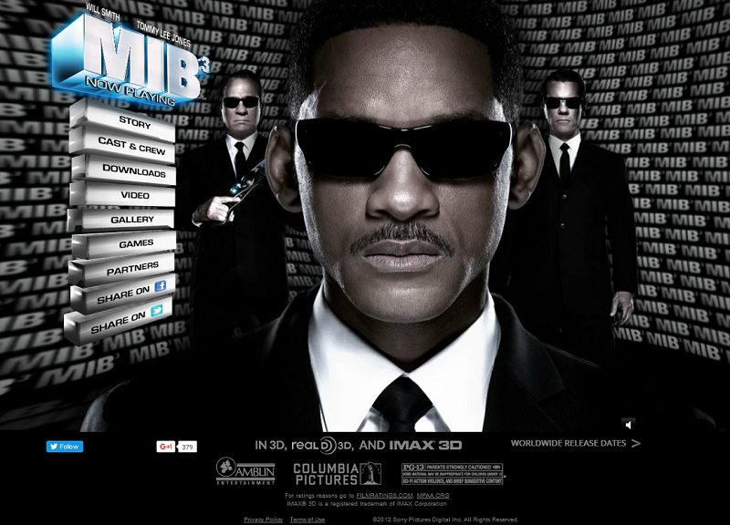
A classic example of a Flash-animated movie website: slow to load, and requires a decent amount of RAM to run smoothly. However, for its time (2011) the solution was quite fresh, and the interesting character switching sequence continues to please the eye even today.
19. THE INTERNSHIP
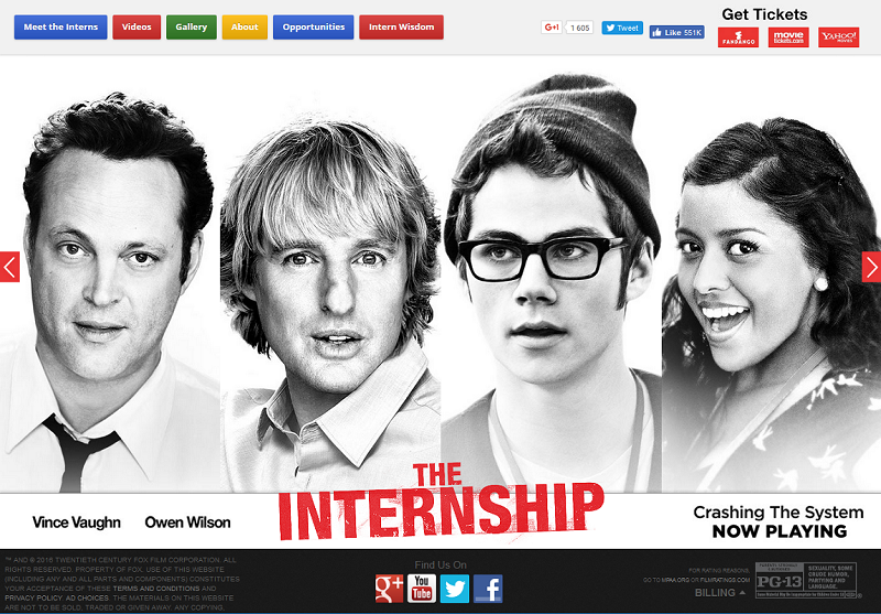
If there was such thing as a “Google” movie, this one would be a perfect illustration. The site looks like it was developed by Google themselves: colors, theme, outlay, and massive social network linking. The animation is smooth and layer-wise, somewhat resembling Google’s “material design” approach.
18. THE GIRL WITH THE DRAGON TATOO
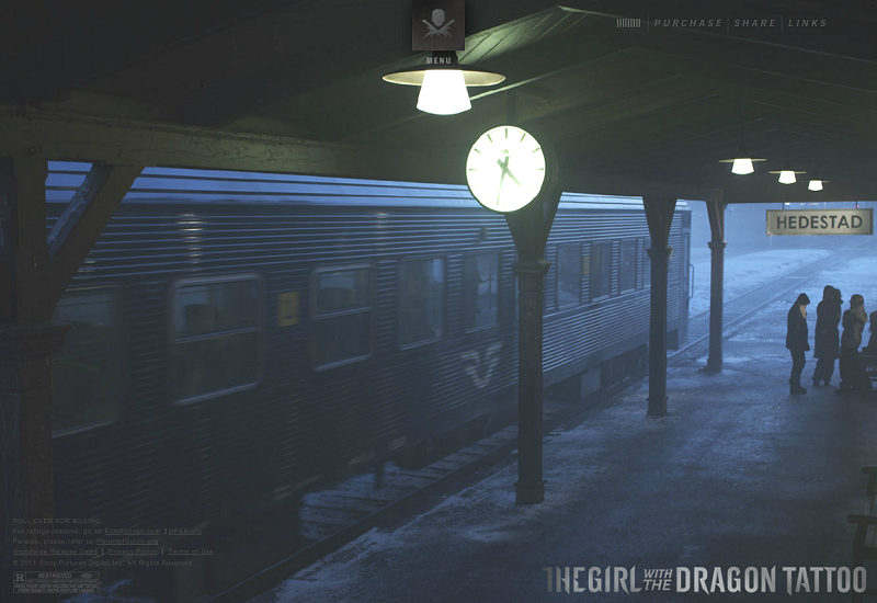
Sequences of movie shots cycle through the site’s background in a random order, so it’s impossible to predict which one comes next. The site has an interesting menu solution, which brings up tags with relevant information about the cast, characters, filming locations etc. Dive into the dark and depressing atmosphere of this thriller, perfectly portrayed by its website.
17. MADAGASCAR
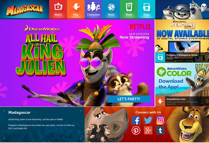
This is how you market a franchise on your movie website. Aside from the main series of films and their spin-offs, numerous apps, news and merchandise are gathered here in one place. The Play section lets you play the featured games online or download them as mobile apps. The site is neatly animated, and while it’s primary set up for children, it can appeal to virtually every audience.
16. MOON
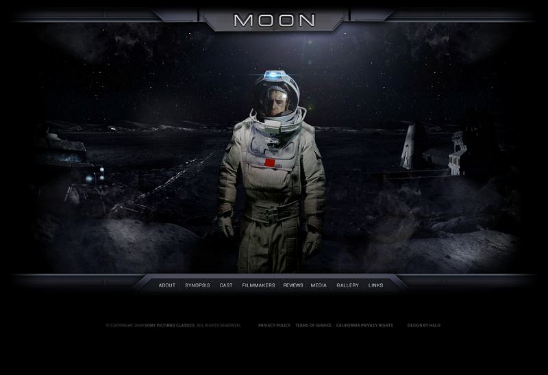
Sci-fi movies often get the most conceptual and futuristic website designs. Here is the first example of such site on our list – the Moon film. The panoramic landscape image turns right to left as you hover the cursor in the relevant direction. This site features a classical menu which opens up sections with similar “living” panoramic backgrounds.
15. WHERE THE WILD THINGS ARE
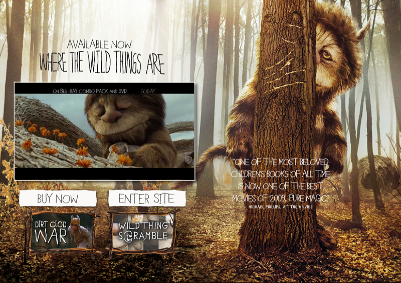
Being one of the brightest examples of live action and animation combo, the movie fully embodies this approach in its website. The conceptual loading screen, integrated video reel sequence and a featured puzzle game – the Wild Thing Scramble – leave no visitor indifferent.
14. LIFE OF PI
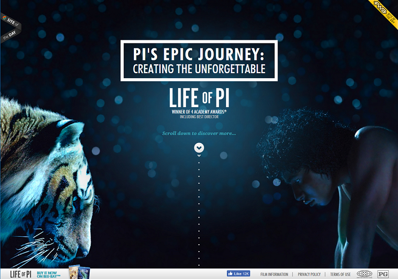
An award-winning website for the award-winning movie. Combination of animations, videos and screen-changers create the outstanding presence effect, and the interactive “making of” story guides the visitor through various movie scenes with impeccable grace. Take a step inside the film with this beautiful website!
13. TO SAVE A LIFE
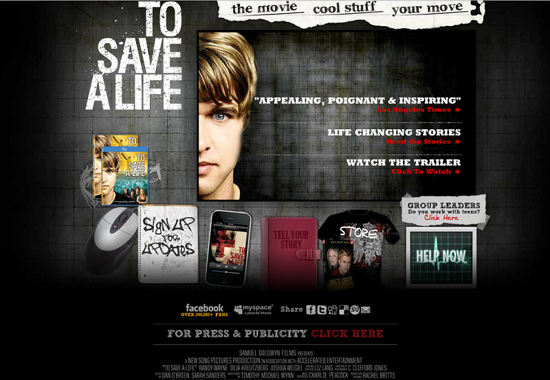
This site basically uses the movie to spread the message. Aside from the film-related info and merchandise, it contains a help section for autistic teenagers – which is one of the problems portrayed in the movie plot. The site also possesses an immense social sharing potential, linking out to almost every possible present-day social media. The animated effects are also worthy of note – just try hovering your mouse over those items below the title section.
12. EPIC
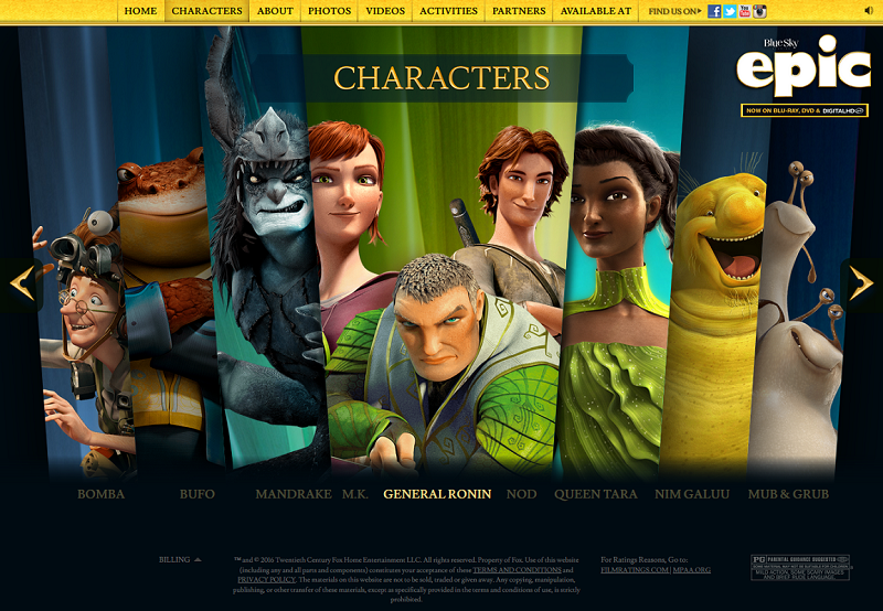
The interesting thing about this site is the animated character guide. Hovering over the particular character brings their portrait up from the main list, revealing details, just like in a video game. The site’s animation is smooth and unobtrusive, and perfectly reflects the spirit of the film.
11. SURROGATES
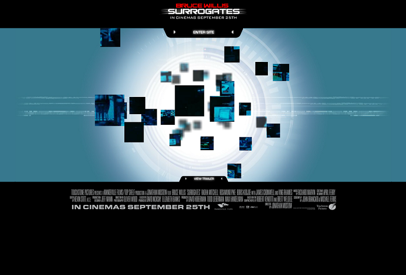
A conceptual frame-spinning animated sequence can catch you staring at it for quite a while. What’s even more interesting about it – the images within the frames are not static, but moving in short looped video clips! The idea of the movie where people are just “dummies” of their real selves has been illustrated flawlessly by this eye-catching website.
10. MOONRISE KINGDOM
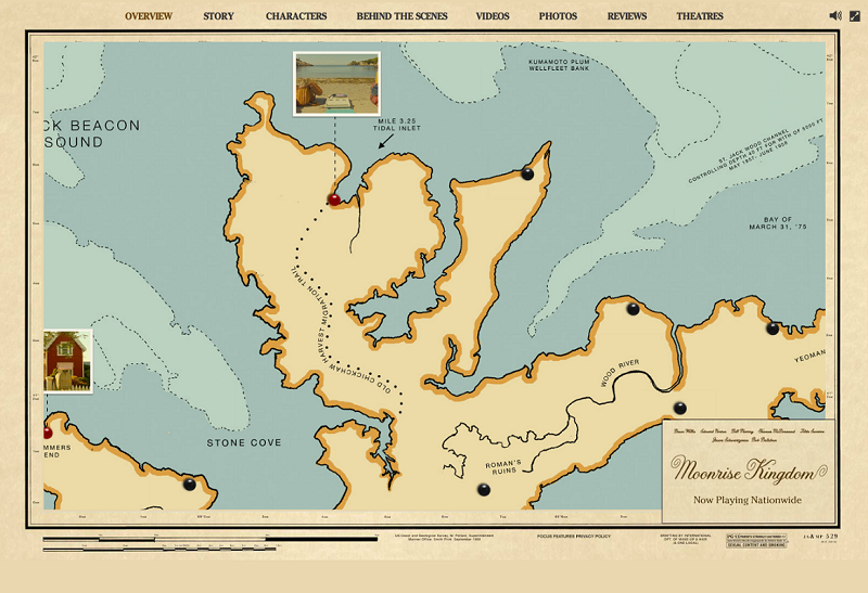
This website resembles a map, where you have to mouse over various locations and landmarks that represent certain portions of the movie featured content. For example, having navigated to the place called Summer’s End you access the “making of” video series, and stopping at Belgian Hours lets you download the soundtrack. For visitor convenience, there is also a “traditional” top menu, but who cares about it when exploring the map is so much fun!
9. PRECIOUS
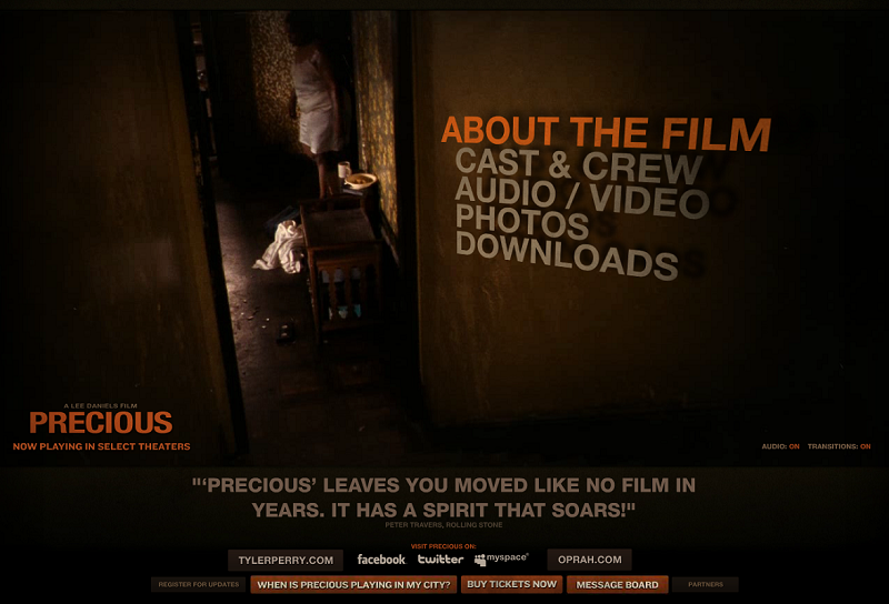
Once you’ve skipped the introductory screen, the site takes you to the interesting “open door” page, where you can see what is happening in the apartment of the film’s main character thorough the doorway. A very neat solution which we cannot remember seeing anywhere else. The menu sections next to the doorstep highlight on mouse-over, creating the impression of switching the film-related content off and on.
8. INTERRUPTION
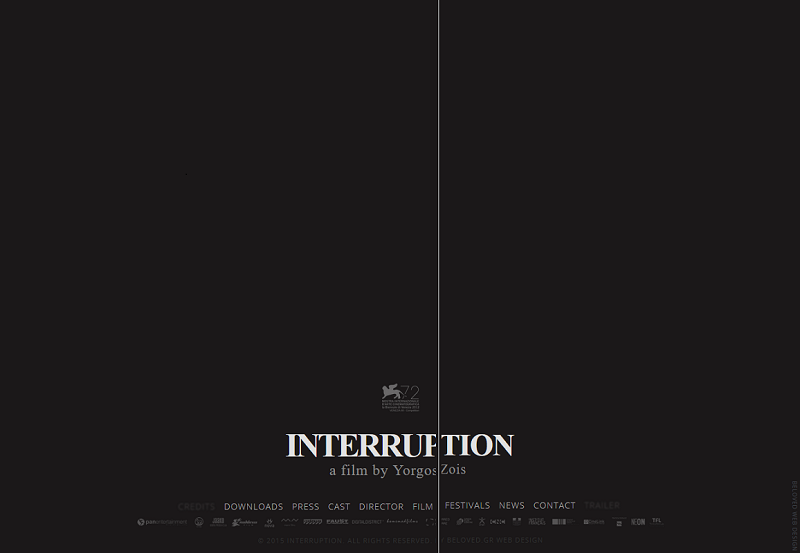
A website with a very unusual navigation style. The position of the central vertical line defines the on-screen content. Moving it towards the left side triggers the “About” page, and moving it to the left brings up trailers and clips. The site may take some time to load, and if this happens, it shows a message that reads “we are sorry for the interruption”. A very creative approach to portraying the title and plot.
7. HARRY POTTER WIZARD’S COLLECTION
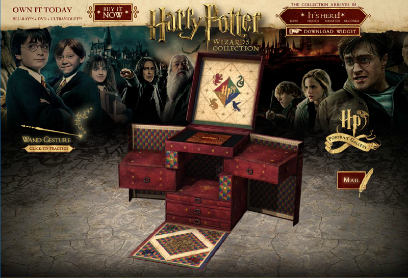
As a part of the celebrated Harry Potter franchise, this website offers the whole collection of the film series, but the exciting thing about it is that is lets you practice wand gestures! A certain gesture opens up a particular menu section. Try it out and find yourself dazed by a catchy game-like experience. The only drawback is that the site uses Flash, which may slow the animations down and is considered an outdated practice.
6. HALLOWEEN II
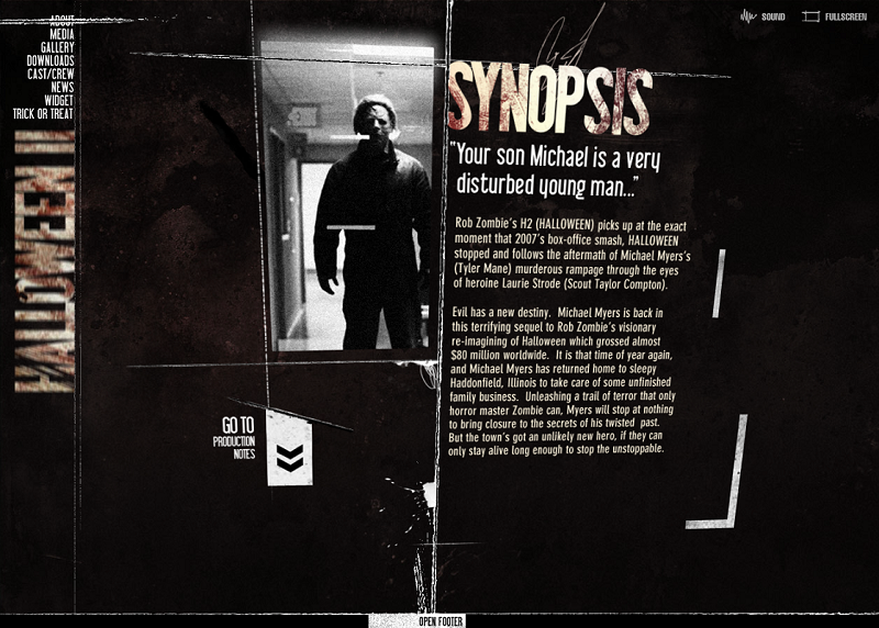
The site looks like it was designed by a psycho serial killer. And this is great, because this is exactly the impression it’s intended to make. Animations are frantic, different elements appear and vanish randomly, and the text headers blur in mind-blowing patterns. This is how you generate the hype for a horror story online!
5. PACIFIC RIM
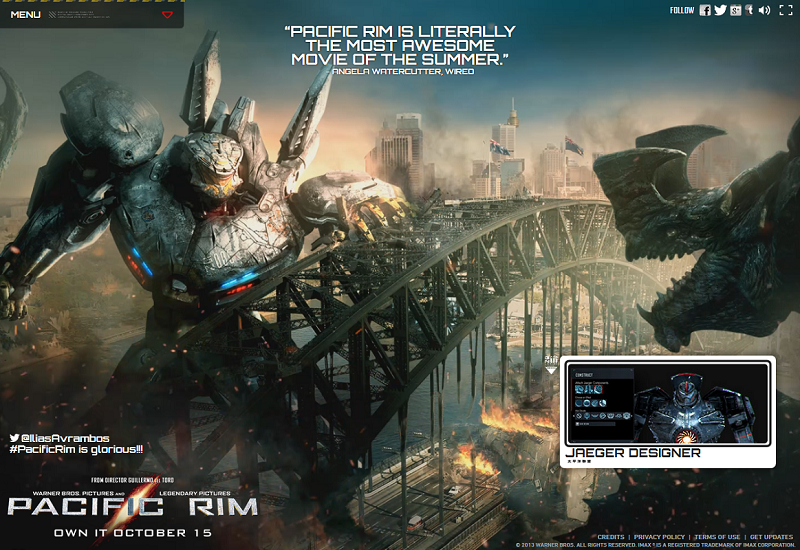
Beautifully rendered and smoothly animated background image with a roll-down menu, which hides to the top of the screen to leave the space for the ongoing eternal battle. An interesting addition to the main site is the stylish and addictive Jaeger Designer game, where you can assemble your own big anthropomorphic robot. The game requires Unity player to run, though.
4. BIRDMAN
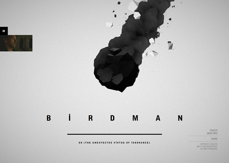
The 2014 Oscar winner for Best film, this movie has a website to match. The loading screen prompts the visitor to enter letters on their keyboard, in order to proceed with the loading. The cover page contains a handsome comet fall animation. There is no traditional, intuitive menu, and the visitor has to explore the screen corners for prompting the additional content. Just like the movie, the website has won the 2014 Webby awards – one of the most notable web design recognitions.
3. JURASSIC WORLD
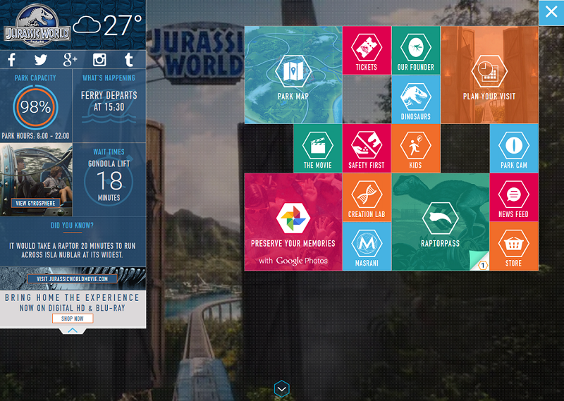
This wonderful promotional website describes the Jurassic World amusement park just as if it existed in real life. Guides, tickets, schedules and various tour offers truly contribute to the impression that the thing is real. You can browse through the site before seeing the movie to hype up your expectations, or after you’ve seen it, to revisit its memorable places and locations.
2. INTERSTELLAR
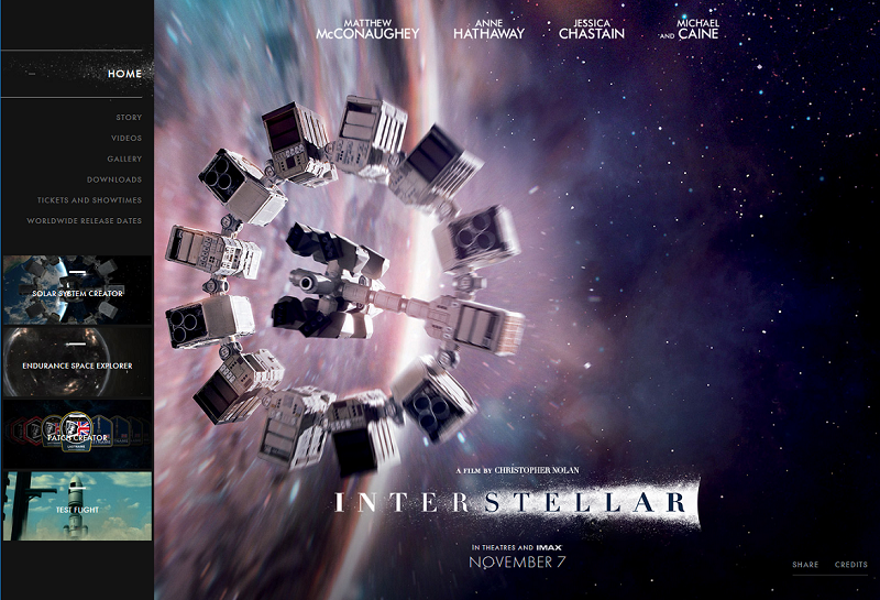
Here is what we considered a perfect example of a movie website. Beautiful animations, nicely rendered images on main screen sequence, and a handful of interesting and entertaining materials, including the two interactive mini-games, Test Flight and Space Explorer. Enjoy the breathtaking shots and video reels from one of the most convincing films of the sci-fi genre.
1. INDEPENDENCE DAY: RESURGENCE
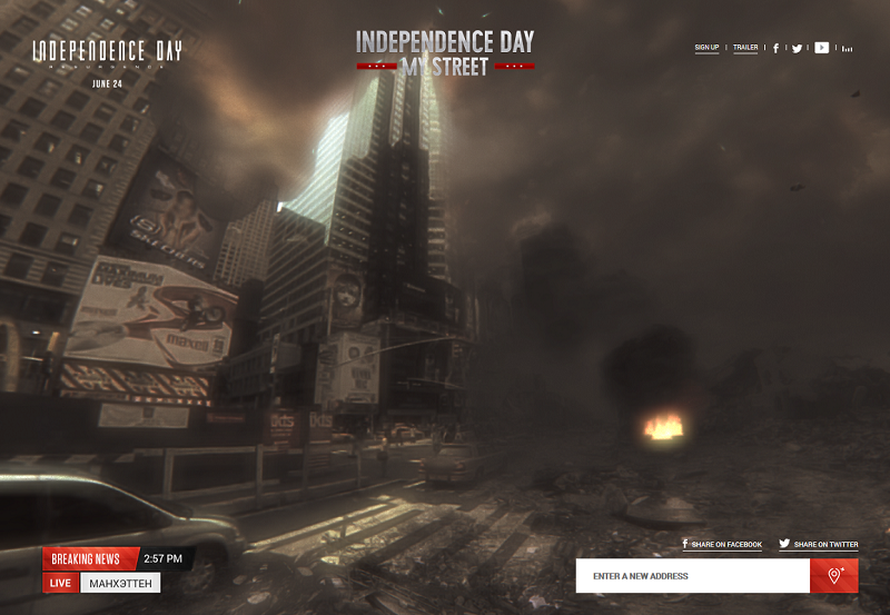
By far, the best promotional movie website we have seen. The alien invasion has come to your town! Just allow the site to track your location, or enter any address in the prompting field, and see the war between humans and aliens unfold on the street of your choice! This stunning website shows what you can do to bring the movie hype right to your viewer’s doorstep.
Did you enjoy our little movie websites chart? Have any film website in mind that you’ve particularly liked, but it’s missing here? Feel free to share and contribute in the comments section!
Check out more of our editor's picks:

View Comments